Wall Art Guide, Wall Art Tutoriels
Pop Art Wall Art: Warhol Lichtenstein Bold Graphic
Jun
So I’ve been obsessing over Pop Art wall pieces lately and honestly it started because a client wanted their home office to look less boring but didn’t want to spend a fortune on original Warhols, obviously. But like, the whole aesthetic is so much more accessible than people think?
First thing – you gotta understand that Pop Art isn’t just slapping any colorful thing on your wall. The Warhol and Lichtenstein vibe is super specific. It’s about that mass-production feel, the irony of making “high art” from commercial imagery. Which actually makes it perfect for modern spaces because it doesn’t take itself too seriously.
Finding Actual Good Prints Without Breaking Your Budget
Okay so the print quality matters SO much more than I thought it would. I bought this cheap Campbell’s Soup print from Amazon for like $15 and it looked fine in photos but when it arrived the colors were muddy and it just screamed “dorm room.” Not the look.
What actually works – look for giclée prints or screen prints. Giclée is basically fancy inkjet printing but on museum-quality paper or canvas. I found this amazing Marilyn Monroe inspired piece (not official Warhol but same style) from an Etsy seller who does giclée printing and the difference is insane. The blacks are actually black, the colors pop the way they’re supposed to.
Screen printing is even better if you can swing it because that’s how Warhol actually made his stuff. There’s a gallery in my neighborhood that does limited edition screen prints of Pop Art style pieces and yeah they’re $200-400 but they look legitimate. The texture, the slight variations in ink coverage – it feels authentic.
Size and Scale (This Is Where Everyone Messes Up)
My cat knocked over my coffee while I was measuring wall space last week and I realized I’d been planning to go way too small. Pop Art needs to be BOLD. These pieces were designed to command attention.
For a living room or bedroom, you want minimum 24×36 inches. Seriously. I see people buying 16×20 prints and hanging them on huge walls and it just looks sad. The whole point of Pop Art was challenging the gallery system and making big statements.
Here’s what I’ve learned works:
- Single large canvas: 36×48 or bigger for above a sofa
- Diptych or triptych: Three 24×36 panels side by side creates that repetition Warhol loved
- Gallery wall of smaller pieces: But only if each piece is at least 16×20 and you’re doing like 6-9 pieces total
I did a gallery wall in my own place with six different Lichtenstein-style comic panels and it took me three tries to get the spacing right. Keep them close together – like 2-3 inches apart max. Too much space between them and you lose the impact.
Color Coordination Without Making It Look Like A Kindergarten
This is gonna sound weird but Pop Art actually requires restraint in the REST of your room. The art is loud, so your furniture and walls need to chill out.
Best color schemes I’ve used:
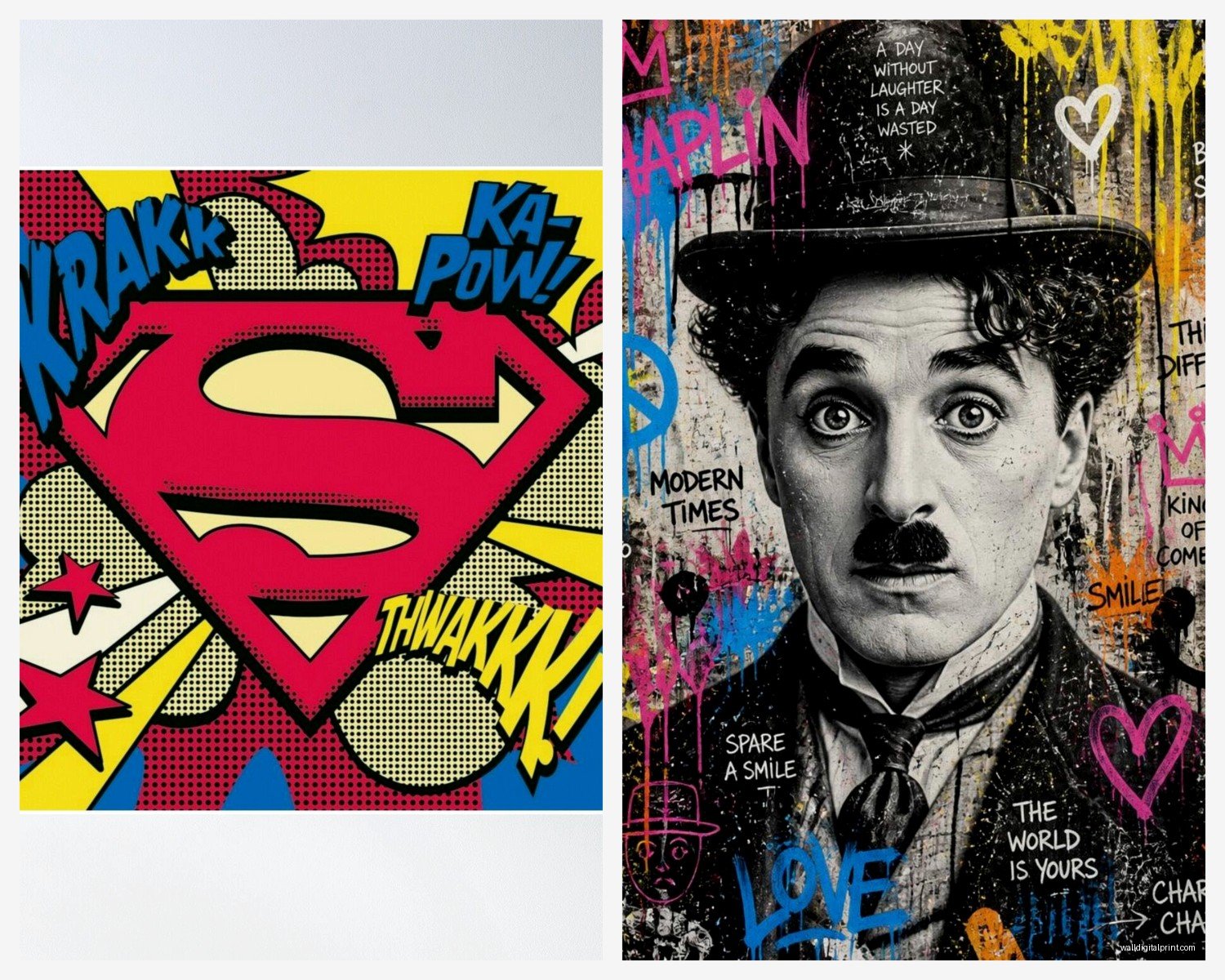
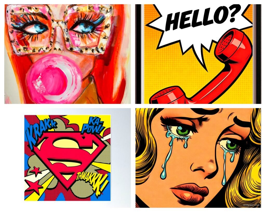
The Classic Approach: White or light grey walls, black and white furniture, then let the Pop Art be your only color. I did this in a client’s apartment with a huge Roy Lichtenstein “Crying Girl” inspired piece and it’s stunning. The reds and blues and yellows just explode off that neutral background.
The Bold Approach: Pick ONE color from your Pop Art piece and echo it in small doses around the room. Like if you’ve got a piece with prominent yellow, maybe yellow throw pillows or a yellow accent chair. But just one color. Don’t try to match all of them or it gets chaotic fast.
I made this mistake in my first attempt – I had a Warhol Marilyn print with pink, yellow, turquoise, and red, and I tried to incorporate all those colors in my decor and it looked like a candy store exploded.
The Furniture Situation
Mid-century modern furniture is the obvious pairing because that’s literally the era Pop Art came from. Clean lines, tapered legs, that whole aesthetic. But honestly? I’ve seen Pop Art work beautifully with:
- Industrial style – exposed brick, metal frames, concrete floors. The contrast between rough textures and slick graphic art is chef’s kiss
- Minimalist Scandinavian – keep everything else super simple and let the art be the personality
- Even traditional spaces if you’re brave – a Warhol above a vintage dresser can be super interesting
What doesn’t work is trying to mix Pop Art with other loud patterns. Like, no busy wallpaper, no overly ornate furniture, no Persian rugs with tons of colors. Pick one statement element and that’s your Pop Art.
Framing Choices That Actually Matter
Okay so funny story, I spent $200 on a print and then put it in a $15 frame from Target and it looked terrible. The frame literally bent when I was hanging it and the whole thing just looked cheap.
For Pop Art specifically:
Float mounting in a simple black frame is my go-to. There’s a gap between the art and the frame backing which creates this shadow effect and makes the piece look more expensive. Plus black frames echo those bold black outlines in Lichtenstein’s work.
Gallery wrapped canvas with no frame also works great, especially for that Warhol screen print look. The image wraps around the sides of the canvas and you just hang it as-is. Very clean, very modern.
White frames can work but they need to be substantial – like 2-3 inches wide. Thin white frames make everything look like a poster you bought in college.
What I avoid: ornate frames, colored frames (unless it’s a really intentional design choice), frames with weird textures or patterns. Pop Art is already busy enough.
Lighting This Stuff Properly
Oh and another thing I learned the hard way – lighting makes or breaks Pop Art. Those bright colors need good light to actually pop.
I installed picture lights above two Warhol-style prints in my dining room and holy crap what a difference. The colors went from kinda flat to absolutely vibrant. You want warm LED picture lights, not the cool white ones that make everything look like an office.
If picture lights aren’t your thing, track lighting aimed at the art works too. Or even just making sure your Pop Art wall gets good natural light during the day.
My client’s apartment has terrible natural light so we added two small spotlight fixtures in the ceiling aimed at her Lichtenstein print and now it’s the first thing you notice when you walk in.
Where To Actually Buy This Stuff
Real talk about sources because I’ve tried basically everything:
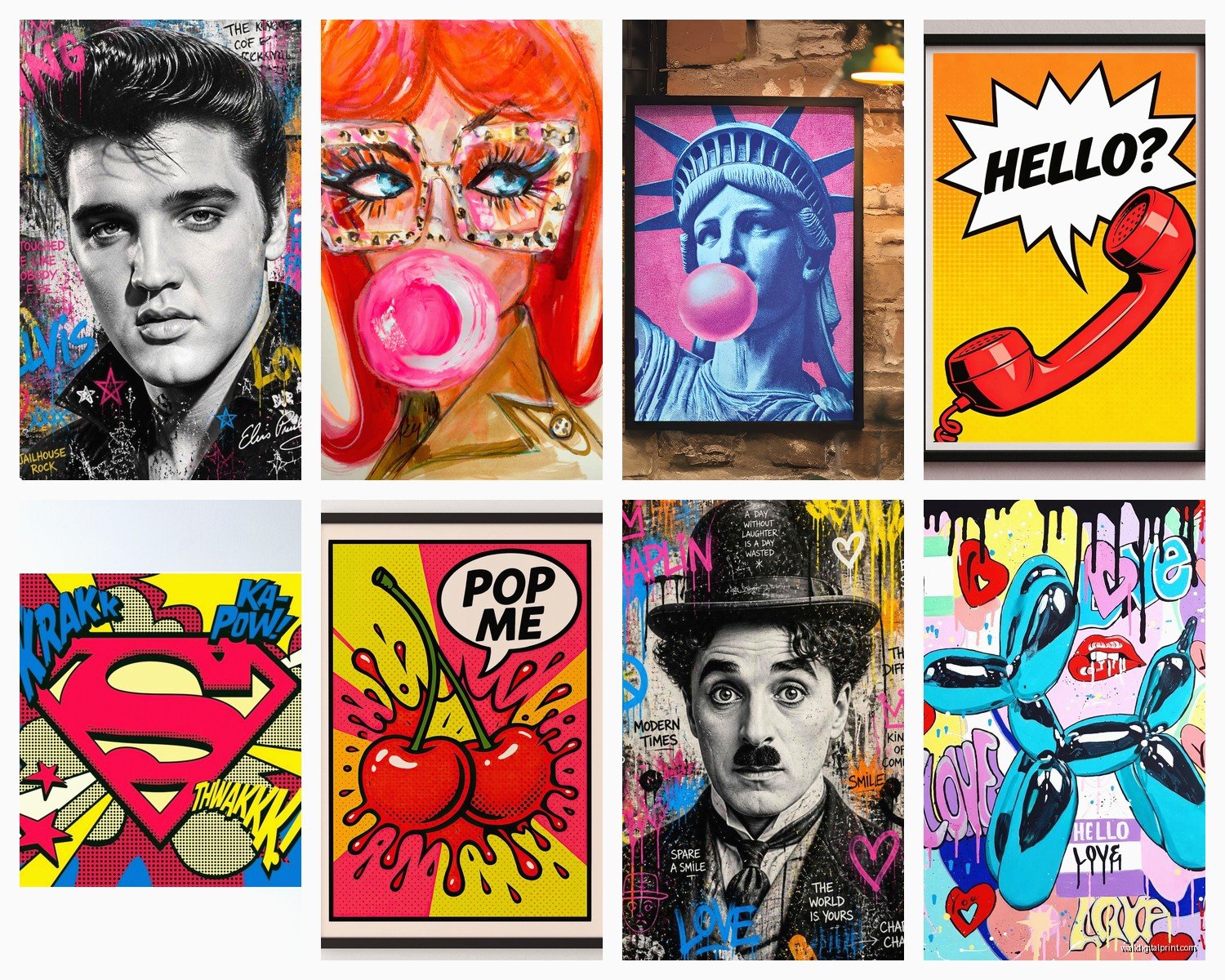
Society6 and Redbubble: Great for affordable prints in tons of sizes. Quality is decent but not amazing. Good for testing out a look before you invest more. I got a set of four Warhol-inspired Campbell’s Soup prints from Society6 for my kitchen and they work perfectly for that space.
Etsy: Hit or miss but when you find a good seller, the quality can be incredible. Search for “pop art giclée” or “Warhol style screen print” and read reviews carefully. I found a seller who does custom Pop Art portraits of your pets in the Warhol style and I’m dangerously close to ordering one of my cat.
AllPosters/Art.com: Huge selection, very commercial but reliable. Their framing options are actually pretty good too. I’ve ordered from them for clients who want quick turnaround.
Local galleries and art fairs: More expensive but you’re getting unique pieces. I found an artist at a local art fair who does Lichtenstein-style paintings of local landmarks and I’m saving up for one.
Museum gift shops: If you want officially licensed Warhol or Lichtenstein reproductions, museum shops are the way. They’re pricey but the quality is legit and you know you’re getting accurate colors.
The Arrangement Game
Wait I forgot to mention – if you’re doing multiple pieces, the arrangement is crucial. Pop Art loves repetition and grid patterns.
The Warhol approach is literally just a grid. Four squares arranged 2×2, or nine squares in a 3×3 grid. All the same size, evenly spaced. It’s mathematical and that’s the point.
For Lichtenstein-style pieces, you can be a bit more flexible but keep it organized. I did three comic-style panels in a horizontal row above a credenza and the symmetry makes it work.
What I’ve tested:
- Four 20×20 inch squares in a grid: Perfect for above a bed or sofa
- Three vertical panels: Great for narrow walls or beside doorways
- One massive statement piece: Sometimes you just need that one big moment
Use painter’s tape to map out your arrangement before you start hammering nails. I’ve repainted walls because I didn’t do this step and ended up with a million extra holes.
Mixing Warhol and Lichtenstein Styles
This is tricky but doable. They’re both Pop Art but the aesthetics are different – Warhol is about repetition and color blocks, Lichtenstein is about those Ben-Day dots and comic book drama.
I’ve successfully mixed them by keeping the color palette consistent. Like, all cool colors (blues, purples) or all warm colors (reds, yellows, oranges). And keeping the sizes similar so one doesn’t overpower the other.
In my living room I have a Warhol Marilyn print and a Lichtenstein crying girl print on opposite walls and it works because they’re both the same size and both have red as a dominant color.
The DIY Route If You’re Crafty
Okay so if you’re artistic at all, Pop Art is actually super accessible to recreate. My friend took a Photoshop class and learned how to do the Warhol effect on photos – you basically posterize the image and apply high contrast, then add blocks of color.
She made a four-panel Warhol-style piece of her dog for like $60 in printing costs and it looks amazing. There are tutorials all over YouTube.
For Lichtenstein dots, you can buy Ben-Day dot overlays or even create them digitally. It’s more complex but totally doable if you’ve got patience.
I tried making my own and gave up halfway through because I don’t have the patience but if you’re into that kind of thing, the supplies are pretty cheap and you get something totally unique.
Common Mistakes I See All The Time
Hanging it too high – the center of your art should be at eye level, which is like 57-60 inches from the floor. I see people hanging art way up near the ceiling and it just floats there awkwardly.
Going too matchy-matchy with colors. Your throw pillows don’t need to be the exact same shade of red as your Warhol print. Close enough is better, actually.
Mixing Pop Art with too many other art styles. Like, if you’ve got Pop Art in your living room, maybe skip the impressionist paintings and abstract sculptures in the same space. Let Pop Art have its moment.
Not committing to the boldness. If you’re gonna do Pop Art, DO it. Don’t get scared and buy a tiny print and hide it on a side wall. Go big or honestly just pick a different style.
The lighting thing I mentioned – so many people ignore lighting and then wonder why their expensive print looks dull.
Specific Pieces That Actually Work In Real Homes
From my experience, these are the most versatile:
Warhol Marilyn: Classic, works in bedrooms or living rooms, lots of color options
Campbell’s Soup cans: Perfect for kitchens or dining rooms, surprisingly sophisticated if you get good quality prints
Lichtenstein comic panels: Great for offices or media rooms, conversation starters
Warhol Flowers: Softer than his other work, works in more traditional spaces
Lichtenstein Brushstrokes: Super graphic, perfect for modern spaces
I’ve used all of these in different client projects and they consistently look good. There’s a reason these images became iconic – they’re just visually strong.
The key with any of them is scale and quality. A tiny soup can print looks silly. A huge, well-printed soup can print looks intentional and cool.
Anyway that’s basically everything I’ve figured out through trial and error and probably too many hours scrolling through art websites when I should be sleeping. The main thing is just commit to the boldness and don’t overthink it – Pop Art is supposed to be fun and a little irreverent, not precious or fussy.