Wall Art Guide, Wall Art Tutoriels
Nurburgring Wall Art: Racing Track Circuit Map Decor
Jun
So I’ve been completely obsessed with racing track wall art lately and honestly the Nurburgring stuff is just *chef’s kiss* for a motorsport-themed space. My neighbor asked me about this last week because his son is super into F1 and GT racing, and I ended up going down this whole rabbit hole testing different styles in my own studio space.
Why Nurburgring Works So Well as Wall Decor
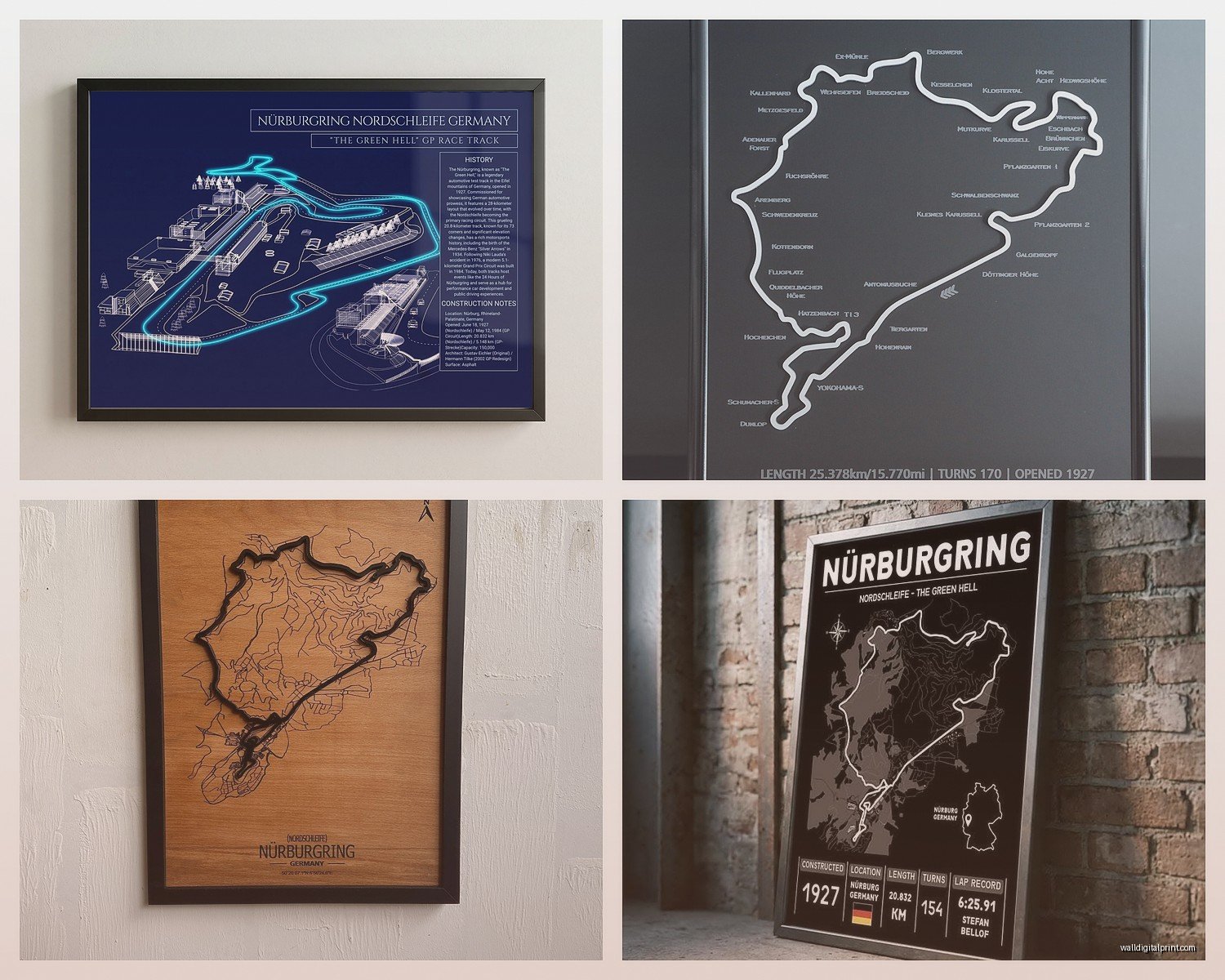
Okay so here’s the thing about the Nurburgring specifically – it’s got this insanely recognizable shape that reads as art even if someone doesn’t know what they’re looking at. The Nordschleife is like 12.9 miles of twisting curves and it creates this almost organic, flowing line pattern that’s just visually interesting. I hung a simple black line version in a client’s minimalist office last month and people kept asking if it was abstract art or a river map or something.
The track has so much history too which makes it feel less like you’re just decorating with “car stuff” and more like you’re celebrating engineering and design legacy. I mean this is the Green Hell we’re talking about.
Different Style Options I’ve Actually Tested
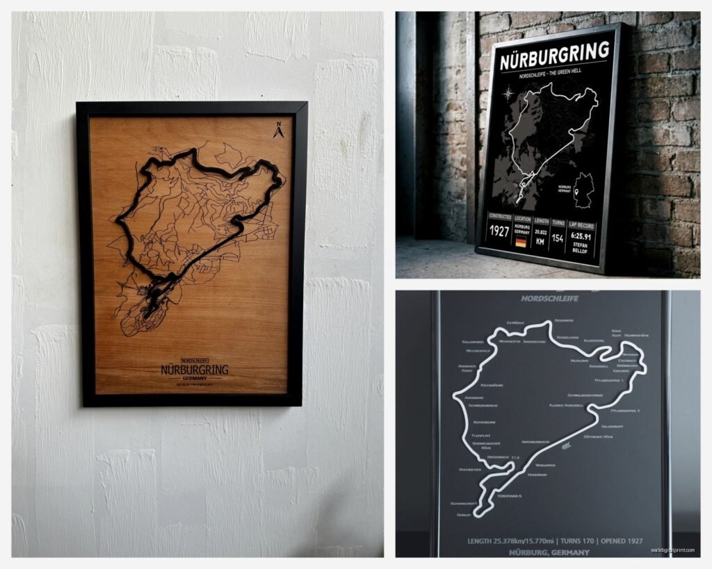
Minimalist Line Maps
These are my go-to for most spaces honestly. Just the circuit outline in black, white, or a single color against a contrasting background. I’ve used them in:
- Home offices where you want something personal but not distracting
- Modern bedrooms with neutral color schemes
- Entryways where you need a conversation starter but nothing too bold
The clean versions usually come as prints or metal prints. Metal prints are gonna cost you more (like $80-200 depending on size) but they have this really nice depth and the colors stay vibrant forever basically. I spilled coffee on one once – just wiped right off.
Regular prints on quality paper run maybe $30-80 and you’ll need to frame them which adds another $40-100 if you want something decent. Don’t cheap out on the frame for minimalist art, it shows way more than with busy pieces.
Vintage Racing Poster Style
Oh and another thing – the vintage poster reproductions are having a moment right now. These usually feature the track map with retro typography, maybe some worn texture effects, sometimes they include old race dates or famous driver names.
I used one in a man cave renovation (ugh I hate that term but that’s what the client called it) and paired it with some leather furniture and industrial lighting. The aged look of the poster actually helped tie together new and vintage elements in the room.
These work best when:
- You’re going for an industrial or vintage vibe already
- The space has warm wood tones or leather
- You want something that feels collected rather than bought-yesterday-at-Target
Price range is similar to minimalist prints but the framing matters even more. A cheap modern frame will kill the vintage vibe completely. Look for black wood frames with a bit of texture or go for a thin metal frame in bronze or brass tones.
Material Choices That Actually Matter
Canvas Prints
I’ve tested a bunch of canvas versions and here’s my honest take – they’re fine for casual spaces but they don’t have the impact of other materials. Canvas can look a bit cheap unless you size up significantly. Like a 16×20 canvas of the Nurburgring just looks… meh. But a 30×40 or bigger starts to make a statement.
The texture of canvas adds warmth though which can be good in bedrooms or family rooms. Just make sure you’re getting gallery-wrapped edges (where the image continues around the sides) because seeing the staples on the edges is tacky.
Cost is usually $50-150 depending on size and they come ready to hang which is convenient.
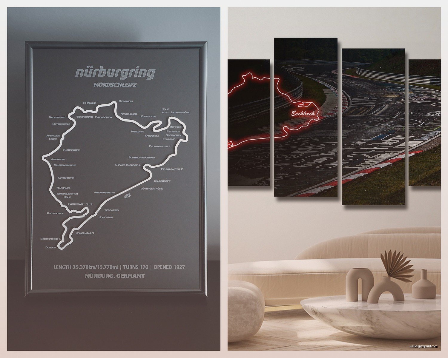
Metal Prints
Okay so I mentioned these earlier but let me expand because I’m borderline evangelical about metal prints for racing art. The colors are SO vibrant and they have this modern, almost industrial quality that fits perfectly with the technical/engineering vibe of motorsport.
I did a whole garage makeover last year – well, technically it was my brother’s garage but I was testing ideas – and used three different Nurburgring metal prints in varying sizes. The way light hits the metallic surface throughout the day keeps the art from feeling static. It’s subtle but it makes a difference.
Downsides: they’re heavier than you’d think so make sure your hanging hardware is solid, and they show fingerprints if you touch them (learned that the hard way when my cat knocked one down and I grabbed it).
Wood Prints and Laser Engraving
This is gonna sound weird but wood versions have become my secret weapon for masculine spaces or anywhere with a lot of natural materials. The track gets printed or laser-engraved onto wood panels – usually birch or bamboo.
The wood grain shows through which gives it this really organic feel despite being a technical racing circuit. I used one in a mountain cabin renovation and it fit perfectly with the exposed beams and stone fireplace. Nobody expected racing decor in that setting but it worked.
These run $70-250 depending on size and wood quality. The laser engraved versions (where it’s actually burned into the wood) tend to be more expensive but they have this incredible tactile quality.
Color Schemes That Won’t Make You Cringe Later
Monochrome is Your Friend
Black track on white background or vice versa is basically foolproof. I’ve never had a client regret this choice. It’s clean, it’s timeless, and it works with literally any other colors in the room.
You can play with the background though – off-white, cream, light gray – these all add subtle warmth without committing to a color that might feel dated in three years.
Track in Color Against Neutral Background
If you want some color, putting the track itself in a bold hue (red, blue, green, orange) against white or black can be really striking. I did a teen’s room with the track in electric blue against charcoal gray and it became the whole color story for the space.
Just make sure you’re pulling that color into at least two other elements in the room – a throw pillow, a lamp, something. A single colored element looks random.
Topographic Style with Elevation Colors
Wait I forgot to mention – there are versions that show the elevation changes of the Nurburgring in different colors, kind of like a topographic map. These are gorgeous and add an extra layer of meaning since the elevation changes are such a huge part of what makes the Nordschleife challenging.
These work best in:
- Offices where the technical aspect adds interest
- Spaces with an existing multi-color palette
- Anywhere you want people to actually stop and study the piece
The colors are usually gradients from green to yellow to red showing low to high elevations. Make sure the colors complement your existing palette – I’ve seen these clash badly with warm orange-red color schemes.
Size and Placement Strategy
Going Big vs Gallery Wall Approach
My general rule: if the Nurburgring is THE focal point, go big. Like 36×48 or larger. The track has enough visual interest to carry a large format and it needs that scale to really show all the detail in those curves.
Smaller versions (16×20 or 20×24) work better as part of a gallery wall with other racing memorabilia, photos from track days, maybe some vintage racing posters. I did this in a garage/workshop and mixed Nurburgring prints with Spa-Francorchamps and Laguna Seca. Created this whole motorsport shrine situation.
Where to Actually Hang It
Home Office: Behind your desk or on the wall you face. It’s motivating without being distracting and makes a great backdrop for video calls if you’re into that.
Garage or Workshop: Obviously. But think about placement – you want it visible from where you actually spend time, not tucked in a corner behind stored stuff.
Living Room: Can work but you gotta commit to the theme. It needs to be part of a cohesive design story, not just randomly placed between your family photos and beach artwork.
Bedroom: Actually works really well over a bed or dresser, especially in minimalist or modern industrial bedrooms. The linear quality of the track map has a surprisingly calming effect.
Man Cave/Entertainment Room: Yeah okay this is an obvious one but it’s obvious because it works.
Mixing Racing Tracks with Other Decor
This is where people get nervous but honestly it’s not that hard. The key is treating the track map like abstract line art in terms of how it relates to other pieces.
I paired a Nurburgring print with:
- Black and white photography (the linear quality echoes well)
- Abstract geometric art (shared aesthetic language)
- Vintage travel posters (if going the retro racing poster route)
- Industrial/architectural photography
What doesn’t work: trying to mix it with soft, romantic, or very traditional decor. The technical nature of circuit maps needs a bit of edge in the surrounding space.
Supporting Elements
If you’re building a whole motorsport theme – which, why not go all in – consider adding:
- A small checkered flag element (subtle, not full-on NASCAR)
- Metal or industrial shelving for displaying models or books
- Leather or metal furniture pieces
- Track lighting or industrial-style fixtures
- A color palette pulled from racing liveries
I’m watching this documentary about Le Mans right now and it’s giving me so many ideas for my next project.
Custom vs Ready-Made Options
Etsy and Independent Artists
Honestly Etsy is where I find most of my track art. Independent designers offer way more variety in style, size, and customization. You can often request:
- Specific colors to match your space
- Size modifications
- Material changes
- Added text (track records, personal lap times, dates)
Prices vary wildly – $25 for a basic digital download you print yourself up to $300+ for large custom pieces. Quality varies too so check reviews and ask for material samples if you’re dropping serious money.
Mass Market Options
Places like Amazon and racing merchandise sites carry Nurburgring art but it tends to be pretty generic. Fine if you want something quick and inexpensive but it won’t have the same impact as a thoughtfully chosen piece.
I grabbed one from Amazon once for a quick staging project and it was… fine. Did the job. Wouldn’t put it in a permanent installation though.
DIY and Digital Download Route
If you’re even slightly crafty or just want to save money, digital downloads are genius. Buy the file for like $8-15, print it at a local print shop or online service, frame it yourself.
This is how I test concepts before committing to expensive pieces. I’ve probably printed and tried 20 different Nurburgring variations in my studio at this point.
Print quality matters though – use a proper photo printing service, not your home inkjet. The difference is huge. I use a local print shop that does large format on quality paper for about $20-40 depending on size.
Framing Tips for DIY
Don’t overthink it but also don’t buy the cheapest frame at Target. Mid-range frames from places like Frame Bridge or even IKEA’s better lines work well. For racing art I lean toward:
- Black wood frames with clean lines
- Thin metal frames in black or silver
- Floating frames for a modern look
Matting is optional – I usually skip it for minimalist track maps because the clean edge-to-edge look is stronger. But vintage style posters can benefit from a mat, especially in cream or gray tones.
Lighting Considerations Nobody Talks About
Okay so funny story – I hung this beautiful Nurburgring metal print in a hallway and it looked amazing… during the day. At night with the overhead lighting it was basically invisible. The angles were all wrong.
If you’re investing in quality track art, consider the lighting:
- Picture lights for smaller pieces (battery-operated ones are surprisingly good now)
- Adjustable track lighting to highlight larger pieces
- Natural light is great but watch for glare on glass-covered prints
- Metal prints can handle direct light without fading which is nice
I added a simple LED picture light to that hallway piece and it completely transformed it. The metallic surface catches the light and the track almost glows.
What to Avoid
Based on my mistakes and client projects that didn’t quite work:
Don’t go too small unless it’s part of a gallery wall. A tiny Nurburgring print on a big wall looks lost and sad.
Don’t mix too many different track maps in one space unless you’re deliberately creating a collection wall. It gets visually chaotic fast.
Don’t cheap out on printing quality for minimalist versions. Every imperfection shows on simple line art.
Don’t forget about the rest of the room. Even the coolest Nurburgring art won’t save a cluttered, unfocused space.
Don’t stress too much about it being “too masculine” or whatever. I’ve used track maps in all kinds of spaces and when styled right they’re just good design.
The main thing is picking a version that matches your space’s vibe and committing to it. A confident choice in the right spot with proper supporting elements will always look better than a perfect piece poorly placed or half-heartedly incorporated.
Anyway that’s basically everything I’ve learned from way too many hours comparing circuit map options and testing them in actual spaces. Let me know which direction you’re leaning and I can get more specific about sources or styling details.