Wall Art Guide, Wall Art Tutoriels
Flower Market Wall Art: Botanical Shop & Garden Prints
Jun
So I’ve been completely obsessed with flower market prints lately and honestly it started because I was trying to fix this weird dead space in my hallway and somehow fell down a rabbit hole of botanical shop art at like midnight. Now I have opinions.
The Actual Appeal of This Whole Aesthetic
Flower market prints work because they’re not trying too hard? Like they have this casual European vibe without being precious about it. I’ve used them in probably six client projects this year and the thing is they go with everything. Modern farmhouse, yes. Minimal Scandi, absolutely. Even worked them into a kind of moody maximalist dining room situation and they held their own.
The key thing nobody tells you is that botanical shop prints are different from regular floral art. Regular florals can feel really grandma-ish or too romantic, but market prints have this documentary quality. They’re about the place and the commerce of flowers, not just pretty petals. Makes them way more versatile.
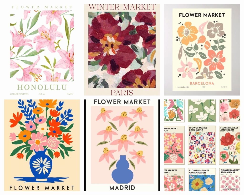
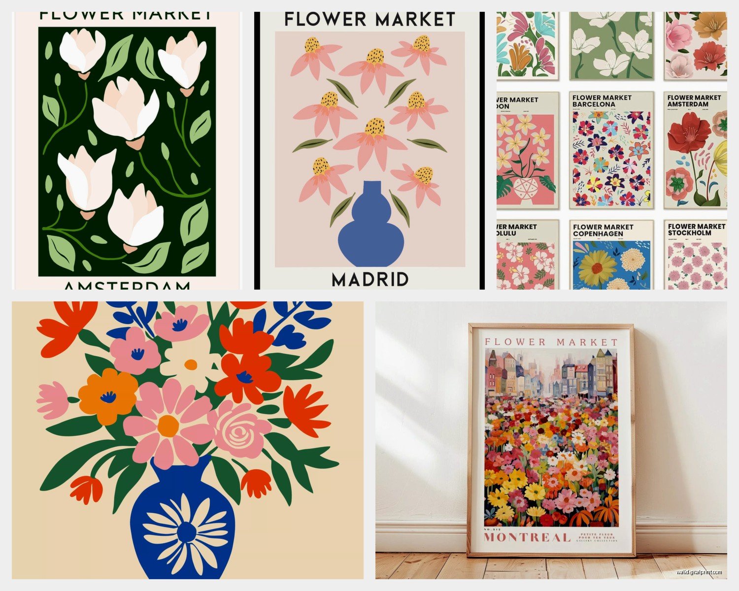
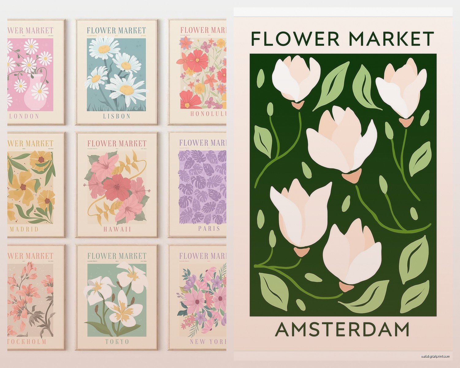
What Actually Counts as Flower Market Art
Okay so there’s a few subcategories here and they matter for styling:
- Street market scenes – these show actual flower stalls, usually European, sometimes with people or bicycles or whatever
- Botanical shop fronts – storefronts with flowers spilling out, very Parisian or Amsterdam vibes
- Wrapped bouquet prints – close-ups of market-style bouquets in that brown paper wrapping
- Garden shed/potting bench scenes – more rustic, shows the working side of flowers
- Vintage seed packet or botanical catalog reproductions – these lean more graphic
I tend to mix the first three categories together. The garden shed ones need different styling energy, more cottagey. And vintage seed packets work better in kitchens or offices for some reason.
Size and Scale Stuff That Actually Matters
This is gonna sound weirdly specific but I learned this the hard way. Flower market prints lose their impact under 16×20 inches. Like, they need enough size for you to see the details – the individual stems, the texture of the paper wrapping, whatever. I made the mistake of ordering 11x14s for a client’s bedroom and they just looked… insignificant? We ended up going with 24×36 for the main piece and it completely changed the feeling.
For hallways I usually do 16×20 or 18×24 in a series of three or four. Living rooms can handle bigger – I did a 40×60 canvas of a Paris flower market scene above a sofa last month and it’s probably my favorite install this year.
Oh and another thing – horizontal orientation works better for most spaces. Vertical can feel too formal unless you’re doing a gallery wall situation. Most flower market scenes naturally want to be horizontal anyway because they’re capturing a scene, not a portrait.
The Gallery Wall Approach
If you’re doing a gallery wall with these, keep it to max 5 pieces. I see people trying to do like 9 or 12 prints and it gets chaotic. Flower market art already has a lot of visual information – colors, textures, details – so you need breathing room.
My formula that works: one large print (20×28 or bigger) as your anchor, then 3-4 smaller supporting prints in the 11×14 to 16×20 range. Keep frames consistent – all black, all natural wood, or all white. Don’t mix frame colors with this style, it gets too busy.
Color Palette Considerations
This is where it gets interesting because flower market prints come in wildly different color stories. You’ve got your soft pastels – pinks, lavenders, whites – which work in bedrooms and feminine spaces obviously. But then you’ve got the ones with deep jewel tones, lots of greenery, richer backgrounds.
I’ve noticed that prints with neutral backgrounds (cream, gray, soft white) are way more versatile. If the background is too colorful or busy, you’re locked into specific wall colors. Had this issue in my own kitchen actually – bought this gorgeous print with a bright blue storefront background and it clashed with my sage green walls. Ended up moving it to my office where the walls are white.
For maximum flexibility, look for prints where:
- The background is 50% or more neutral tones
- Flower colors are varied (not all pink or all yellow)
- There’s some green/foliage to ground it
- The overall tone reads as either warm or cool, not fighting itself
Wait I forgot to mention – black and white flower market prints are having a moment and honestly they’re genius if you’re indecisive about color. Lost the romantic quality a bit but gained this editorial sophistication that works in offices and modern spaces.
Frame Choices That Don’t Suck
Okay so framing makes or breaks this whole thing. I’ve tested a bunch of options because my client canceled last Tuesday so I literally spent an hour at a frame shop comparing options like a total weirdo.
Natural wood frames in light or medium tones work best for the European market aesthetic. Black frames make things more modern and graphic – good if your space leans contemporary. White frames can work but they need to be slightly off-white or warm white, not stark white, or everything looks too sterile.
The thickness matters too. Thin frames (under 1 inch) make the art feel cheaper even if it’s not. I stick with 1.5 to 2 inch frames for most flower market prints. Gives them enough presence.
Mat or No Mat
Personal preference incoming: I almost always use mats with prints under 20×24. The mat creates breathing room and makes the art feel more intentional. Go with at least a 2-inch mat, preferably 3 inches. White or cream mats are safest.
For larger prints – like 24×36 and up – you can skip the mat and go straight to edge of frame. The scale doesn’t need that extra buffer.
Where to Actually Source These Prints
This is probably what you really wanted to know. I’ve bought from probably 15 different places at this point and here’s what I’ve learned:
Etsy is actually great for this specific genre. Search “Paris flower market print” or “botanical shop print” and you’ll find tons of independent photographers and artists. Quality varies wildly though – always check reviews and read the description carefully about what you’re getting. Some are digital downloads you print yourself, some are physical prints, some are canvas. I’ve had good luck with shops that show the actual print in the frame, not just the digital mockup.
Print-on-demand sites like Society6 or Minted have curated collections but they’re pricier. The advantage is consistent quality and easy returns. I use these when clients have specific size requirements because you can usually get custom dimensions.
Art.com and AllPosters have surprisingly good botanical sections. More commercial but reliable. Good for when you need something fast.
Honestly though? Some of my favorite pieces came from independent photographers on Instagram who sell prints through their websites. The authenticity is there because they actually shot the photo at a real flower market in Paris or Amsterdam or wherever. You’re paying more but it’s original work.
The Digital Download Route
If you’re on a budget, buying digital downloads and printing at a local print shop is totally viable. I do this for my own house all the time. Just make sure:
- The file is at least 300 DPI
- Resolution matches your desired print size (ask the seller)
- You use a quality print service – Costco and Staples are fine for smaller prints, but go to an actual photo lab for anything over 16×20
This is gonna sound weird but I keep a running list on my phone of flower market images I find on Instagram and then reverse image search them to find print sources. Found some amazing options this way.
Styling These Prints in Different Rooms
Okay so practical application time because this changes by room.
Living Rooms
Go big. Seriously, this is where you want impact. A large flower market scene above the sofa or on the main wall anchors the whole room. I like pairing one large print with smaller botanical elements on other walls – maybe a pressed flower piece or a simple vase photograph.
Color-wise, pull from your existing palette. If you’ve got blue accents in your pillows, choose a print with some blue in the flowers or background. Sounds obvious but you’d be surprised how many people ignore this and then wonder why things feel off.
Bedrooms
Softer market scenes work better here. Look for prints with lots of whites, blush pinks, soft greens. The wrapped bouquet style prints are perfect over a bed – romantic without being too sweet.
I did a bedroom last spring with three 16×20 prints of different wrapped bouquets in matching gold frames above the headboard and it was *chef’s kiss*. The repetition of the bouquet format created cohesion while the different flower varieties kept it interesting.
Kitchens and Dining Rooms
This is where you can have more fun. Brighter colors work here, more energy. Market scenes with people and activity feel appropriate because these are gathering spaces. I’ve also used the vintage seed packet style prints in kitchens and they’re perfect – graphic enough to hold up in a utilitarian space.
One trick: if your kitchen has open shelving, coordinate your print colors with your dishware. Sounds fussy but it creates this pulled-together look without much effort.
Bathrooms
Smaller botanical shop prints work great in bathrooms, especially powder rooms. Keep it to one statement piece though – bathrooms are usually small and you don’t want visual clutter. I go for prints with lots of white space or softer palettes here.
Just make sure if it’s a steamy bathroom you’re using a frame with plexiglass instead of real glass, and seal the back of the frame. Learned that one the hard way when a client’s beautiful print got moisture damage.
Common Mistakes I See People Make
Hanging them too high – the center of your art should be at eye level, which is usually 57-60 inches from the floor. I see so many flower market prints floating near the ceiling and it’s just… wrong.
Mixing too many styles – pick a lane. Either go full French flower market or rustic garden or botanical shop, but don’t mix all three in the same space. It gets confused.
Ignoring lighting – these prints need decent light to show their detail. If you’re putting one in a dark hallway, add a picture light or make sure there’s ambient lighting. They fall flat in darkness.
Cheap printing – I get wanting to save money but if you’re gonna buy a digital download, invest in quality printing. A gorgeous image printed on flimsy paper with bad color calibration is worse than a mediocre image printed well.
Making It Feel Collected Not Matchy-Matchy
The best flower market art situations feel like you’ve collected these prints over time, not bought a matching set from HomeGoods. To get this vibe:
Vary your sources – don’t buy all your prints from the same place or photographer. Mix a photograph with an illustration with a vintage reproduction.
Different but coordinated frames – same color family but maybe different profiles or materials. All wood frames but one’s oak, one’s walnut, one’s bamboo.
Include one unexpected piece – if everything is Paris flower markets, throw in one Amsterdam canal scene with flowers or a Copenhagen shop front. Breaks up the obvious pattern.
My cat just knocked over my coffee which is probably a sign I should wrap this up but real quick…
Seasonal Switching
One thing I’ve started doing is keeping a few different flower market prints and rotating them seasonally. Spring gets the bright tulip market scenes, summer gets lush full-bloom arrangements, fall gets dahlias and mums in market baskets, winter goes for evergreen and amaryllis shop fronts. It’s extra, I know, but it keeps spaces feeling fresh and you’d be surprised how much joy it brings to switch things up.
Just store your off-season prints flat in a portfolio case or between layers of acid-free paper. Don’t lean them against walls or stack them directly – the weight can cause damage over time.
Budget Real Talk
You can do this at literally any price point. I’ve seen beautiful flower market gallery walls done for under $200 total (digital downloads, IKEA frames, DIY hanging) and I’ve specified custom framed original photographs that ran $3000+ for a single piece.
If you’re just starting out, test the waters with one medium-sized print in a ready-made frame. Live with it for a few weeks, see how you feel. This aesthetic isn’t for everyone – some people find it too busy or too feminine or whatever. Better to discover that with a $75 investment than $750.
For the best bang for your buck: buy digital downloads of prints in the 16×20 to 18×24 range, get them printed at a local photo lab, and frame them in natural wood frames from Amazon or Target. You’re looking at maybe $40-60 per finished piece and they’ll look way more expensive than that.
Okay I think that’s everything I’ve learned from my weird flower market print obsession. The main thing is just to start with what genuinely appeals to you visually, not what you think is “supposed” to work. These prints should make you happy when you look at them, not just fill a space.