Wall Art Guide, Wall Art Tutoriels
Oak Tree Wall Art: Majestic Tree Nature Photography
Jun
So I’ve been obsessing over oak tree photography for walls lately and honestly it started because a client asked for something “substantial but not overwhelming” and I was like…okay, that’s literally every piece of art ever? But then I found myself down this whole rabbit hole of tree photography and now my apartment has three different oak prints because apparently I have no self control.
Why Oak Trees Hit Different Than Other Nature Photos
The thing about oak tree wall art is it’s got this weight to it that other nature photography just doesn’t have. Like, I love a good mountain scene or beach sunset, but oaks feel…grounded? My cat knocked over my coffee while I was arranging prints last week and I just stood there thinking about how these trees live for centuries and here I am stressed about wall placement. Anyway.
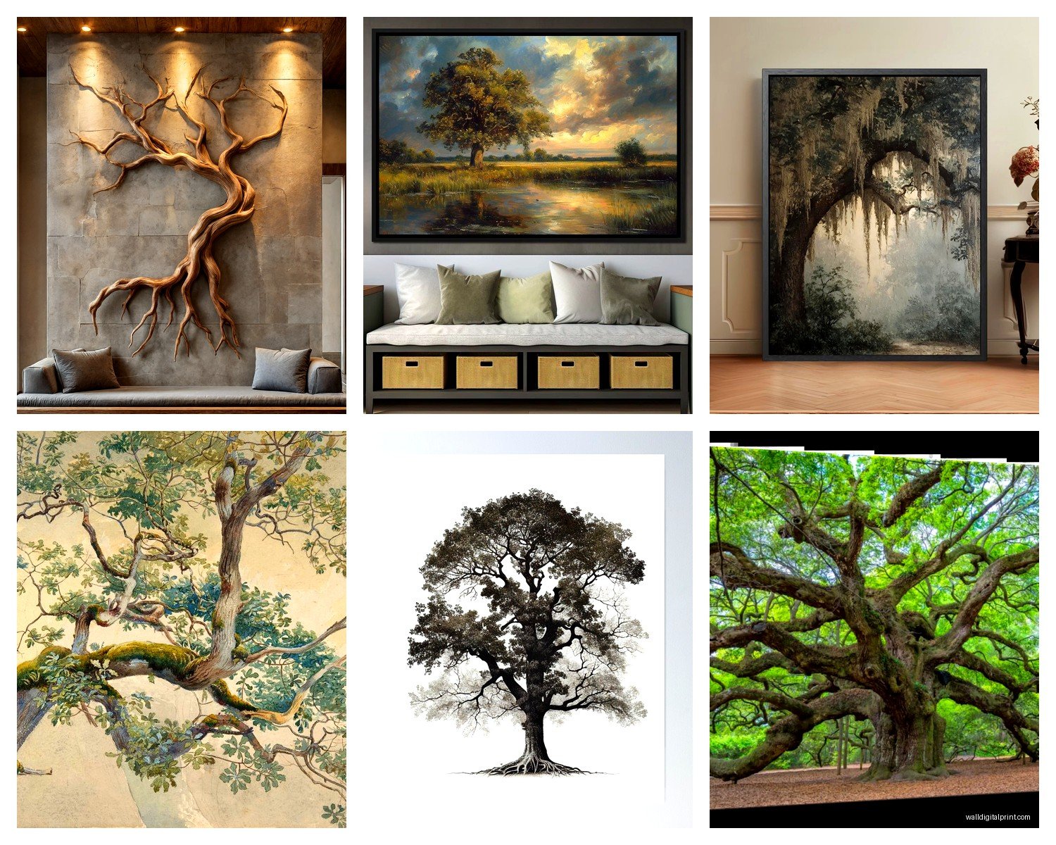
Oak trees photograph in this really specific way where the branches create these incredible patterns against the sky. You want to look for images that capture that gnarled, reaching quality—the ones where you can almost feel the texture of the bark through the print. I learned this the hard way after buying a print that looked amazing online but turned out to be so heavily filtered it looked like a painting, which…fine if that’s your thing, but not what I wanted.
Sizing Is Gonna Make or Break This
Okay so funny story, I ordered a 16×20 oak tree print for above my entryway table thinking it would be perfect and it arrived and looked like a postage stamp on the wall. Total rookie mistake even though I literally do this for a living sometimes my brain just…stops working.
Here’s what actually works:
- For above a sofa or bed: you want at least 36-48 inches wide, seriously
- Entryways can handle 24×36 if the space is narrow
- Office spaces look good with 20×30 or clusters of smaller prints
- Those massive statement walls? Go 40×60 or bigger, don’t be scared
The rule I use now is the art should take up about two-thirds to three-quarters of the furniture width below it. But also rules are meant to be broken if it looks good to your eye.
Black and White vs Color and Why It Actually Matters
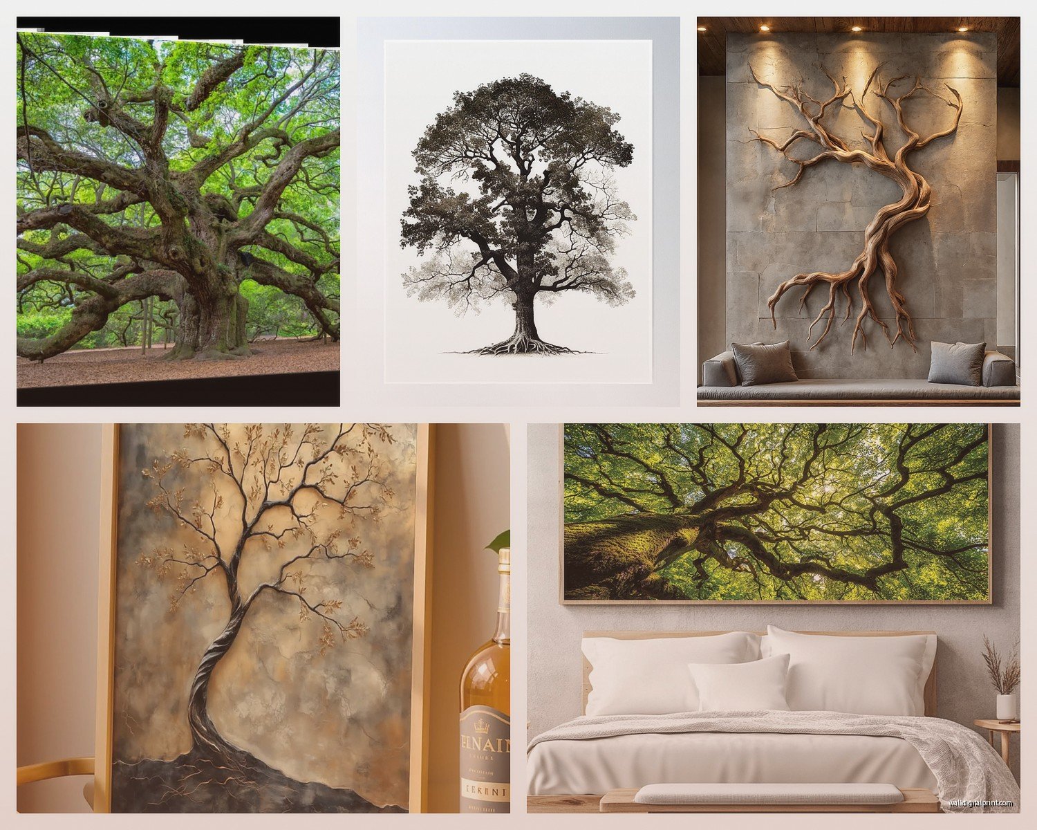
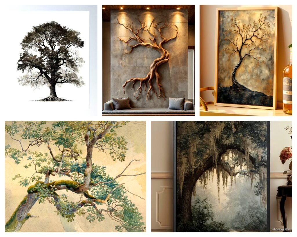
This is where people get really stuck and I get it because both options are stunning in different ways. Black and white oak tree photography has this timeless, almost architectural quality. The contrast between the dark branches and bright sky creates these dramatic shadows that work really well in modern or minimalist spaces. I have a black and white oak in my bedroom and it’s probably my favorite piece—the branches look like lightning frozen in time.
But color oak tree photos? They’re having a moment. Especially those golden hour shots where the leaves are backlit and glowing amber and green. These work better in spaces that already have warmth—like if you’ve got wood furniture or warm-toned textiles. The thing nobody tells you is that color oak prints can actually make a room feel bigger if you choose ones with lots of sky showing through the branches.
Wait I forgot to mention—seasonal oak photography is a whole other category. Fall oaks with orange and red leaves are gorgeous but they’re very…specific? Like you’re committing to a vibe. Winter oaks with bare branches against gray skies are moody and work year-round though.
The Print Material Thing That Everyone Overlooks
So my client canceled last month and I spent like three hours comparing print materials at this one shop and here’s what I learned. Canvas is the default everyone goes for with tree photography because it feels “artsy” but honestly? For detailed oak tree images with lots of intricate branch work, photo paper or metal prints preserve detail way better.
Canvas can make fine details look slightly fuzzy, especially in the branches. It works great for more impressionistic oak shots or ones taken from further away where you’re capturing the whole tree silhouette. But if you’ve got one of those incredible close-ups where you can see individual leaves and bark texture, go with:
- Acrylic prints for serious depth and color vibrancy
- Metal prints for ultra-modern spaces (the oak looks almost three-dimensional)
- Museum-quality photo paper in a float frame for galleries or formal rooms
- Wood prints which sounds weird but oak on wood is actually really cool
The wood print thing is gonna sound weird but I saw an oak tree printed directly onto birch wood and the grain of the wood became part of the image somehow? Very meta, very cool for a study or library.
Framing Without Making It Look Like A Hotel Lobby
Frames can make oak tree photography look either really sophisticated or like something from a corporate waiting room and the difference is subtle but important. Thin black frames work for almost everything—they’re the safe choice. But oak trees can actually handle more substantial frames because the subject matter is already so strong.
I’ve been using these chunky natural wood frames lately that pick up the tones in the oak bark. Like a 2-3 inch wide frame in walnut or oak (yes oak frame for oak tree, very on the nose but it works). It creates this cohesive thing where the frame becomes part of the image.
White or light frames work too but only if your space is already bright and airy. Otherwise the contrast between a dark, detailed oak tree and a white frame can feel jarring. Matting is optional—I usually skip it for modern spaces and include it for traditional ones.
Placement Ideas That Actually Work In Real Homes
Everyone always asks where to put these and the answer is…more places than you’d think? Obviously above the sofa is classic but here’s where I’ve placed oak tree photography that worked really well:
In a dining room opposite windows—the natural light hits the glass and the tree almost becomes a second window view. This is especially good if your actual windows look out at something boring like a parking lot (speaking from experience here).
Stairwell walls are perfect for vertical oak tree shots, especially those looking-up-through-the-canopy perspectives. You’re already moving through the space so the upward perspective makes sense.
Bedroom across from the bed so it’s the first thing you see in the morning. Sounds cheesy but waking up to a massive oak tree image is actually pretty grounding. Better than scrolling your phone immediately which is what I was doing before.
Oh and another thing—bathrooms. Hear me out. A smaller oak tree print in a bathroom adds this unexpected natural element and because bathrooms are usually small, even a modest sized print makes an impact. Just make sure it’s properly sealed if it’s near the shower.
The Perspective Thing Nobody Talks About
Oak tree photography comes in basically four perspectives and each one creates a completely different mood:
Looking up from the base of the tree creates drama and makes ceilings feel higher. These are my favorite for smaller rooms because they add vertical space visually.
Eye-level full tree shots are classic and calming but can feel static if the composition isn’t interesting. Look for ones with dynamic branch movement or interesting sky.
Close-up bark and branch details are super textural and work as part of a gallery wall or in smaller spaces where you want impact without showing the full tree.
Distant landscape shots with the oak as a focal point in a field or hillside—these are more about the overall scene and work well in spaces where you want something peaceful rather than dramatic.
Mixing Oak Prints With Other Art
This is where it gets fun because oak tree photos are actually really versatile for gallery walls. I’ve mixed them with:
- Botanical prints (leaves, ferns, other plant studies)
- Abstract art in earthy tones
- Black and white photography of other subjects
- Vintage maps or book pages
- Other tree species for a forest gallery effect
The key is keeping either the color palette or the frame style consistent. I did a whole wall in my office with different tree species all in black and white with matching black frames and it looks intentional instead of chaotic.
Where To Actually Buy Good Oak Tree Photography
Etsy has tons of options from actual photographers and you can often get custom sizing which is clutch. I’ve found that searching for “fine art oak tree” gets better results than just “oak tree photo” because you filter out the generic stuff.
Society6 and similar print-on-demand sites are hit or miss—the quality varies by which printing method they use. Always check reviews for the specific print material.
Local art fairs and photography galleries are actually where I’ve found my favorite pieces because you can see the print quality in person and talk to the photographer about their process. Plus you’re supporting actual artists which feels good even if it costs more.
This is gonna sound weird but I’ve also commissioned custom oak tree photography by reaching out to landscape photographers on Instagram. If you have a specific vision or want an oak tree from a particular location, this is the way to go. Usually costs $200-500 depending on the photographer and size.
The Lighting Situation You Gotta Consider
Natural light can fade prints over time so if you’re putting oak tree photography on a wall that gets direct sun, invest in UV-protective glass or acrylic. I learned this after a print in my living room started looking washed out after like six months.
Also consider how the light hits the print at different times of day. I have this oak tree photo that looks completely different in morning vs evening light—morning it’s all cool tones and calm, evening it picks up warmth from the sunset through my windows. Actually kinda cool but something to think about.
If you’re hanging in a dark hallway or room without much natural light, backlit frames or picture lights can make the image pop. Oak trees with lots of sky benefit from this especially.
Styling Around The Print
Once you’ve got your oak tree photography up, the styling is pretty straightforward. Natural materials echo the organic subject—think wood shelves, woven baskets, ceramic vases. But honestly oak tree prints are strong enough that they don’t need much support.
I usually add one or two elements on the surface below the print—maybe a small plant and a candle or book stack. The print does the heavy lifting so you don’t want to compete with it too much.
Color-wise, oak tree photography works with almost any palette but it really sings with earth tones, deep greens, warm grays, and cream. I’ve also seen it look amazing in spaces with navy or charcoal walls where the contrast is really striking.
Anyway I’m realizing I’ve written like a novel about tree photography but hopefully this helps? The main thing is just pick something that makes you want to look at it every day because you’re gonna be living with it for a while.