Wall Art Guide, Wall Art Tutoriels
Cityscape Wall Art: Urban Skyline Architecture Photography
Jun
So I’ve been completely obsessed with cityscape photography for walls lately and honestly it started because a client wanted to transform their boring home office into something that felt more sophisticated but not stuffy, you know? And we landed on urban skyline prints and wow, the difference was insane.
Choosing the Right City for Your Space
Okay so here’s the thing nobody tells you – you don’t have to pick a city you’ve been to or even care about. I mean, sure, if you have a connection to Chicago or whatever, that’s great. But I’ve used Tokyo skylines in suburban Connecticut homes and it just WORKS because the vibe matters more than the personal connection sometimes.
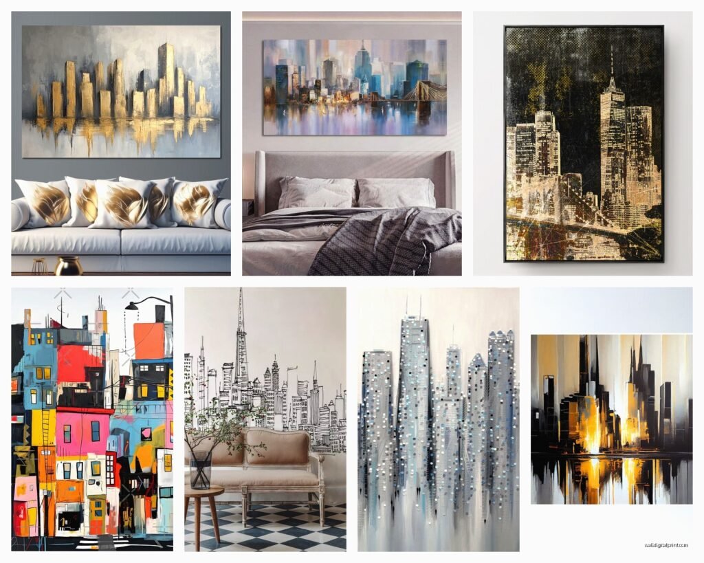
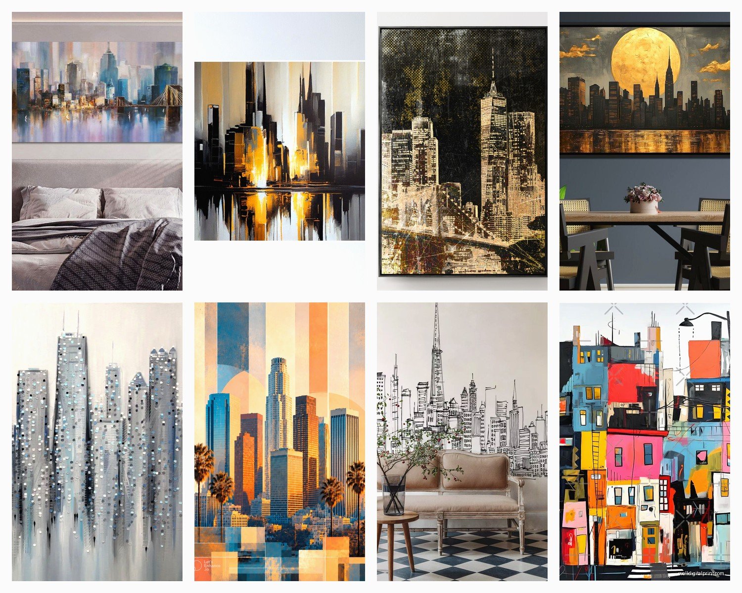
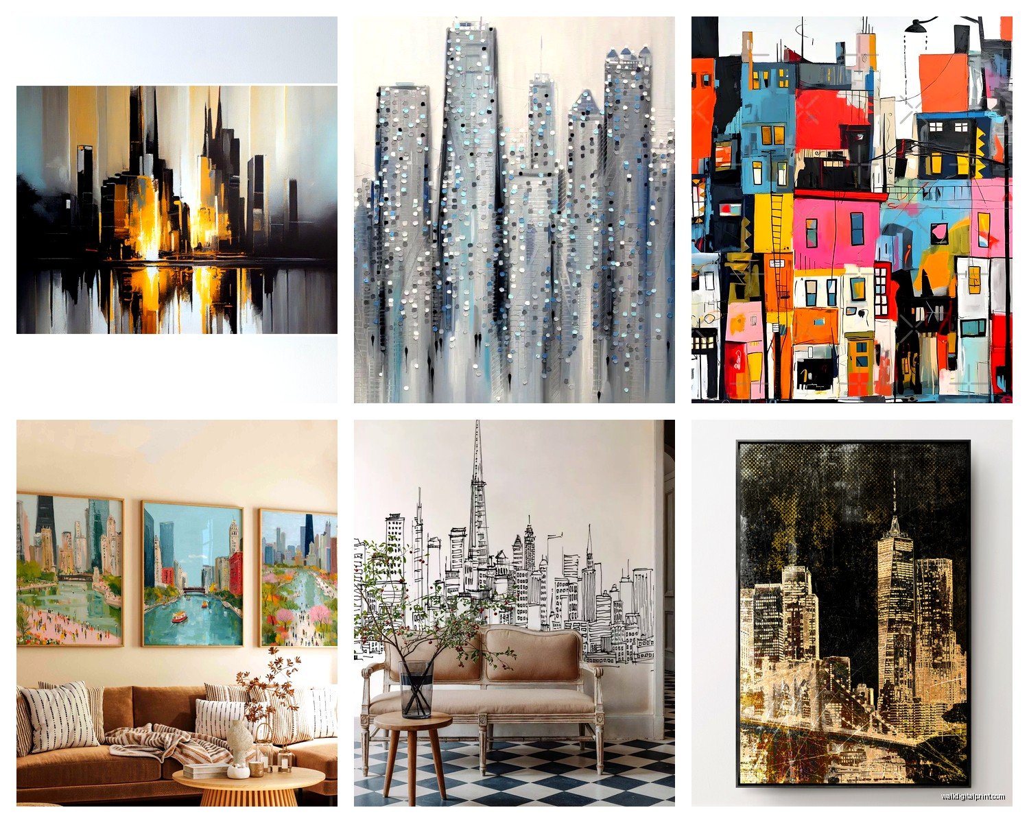
The cities that photograph best are gonna be the ones with distinctive skylines. New York, Dubai, Hong Kong, Singapore – these have recognizable silhouettes that read well from across a room. I learned this the hard way when I ordered this beautiful print of a European city (can’t even remember which one now) and it just looked like…buildings. No character, nothing that made you stop and look.
What Actually Matters in Skyline Selection
- Recognizable landmarks or unique building shapes
- Good contrast between buildings and sky
- Interesting lighting conditions (golden hour, blue hour, night shots)
- Clean composition without too much visual clutter
Wait I forgot to mention – if your room has a specific color scheme, look for cities that match. Miami’s art deco pastels are completely different from Seattle’s grey-blue tones. I spent way too long one night (my dog was sick so I was up anyway) comparing how different cities photograph and the color palettes are wild. Singapore tends toward this ultra-modern blue-green, while places like New York can go really warm with all the brick and sunset shots.
Photography Style Makes or Breaks It
This is gonna sound weird but the style of photography matters WAY more than the actual city sometimes. You’ve got like five main categories:
Black and white architectural shots – these are my go-to for modern spaces or anywhere you want that timeless gallery feel. They’re forgiving too because they work with literally any color scheme. I used a black and white Manhattan bridge shot in a room with burgundy walls once and everyone thought I was a genius but really it’s just…black and white works with everything.
Golden hour/sunset cityscapes – these bring warmth and can make a cold room feel more inviting. But careful because they can also feel dated if the photography style is too saturated or has that 2010s HDR look. You want natural warmth, not like someone cranked the orange slider to 100.
Blue hour photography – that time right after sunset when the sky goes deep blue but city lights are on? *Chef’s kiss*. These prints are sophisticated as hell and work amazing in bedrooms or dining rooms. The blue tones are calming but the lit buildings add energy.
Aerial/drone photography – super trendy right now and honestly I get it. The perspective is so different from what we normally see. Grid patterns of cities like Barcelona or the crazy density of Hong Kong from above…it’s almost abstract art.
Long exposure night shots – where car lights become light trails and everything has that smooth, dreamy quality. These can be stunning but make sure the actual photograph is sharp and well-composed because the technique can sometimes overshadow bad composition.
Size and Scale (This Is Where People Mess Up)
Okay so funny story – I once ordered what I thought was a 40×60 inch print and it arrived as 40×60 centimeters because I didn’t check the listing carefully. Now I’m paranoid and always confirm dimensions in inches AND centimeters.
For cityscape photography, bigger is usually better because the detail matters. Those tiny windows and architectural elements get lost if you go too small. Here’s what I’ve found actually works:
Living rooms or above a sofa: minimum 36 inches wide, ideally 40-60 inches. Cityscapes have horizontal orientation naturally so embrace it. I did a 60×40 Hong Kong skyline above a sectional and it anchored the entire room.
Home offices: 24-36 inches works well, especially if it’s going above a desk or credenza. You’re closer to it so you don’t need massive scale.
Bedrooms: 30-48 inches above the bed feels right. I personally think going too big in bedrooms can feel overwhelming but that might just be me.
Hallways or narrow spaces: vertical cityscape shots exist! Look for architectural photography that emphasizes building height. A 24×36 or 20×30 vertical print can be perfect for those awkward narrow walls.
The Multi-Panel Thing
Triptychs and multi-panel cityscape prints are everywhere right now and…I have mixed feelings? They can look incredible when done right – like a panoramic skyline split across three panels creates this cinematic effect. But cheap multi-panel prints where the image is just randomly divided look terrible and the spacing between panels never seems quite right.
If you’re gonna do multi-panel, make sure the image is actually composed for it. Purpose-shot panoramas or images where the natural division makes sense compositionally.
Print Quality and Materials (Don’t Skip This Part)
I’ve tested SO many different print types because clients always ask what’s worth the extra money and what’s just marketing BS.
Canvas prints – these are popular for cityscapes and I get why. They feel artistic and substantial. But here’s the thing: canvas can actually reduce the sharpness of architectural photography. Those crisp lines and details get softened by the texture. I use canvas for more painterly cityscape interpretations or when I want a softer feel, but for sharp architectural photography, I usually skip it.
Metal prints – okay these are expensive but WOW for modern cityscapes they’re unmatched. The colors are vibrant, the finish is sleek, and architectural photography looks SO crisp on metal. The reflective quality adds depth. I used a metal print of Dubai’s skyline in a contemporary condo and it literally looked like a window. Downside is they’re heavy and mounting can be tricky.
Acrylic/plexiglass prints – similar effect to metal but with this depth because the image is printed behind the acrylic. Super modern, super expensive. Worth it for statement pieces in high-end spaces. I wouldn’t do this for every room but in the right spot? Stunning.
Fine art paper prints (framed) – this is what I use most often honestly. A high-quality giclee print on fine art paper in a simple black or white frame just works. It’s classic, it’s affordable compared to metal or acrylic, and you have total control over the framing to match your space.
The biggest mistake I see is people ordering cheap poster-quality prints and then wondering why their cityscape looks flat and dull. For architectural photography specifically, you need high resolution and good print quality because the details matter so much.
Framing Cityscape Photography
Simple frames work best. I know everyone wants to get creative but cityscapes are already visually complex – buildings, windows, lights, sky. A ornate frame just competes for attention.
- Black frames: modern, classic, makes colors pop
- White frames: clean, gallery-like, works in light spaces
- Natural wood frames: adds warmth to cold architectural shots
- Metal frames: ultra-modern, great for contemporary spaces
- Frameless (float mounting): very modern but only works with certain print types
Mat or no mat? For cityscapes I usually skip the mat unless the print is small. The horizontal expanse of a skyline looks better when it goes edge to edge in the frame. But that’s just like, my opinion.
Where to Actually Buy This Stuff
Oh and another thing – where you buy matters because quality varies wildly and return policies are important when you’re dropping money on large prints.
I’ve had good luck with specialty photography print sites where actual photographers sell their work. The quality control is better and you’re supporting artists. Etsy has tons of cityscape photography but you gotta vet the sellers – check reviews, ask about print specs, confirm resolution.
For budget-friendly options, places like Society6 or Redbubble let you choose print size and material. Quality is decent for the price but it’s not gallery-level. Fine for apartments or if you like changing your art frequently.
If you want investment-quality pieces, look for limited edition architectural photography prints from established photographers. Yes, they’re expensive, but the quality and uniqueness is worth it for statement pieces.
Placement and Lighting
This is gotta be quick because I’m realizing I’m rambling but – lighting matters SO much with cityscape prints. If you’re gonna invest in a nice piece, invest in proper lighting too.
Picture lights or track lighting that highlights the print makes such a difference, especially with nighttime cityscape photography. The contrast between lit buildings and dark sky really pops when the print itself is well-lit.
Avoid direct sunlight on any print because fading, but especially avoid it on color cityscape photography. Those vibrant sunset oranges and blue hour blues will wash out over time.
And think about what’s across from the print – if it’s a window, you might get glare depending on the finish. Matte finishes reduce glare but can look a bit flat. Glossy finishes are more vibrant but can be reflective. I usually go semi-gloss as a compromise.
Matching Cityscape Art to Room Style
Modern/contemporary spaces – this is obvious territory for cityscape photography. Go bold with size, consider metal or acrylic prints, choose dramatic lighting conditions like blue hour or night shots.
Traditional spaces – yes you can still use cityscape art! Black and white architectural photography in classic frames works beautifully. Or choose cities with historic architecture like Paris or London where the buildings themselves have traditional elements.
Industrial/loft spaces – gritty urban photography, maybe with visible fire escapes or raw architectural elements. Brooklyn bridge shots, Chicago’s elevated trains, warehouse district photography. The grittier the better.
Minimalist spaces – clean, simple skyline silhouettes. Maybe even just outlines or very minimal compositions. Lots of negative space in the photograph itself.
Color Coordination
Pull colors from the photograph into your room or vice versa. If you have blue accents in your space, a blue hour cityscape ties everything together. Warm-toned rooms pair beautifully with golden hour city photography.
Or go opposite – use the cityscape as your color accent. Neutral room with a vibrant sunset skyline as the pop of color.
Common Mistakes to Avoid
Hanging it too high – the center of the print should be at eye level (roughly 57-60 inches from the floor). So many people hang art too high and with large cityscapes it makes the room feel off-balance.
Choosing overly processed photos – that super saturated, over-HDR’d look dates your space immediately. Natural processing ages better.
Ignoring the room’s purpose – a super energetic, bright cityscape might not be ideal for a bedroom where you want calm. Save those for living spaces and offices.
Not considering the view – if you have actual windows with actual views, make sure your cityscape photography complements rather than competes. Or place it on a wall without windows so it becomes its own “view.”
Okay I think that covers most of what I’ve learned through trial and error with cityscape photography…the main thing is just pick something that makes you stop and look at it, that matches your space’s vibe, and invest in decent print quality because cheap prints of architectural photography just look sad and you’ll end up replacing them anyway.