Wall Art Guide, Wall Art Tutoriels
Pink Floral Wall Art: Feminine Flower Garden Designs
Jun
So I’ve been obsessing over pink floral wall art lately because honestly, it’s having this massive moment and I get why. My sister texted me last week asking how to make her bedroom feel less… bland? And I immediately thought pink florals because they’re feminine without being too precious, you know?
Why Pink Floral Actually Works (When It Could Go Wrong)
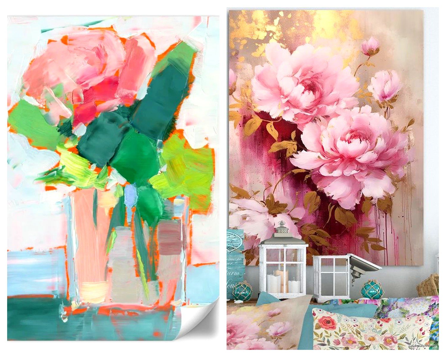
Okay so here’s the thing about pink floral wall art – it can either look incredibly sophisticated or like you never left your teenage bedroom. The difference is literally in how you pick your shades and the style of the flowers. I learned this the hard way when I bought this peachy-pink peony print that looked gorgeous online but in my dining room it just screamed “grandma’s guest bathroom” in the worst way.
The trick is understanding your pinks. There’s dusty rose (my personal favorite, very French countryside), blush (super neutral, almost beige-adjacent), hot pink (statement piece energy), coral pink (warmer, almost tropical), and that millennial pink that was everywhere in 2016 but actually still works if you style it right.
Matching Pink Tones to Your Space
I’m gonna break this down by room because context matters so much:
- Bedrooms – Go softer here. Dusty rose or blush florals work because they don’t overstimulate. I have this watercolor cherry blossom piece above my bed and it’s muted enough that it doesn’t mess with my sleep but still feels decorative
- Living rooms – You can go bolder. A large-scale pink and green botanical print or even abstract florals work. Just balance it with neutral furniture
- Bathrooms – Smaller spaces = smaller prints usually, but I’ve seen oversized single flower prints look amazing in powder rooms
- Offices – This is where people get scared but honestly a pink floral gallery wall behind your desk adds personality without being unprofessional
Style Categories That Actually Matter
When you’re shopping (and I’ve spent way too many hours on Etsy and at HomeGoods doing this), you’ll see pink florals fall into these categories:
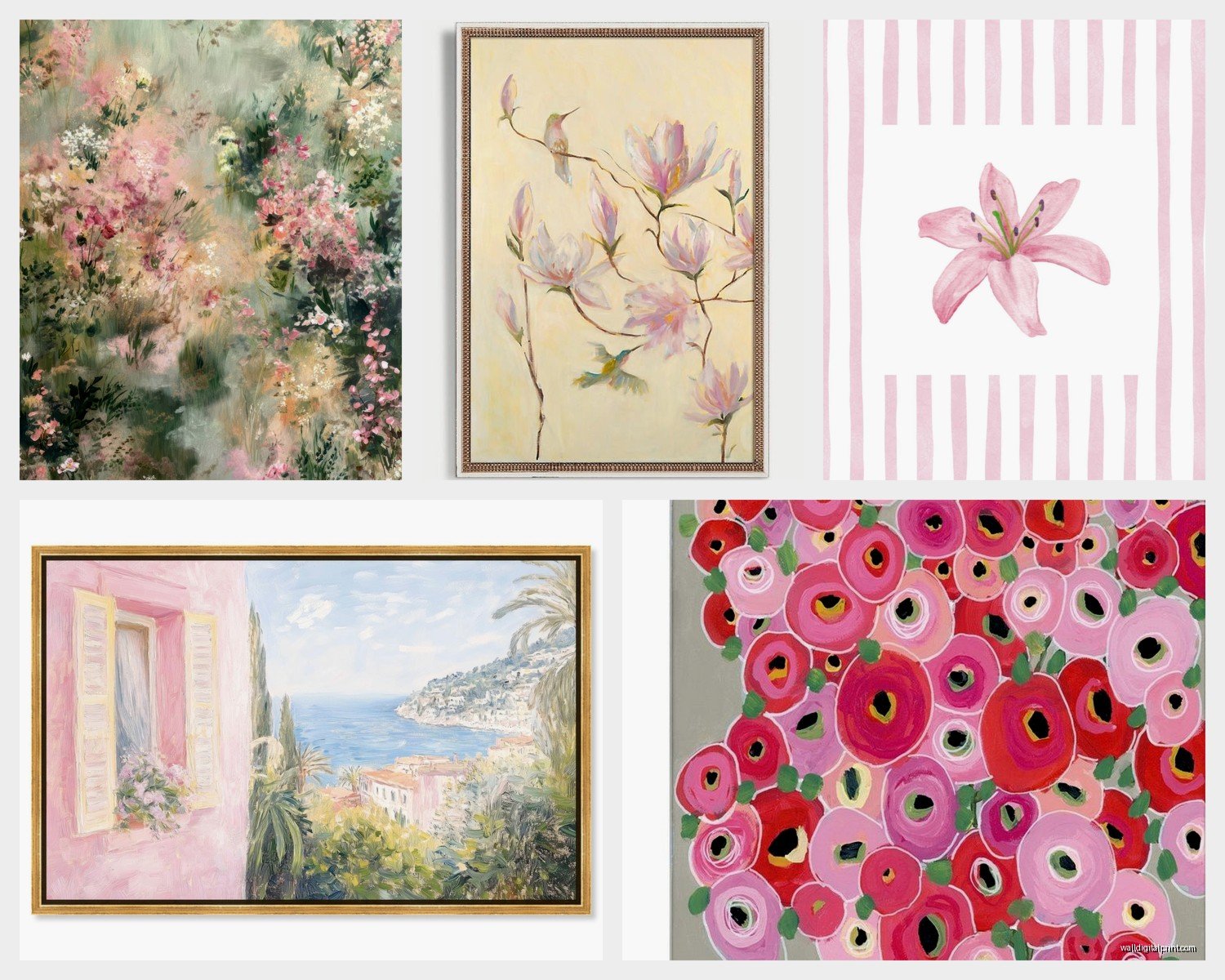
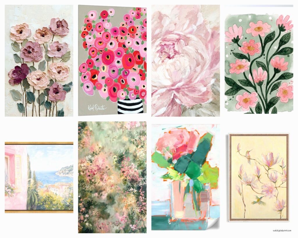
Vintage Botanical Illustrations
These are those detailed, almost scientific-looking flower drawings. Think pressed flowers in old books. They’re having a huge comeback and I love them because they feel collected and intellectual rather than just “pretty.” You can find affordable prints of actual vintage botanical plates – I got a set of three pink rose illustrations from an estate sale, had them matted in cream, and they look way more expensive than the $30 I spent.
The key with these is grouping them. One botanical print can look lonely, but three or five in matching frames? That’s a moment.
Abstract Watercolor
This is where the pink bleeds and blends with other colors. Less defined, more artistic. These work really well in modern spaces because they’re soft but still contemporary. My friend has this massive abstract peony piece that’s mostly pink with hints of gray and it completely transformed her minimalist living room – gave it warmth without clutter.
Wait I forgot to mention – with watercolor styles, pay attention to the white space in the composition. Too much flower and not enough breathing room can feel overwhelming.
Photographic Florals
Actual photographs of flowers, usually close-up. These can be either super romantic (think soft focus peonies) or really modern and graphic (sharp focus on flower details). I’m personally obsessed with the graphic ones right now. There’s something about a crisp photograph of a pink ranunculus that feels both feminine and architectural.
Line Art and Minimalist
Single line drawings of flowers in pink. Very Matisse-inspired. These are perfect if you want the feminine floral vibe but your space is really modern or Scandinavian. They’re subtle, almost masculine in their simplicity but the pink keeps them soft.
Size and Placement (Because I’ve Messed This Up)
Okay so funny story – I once bought what I thought was a 24×36 inch print and it arrived as 24×36 centimeters. My own fault for not reading carefully but it taught me to really think about scale.
General Guidelines I Actually Follow:
For above a bed: You want something that’s roughly two-thirds the width of your headboard. I see so many people go too small here. If you have a queen bed, you’re looking at something around 40-50 inches wide, either as one piece or a diptych/triptych.
For above a sofa: Similar rule – about two-thirds to three-quarters the width of the sofa. But honestly if you’re doing a gallery wall, you can fudge this because the collective width matters more than individual pieces.
In narrow spaces like hallways: Vertical orientations work better. I have a long vertical print of pink delphiniums in my hallway and it makes the ceiling feel higher.
Color Combinations That Won’t Make You Cringe
This is where people get stuck because pink can clash with the wrong partners. Here’s what I’ve tested:
Pink + Navy – Classic, preppy, surprisingly versatile. The navy grounds the pink and keeps it from feeling too sweet.
Pink + Charcoal or Black – Super modern. The contrast is dramatic but the pink softens it. I did this in my office with a hot pink floral against charcoal walls and everyone who sees it comments on it.
Pink + Sage Green – This is having such a moment right now and for good reason. It’s natural, botanical, very English garden vibes. Most pink floral art already includes green leaves so this is an easy one.
Pink + Gold – Glam without being too much. Use gold frames with pink florals and maybe gold accent decor. Just don’t overdo it or it tips into tacky.
Pink + White/Cream – The safest route. Clean, fresh, feminine but not overwhelming. This is my go-to recommendation when someone’s nervous about color.
Oh and another thing – if your walls are already colored, be careful. Pink florals on pink walls can be too monochromatic unless that’s specifically the cocooning vibe you want. I usually suggest keeping walls neutral if you’re going with pink art.
Frame Choices (Because They Change Everything)
I cannot stress this enough – the frame matters as much as the art. I’ve seen beautiful pink floral prints ruined by cheap plastic frames and mediocre prints elevated by good framing.
Wood frames in natural oak or walnut – These work with almost everything. The natural wood tone adds warmth and makes florals feel more organic and less cutesy.
White or cream frames – Clean and classic. These basically disappear and let the art be the focus. Great for gallery walls.
Black frames – More modern and graphic. These create strong contrast and work especially well with softer, watercolor-style florals because the frame provides structure.
Gold or brass frames – Elevated and feminine. These work best with vintage botanical styles or if you’re going for a more maximalist, collected look.
I usually avoid ornate frames with pink florals unless you’re specifically going for Victorian vibes. Simple profiles work better in contemporary spaces.
Where to Actually Buy This Stuff
Real talk – you don’t need to spend a fortune. Here’s where I shop:
Etsy for vintage botanicals and downloadable prints. You can find incredible vintage plates for like $5-10 as digital downloads, then print them yourself at FedEx or Staples for cheap. Just make sure you’re getting high resolution files.
Society6 and Minted for contemporary artists. More expensive but the quality is consistently good and they have framing options.
Target and HomeGoods for affordable framed pieces. You gotta hunt but I’ve found some really good stuff. Just go in with your phone and measure because their scale can be deceptive in the store.
Framebridge or Simply Framed if you have prints that need professional framing. Yes they’re pricier but sometimes the convenience and quality is worth it.
DIY Option That Actually Works
My cat knocked over a vase of pink peonies last month (of course) and as I was cleaning up, I thought… these would photograph beautifully. So I did a whole photoshoot with flowers from Trader Joe’s, edited them on my phone to be slightly overexposed and dreamy, and had them printed at Costco. Cost me like $30 total for three 16×20 prints and they look legitimately good in my guest room.
Styling Around Your Pink Floral Art
Once you’ve got your art up, you gotta style the rest of the space so it all makes sense together. This is where I see people either nail it or make it look like they just randomly bought pink things.
Repeat the pink in small doses
Add pink throw pillows, a pink vase, maybe pink spines on books if you’re feeling extra. But keep it to like 2-3 additional pink elements. More than that and it’s pink overload.
Bring in the other colors from your art
If your pink floral has green leaves, add green plants or green textiles. If there’s gold in the frame, echo that in hardware or small decor items. This creates cohesion.
Layer in texture
Pink can read flat if everything is smooth. Add a chunky knit throw, a jute rug, linen curtains. Texture makes feminine spaces feel grounded and intentional.
Don’t forget negative space
Not every surface needs stuff on it. Pink florals are already quite decorative, so balance them with clean, empty areas. I learned this after my living room looked like a Pinterest board exploded – sometimes less really is more.
Common Mistakes I’ve Made (So You Don’t Have To)
Okay so I’m just gonna rapid-fire these because I’ve learned them all the hard way:
- Hanging art too high – the center should be at eye level, around 57-60 inches from the floor
- Choosing pink that doesn’t work with your lighting – cool pinks in warm light look muddy, warm pinks in cool light look garish. Test before you commit
- Mixing too many floral styles in one space – pick a lane. Vintage botanicals OR abstract watercolors, not both in the same gallery wall
- Forgetting about proportion – tiny art on a huge wall looks lost, massive art in a tiny room feels claustrophobic
- Not considering the mood – hot pink poppies give different energy than pale blush roses. Think about how you want the space to feel
Specific Flower Types and Their Vibes
Different flowers have different personalities, which sounds ridiculous but it’s true:
Peonies – Romantic, lush, classic feminine. These are the safe choice that still feels special.
Cherry blossoms – Delicate, Japanese-inspired, transitional between seasons. More whimsical.
Roses – Depends on the style but can range from vintage romantic to modern graphic depending on how they’re rendered.
Ranunculus – Textural, interesting, a bit more unique than peonies but similar vibe.
Cosmos and wildflowers – Casual, cottagecore, more relaxed and less formal.
Dahlias – Geometric, architectural, sophisticated. These feel more grown-up somehow.
I’m currently watching The Great British Baking Show and every time they show the garden shots I want to screenshot them for art inspiration, which is probably weird but the florals are gorgeous.
Anyway, the main thing with pink floral wall art is just committing to it. Don’t try to make it work if you’re not actually into feminine aesthetics – there’s no shame in admitting pink isn’t your thing. But if you do love it, go for it properly instead of half-heartedly adding one small print and hoping it transforms your space. Scale up, choose your pinks intentionally, frame it well, and style around it. That’s literally the formula that works every time.