Wall Art Guide, Wall Art Tutoriels
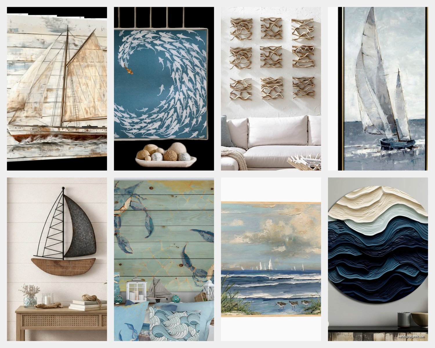
Large Nautical Wall Art: Oversized Maritime Sailing Decor
Jul
So I’ve been totally obsessed with oversized nautical art lately because this whole beach house project I did last month completely changed how I think about maritime decor. Like, I used to think nautical meant those tiny anchor prints from HomeGoods but then I found this 6-foot sailboat canvas and everything clicked.
Why Size Actually Matters More Than You Think
Okay so here’s the thing about large nautical pieces—anything under 40 inches wide is gonna look like you’re trying too hard. I learned this the hard way in my own living room. Had this cute 24×36 sailboat print and it just looked… lost? The wall was eating it alive. Maritime art needs to feel like you’re standing on a dock looking at an actual horizon, and you can’t get that feeling from something the size of a poster.
I usually tell people to go minimum 48 inches on your smallest dimension if you’ve got a wall that’s more than 10 feet wide. My client Sarah has this amazing 72×48 inch piece of a weathered sailing ship and it’s literally the first thing anyone mentions when they walk in. The scale makes it feel like fine art instead of just “beach decor.”
The Different Styles That Actually Work
There’s basically three directions you can go and they all give totally different vibes:
Vintage Nautical Charts and Maps
These are my secret weapon honestly. I found this reproduction of an 1800s coastal navigation chart that’s 60 inches wide and it looks expensive even though it was like $340. The trick with maps is getting ones that have actual detail—you want people to be able to walk up close and read harbor names and depth measurements.
The best ones have that aged parchment look but aren’t so distressed that they look fake. I’ve seen too many that are trying SO hard to look vintage with artificial coffee staining and it just reads as Target clearance section. Look for reproductions from actual maritime museums or historical societies because they use real archival images.
Abstract Ocean and Sailing Scenes
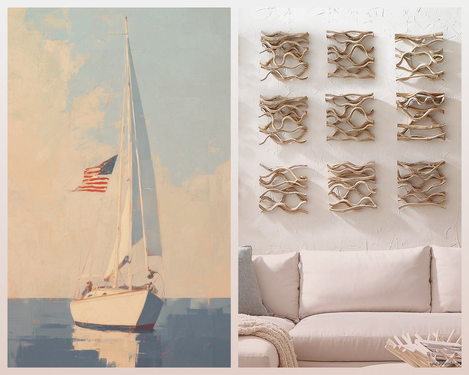
This is where you can get really dramatic. Think huge waves, sails catching wind, that kind of movement. I just installed this 80-inch triptych in a client’s study—three panels of a sailboat cutting through dark blue water with white caps—and it gives the room this whole moody sophisticated thing.
The abstract route works really well if your space is modern or contemporary because you’re not gonna have that clash between sleek furniture and literal realistic ship paintings. My cat knocked over my coffee while I was writing this but anyway—abstract nautical reads more as “art collection” than “theme.”
Realistic Maritime Paintings
Okay this is gonna sound weird but I actually love a good realistic tall ship painting if you commit to it. Like you can’t half-ass this one. If you’re going realistic, you need museum-quality reproduction or original work from an actual maritime artist.
I have a client who collects original oils of whaling vessels and they’re stunning because they’re REAL art, not just decor. But I’ve also sourced amazing giclée prints of classic maritime paintings—Winslow Homer style seascapes, ships in harbors at sunset—that run around $600-900 for 60×40 sizes and they’re absolutely worth it.
Material Choices That Won’t Make You Regret Everything
So I’ve made every mistake here so you don’t have to:
Canvas prints are your friend for anything over 48 inches because they’re lightweight and you’re not gonna destroy your wall trying to hang them. I use gallery-wrapped canvas where the image continues around the edges—no frame needed and it looks intentional. Make sure you’re getting at least 1.5-inch depth on the stretcher bars though because thin canvas looks cheap from the side.
Framed prints under glass get really heavy and expensive once you’re talking about large sizes. Like a 60×40 frame with museum glass can run you $800 just for the framing. I only go this route for truly special pieces or if someone’s got original artwork. The glass does protect better obviously but the weight becomes a structural issue.
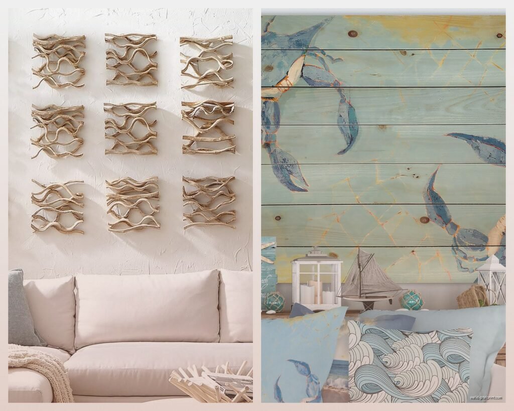
Wood prints are having a moment and they work beautifully for nautical themes. There’s something about printing a weathered boat image directly onto wood planks that just works. I did a client’s bedroom with a 72-inch wood print of a sailboat and the texture adds this whole other dimension. They run pricier—expect $500-1200 depending on size—but they’re conversation pieces.
Metal prints can look incredibly sharp for modern nautical. The colors pop in this really vibrant way and they’re durable as hell. I used a 60×40 metal print of an abstract ocean scene in a bathroom (moisture resistance!) and it’s held up perfectly for two years now.
Where to Actually Find Good Pieces
This is where I’ve spent way too much time researching…
Etsy is actually really good for large-scale nautical prints if you filter carefully. Search for “large nautical canvas” or “oversized maritime art” and look for sellers who do custom sizing. I’ve found several artists who’ll print up to 80 inches and they’re using high-quality processes. Read the reviews obsessively though—some sellers use cheap canvas that arrives wrinkled.
Chairish and 1stDibs for vintage and antique pieces if you’ve got budget. I found an original 1960s oil painting of a racing yacht that was 5 feet wide for around $2,800. Not cheap but it was actual art with provenance. These sites are good for authentic vintage nautical charts too.
Society6 and Saatchi Art have independent artists and you can order a lot of designs in oversized formats. The quality on Society6 is hit or miss—I only order their framed prints or canvas, never the tapestries. Saatchi is pricier but you’re buying from actual artists and the quality control is better.
Local marine museums and galleries often have reproduction prints of pieces from their collections. I got this stunning 58-inch print of a clipper ship from a maritime museum gift shop for like $450 and it came with a certificate of authenticity. Plus you’re supporting the museum which feels good.
oh and another thing—estate sales near coastal areas can be goldmines. I’ve found incredible vintage maritime oil paintings at estate sales in port cities. Bring measurements and be ready to negotiate.
Hanging These Massive Things Without Destroying Your Walls
Okay so this is actually the hardest part and where people mess up constantly.
For anything over 40 pounds you absolutely need to hit studs or use proper anchors. I use these heavy-duty toggle bolts rated for 100+ pounds when I can’t hit a stud. French cleats are your best friend for really large pieces—they distribute weight and make leveling so much easier.
My general rule: if it’s over 50 inches in any direction, use at least two hanging points. A single center wire is asking for disaster. I learned this when a 60-inch canvas I hung in my own hallway came crashing down at 2am because I trusted the wire and a single hook. My dog lost his mind.
For really large triptychs or multi-panel pieces, I measure everything out on paper first and use painter’s tape on the wall to mark placement. Sounds excessive but it saves you from having 12 unnecessary holes in your wall.
Height and Placement
Center point should be at 57-60 inches from the floor—this is standard gallery height and it works. But honestly with really large pieces I sometimes go slightly lower, especially if it’s going above furniture. You want the visual weight to feel anchored.
If you’re hanging above a sofa, leave 6-10 inches between the furniture and the bottom of the art. Less than that and it looks cramped, more and they feel disconnected.
Color Palettes That Don’t Scream “Beach House Cliché”
I’m so tired of the blue-and-white-with-red-accents thing. It’s fine but it’s everywhere.
Try these instead:
Deep navy with brass and cognac—this is my go-to for sophisticated nautical. Dark moody blues with warm leather tones and brass fixtures. Your nautical art becomes the anchor (pun intended) for a really rich color story.
Gray-scale maritime—black and white photography or charcoal drawings of ships and harbors. Pair with any color palette and it reads as artistic rather than themed. I did an entire living room around a massive black and white photograph of sailboat rigging and it’s stunning.
Weathered naturals—think driftwood grays, rope beiges, oxidized copper greens. Your art can have these muted oceanic colors without screaming BEACH. I love oversized prints of weathered boat hulls in these tones.
Unexpected brights—okay hear me out. A huge abstract sailing scene with pops of coral, turquoise, and yellow can be gorgeous in a modern space. It’s nautical but playful. Just make sure the piece itself is sophisticated in execution.
Styling Around Your Massive Nautical Piece
The art should be the star so don’t compete with it. I keep other decor minimal when I’ve got a 6-foot sailboat on the wall.
But you can layer in subtle maritime elements: a brass telescope on a bookshelf, rope-wrapped lamp bases, a vintage wooden boat model. Keep it curated though—like three to five supporting pieces max. Otherwise you’re gonna tip into Cracker Barrel territory real fast.
One thing I love doing is mixing in real vintage maritime objects. Authentic nautical flags, actual ship’s instruments, old sailing logs. They make the space feel collected over time rather than decorated in a weekend.
Budget Real Talk
You can absolutely do this without spending thousands. My breakdown:
Budget option ($200-400): Large canvas print from Etsy or Society6, gallery-wrapped, no frame needed. I’ve sourced beautiful 60×40 pieces in this range that look way more expensive than they are.
Mid-range ($500-1000): Higher quality giclée prints, wood or metal prints, or really well-done canvas with custom sizing. This is where I spend for most client projects because the quality jump is noticeable.
Investment ($1000+): Original art, vintage paintings, museum-quality reproductions, or multi-panel installations. Worth it if you’re gonna be in the space long-term and you want something truly special.
wait I forgot to mention—seasonal sales are real. I’ve gotten 40% off large canvas prints during Black Friday sales. Sign up for email lists from art sites and wait for the codes.
Mistakes I’ve Seen Too Many Times
Going too literal with the theme. You don’t need anchors AND rope AND ship wheels AND sailboats. Pick one strong piece and let it breathe.
Choosing art that’s too small because you’re scared. I promise the larger piece will look better even if it feels scary in the store.
Ignoring your actual color scheme. Just because you love that bright blue sailboat doesn’t mean it’ll work with your burgundy sofa. Bring paint chips when you shop.
Hanging stuff too high. I’ve walked into so many homes where the art is basically on the ceiling. Lower is usually better.
Okay I think that’s everything I’d tell you if we were actually texting about this at 10pm… the main thing is just commit to the size and quality. A big beautiful maritime piece can totally transform a room from boring to actually interesting, but you gotta go for it.