Wall Art Guide, Wall Art Tutoriels
Footprints in the Sand Wall Art: Beach Poetry Religious
Jul
So I’ve been working with this Footprints in the Sand wall art for like three years now, ever since a client asked me to help her design a coastal meditation space and wanted something that wasn’t just another generic “Live Laugh Love” beach sign. The whole religious beach poetry thing is actually trickier than you’d think because it can go really tacky really fast, or it can be this beautiful focal point that doesn’t scream “I bought this at a hotel gift shop.”
First thing – and I cannot stress this enough – size matters SO much with this particular piece. I learned this the hard way when I ordered what I thought was a 24×36 for a client’s bedroom and it showed up as 16×20. The text was so small you literally had to walk up to the wall to read the poem, which totally defeats the purpose. For bedroom spaces, you’re looking at minimum 24×36, but honestly 30×40 or larger works better if you’ve got the wall space. Living rooms or entryways can handle 40×60 if it’s your main piece.
The material choice is where things get interesting. Canvas prints are obviously the most popular because they’ve got that soft, contemplative vibe that matches the whole spiritual theme. But I’ve also used metal prints for coastal homes where there’s actual salt air concerns, and they hold up way better. There’s this one house in Cape Cod where we did a brushed aluminum version and the way it catches the morning light through the window is just… yeah, it works. Wood prints can be gorgeous too but they’re heavier and you gotta make sure your hanging system can handle it.
Oh and another thing – framed versus unframed is a whole debate. The gallery-wrapped canvas (where the image wraps around the edges) looks more modern and less formal, which I actually prefer for this piece because the poem itself is already pretty formal and traditional. Adding a heavy ornate frame on top of that can make it feel like you’re in a church waiting room instead of a home. BUT if your walls are really busy or colorful, a simple white or natural wood frame can help ground the piece and make it feel more intentional.
Now let’s talk about the actual design variations because there are like a million versions of this poem out there. You’ve got:
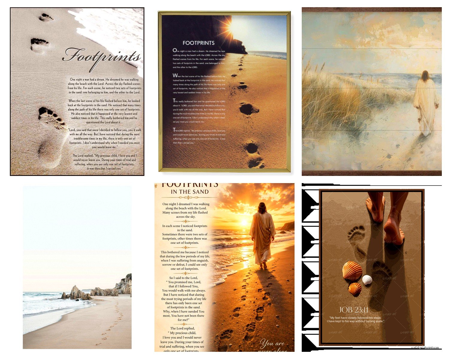
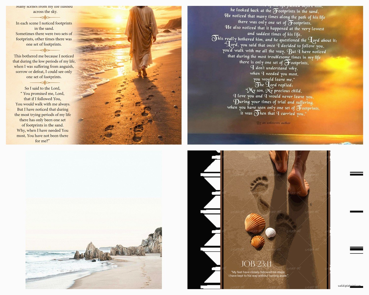
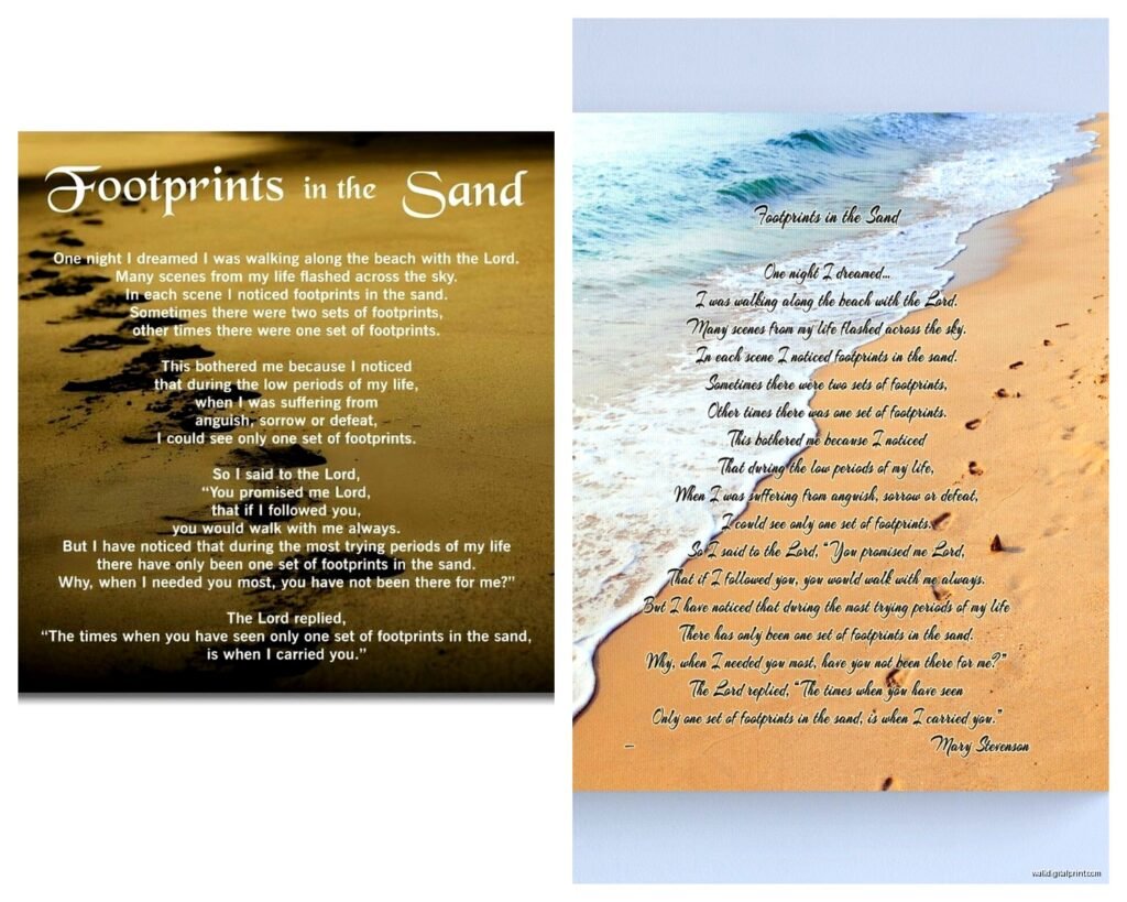
- The classic text-over-beach-photo style
- Artistic renderings with painted footprints
- Minimalist versions with just the poem on solid background
- Mixed media with actual sand texture incorporated
- Sunset/sunrise variations that change the whole mood
I personally lean toward the versions where the beach photo is slightly faded or has a soft focus, with the text in a clean serif font. You want people to feel the message, not struggle to read white text on a white sand background. I’ve seen too many where the contrast is so bad you need a flashlight to make out the words.
Color palette is huge here. Most people automatically think “blues and tans” because beach, but I’ve done some really beautiful ones in more muted tones – grays, soft lavenders at sunset, even black and white for a more contemporary space. My friend Sarah has one in her guest room that’s almost entirely sepia-toned and it feels vintage and timeless instead of overtly religious, which was perfect for her since she has guests of all different backgrounds.
Wait I forgot to mention – placement is critical with this piece. It’s not just decorative, it’s meant to be read and contemplated, so putting it somewhere you actually pause makes sense. I see people hang it in dining rooms all the time and I’m like… are you really gonna read a spiritual poem while eating spaghetti? The best spots I’ve found:
- Bedroom – either above the bed or on the wall you see when you wake up
- Home office – especially if you work from home and need those reminder moments
- Meditation or prayer spaces obviously
- Entryway – but only if it’s a calm entryway, not one where everyone’s dumping shoes and backpacks
- Bathroom – okay hear me out, a really nice bathroom where you actually soak in the tub and have thinking time
The bathroom thing sounds weird but I have it in my own master bath and it’s actually perfect for those moments when you’re just… existing, you know?
Styling around it is where people get stuck. You don’t wanna create a shrine situation with crosses and candles everywhere unless that’s genuinely your aesthetic. I usually go pretty minimal around it – maybe one or two other coastal elements max. Like a small piece of driftwood on a shelf below, or a simple white coral piece. Sometimes just leaving it alone on the wall is the move.
My cat keeps knocking over this little succulent I had on my desk, sorry, distracted – anyway, if you’re mixing it with other wall art, keep the other pieces either totally abstract or complementary beach scenes without text. Two text pieces near each other always compete for attention. I did a gallery wall once where we had the Footprints piece as the center anchor, then surrounded it with four smaller abstract ocean paintings in similar tones. Worked perfectly.
Lighting matters more than you’d think. If you can position it where natural light hits it during a specific time of day, that’s ideal. There’s something about morning light on this particular piece that just hits different. If that’s not possible, a simple picture light or even a nearby lamp that casts soft light works. Don’t use harsh overhead spotlights – makes it feel like a museum exhibit.
Quality check before you buy – and this is gonna sound obvious but I’ve been burned – zoom in on the product photos and check the text clarity. Some cheaper prints have pixelated text or weird font choices that look like someone made it in Microsoft Word in 2003. The font should be elegant but readable. Script fonts can be beautiful but if they’re too swirly, good luck reading “when you saw only one set of footprints” without squinting.
For the actual poem text, there are different versions and lengths. Some include just the core story, others have additional verses. I prefer the shorter versions visually because they don’t overwhelm the image, but if the words are really important to you or whoever you’re buying for, get the full version. Just make sure the print is large enough to accommodate it.
This is gonna sound weird but smell matters if you’re getting canvas. Some cheaper canvas prints have this chemical smell that takes weeks to air out. If you’re ordering online, check reviews for mentions of odor. I had one arrive for a nursery project and we had to air it outside for like five days because it smelled like a tire factory.
Okay so funny story – I was installing one of these in a client’s bedroom and her husband came home and was like “oh great, another beach thing” in this super sarcastic tone. But then he actually read it and got really quiet and was like “oh, that’s actually… okay I get it now.” The piece had been requested by the wife who’d gone through a really difficult health crisis, and the message meant something specific to her journey. That’s when I realized this isn’t just decor – people buy this when they need the reminder. So if you’re buying it as a gift, maybe include a little note about why you chose it. Makes it way more meaningful.
For households with different faith backgrounds or mixed beliefs, there are more subtle versions that emphasize the beach and footprints imagery without explicitly religious text. Still carries the metaphor but feels more universal. I’ve used these in Airbnb properties where you want something meaningful but not denominational.
Maintenance is pretty straightforward – dust it occasionally, keep it out of direct harsh sunlight that’ll fade it over time, don’t hang it in a steamy bathroom unless it’s on metal or sealed properly. Canvas can warp with too much humidity.
Price-wise, you can find versions from like $30 to $500+ depending on size and quality. The sweet spot I’ve found is around $80-150 for a good quality 30×40 canvas print from a reputable seller. Anything cheaper tends to look cheaper. Anything way more expensive better be hand-painted or something special.
Oh and if you’re the DIY type, you can actually create a custom version using your own beach photo and overlaying the text. I’ve done this for clients who have a specific beach that’s meaningful to them – like where they got married or scattered ashes or whatever. Makes it even more personal. Just make sure you have rights to the photo and the poem is public domain or properly attributed.
The hanging hardware situation – use proper wall anchors if you’re not hitting a stud, especially for larger pieces. I once had a 40×60 canvas crash down at 2am because someone used those cheap plastic anchors. Scared the life outta everyone in the house. Toggle bolts or proper drywall anchors are your friends.
One last thing – consider the existing vibe of your space. If your whole house is modern minimalist with clean lines and no other decorative text anywhere, this piece might feel out of place unless you commit to it as an intentional contrast. But if you’ve already got that coastal casual or transitional style going, it’ll fit right in. I’ve also seen it work surprisingly well in farmhouse-style spaces because the natural, reflective tone meshes with that aesthetic.
Don’t overthink the “is this too religious for my space” question. If the message resonates with you, hang it. Your home should reflect what matters to you, not what some design rule says. I’m not even particularly religious but I appreciate the metaphor and the artistry, and I think that’s valid too.
Just… measure your wall space before you order, okay? Can’t tell you how many times that’s been the issue.