Wall Art Guide, Wall Art Tutoriels
Mustang Wall Art: Wild Horse & Ford Car Decor
Jul
So I’ve been working with mustang wall art for like three years now and honestly it’s one of those themes that can go really wrong or really right, there’s no middle ground. Last month I had a client who bought this massive Ford Mustang print and it looked like a teenage boy’s bedroom and she’s a 52-year-old lawyer, so yeah, we gotta talk about this.
The Two Types and Why It Matters
Okay so first thing – you need to figure out if you want the HORSE mustang or the CAR mustang because mixing them is… I mean you CAN but it’s tricky and most people shouldn’t attempt it. The horse people are usually going for that western, free-spirited, maybe a bit boho vibe. The car people want vintage Americana, garage vibes, maybe some masculine energy without being too aggressive about it.
I had this whole thing last year where someone wanted both in their living room and we actually made it work but it required using really neutral frames and keeping the color palette super tight. Like, all black and white photography only. But that’s advanced stuff.
Wild Horse Mustang Art (The Animal Kind)
What Actually Looks Good
The running herd shots are everywhere and they’re popular for a reason but here’s what I’ve learned – you want one where the composition isn’t too busy. I spent way too long one night (my cat knocked over my wine, whole thing) comparing different herd prints and the ones that work best have like 3-5 horses max in clear focus, not 47 horses where you can’t tell what you’re looking at from across the room.
Black and white photography is your safest bet honestly. There’s this thing that happens with color photos of horses where they can look either really expensive and gallery-worthy OR they look like something from a dentist’s office, and it’s hard to tell which until you get it on your wall. The black and white removes that risk.
Size matters so much with horse art. Too small and it looks timid, which is the opposite of what a wild mustang should convey. I usually tell people nothing smaller than 24×36 for a focal piece. If you’re doing a gallery wall, you can mix sizes but your largest piece should still hit that minimum.
Styles That Work
- Silhouette art – super dramatic, works in modern spaces, doesn’t compete with other decor
- Close-up portraits of a single horse – these are powerful, need space to breathe though
- Abstract/watercolor interpretations – good if your space is already pretty neutral and needs a color pop
- Vintage poster style – think national parks vibes, works great in cabins or rustic modern spaces
The watercolor ones are having a moment right now but be careful because that trend might feel dated in like three years. I’m not saying don’t do it, just maybe don’t invest in the super expensive version if you’re trend-sensitive.
Where to Actually Hang Horse Art
Living room above the couch is obvious but it works. Just make sure your couch isn’t too busy pattern-wise. I had someone with this floral couch and horse art and it was just… too much nature competing.
Home offices are actually perfect for wild horse imagery. There’s something about that freedom and movement that works when you’re stuck at your desk. One of my clients is a financial advisor and she has this gorgeous mustang print behind her Zoom background and people always comment on it.
Bedrooms can work but it’s gotta be calmer imagery. Not the running herd – that’s too much energy for where you sleep. A peaceful grazing scene or a single horse portrait in softer tones.
Ford Mustang Car Art (The Vehicle Kind)
Oh man okay so this is where I see people mess up constantly. Car art in homes – not garages, actual living spaces – needs to be treated like fine art, not like memorabilia. There’s a difference.
The Vintage Route
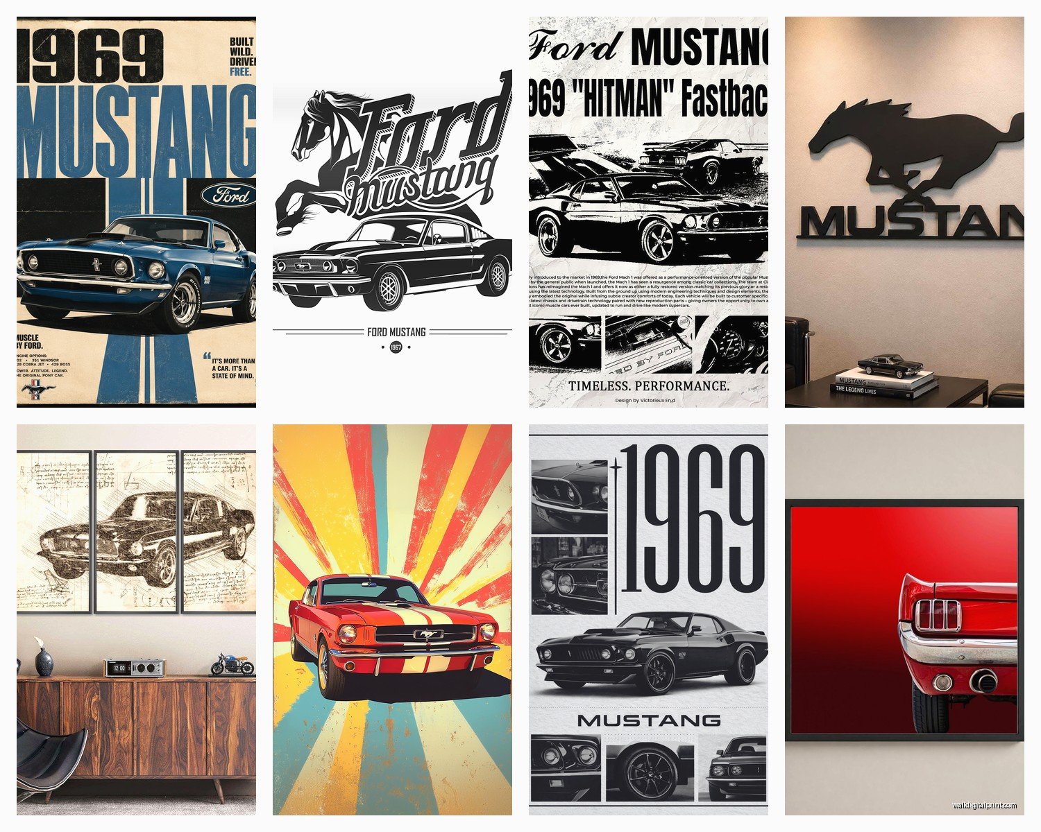
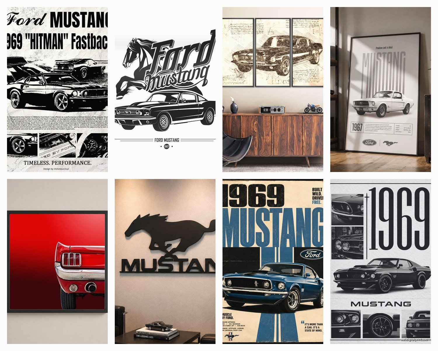
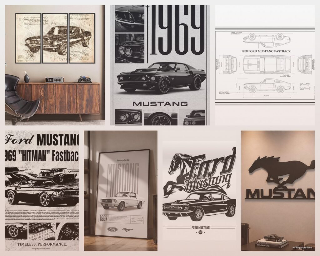
Classic Mustangs from the 60s and early 70s have the best visual appeal for home decor. The body lines are cleaner, less aggressive than modern ones. I’m talking ’65, ’67, ’69 models specifically. These look like art objects, not just cars.
You want either:
- High-quality photography prints with dramatic lighting
- Technical blueprint style drawings (these are SO good in offices or man caves)
- Minimalist line art interpretations
- Vintage advertisement reprints from the era
The blueprint ones are genius because they satisfy the car enthusiasm but they look sophisticated. I used one in a dining room once and it totally worked because it read as architectural rather than automotive.
Modern Mustang Art
Current model Mustangs are harder to make work in home decor unless you’re going full garage/entertainment room vibes. They’re just more aggressive looking. But if you love them, go for black and white photography or those motion blur shots that are more about speed as an abstract concept.
There’s this photographer – I’m blanking on the name, was just watching that baking show and got distracted – anyway, there’s photographers who shoot cars like fashion photography and THOSE prints work in homes. Lots of negative space, interesting angles, the car isn’t always fully in frame.
Color Considerations for Car Art
Red Mustangs are iconic but red is tough in rooms. It demands attention. If your room can handle a red focal point, great, but most rooms can’t. I usually steer people toward black, white, or silver Mustangs in their prints. Blue can work too, especially that classic blue Ford used.
One trick – if you love a specific color Mustang, pull one accent color from the print and repeat it in 2-3 small places in the room. Like if it’s a red Mustang, maybe red throw pillows and a red spine on a coffee table book. This makes it feel intentional instead of random.
Framing and Presentation
Okay so you can’t just stick these in whatever frame you have lying around. Well you CAN but it won’t look good.
For horse art – natural wood frames work great if you’re going rustic. Black frames for modern spaces. I’m really into the thin black metal frames right now, they don’t compete with the image. White/cream frames can work for softer, more feminine spaces but test it first because sometimes they wash out the image.
For car art – black or metallic frames. Chrome or brushed metal frames can be perfect for car prints if you don’t overdo it. Wood frames can work for vintage advertisement style prints but they need to be dark wood, not that honey oak situation.
Canvas prints without frames are tricky. They can look cheap really easily. If you go canvas, make sure it’s gallery-wrapped (the image continues around the edges) and it’s thick enough that it has presence on the wall. At least 1.5 inches deep.
The Matting Question
For photography, yes to matting. It gives the image room to breathe. White or cream mats for most situations. Black mats can work but they’re dramatic and not everyone’s style.
For vintage posters or graphic art, you can skip the mat if the frame is substantial enough. Sometimes the mat actually makes it look more formal than you want.
Gallery Wall Approach
If you’re doing multiple pieces – and this can be really effective – you gotta have a unifying element. Can’t just be random mustang images all over.
Options that work:
- All black and white photos in matching frames (different sizes okay)
- Same subject (all horses OR all cars, don’t mix) in different artistic styles
- Same color palette across all pieces even if subjects vary slightly
- Blueprint/technical drawing style in matching frames
I did a gallery wall last year with horse silhouettes in different poses – all black silhouettes on white backgrounds, five pieces, different sizes. Looked like something from Pottery Barn but cost way less because we ordered prints online and framed them ourselves.
Layout Tips
Cut out paper templates of your frames first and tape them to the wall. Move them around until it looks right. I know everyone says this but people still don’t do it and then they have 47 holes in their wall.
The center of your middle piece should be at eye level, which is usually around 57-60 inches from the floor. Everything else arranges around that anchor point.
Keep spacing consistent between frames – 2 to 3 inches usually looks intentional. More than that and it starts looking disconnected.
Where to Buy Without Getting Ripped Off
Okay so here’s the thing – you can spend $2000 on a piece or $40 and sometimes the $40 one looks better in your actual space. It depends on the room size, lighting, and what else you have going on.
Etsy has tons of independent photographers and artists. You can often buy the digital file and print it yourself at a local print shop for way less. Just make sure you’re buying from someone who actually took the photo or created the art, not someone reselling stuff.
Society6 and similar print-on-demand sites are fine for trying out a look before you commit to something expensive. The quality is decent enough for most spaces. Not gallery-level but for a bedroom or office, totally fine.
If you want actual gallery quality – and sometimes you do, like over a fireplace in a formal living room – look at photography galleries online or even Saatchi Art. You’ll pay more but it’s actually archival quality and will last.
For vintage Ford Mustang advertisements, there’s legit reprints and then there’s cheap reproductions. The reprints usually cost $50-150 and they’re worth it because the paper quality and printing makes a difference. The $15 Amazon version will look like… a $15 Amazon version.
Common Mistakes to Avoid
Hanging it too high – this is the number one thing I fix in people’s homes. Art should relate to your furniture, not float near the ceiling.
Choosing something too literal if you’re not actually a car collector or horse owner. Like, if you just think Mustangs are cool, go for artistic interpretations rather than super realistic detailed images. The artistic versions give you plausible deniability that you’re just into good art.
Ignoring the rest of your decor style. If your whole house is coastal grandmother, a revving Mustang GT is gonna look weird. Make sure there’s some thread connecting the art to your overall aesthetic.
Too many words or text in the print. Vintage ads are an exception but modern prints with quotes or text usually look dated really fast. Let the image speak for itself.
The Lighting Thing
Oh and another thing – lighting makes or breaks wall art. If you’re putting it somewhere dark, either add a picture light or reconsider the location. I’ve seen gorgeous prints look like muddy messes because they’re in a dim hallway.
Natural light is great but not direct sunlight, that’ll fade your prints over time. If it’s gonna get sun, make sure you’re using UV-protective glass or acrylic in the frame.
Making It Work With Partners
Real talk – sometimes one person loves mustang art and the other person is like “why is there a horse in our dining room.” The compromise is usually going more abstract or artistic rather than literal. A beautiful black and white horse portrait reads as sophisticated art. A muddy herd of wild mustangs reads as theme decor.
For car art, the blueprint/technical drawing style is usually an easier sell because it’s more about design and engineering than “I really love cars.” My husband didn’t get why I spent two hours researching this stuff but then he saw the final result in a client’s home and was like oh okay I see it now.
Anyway that’s most of what I’ve learned through trial and error and some expensive mistakes. The main thing is just making sure whatever you choose actually fits your space and your life, not just what looks cool on Pinterest. Because trust me, lots of things look cool in a perfectly styled room with perfect lighting that will look completely different in your actual house with your actual stuff.