Wall Art Guide, Wall Art Tutoriels
Psalm 91 Wall Art: Protection Prayer Bible Verse
Jul
So I’ve been completely obsessed with Psalm 91 wall art lately because honestly, it started when my sister asked me to help her decorate her new apartment and she wanted something meaningful but not like…churchy? And that’s when I fell down this rabbit hole of protection prayer art.
Why Psalm 91 Actually Works for Wall Art
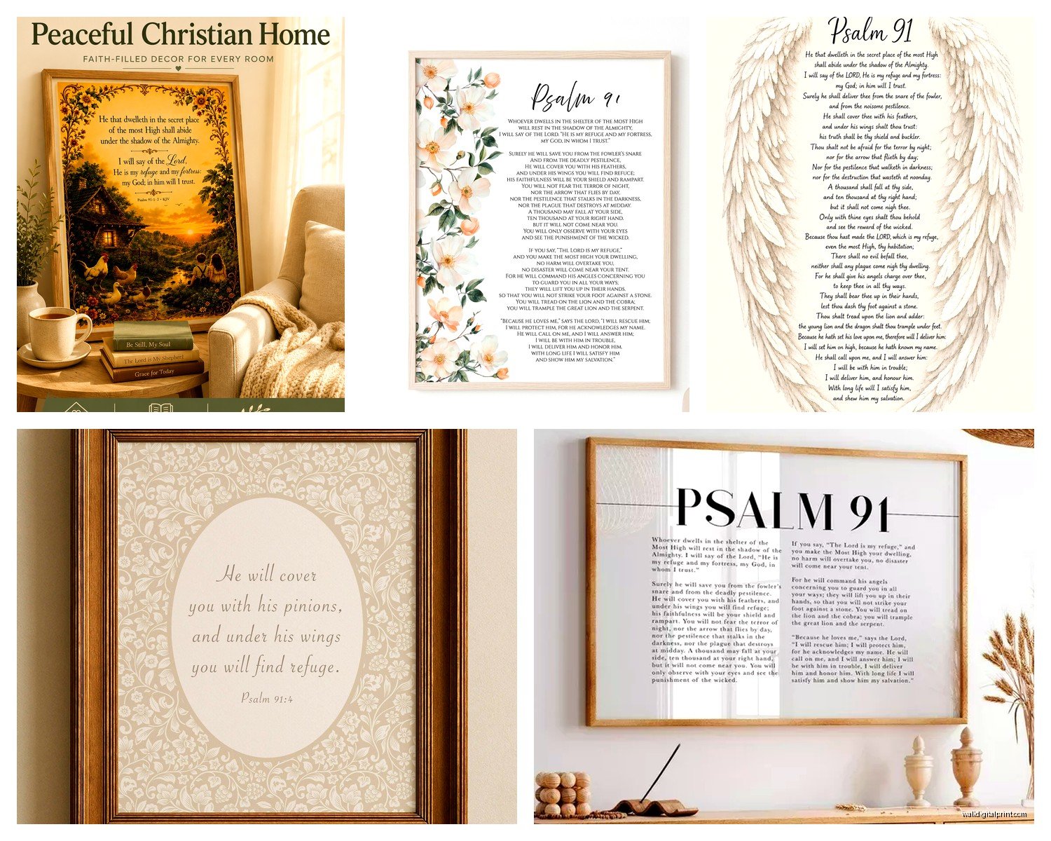
Okay so here’s the thing about Psalm 91 specifically. It’s got these really powerful lines about dwelling in the shelter and refuge under His wings, and visually that translates SO well to art. Like you can go literal with wings and shields or super minimalist with just the text. I’ve curated probably 30 different pieces at this point and the range is insane.
The verse itself is long though, that’s the challenge. Most people use excerpts like “He will cover you with his feathers” or “No harm will overtake you” because fitting the whole thing on a print looks cluttered unless you go really large format.
The Main Styles You’ll Actually See
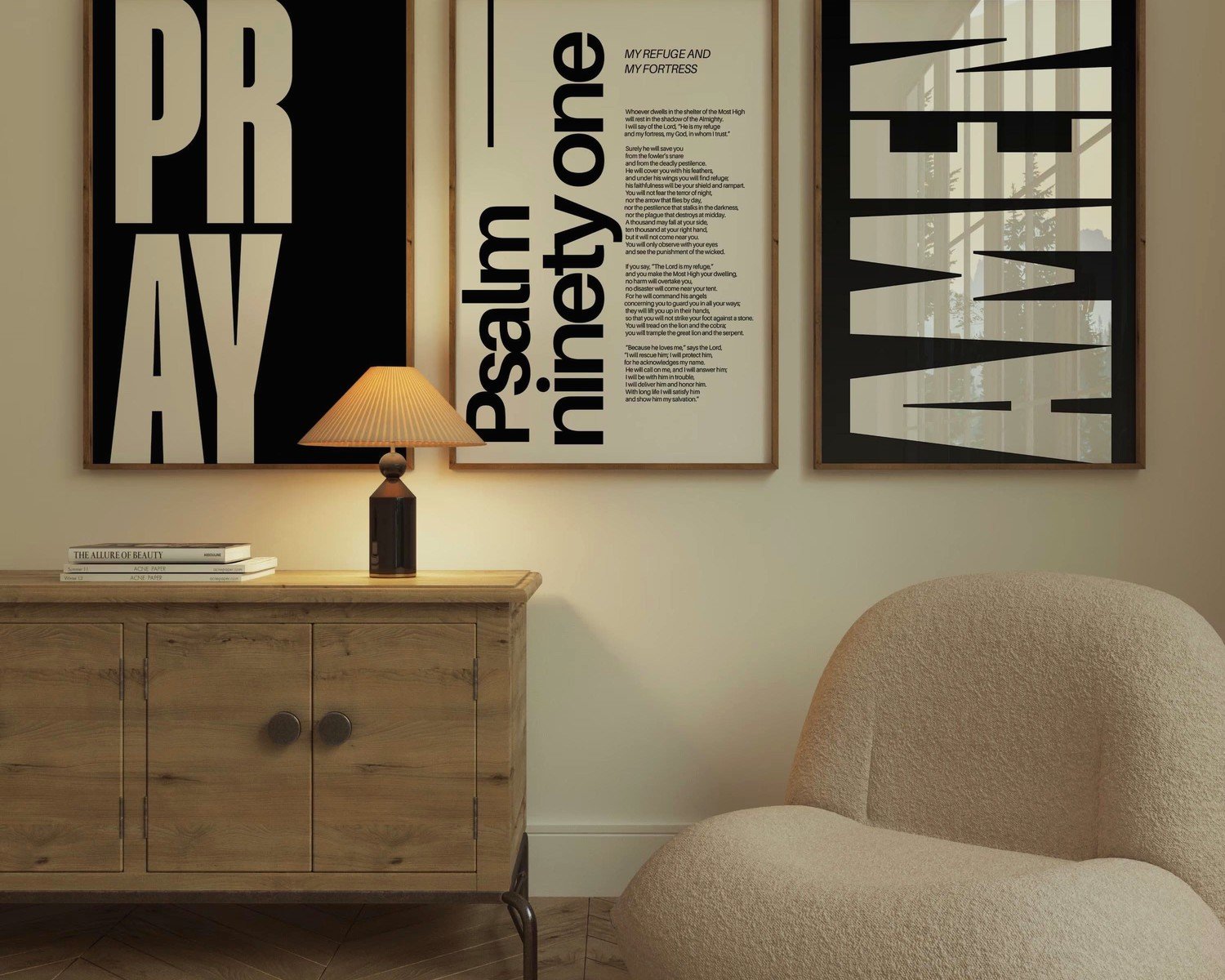
Modern Farmhouse Typography
This is everywhere right now. Black text on white or cream backgrounds, usually with that slightly distressed look. Sometimes they add a thin frame illustration or a simple botanical element. I put one of these in a client’s entryway last month and it’s perfect for that first thing you see when you walk in vibe.
The good ones use a mix of fonts…like maybe three max. Script for emphasis words, sans serif for the reference, and a bold serif for the main text. When it’s done badly it looks like a ransom note so watch out for that.
Watercolor and Florals
These lean feminine but in a good way? Soft backgrounds with the verse overlaid, usually featuring flowers or abstract washes. I’ve seen gorgeous ones with eucalyptus, wildflowers, or just gentle blue and gray washes that feel really peaceful. My friend Sarah has one in her bedroom and every time I see it I’m like okay yeah that’s calming.
The trick with these is making sure the text is still readable. Some artists get so into the background art that the words disappear and then what’s the point.
Literal Biblical Imagery
Wings, shields, fortresses. Some people want that direct visual connection to the metaphors in the psalm. I’ve seen beautiful ones with eagle wings or dove wings, architectural elements that suggest protection. These work really well in home offices or prayer spaces.
There’s this one print I almost bought that has a subtle shield watermark behind the text and it’s just…chef’s kiss. Still thinking about it actually.
Minimalist Line Art
Single line drawings with the verse. Super contemporary, works in literally any decor style. I put one in a lawyer’s office once and it fit perfectly with his modern aesthetic. You wouldn’t necessarily clock it as religious art from across the room which some people prefer.
Size Matters More Than You Think
Okay so this is gonna sound obvious but I see people mess this up constantly. A tiny 5×7 print with Psalm 91 is basically unreadable from any distance. You’re squinting at it like an eye exam.
For bedroom walls where you want that protection prayer energy, I’d go minimum 11×14. Better yet, 16×20. You want to actually read it from your bed without getting up.
Living room or entryway? Think 18×24 or even 24×36 if you’ve got the wall space. I did a huge canvas for a client’s two story entryway and it’s literally the first thing everyone comments on.
Gallery walls are different…you can mix smaller prints but then you’re creating a whole composition. Which actually, wait I forgot to mention, Psalm 91 works great as the anchor piece in a faith based gallery wall with other verses or inspirational quotes.
Frame or Canvas or What
This changes the whole vibe. Framed prints feel more traditional, collected. Canvas wraps feel modern and finished without a frame. Then there’s wood signs which have that rustic farmhouse thing happening.
I’m personally obsessed with floating frames right now. You know the ones where there’s space between the print and the frame? They make even inexpensive prints look expensive. But they only work with certain styles…don’t put a rustic design in an ultra modern frame situation.
Wood signs are tricky because they can look very hobby lobby if you’re not careful. The good ones use quality wood, professional printing or engraving, and thoughtful design. The bad ones look like your aunt made them in her garage (no offense to craft aunts).
Oh and another thing, metal prints are having a moment. The verse printed directly on aluminum with this luminescent quality. Super durable, very contemporary. I used one in a modern farmhouse kitchen and it’s held up perfectly even with all the humidity.
Custom vs Ready Made
So I’ve gone both routes. Ready made from like Etsy or Amazon is obviously faster and usually cheaper. You can find really beautiful designs for $20-50 printed. But then it’s not exactly sized for your space and you might see it in someone else’s house.
Custom is where you can specify exact dimensions, colors that match your room, even incorporate specific verses or portions. I work with this one calligrapher who does absolutely stunning custom pieces but you’re looking at $200+ and a 6 week wait. Worth it for the right project though.
There’s a middle ground too…lots of shops offer customizable templates where you pick colors and sizes but the design is set. That’s honestly the sweet spot for most people.
Where to Actually Put This
Everyone defaults to bedroom and yeah, that makes sense for a protection prayer. Over the bed is classic. But I’ve placed these in some unexpected spots that really work.
Entryway – Setting that intention as you leave and return home. I love this placement because it’s like a daily blessing over your coming and going.
Nursery or kids room – Obviously. Parents love having that protective prayer over their children’s spaces. Just keep the design age appropriate…soft colors for babies, maybe something more playful for older kids.
Home office – Especially if you work from home and need that reminder of protection and peace during stressful work days. I have a client who’s a therapist and she has Psalm 91 where her clients can see it and she says it sets a tone.
Stairway wall – Big blank wall that nobody knows what to do with? Gallery wall with Psalm 91 as the centerpiece.
Above a console table – With some candles or a plant underneath, creates a little intentional moment in any room.
My cat knocked over a plant while I was writing this and now there’s dirt everywhere but anyway…
Color Choices That Actually Matter
This is where I see people freeze up. The verse itself doesn’t dictate colors obviously, so you’ve gotta think about your space.
Neutrals are safe. Black and white, grays, beiges, creams. They go with everything and won’t look dated in three years. But they can also be boring if your whole room is already neutral.
Navy blue is having such a moment and Psalm 91 in navy on white or cream looks really sophisticated. Not overly feminine or masculine, just classic.
Earthy tones work beautifully with the protective nature imagery. Sage greens, terracotta, warm browns. These feel grounding which matches the verse energy.
I’m personally not huge on bright colors for scripture art unless it’s for a kids room. Bright yellow or coral can feel too casual for something this meaningful? But that’s just like, my opinion.
Gold accents are tricky. Real gold leaf or foil can be stunning. Fake gold that’s just yellow can look cheap. Be careful.
Materials and Quality Stuff You Should Know
Not all prints are created equal and this is where you can waste money. Cheap paper fades, especially if there’s any sunlight hitting it. You want at least decent cardstock or better yet, archival quality paper if you’re spending over $30.
Canvas should be actual canvas, not paper printed to look like canvas texture. You can tell by the edges and the weight.
Wood signs should be sealed properly or they’ll warp with humidity. Ask about the finish.
Metal prints are pretty bulletproof but make sure it’s actual dye sublimation on aluminum not just a cheap sticker.
Acrylic prints are gorgeous and modern but they’re heavy and you need proper hanging hardware. Don’t just use a command strip situation.
The Etsy vs Amazon vs Local Artist Breakdown
Etsy is where I find the most unique designs. You’re supporting small artists and makers, and there’s huge variety. But quality is inconsistent so read reviews carefully. Look for shops with hundreds of sales and good photos of actual products not just mockups. Shipping can take forever sometimes.
Amazon has gotten surprisingly good for this stuff. Fast shipping obviously, and returns are easy. But designs tend to be more generic and you’re probably getting something mass produced. Fine if you just want something quick and decent.
Local artists or commissioning someone…this is the most expensive route but you get exactly what you want. I have a calligrapher I use, a watercolor artist, and a guy who does incredible woodworking. They’re not cheap but the quality is next level.
Print shops like Minted or Shutterfly let you upload designs or customize templates. Good middle ground for quality and price. Their framing options are usually decent too.
Installation Tips Nobody Tells You
Okay so you bought the perfect Psalm 91 art and now what. If it’s lightweight, command strips are honestly fine and won’t damage walls. But use the right weight rating…people always underestimate.
Anything over like 5 pounds needs a nail or screw. Find the stud if you can. Those picture hanging strips that are rated for heavy stuff work but they’re permanent…your paint is coming off when you remove them.
Height matters. Center of the artwork should be at eye level which is roughly 57-60 inches from the floor. Over furniture it’s different…leave 6-8 inches between the furniture and the bottom of the frame.
Make sure it’s level. Seriously. A crooked piece of scripture art is gonna bug you every single day. Use a level app on your phone if you don’t have a real one.
Mixing Psalm 91 With Other Decor
This doesn’t have to be your only faith element in the room but you also don’t want it to feel like a church sanctuary unless that’s your thing. I usually balance scripture art with secular pieces, plants, normal decor stuff.
It works really well with natural elements. Wood, plants, organic textures complement the protective nature theme of the psalm.
Keep the rest of the wall relatively simple. If you’ve got a busy patterned wallpaper or a gallery wall with 47 things, adding Psalm 91 is just gonna create visual chaos.
Layer it with other meaningful pieces. Photos of loved ones, other verses, inspirational quotes. Just make sure there’s some visual cohesion…similar frames or a consistent color palette.
Oh and lighting matters more than you’d think. A picture light or even just good ambient lighting makes the piece feel intentional versus slapped up there.
Look I could keep going but honestly you’ve got enough to make a decision now. The main thing is picking something that actually resonates with you and fits your space. Don’t overthink it but also don’t just grab the first thing you see. This is a meaningful verse so give it a spot and a style that honors that.