Wall Art Guide, Wall Art Tutoriels
Sensual Wall Art: Intimate Romantic Bedroom Decor
Jul
So I’ve been working on this couple’s bedroom for like three weeks now and honestly the wall art conversation is where things either get really good or super awkward, and I’m gonna walk you through what actually works because I’ve made every mistake possible.
The Stuff That Actually Creates Intimacy Without Being Cringe
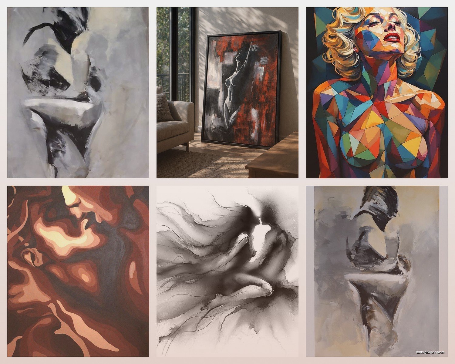
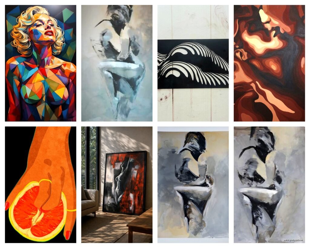
Okay first thing – you don’t need explicit art to make a bedroom feel sensual. Like, I had this client who wanted “sexy” and showed me these awful prints from some random Etsy shop that were just… no. The secret is in suggestion and texture and warm tones, not literal body parts on your wall.
The pieces that work best are abstract florals in deep reds and blushes. I’m obsessed with Georgia O’Keeffe style close-ups but modern interpretations – there’s this artist on Minted who does these incredible peony abstracts that are basically petals folding into themselves and the way light hits them is just… yeah. They run about $180 for a 24×36 which isn’t cheap but they’re museum quality prints.
Line drawings are having such a moment right now and some of them are perfect for this. The continuous line figure studies – where it’s one unbroken line creating two figures intertwined or a single form. Not the cheesy ones you see everywhere, but the really well-executed ones. I found my favorite set at an actual gallery in Portland last summer (was there visiting my sister and stumbled into this place while she was napping with her kids) and the artist does these ink drawings that are somehow both minimal and incredibly intimate.
Color Psychology Stuff That’s Not BS
Here’s what I’ve learned from actually living with different colors in bedrooms – mine and like forty clients’ spaces. Deep burgundy and wine tones make everything feel more luxurious and closer. It’s something about how they absorb light differently. But you gotta balance them or your room feels like a Victorian funeral home.
Blush and terracotta together create this warmth that’s way more sensual than you’d think. I have a blush abstract in my own bedroom that I picked up from an artist in Santa Fe and paired it with terracotta bedding and the whole vibe shifted. My partner literally commented on it which is saying something because he notices approximately nothing about decor changes.
Blacks and charcoals work if you have really good lighting – both natural and artificial. I did a bedroom last year with this massive black and white photograph (it was a close-up of fabric or maybe sand dunes? the abstraction made it unclear) and with the right lighting it was moody and intimate. Wrong lighting and it’s just dark and depressing.
Stuff to Avoid Color-Wise
Bright primary colors – just no. Unless you want your bedroom to feel like a daycare.
Cool grays and blues can work but they tend to read more serene than sensual. I mean if that’s your vibe cool, but we’re talking romance here.
Stark white on white – too clinical. You’re not trying to create an Apple Store.
Sizing and Placement Because This is Where People Mess Up
The biggest mistake is going too small. I see it constantly. Someone buys these cute 8×10 prints and hangs them above a queen bed and they just look lost and sad. For above a bed you want to think 40-60 inches wide minimum for a queen, bigger for a king.
My rule is the art should take up about two-thirds to three-quarters the width of your bed. So if you have a 60-inch wide queen, you’re looking at 40-50 inches of art width. This can be one large piece or a diptych or triptych.
Height-wise hang it so the center is at eye level when you’re standing, which is usually around 57-60 inches from the floor. But honestly in a bedroom I go slightly lower because you’re seeing it from bed height a lot. Like maybe 54-56 inches to center.
Oh and another thing – if you’re doing a gallery wall situation (which can work but is tricky in bedrooms) keep it contained. I did one that was maybe 48 inches wide by 36 inches tall, all in the same color family, all abstract or semi-abstract pieces. Mixed frames in black, brass, and natural wood. It worked because it felt curated not chaotic.
Texture and Dimension Actually Matter More Than You Think
Flat prints are fine but adding dimension makes such a difference. Canvas prints have that slight texture that catches light differently throughout the day. I’m really into linen-wrapped canvases right now – there’s something about that fabric texture that feels more tactile and intimate.
Framed art under glass can work but skip it for the bedroom honestly. The glare is annoying and it creates this barrier between you and the art. Unless it’s something really special that needs protection.
Woven pieces or fiber art – this is gonna sound weird but I’ve used these in several bedrooms and they add this warmth that paper or canvas doesn’t. There’s an artist who does these incredible organic shapes in cream and rust-colored fibers and I used one above a bed with really minimal other decor and it became this focal point that felt both modern and primal? If that makes sense.
DIY Texture Options
If you’re on a budget you can create texture by layering. Print something you love on nice paper, mount it on a thicker backing board, frame it with a deep mat. The shadow creates dimension.
Or do what I did in my guest bedroom – bought inexpensive prints and had them mounted on wood panels instead of traditional framing. Cost like $30 per piece at a local frame shop and they look way more expensive than they were.
The Photography Question
People always ask about personal photos in the bedroom and look, it depends. Photos of you and your partner can be intimate if they’re done well. I’m talking professional boudoir-style shots or really beautiful couples photography, not your beach vacation selfies.
I worked with a couple who had this gorgeous black and white photo from their wedding – just their hands intertwined, shot by their photographer friend who actually knew what she was doing. Printed large on canvas, no frame, it was stunning and personal without being cheesy.
But kids’ photos in the bedroom? Hard pass. Parents’ photos? Nope. You want the bedroom to be your space as a couple (or your space as yourself) not a family album.
Where to Actually Buy This Stuff
Okay so after trying approximately all the online art sources here’s what’s actually worth your time:
Minted has really solid curation and their printing quality is excellent. Plus they have this thing where you can preview art in your room using AR which is gimmicky but actually helpful for sizing decisions.
Artfully Walls is pricier but their selection for bedrooms specifically is really good. Lots of abstract and figure studies that walk that line between artistic and sensual.
Etsy is hit or miss – you gotta dig through a lot of garbage but there are incredible artists on there. I found this woman who does the most beautiful watercolor abstracts in exactly the color palette I needed for a client and they were like $60 for digital downloads that we printed ourselves at a local print shop.
Society6 and Redbubble are fine for prints but the quality varies wildly depending on the original artwork file. I’ve had good luck and bad luck.
Local galleries and art fairs – honestly this is where I find the most unique stuff. You’re paying more but you’re getting actual original work or limited editions. Plus supporting actual artists which feels good.
The Lighting Component Nobody Talks About
Your art is only as good as your lighting. I learned this the hard way when I hung this beautiful piece in my bedroom and it just looked flat and dead until I added picture lights.
Battery-operated picture lights are a game changer if you don’t have hardwiring options. They’re like $40 on Amazon and you just stick them on. Get the ones with the warm LED bulbs not the cool white ones.
Sconces on either side of the bed aimed at the wall wash light across your art and create this ambient glow that’s way more romantic than overhead lighting. I use the IKEA Nymåne sconces in like half my projects because they’re $30 and look way more expensive.
If you have natural light hitting your art, consider how it changes throughout the day. I had a piece that looked amazing in morning light and completely washed out in afternoon sun. Ended up moving it to a different wall and problem solved.
Dimmer Switches Are Not Optional
Install dimmers on everything in the bedroom. Your art looks different at different brightness levels and being able to control that changes the whole mood. This is like a $15 fix at Home Depot and takes ten minutes to install. Or hire an electrician if you’re not into that.
Mixing Styles Without Looking Confused
You can mix photography with painting with line drawings but keep something consistent. Usually that’s the color palette or the framing style or the overall mood.
I did a bedroom where we had a large abstract painting in rust and cream tones, flanked by two smaller black and white photographs of architectural details. Different mediums, different subjects, but the tonal quality and the symmetrical arrangement made it work.
Or go all-in on one style. All abstracts, all figure studies, all photography. Sometimes more cohesive is better especially if your bedroom has a lot of other stuff going on.
The Pieces I Keep Coming Back To
There’s this one artist – her name is escaping me but she does these incredibly subtle figure studies in charcoal where you can barely make out the forms. They’re more about shadow and suggestion and I’ve used her work in probably five bedrooms now. She sells through Saatchi Art I think.
Abstract landscapes in warm tones – not like realistic landscapes but impressionistic or abstracted ones. There’s something about organic shapes and earth tones that just works in intimate spaces.
Botanical prints but not the overdone ones. I’m talking vintage-style botanical illustrations or really contemporary abstract florals. There’s a middle ground that’s harder to find but worth looking for.
Oh wait I forgot to mention – metallic accents in art can be really beautiful in bedrooms. Like a print with gold leaf details or artwork that incorporates copper tones. Catches light, adds richness, feels special. Just don’t overdo it or it gets gaudy fast.
The Practical Stuff About Hanging
Use proper hardware. Those little sawtooth hangers that come on cheap frames are terrible. Get D-rings and picture wire or use heavy-duty velcro strips for lighter pieces.
For anything over 10 pounds find the studs. For anything under that, good drywall anchors work fine. I use the E-Z Ancor ones – they’re like $8 for a pack and actually hold.
Level everything. Your eye will catch if something’s off even slightly. I use a laser level now after years of the bubble level method because my cat knocked my phone off the bed while I was trying to use the level app and I just bought the actual tool.
The spacing between multiple pieces should be 2-3 inches typically. Closer feels too crowded, farther apart and they don’t read as a cohesive group.
Budget Breakdown For Different Approaches
If you’re working with like $100-200 total, go for one statement piece. Better to have one really good large print than several mediocre smaller ones. Digital downloads printed at a local shop can look amazing for $60-80 total.
$300-500 range you can do a nice diptych or small gallery wall. Mix some originals from local artists with quality prints. Frame them yourself to save money – framing is insanely expensive at frame shops.
Over $500 you’re getting into original artwork territory or really high-end prints. This is where I’d invest if you’re gonna be in the space for years. Original art appreciates sometimes and it just has a different energy than prints.
The thing nobody tells you is that you can also rent art now? There are services where you pay monthly and can swap pieces out. I haven’t tried it personally but a client did and she liked being able to change things seasonally.
Anyway that’s basically everything I’ve learned from doing this professionally for the past eight years plus my own bedroom which has gone through like six iterations. Start with your color palette, think about scale before you buy anything, and remember that the goal is creating a mood not filling wall space.