Wall Art Guide, Wall Art Tutoriels
Gangster Wall Art: Mafia Crime Mob Movie Culture Decor
Jul
So I’ve been down this rabbit hole of gangster wall art lately because a client wanted to do this whole speakeasy-vibe home bar and honestly? It’s way more nuanced than just slapping up a Scarface poster and calling it a day.
First thing you gotta figure out is which era you’re actually into because the aesthetic changes completely. Like, are we talking 1920s prohibition Peaky Blinders style, or are we going full 80s Scarface Miami vice energy? Because those are gonna look totally different on your wall and the rest of your room needs to match that vibe or it gets weird fast.
The Different Gangster Aesthetics You’re Working With
Okay so the prohibition era stuff is all art deco lines, black and white photography, vintage newspaper clippings about raids and bootleggers. Think geometric patterns, lots of gold accents, that whole Gatsby adjacent thing. I found this amazing print last month that was a vintage mugshot collection from the 1920s and it looked incredible in these thin black frames arranged in a grid. Very different from what most people expect.
Then you’ve got your classic Italian mafia era which is like… The Godfather, Goodfellas, that whole aesthetic. This is where you see a lot of those iconic movie stills, the puppet master hands imagery, playing cards, dice, vintage Italian-American social club vibes. More warm tones, lots of sepia and burgundy reds. My neighbor actually did his entire den in this style and used these canvas prints of old Italian streets mixed with Godfather quotes and it somehow didn’t look cheesy? The trick was he kept the frames consistent and didn’t go overboard with the quotes.
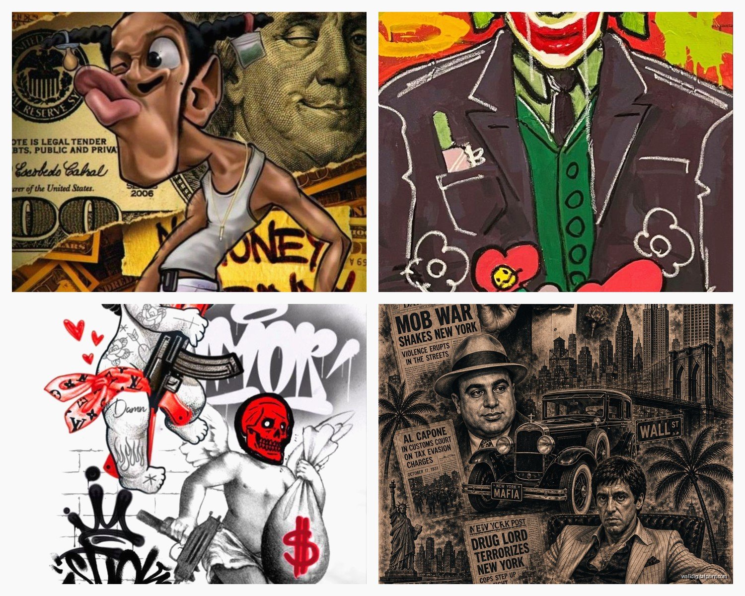
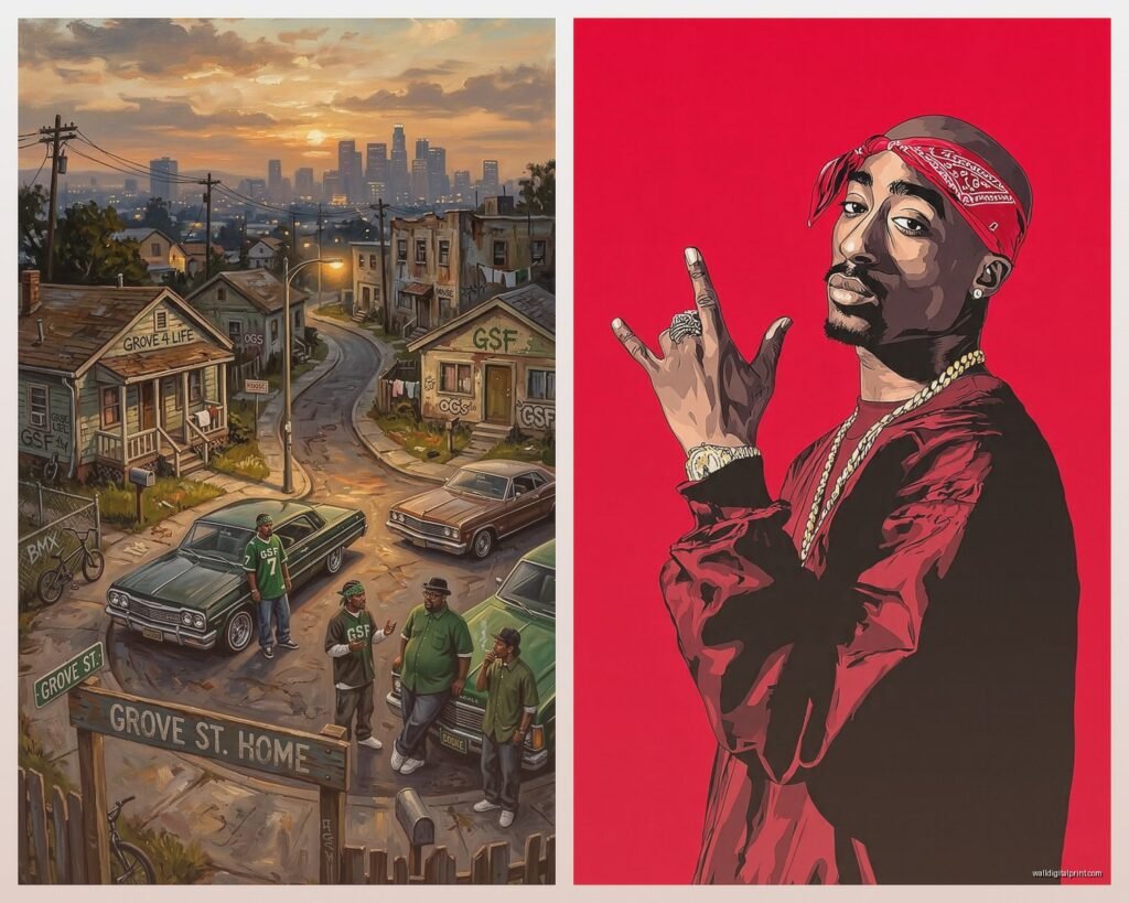
Modern gangster stuff pulls from movies like Scarface obviously, Casino, the neon-soaked 80s Miami thing, or even more recent stuff like Peaky Blinders which has brought back that early century look but with a modern edge to it. Way more color options here.
Where to Actually Source This Stuff
So Etsy is gonna be your best friend for unique prints but you gotta dig. Don’t just search “gangster wall art” because you’ll get buried in dropshipped garbage that looks like it was designed in 2003. Search for specific things like “vintage mugshot prints” or “prohibition era posters” or “1920s speakeasy art” and you’ll find way better stuff from actual designers.
I spent like three hours one night when I couldn’t sleep comparing different sellers and here’s what I learned – look at their other products. If they’re selling literally every trend under the sun (like gangster stuff AND boho AND farmhouse AND minimalist) they’re probably just dropshipping. Find sellers who specialize in vintage reproductions or that specific era.
Society6 and Redbubble have some decent options if you want something more artistic rather than straight movie stills. There are artists doing really cool interpretations of gangster culture that feel more elevated than just a movie poster. I found this one artist who does these minimalist line drawings of famous mob figures that are subtle enough you could actually put them in a living room without it looking like a college dorm.
Oh and another thing – check out museum reproduction sites. The National Archives has insane collections of actual historical mugshots and crime scene photos from prohibition that you can get printed. Way more authentic than the stuff marketed as “gangster decor” and honestly cooler conversation pieces.
The Movie Poster Situation
Look, everyone’s first instinct is to get a Scarface or Godfather poster and like… you can. But if you’re gonna do it, at least get a good reproduction. The cheap ones on Amazon look terrible in person – the colors are off, the paper quality is like printer paper, they arrive creased.
AllPosters and MoviePosterShop have licensed reproductions that actually look decent. Spend the extra $30 and get it properly mounted or framed. A $15 poster in a $60 frame looks way better than a $75 poster in a cheap frame, I’ve tested this theory multiple times unfortunately.
What I actually prefer though is finding original vintage movie posters from lesser-known gangster films. There were SO many mob movies made in the 60s and 70s that nobody remembers and their posters have incredible graphics without being so obvious. I grabbed a French release poster for some obscure crime film last year for like $40 and everyone asks about it because it’s not the same Godfather image they’ve seen a thousand times.
Creating a Gallery Wall That Doesn’t Look Ridiculous
This is where people mess up constantly. They buy a bunch of random gangster-themed prints in different styles, different color schemes, different frame styles and just… throw them up. It looks chaotic and not in a good way.
Pick a color story first. Are you going black and white only? Sepia tones? Do you want pops of red? Commit to that. I did a whole wall in my studio that’s only black and white crime scene photos and vintage mugshots, all in identical thin black frames, and the consistency makes it look intentional and sophisticated instead of like a teenager’s bedroom.
If you want to mix eras or styles, use the frames to unify everything. All black frames, all the same width mat board, similar sizes. Or go the opposite way and do a salon-style wall with all different vintage frames but keep the actual art black and white. One or the other needs to be consistent.
Size matters too – don’t just get a bunch of 8x10s. Mix in some larger statement pieces. I usually do one 24×36 as an anchor, a few 16x20s, then fill in with smaller stuff. Odd numbers look better, groups of 3 or 5 or 7.
The Typography/Quote Problem
Okay so those prints with mob movie quotes on them… they can work but you gotta be careful. “Keep your friends close but your enemies closer” in fancy script can look cool or can look like a TJ Maxx clearance section depending on the execution.
If you’re doing quotes, treat them like typography art. Clean fonts, good kerning, minimal design. I saw someone do just the word “Omertà” in this gorgeous vintage typeface on aged paper and it was perfect – subtle nod to the theme without being heavy-handed.
Actually wait I forgot to mention – if you go the quote route, consider getting them custom printed on something other than paper. I found this place that does metal prints and got a Godfather quote done on brushed aluminum and it looks SO much better than it would on canvas. More industrial, fits the whole crime aesthetic better.
Beyond Posters – Other Wall Decor Options
Vintage playing cards framed individually or in a grid look incredible and totally fit the theme. You can find actual antique casino cards on eBay pretty cheap. I framed nine of them in a 3×3 grid with black mats and it became this whole focal point in my friend’s poker room.
Old prohibition-era advertisements are amazing too. Ads for whiskey, cigars, men’s suits from the 1920s and 30s – they have that perfect vintage gangster vibe without being explicitly crime-themed so they work in more formal spaces. Found a collection of old Lucky Strike ads that had this perfect noir feeling.
License plates, vintage bar signs, old wanted posters (reproductions obviously), even framed vintage currency from the era. There’s this whole world beyond just movie posters that gives you the aesthetic without being so literal about it.
My cat just knocked over my coffee but anyway – neon signs are having a moment and you can get custom ones made pretty affordably now. A simple neon outline of a fedora or a whiskey glass, something subtle like that, adds so much atmosphere. I’m seeing them everywhere in speakeasy-themed spaces lately.
The Canvas vs Frame Decision
Everyone wants to know if they should do canvas or framed prints. Here’s my take after decorating like 50+ spaces with various options – canvas works better for more modern interpretations and larger pieces. If you’ve got a big Scarface canvas or one of those artistic mob scene paintings, the gallery wrap looks clean and contemporary.
Framed prints work better for vintage-style stuff, photographs, movie posters, anything that’s trying to look historical or authentic. Glass and a proper frame just elevates the whole thing and makes it look more curated. Plus you can control the mat color which helps tie everything together.
Don’t do those weird canvas prints that try to look like vintage photos though. It never works. Vintage imagery needs to be behind glass to sell the authenticity – when it’s on canvas it just looks confused about what it wants to be.
Styling the Rest of the Space
Your wall art is gonna look weird if the rest of your room doesn’t support the theme at least a little bit. You don’t have to go full speakeasy but like… some complementary elements help.
Dark wood furniture works with literally any gangster era. Leather seating, especially in cognac or burgundy tones. Brass or gold accents. Vintage bar cart if you can swing it. Even just swapping out your lamp for something with an art deco shape or adding some old books with leather spines on your shelf helps sell the whole vibe.
Lighting is huge – I cannot stress this enough. Harsh overhead lighting makes everything look cheap and flat. Get some warm-toned table lamps, maybe a vintage-style floor lamp, use dimmers if you can. The whole prohibition-era aesthetic relies on that moody, low-lit atmosphere. Your wall art will look completely different (better) in warm, dim lighting versus bright white LEDs.
Textiles matter too. Velvet throws, dark patterned rugs, even just some dark green or burgundy throw pillows. I watched someone completely transform their space just by switching from bright accent pillows to deep jewel tones and suddenly their gangster wall art made sense with the room instead of fighting against it.
What Actually Looks Good vs What’s Too Much
There’s a fine line here and I’ve definitely seen people cross it. A few guidelines that have served me well:
If you have movie posters, limit it to one or two max per room. More than that and it reads teenage boy bedroom no matter how nice the frames are.
Avoid anything with fake blood splatters or guns prominently featured unless you’re doing like a dedicated theater room or something. It’s too aggressive for most living spaces and makes guests uncomfortable which is probably not the vibe you want.
Subtlety usually wins. A vintage photo of a 1920s street scene with a bootlegger lurking in the background is cooler than a print that just says GANGSTER in huge letters with tommy guns everywhere. Trust your guests to get the reference without hitting them over the head with it.
Mix in some non-themed art. Even in my client’s speakeasy bar, we did like 60% on-theme and 40% just nice vintage art, old maps, abstract pieces. It keeps it from feeling like a Halloween Spirit store exploded on your walls.
Color Schemes That Actually Work
Black, white, and gold – classic, works with everything, very art deco prohibition era
Black, white, and red – more dramatic, very Godfather/Italian mafia coded
Sepia and cream tones – vintage photograph vibe, softer and more sophisticated
Dark green, burgundy, brass – very rich 1920s gentlemen’s club energy
Navy and gold – underrated but looks incredible with vintage crime aesthetics
Whatever you pick, keep it consistent across your pieces. I’ve seen people try to mix a black and white Godfather poster with a neon-colored Scarface print and it just… doesn’t work. Pick your lane.
Actual Product Recommendations Based on What I’ve Used
The IKEA Ribba frames are honestly perfect for this if you’re on a budget. Black, clean lines, come in tons of sizes. I’ve used them in $500 projects and $5000 projects and they look good in both.
For prints themselves, King and McGaw has gorgeous vintage reproduction posters including crime and noir stuff. A bit pricey but the quality is there.
Minted sometimes has really cool artistic interpretations of vintage crime aesthetics during their sales. I grabbed a series of minimalist mob movie prints for 40% off last Black Friday.
If you want actual vintage, Chairish and 1stDibs have authentic old movie posters but you’re paying for it. We’re talking hundreds to thousands depending on rarity. Only worth it if you’re really committed to the aesthetic long-term.
For custom stuff, Framebridge does a good job and their online tool makes it easy to visualize how different mat and frame combos will look. A bit overpriced but convenient if you hate making decisions.
The thing nobody tells you is that the hanging part matters as much as the art itself. Get a good level, use proper anchors if you’re going into drywall, measure twice. I’ve seen beautiful gallery walls ruined because everything’s crooked or the spacing is off. Take your time with the install or pay someone to do it right.
Anyway that’s basically everything I’ve learned from way too many hours sourcing gangster wall art for various projects. The key is just committing to a specific vibe and keeping things cohesive – pick your era, pick your color scheme, invest in decent frames, and don’t go overboard with the obvious stuff. You want it to look curated and intentional, not like you searched “gangster poster” on Amazon and bought the first five results.