Wall Art Guide, Wall Art Tutoriels
Large Botanical Wall Art: Oversized Plant & Flower Prints
Jul
So I’ve been obsessing over large botanical prints lately and honestly it started because I needed to fill this massive wall in my loft and didn’t want to spend like three thousand dollars on original art. Let me tell you what I’ve learned because I’ve made some mistakes and also some really good calls.
Size Actually Matters More Than You Think
Okay so here’s the thing everyone gets wrong – they go too small. If you’re thinking about a large botanical print, I’m talking minimum 30×40 inches. Anything smaller and it just looks like you ran out of money halfway through decorating. I learned this the hard way with a 24×36 print that looked HUGE on my laptop screen and then arrived and looked like a postage stamp on my actual wall.
The sweet spot I’ve found is between 40×60 and 48×72 inches for a statement piece. My living room has this 50×70 monstera leaf print and people literally stop talking when they walk in. But measure your wall first because I definitely didn’t do that initially and had to return something.
Where to Actually Buy These Things
I’ve ordered from probably fifteen different places at this point. Some for clients, some for myself, one time just because my cat knocked over my coffee and I stress-shopped at 2am.
Minted is solid if you want quality and don’t mind paying for it. Their botanical collection is huge and the printing is genuinely good. I got this vintage fern print from them that’s been hanging in direct sunlight for two years and hasn’t faded at all.
Etsy is where I find the most unique stuff but you gotta be careful. Read the reviews, make sure they’re actually selling prints and not just digital downloads (made that mistake once). There’s this seller called VintageBotanicalPrints or something similar who does amazing reproductions of old botanical illustrations. The kind that look like they came from a 19th century museum.
Society6 and Redbubble are hit or miss. The selection is massive but quality varies wildly depending on who uploaded the design. I’ve gotten stuff that looks incredible and stuff that was pixelated and weird. Always check the artist’s other reviews.
The Print-on-Demand Route
If you want something REALLY large or custom-sized, places like Printful or local print shops are the way. I’ve uploaded high-res botanical images (you can find these on Unsplash or public domain sites) and had them printed at exactly the size I needed. Just make sure your image resolution is high enough – you want at least 150 DPI at the final print size or it’ll look blurry.
What Actually Looks Good on Walls
This is gonna sound weird but not all plants photograph well as wall art. Like I love succulents in real life but succulent prints often look kind of… medical? Clinical?
What works consistently:
- Monstera leaves – classic for a reason, the holes create negative space that keeps it from feeling too heavy
- Palm fronds – especially if you want that California/tropical vibe without being too literal about it
- Ferns – vintage botanical fern illustrations are chef’s kiss, they have this delicate thing going on
- Eucalyptus branches – subtle, goes with everything, doesn’t scream “I DECORATED”
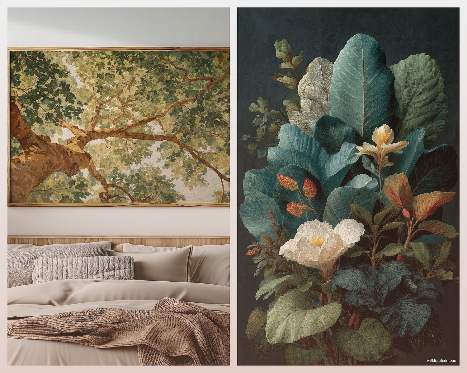
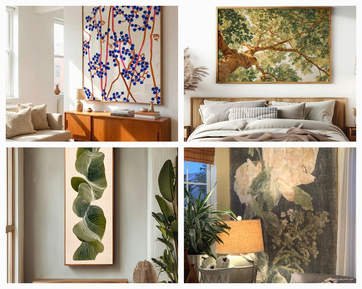
- Oversized single flowers – peonies, magnolias, lotus flowers work great, roses can go either romantic or grandma depending on the style
What usually doesn’t work as well in huge sizes:
- Busy wildflower meadow scenes – too chaotic at large scale
- Multiple small flowers arranged in patterns – feels like wallpaper
- Super bright, saturated colors – overwhelming after about a week
Framing Is Where People Mess Up
Oh and another thing – framing these massive prints is expensive and annoying. A custom frame for a 40×60 print can easily cost $400-600. So here’s what I actually do:
Floating frames from Framebridge or Simply Framed are pricier upfront but they handle everything including hanging hardware. Worth it if you’re scared of messing up a $200 print.
DIY frame kits from Amazon – there are these companies that sell frames specifically for standard poster sizes. They’re like $80-150 for larger sizes. The quality is fine, not amazing, but fine. I’ve used American Frame for clients and they’re decent.
Canvas prints skip the framing issue entirely. You can hang them with just a nail. The downside is they have that… canvas texture that some people hate? I don’t mind it for more casual spaces.
Just clips or pins – honestly for a really modern minimal look, you can use binder clips at the top or poster pins at the corners. I did this in my home office with a giant palm fringe print and it looks intentional not cheap.
Color Schemes That Don’t Make Your Room Weird
I’ve tested this extensively because I curate art for clients and everyone’s always like “will this work with my couch” and the answer is usually yes but here’s the nuance:
Green botanicals are the most versatile. They work with literally everything – warm woods, cool grays, white walls, even that terracotta trend everyone’s doing. I have this massive banana leaf print in deep forest green and it’s been in three different rooms as I’ve moved and worked every time.
Black and white botanical prints are foolproof but can feel a little… I don’t know, safe? Like a hotel lobby. They work great if your room already has a lot of color and texture happening.
Sepia or vintage tones – those old botanical illustration vibes – these are amazing for adding warmth without committing to actual color. They play well with brass, leather, warm whites.
Colorful flower prints – this is where you gotta be strategic. I match them to existing accent colors in the room, not the wall color. So if you have navy pillows, a print with some navy in it ties things together.
Wait I forgot to mention – consider the light in your room. I put this gorgeous pale pink cherry blossom print in a north-facing room once and it just looked gray and sad all the time. South-facing rooms can handle more saturated colors, north-facing rooms need warmer tones.
Arrangement Ideas Because One Huge Print Isn’t Always The Answer
Sometimes you want multiple prints instead of one massive one. Here’s what actually works:
Diptych or triptych – two or three panels of the same botanical subject spread across a wall. I did this with olive branches for a client and it’s stunning. Each panel was 24×36 but together they read as one 72-inch wide piece.
Grid of four – four identical-sized botanical prints in a grid. Keep them related but not identical – like four different fern species or four different angles of the same flower type.
Asymmetrical cluster – okay this one’s harder to pull off but when it works it WORKS. Different sized botanical prints arranged in an organic cluster. The trick is to lay them out on the floor first and take a photo from above to see if it feels balanced.
Spacing Rules Nobody Tells You
Keep 2-4 inches between prints in a multi-print arrangement. Less than that and they look crowded, more and they look disconnected. And the whole arrangement should be roughly centered at eye level, which is about 57-60 inches from the floor to the center of the arrangement.
Styles Beyond Basic Green Leaf Prints
Because there’s more variety than you’d think and I get bored easily:
Vintage botanical illustrations – those detailed scientific drawings from old textbooks and encyclopedias. They have this collected-over-time vibe that feels expensive and smart.
Pressed flower style – prints that look like actual pressed flowers under glass. Delicate and romantic without being too sweet.
Watercolor botanicals – softer and more artistic than photographic prints. Good for bedrooms or spaces where you want things to feel calm.
Line drawings – single-line botanical illustrations are having a moment. Very minimal, very now, might feel dated in five years but currently they’re everywhere.
Moody dark botanicals – plants photographed against black or deep navy backgrounds. Super dramatic, works great in dining rooms or spaces you want to feel more evening-appropriate.
Practical Stuff About Paper and Printing
Okay so this matters more than I thought it would. I was watching this show about art forgery the other night and it made me think about paper quality which sounds pretentious but hear me out.
Matte paper is usually the best choice for botanicals. No glare, feels more like actual art, doesn’t show fingerprints if you touch it while hanging.
Glossy paper makes colors pop more but the glare is annoying and it can look cheap depending on the image.
Fine art paper (cotton rag, watercolor paper texture) – this is the fancy option. Feels substantial, ages well, costs more. Worth it for prints you’re gonna keep forever.
Canvas – already mentioned this but it’s super durable and has that artistic texture. Some people love it, some people think it’s trying too hard.
Giclée printing is just a fancy word for high-quality inkjet printing. It’s good but don’t let anyone charge you triple just because they use the word giclée.
Where to Hang These Things
Not all rooms can handle a massive botanical print. Here’s where they work best:
Living room above the sofa – the classic spot, works great if your sofa is at least 60% of the width of your print
Bedroom above the bed – calming and hotel-like in a good way, just don’t go too bold or you’ll hate waking up to it
Dining room – people forget about dining room art but a large botanical here is unexpected and elegant
Bathroom – if you have a large bathroom, a botanical print adds that spa feeling everyone wants
Hallways – long walls are perfect for oversized prints, makes the space feel intentional instead of just… a hallway
Home office – brings life into a room that’s often pretty sterile, plus green is supposedly good for productivity or whatever
What to Avoid
Things I’ve done wrong so you don’t have to:
Don’t hang botanical prints in your kitchen. The grease and humidity will destroy them even if they’re framed. I learned this the expensive way.
Don’t buy prints with white borders unless you’re framing them immediately. The borders get dirty and bent so easily.
Don’t hang them in direct sunlight without UV-protective glass. Even the good prints will fade. I have this sad lavender print that’s now basically gray because I ignored this rule.
Don’t match your botanical print to your actual plants too literally. Like if you have a monstera plant, maybe don’t get a monstera print? It feels redundant. Mix it up.
Budget Breakdown
Since everyone wants to know what this actually costs:
Budget option – $30-80 for a print from Amazon or a poster site, $50-100 for a basic frame, total around $100-150
Mid-range – $100-200 for a quality print from Minted or Etsy, $150-300 for decent framing, total $250-500
Investment piece – $300+ for a limited edition or original botanical print, $400+ for custom framing, total $700-1200
I usually tell clients to budget around $400 for a really good large botanical that’ll last and look expensive. You can definitely do it cheaper but that’s the sweet spot for quality.
Quick Fixes If You Already Have Art That Isn’t Working
Oh wait, sometimes you already bought something and it’s not right. Try these:
Move it to a different room – what doesn’t work above your sofa might be perfect in your bedroom
Change the frame – swapping a basic black frame for natural wood or brass can completely transform how a print reads
Add side lighting – a picture light or nearby sconce can make mediocre art look way better
Layer it – lean it on a console or shelf instead of hanging it, feels more casual and collected
So yeah, that’s basically everything I’ve figured out about large botanical prints through trial and error and one slightly obsessive month where I reorganized my entire apartment. The main thing is just go bigger than you think you should and make sure the colors work with your actual space not just the vibe you saw on Pinterest.