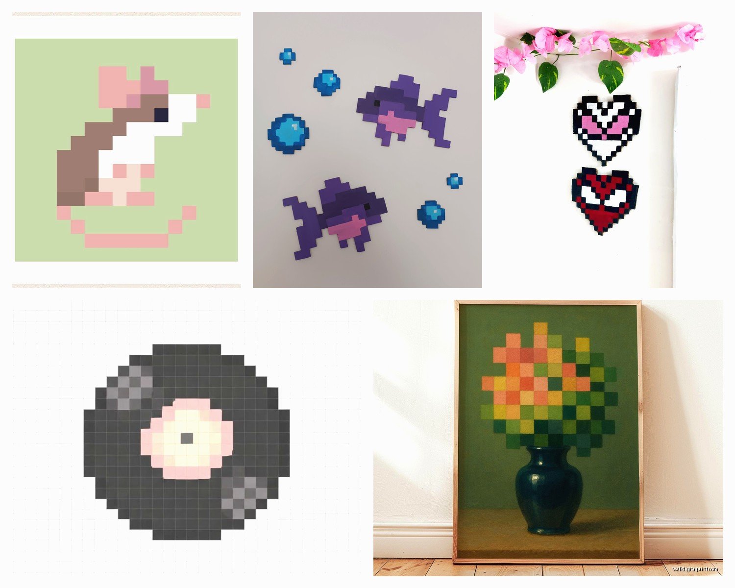
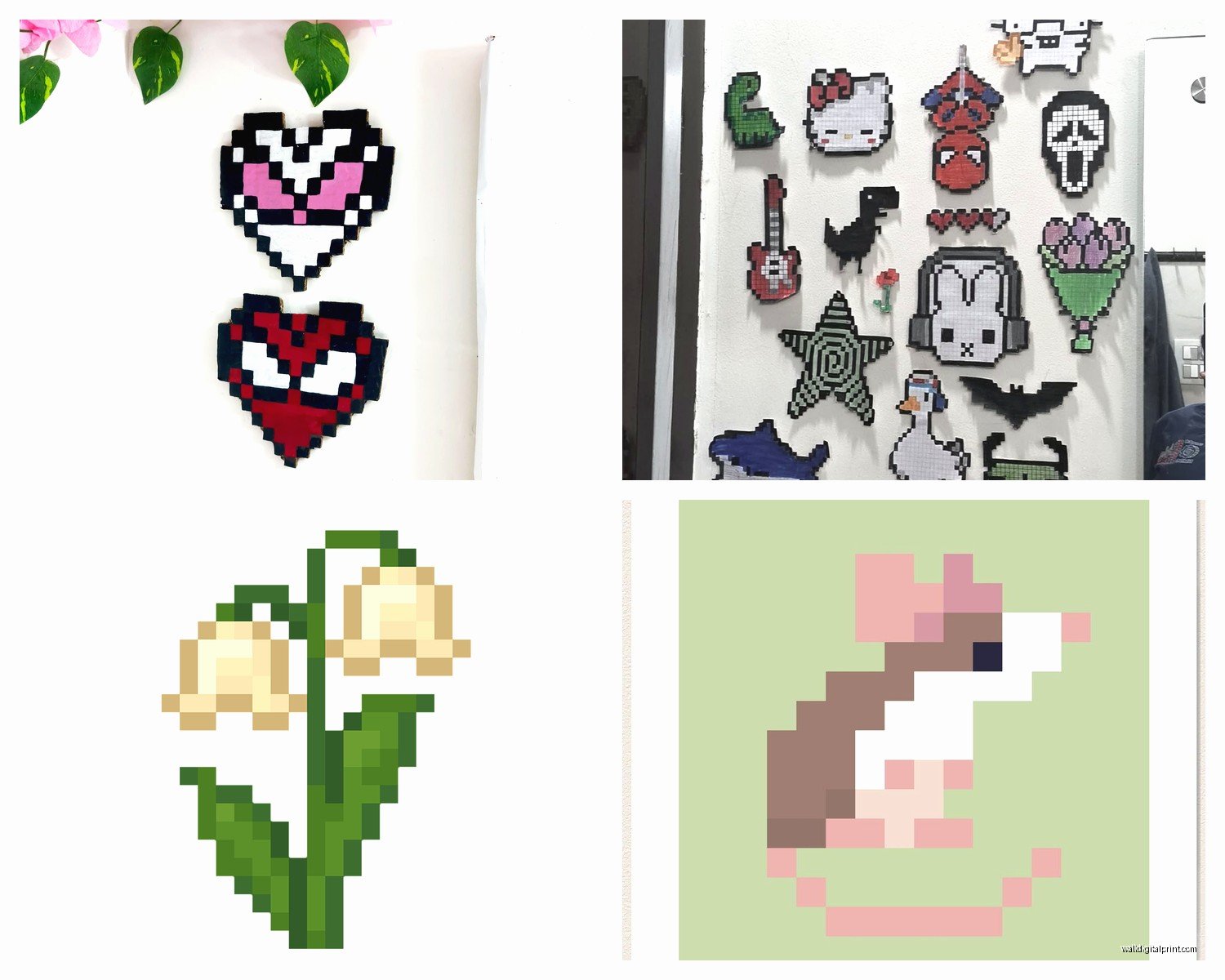
Wall Art Guide, Wall Art Tutoriels
Pixel Wall Art: 8-Bit Retro Video Game Digital Art
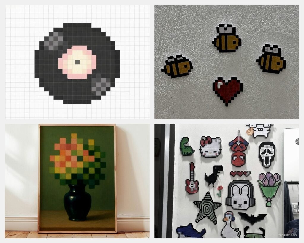
Jul
So I’ve been absolutely obsessed with pixel wall art lately and honestly it started because I was reorganizing my studio space and realized how boring that one wall looked. Like painfully boring. And I remembered seeing this amazing 8-bit Mega Man piece at a friend’s apartment last year and thought, okay, I need to figure this out properly.
Finding the Right Pixel Art That Doesn’t Look Cheap
First thing you gotta know is that not all pixel art is created equal. I spent way too much time scrolling Etsy at like 11pm one night when I should’ve been finishing a mood board, and here’s what I learned. The resolution matters SO much more than I thought it would. You want art that’s been upscaled properly, not just stretched. There’s this whole thing with nearest-neighbor scaling that keeps the pixels crisp instead of blurry.
I usually look for files that are at least 300 DPI if you’re printing anything larger than 8×10. Made that mistake once with a Donkey Kong print that looked amazing on screen and then came out looking like someone printed it on a napkin. My cat knocked it off the desk before I even hung it up which was probably for the best honestly.
The best sources I’ve found are actually independent artists on Society6 and Redbubble because they handle the printing quality control. But if you’re downloading files to print yourself, check the dimensions carefully. I keep a spreadsheet now because I got tired of ordering the wrong sizes.
Color Schemes That Actually Work in Real Rooms
Okay so this is where my interior stylist brain kicks in. You can’t just throw up a super saturated Mario Bros scene on your wall and expect it to work with everything else. Well you can, but it might look chaotic.
I’ve found these color approaches work really well:
- Monochromatic pixel art in black and white or single color variants – super clean, works with literally everything
- Matching the accent colors you already have – if your room has teal pillows, find pixel art with similar teal tones
- Going full neon but keeping it to ONE statement wall, everything else neutral
- Vintage color palettes from actual 80s games – those muted greens and browns are weirdly sophisticated
I did this project last month where we used three different Zelda prints but all in this dusty rose and sage green palette, and it totally transformed what could’ve been a “man cave” vibe into something actually elegant. The client’s wife was skeptical until she saw it installed.
The Frame Situation Nobody Talks About
This is gonna sound weird but the frame makes or breaks pixel art. Like completely. I’ve tested this with the same print in different frames and it’s night and day.
For 8-bit art specifically, you want either super minimal modern frames or you go the opposite direction with chunky retro frames. The in-between stuff just looks confused. I usually grab frames from IKEA’s RIBBA line for the modern look – they’re cheap and the mat boards are included which is clutch. For retro, I hunt thrift stores because authentic 80s frames have this perfect thickness that you can’t really replicate.
Oh and another thing – float mounting works incredibly well with pixel art. It gives it this gallery feel that elevates the whole gaming nostalgia thing into actual art territory. I float mounted a set of Castlevania prints for my own place and people always ask where I got them done professionally, but I literally did it myself with foam board and double-sided tape.
Size and Scale Without Making It Look Like a Poster in a Dorm Room
The biggest mistake I see people make is going too small OR having just one random print floating on a massive wall. Pixel art actually works amazing in grid layouts because it mimics the grid structure of the pixels themselves.
Here’s my formula that I use constantly:
- For a gallery wall: mix 8×10, 11×14, and 12×16 sizes in a grid pattern
- For a statement piece: go BIG, like 24×36 or larger, but make sure it’s the focal point
- For shelving: smaller 5×7 prints work great leaning against books and plants
- For tight spaces: vertical 8×10 or 9×12 formats fit better than horizontal
I recently did this thing where I arranged nine 8×8 square prints in a perfect grid, each one showing a different classic game character, all in the same color family. The symmetry played perfectly with the geometric nature of pixel art. Took forever to get them level though, I was standing on my desk with a laser level at midnight.
Mixing Pixel Art with Other Art Styles
Wait I forgot to mention – you don’t have to make it all pixel art. Actually it looks better when you don’t. I mix pixel pieces with:
- Modern abstract prints in complementary colors
- Black and white photography
- Minimalist line drawings
- Vintage travel posters that have that same nostalgic vibe
The key is finding a common thread. Usually I pick one color that appears in everything, or I stick to similar frame styles, or I theme it by era rather than by medium. Like combining 8-bit art with actual 80s movie posters creates this cohesive retro moment without being too literal about it.
DIY Printing vs Professional Printing
Okay so I’ve done both extensively and here’s the actual breakdown. If you’re printing anything smaller than 11×14, honestly just use a local print shop or even a good home printer if you have one. I use an Epson EcoTank for small prints and the quality is perfectly fine for pixel art since you’re not trying to capture subtle gradients or anything.
For larger pieces, I always go professional. I use Nations Photo Lab or Printique because their color accuracy is consistent. Pixel art can look really washed out if the printer doesn’t handle vibrant colors well. I learned this the hard way with a Sonic print that came back looking like it had been left in the sun for three years.
Paper Types Matter More Than You’d Think
Matte paper is usually your friend with pixel art. Glossy can create weird reflections that make it harder to see the details, especially with bright colors. I use matte cardstock for most prints, but I’ve also experimented with:
- Canvas – gives it a more “serious art” feel but can blur the pixels slightly
- Metal prints – surprisingly amazing for neon-colored pixel art, super modern look
- Wood prints – creates this cool rustic gaming vibe, weird but it works
- Textured fine art paper – adds dimension without losing the pixel clarity
I did a metal print of a Space Invaders scene last year and hung it in my kitchen of all places and it’s become this whole conversation piece. The reflective quality actually enhances the retro arcade feel.
Creating Your Own Pixel Art Compositions
If you can’t find exactly what you want, making your own is actually easier than it sounds. I use Piskel or Aseprite – both have free versions. You can take existing game screenshots and modify colors, or combine elements from different games into one piece.
There’s also this technique where you pixelate your own photos or other images. I took a photo of my dog and ran it through a pixel filter and now it’s hanging in my hallway looking like a indie game character. It’s ridiculous but I love it.
The important thing is keeping your canvas size in actual pixel dimensions – like 128×128 or 256×256 – so it maintains that authentic 8-bit look. If you start with too high a resolution and then try to pixelate it, it just looks like a bad Instagram filter.
Lighting Your Pixel Art Display
This is something I didn’t think about initially but it makes such a difference. Pixel art with its bold colors and high contrast actually looks incredible with proper lighting. I use small picture lights on larger pieces or track lighting aimed at gallery walls.
The trick is avoiding glare but making sure the colors pop. I usually go with warm white LEDs around 3000K because they don’t wash out the colors but they’re not as harsh as daylight bulbs. And dimmer switches are your friend – being able to adjust the brightness depending on time of day or mood is clutch.
For my studio setup, I have three different pixel art pieces that I light with smart bulbs so I can change the color temperature. When I’m working on warm-toned projects I make the lighting warmer, and it all feels cohesive. Sounds extra but it genuinely affects the whole room vibe.
Placement Ideas Beyond the Obvious
Everyone thinks office or gaming room but pixel art works in unexpected places:
- Bathrooms – a small 8-bit Pac-Man or Frogger print adds personality to a usually boring space
- Kitchens – food-related game art like Burger Time or Cooking Mama
- Entryways – a vertical character print makes a strong first impression
- Behind shelving – layering pixel art behind floating shelves adds depth
- In kids rooms but make it classy – vintage game art in nice frames instead of character merch
I styled a nursery last spring with soft pastel pixel art – Kirby characters and Animal Crossing scenes – and it was adorable without being cutesy. The parents wanted gaming references but nothing too obvious and the pixel aesthetic worked perfectly.
Budget Breakdown Reality Check
Let’s talk actual money because this can get expensive or stay super reasonable depending on your approach. For a basic setup:
- Digital downloads from Etsy: $5-15 per print
- Professional printing: $15-40 depending on size
- Frames: $10-30 each for decent quality
- Matting and mounting: $5-20 if DIY
So you’re looking at roughly $35-100 per finished piece. I usually tell people to start with one statement piece or a small gallery wall of three prints before committing to a whole room. Test it out, see how it feels, make sure you’re not gonna get tired of it in three months.
The thing with pixel art is it’s trendy right now but also has genuine staying power because of the nostalgia factor. I’ve had my Legend of Zelda triptych up for three years and I still love it. But I’ve also swapped out other pieces that felt too trendy after a while.
Maintenance and Longevity
Pixel art actually ages really well compared to other print types because you’re not worried about subtle detail loss. The bold lines and simple shapes hold up. I have prints that are five years old that still look fresh.
Keep them out of direct sunlight obviously – colors will fade eventually with UV exposure. Use UV-protective glass or acrylic if you’re hanging something in a sunny spot. And dust your frames regularly because nothing makes art look cheap faster than dusty frames.
Oh and if you’re using command strips to hang stuff, make sure you’re using enough weight capacity. I had a framed Metroid print crash down at 3am once because I cheaped out on the strips and it scared the hell out of me. My dog wouldn’t go near that wall for a week.
The cool thing about pixel art as a theme is you can rotate pieces seasonally or when you get bored without feeling like you’re constantly redecorating. I swap out a few prints every six months or so, keep some favorites permanent. It keeps the space feeling current without major investment.
Anyway that’s basically everything I’ve figured out through way too much trial and error. The main thing is just start with what you actually love rather than what you think is gonna look cool. If you loved playing Street Fighter as a kid, get Street Fighter art. Don’t get something just because it matches your couch perfectly – the personal connection is what makes it work as decor.