
Wall Art Guide, Wall Art Tutoriels
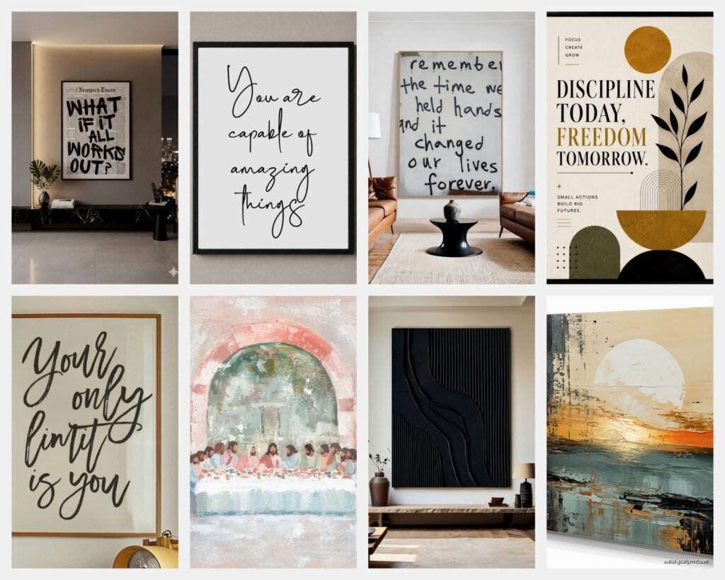
Inspirational Wall Art: Motivational Quote Uplifting Designs
Jul
So I’ve been going down this rabbit hole with inspirational wall art lately because honestly, three different clients asked about it in the same week and I was like…okay universe, I hear you. Let me tell you what actually works versus what looks good on Instagram but makes your space feel like a corporate training room.
First Things First – Size Matters More Than You Think
The biggest mistake I see is people buying these tiny 8×10 prints with massive quotes and then wondering why their wall looks cluttered. You want the art to be big enough that you can read it from across the room WITHOUT squinting. I usually tell people to go at least 16×20 minimum for a bedroom or office space. For living rooms or over a sofa, you’re looking at 24×36 or bigger.
My golden rule is this: hold your arms out in front of you at shoulder width. That’s roughly how wide your piece should be if it’s going above furniture. Sounds weird but it actually works.
The Font Thing Nobody Talks About
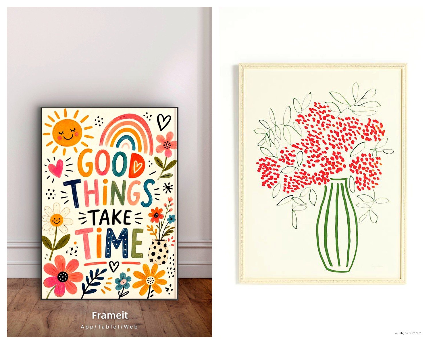
Okay so this is gonna sound super picky but the font makes or breaks these pieces. I’ve seen beautiful quotes completely ruined by fonts that are either too trendy (looking at you, excessive script fonts) or too basic (Times New Roman can stay in 2005 where it belongs).
What actually works:
- Clean sans-serif fonts for modern spaces – think Helvetica vibes
- Minimalist serif fonts if your space leans traditional
- Hand-lettered styles but ONLY if they’re actually readable, not the ones where every letter connects in weird ways
- Mixed fonts can work but maximum two different styles per piece
I did this whole project last month where the client had bought like five different motivational prints from different Etsy shops and none of them matched because every single one used a different font style. We ended up reordering everything from one seller just to get consistency and the difference was insane.
Color Schemes That Don’t Make You Wanna Scream
Here’s where people get it wrong – they pick quotes in colors they like rather than colors that work with their actual room. I love teal but that doesn’t mean I’m putting teal text everywhere, you know?
The safest approach is honestly black text on white or cream backgrounds. It’s classic, it goes with everything, and it doesn’t compete with your other decor. But if you want color, pull from what’s already in your space. Got navy throw pillows? Navy text works. Terracotta pots on your shelf? Rust-colored quotes can tie it together.
One trick I use is the 60-30-10 rule. Your wall art should pull from either your 30% or 10% accent colors, not your dominant 60% wall color. Makes the art pop instead of disappearing into the background.
Neutrals Are Your Friend When You’re Unsure
If you’re commitment-phobic about color (same honestly), stick with:
- Black, white, gray spectrum
- Warm neutrals like beige, cream, tan
- One accent color maximum per piece
Quote Selection Without the Cheese Factor
This is where it gets tricky because what feels motivational to one person feels like a Pinterest cliché to someone else. I’m gonna be real with you – if the quote is something you’d see on a corporate motivational poster in an office building, maybe skip it.
Some guidelines that have served me well:
Short quotes work better than long ones. Like, three to seven words is the sweet spot. Anything longer and it starts feeling like you’re reading a paragraph on your wall which is just…no. My cat knocked over a plant while I was measuring wall space yesterday and I realized I’d been staring at a 50-word quote for like ten minutes trying to figure out why it felt wrong. Too many words, that’s why.
Pick quotes that mean something specific to YOU or the person you’re designing for. Generic “Live Laugh Love” stuff is fine if that genuinely resonates, but I find that quotes tied to specific memories or values have way more staying power. You won’t get sick of them as fast.
Categories That Actually Work
- Single powerful words: Breathe, Create, Begin, Home
- Short phrases: “But first, coffee” / “Make it happen” / “Choose joy”
- Literary quotes if you’re a book person
- Song lyrics that aren’t too obviously song lyrics
- Personal mantras or family sayings
Placement Strategy Because Location Is Everything
Okay so you’ve got your perfect piece, now where does it go. This matters more than people think because context changes how you interpret the message.
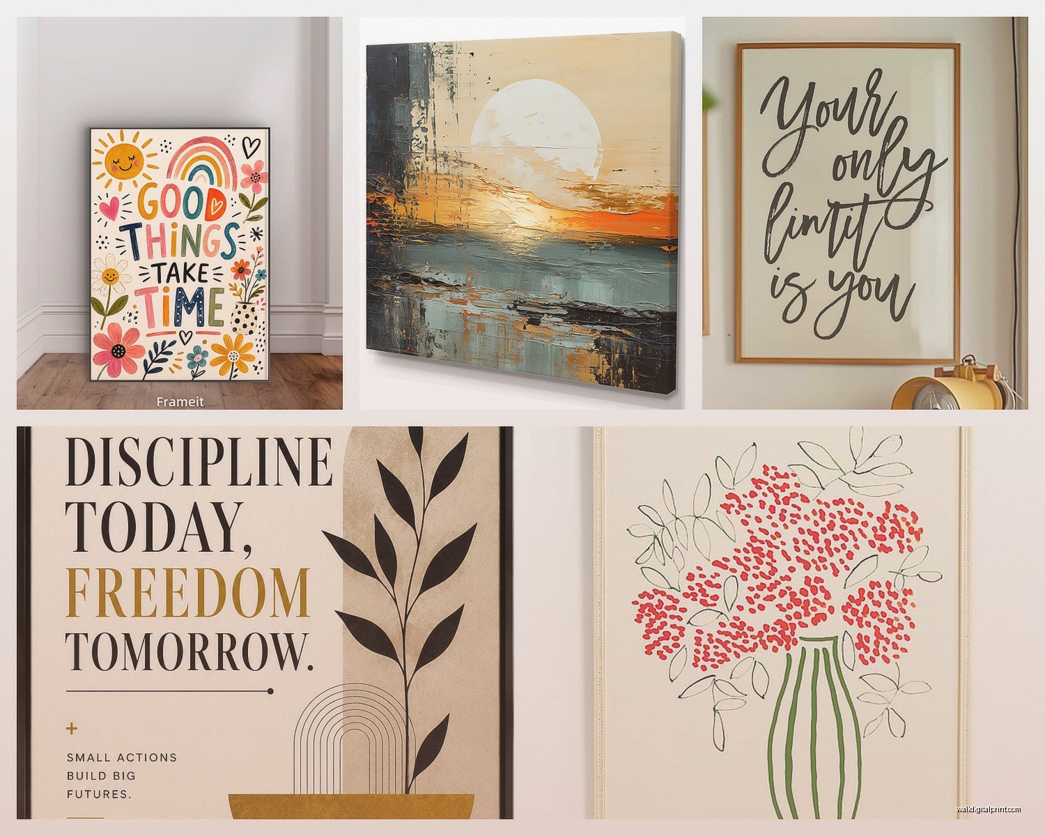
Bedroom: Go for calming, reflective stuff. “Rest” or “Dream” or “Breathe deeply” – things that support the room’s purpose. I had a client who put “Rise and Grind” above their bed and then complained about sleeping poorly and I was like…yeah, maybe let’s move that to your home office?
Home office: This is where you can get more intense with the motivation. “Do epic shit” or “Make it happen” or whatever gets you pumped to work. Just make sure it’s in your sightline when you’re at your desk, not behind you where you’ll never see it.
Kitchen: Food-related quotes or family-focused stuff works here. “Gather” is popular for a reason. “Good food, good mood” if you wanna be a bit playful.
Entryway: Something welcoming but not too personal since guests see this first. “Hello” or “Welcome home” or even just your family name in nice lettering.
The Gallery Wall Approach vs Single Statement Piece
This is totally personal preference but here’s what I’ve learned from trial and error (so much error, oh my god).
Single large piece: Works best when you want that quote to be THE focal point. Clean, modern, makes a strong statement. Easier to style around. Less commitment if you change your mind later.
Gallery wall with multiple quotes: Can look amazing but requires more planning. You gotta make sure the quotes don’t contradict each other or create weird accidental messages when read together. I once saw a gallery wall that said “Always be yourself” next to “Fake it till you make it” and it was just…confusing.
If You’re Doing Multiple Pieces
- Keep the same color palette across all pieces
- Stick with similar frame styles (all black, all wood, all white)
- Use the same or complementary fonts
- Space them 2-3 inches apart
- Plan the layout on the floor first, I’m serious, this saves so much wall damage
Frame or No Frame – The Great Debate
Framing elevates everything, that’s just facts. But it also adds cost and commitment. Here’s my take:
Frame it when: You want it to feel permanent and polished, you’re hanging it in a main living space, the art itself is simple and needs that finished edge, you’re going for a gallery wall look.
Skip the frame when: You’re doing a casual vibe, you like switching things out frequently, you’ve got a canvas print that’s already finished on the edges, budget is tight (frames add up fast).
If you do frame, black frames are the most versatile. Wood frames work great in warmer, traditional spaces. White frames can feel sterile unless your whole space is really light and airy. Oh and another thing – make sure the mat board color doesn’t clash with your wall color. White mats on cream walls can look dingy.
DIY vs Buying – What’s Worth Your Time
I’ve done both extensively and here’s the honest breakdown. DIY is cheaper but way more time-consuming. If you’ve got design skills and you’re picky about exact fonts and colors, go for it. Download your fonts, use Canva or whatever design program, print at a local print shop or online.
Buying from Etsy or similar: Saves time, supports small businesses, usually pretty affordable for digital downloads you print yourself. Watch out for resolution issues though – make sure you’re getting high-res files, at least 300 DPI.
Buying finished prints: Most convenient but priciest. Good option if you hate decision-making or want everything to arrive ready to hang.
Lighting Makes It Work
This is something people forget but lighting can make or break your inspirational art. If it’s in a dark corner where you can barely read it, what’s the point? I usually recommend picture lights for pieces you really want to highlight, or at minimum make sure there’s decent ambient lighting in that area.
Natural light is great but watch for direct sunlight because it’ll fade your prints over time. UV-protective glass helps if you’re framing.
The Authenticity Test
Before you commit to any piece, ask yourself: would I actually say this quote out loud without feeling ridiculous? If the answer is no, it’s probably not right for your space. Your wall art should feel like an extension of your actual personality, not some aspirational Instagram version of who you think you should be.
I had a client who really wanted “She believed she could so she did” because it’s everywhere right now, but when we talked about it more, she admitted it felt too cutesy for her actual style. We went with “Nevertheless, she persisted” instead and she lights up every time she sees it because it actually resonates with her history.
Maintenance and Longevity
Paper prints behind glass need dusting but that’s about it. Canvas prints can be gently wiped with a slightly damp cloth. If you’ve got unframed prints, they’re more vulnerable to damage so maybe don’t put them in high-traffic areas where they’ll get bumped.
Expect to swap things out every few years. Your taste changes, your life circumstances change, what motivated you at 25 might feel irrelevant at 35. That’s totally normal. This is why I don’t recommend spending hundreds on custom commissioned quote art unless you’re absolutely certain it’s got lifelong meaning.
Budget Breakdown
Since someone always asks about cost, here’s roughly what you’re looking at:
- DIY digital creation and home printing: $5-15 per print
- Etsy digital downloads: $3-10, then printing costs $10-30 depending on size
- Ready-made prints: $20-60
- Framed pieces: $40-150+
- Custom commissioned work: $100-500+ depending on artist
I usually tell people to start with one or two pieces in key locations rather than trying to fill every wall at once. See what you actually look at and what you ignore, then build from there.
Common Mistakes I See Constantly
Hanging stuff too high – the center of your art should be at eye level, roughly 57-60 inches from the floor. Too many different styles in one space creating visual chaos. Choosing trendy quotes that’ll feel dated in two years. Forgetting to consider the room’s purpose when selecting messages. Using art that’s too small for the wall space so it looks like it’s floating awkwardly.
Also people get really attached to symmetry when sometimes asymmetrical arrangements look way better and more natural. Just gotta play around with it.
wait I forgot to mention – if you’re renting, use command strips rated for your frame weight. Saved me so many times with security deposits. And take photos before you start hammering so you remember what worked and what didn’t for next time.
