Wall Art Guide, Wall Art Tutoriels
Leopard Wall Art: Spotted Big Cat African Safari Decor
Jul
So I’ve been kinda obsessed with leopard wall art lately and honestly it started because a client wanted to do this whole safari thing but didn’t want it to look like a 90s lodge threw up in her living room, you know? And I’ve learned SO much about what actually works versus what just looks tacky.
First Things First – Size Actually Matters Way More Than You Think
Okay so here’s where most people mess up. They get these tiny little leopard prints thinking they’ll be subtle and classy, but then it just looks like you couldn’t commit to the theme. If you’re gonna do leopard wall art, you need at least one statement piece that’s minimum 30×40 inches. I learned this the hard way when I bought this gorgeous print that was only 16×20 and it literally disappeared on my wall. Had to return it and size up.
The sweet spot I’ve found is either one large focal piece (like 40×60 or bigger) or a gallery wall with three pieces where the center one is substantial. Don’t do five tiny leopards all the same size unless you want it to look like a doctor’s waiting room.
Print Types and What Actually Looks Good IRL
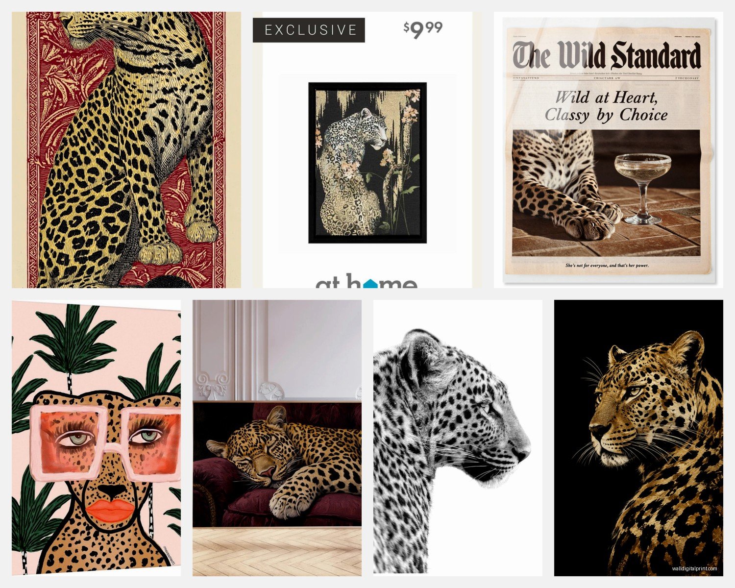
Photography prints are your safest bet honestly. There’s something about a high-quality photograph of an actual leopard that just reads as sophisticated rather than themed. I’ve got this one from a wildlife photographer on Etsy – can’t remember the shop name right now but lemme find it… anyway, it’s a close-up of a leopard’s face and the detail is insane. You can see individual whiskers and the texture of the fur.
Watercolor leopards can work but they’re tricky. Most of them veer into nursery territory which might be what you want if it’s for a kid’s room but probably not for your living room. The ones that work best have muted colors – think burnt sienna, ochre, deep greens instead of bright oranges and yellows.
Abstract or minimalist line drawings are having a moment right now and I’m here for it. Single line leopard silhouettes in black on white or cream backgrounds look really modern. They give you the safari vibe without being too literal about it. My dog knocked over one of these last week and the frame shattered but the print was fine thank god.
What to Avoid
Anything with the word “fierce” or “wild” in script font over the leopard. Just no. Also those weird geometric leopards made of triangles? They had their moment in like 2015 and it’s over. And please skip the leopard print pattern stuff – that’s different from actual leopard imagery and it reads more fashion than safari decor.
Color Schemes That Don’t Look Like a Theme Restaurant
This is gonna sound weird but the key to making leopard art work is actually in what colors you pair it with. Everyone thinks safari = beige and tan and brown, and yeah those work, but they can also be really boring.
I’ve had the most success with:
- Deep forest greens and blacks – creates this moody, lush jungle vibe
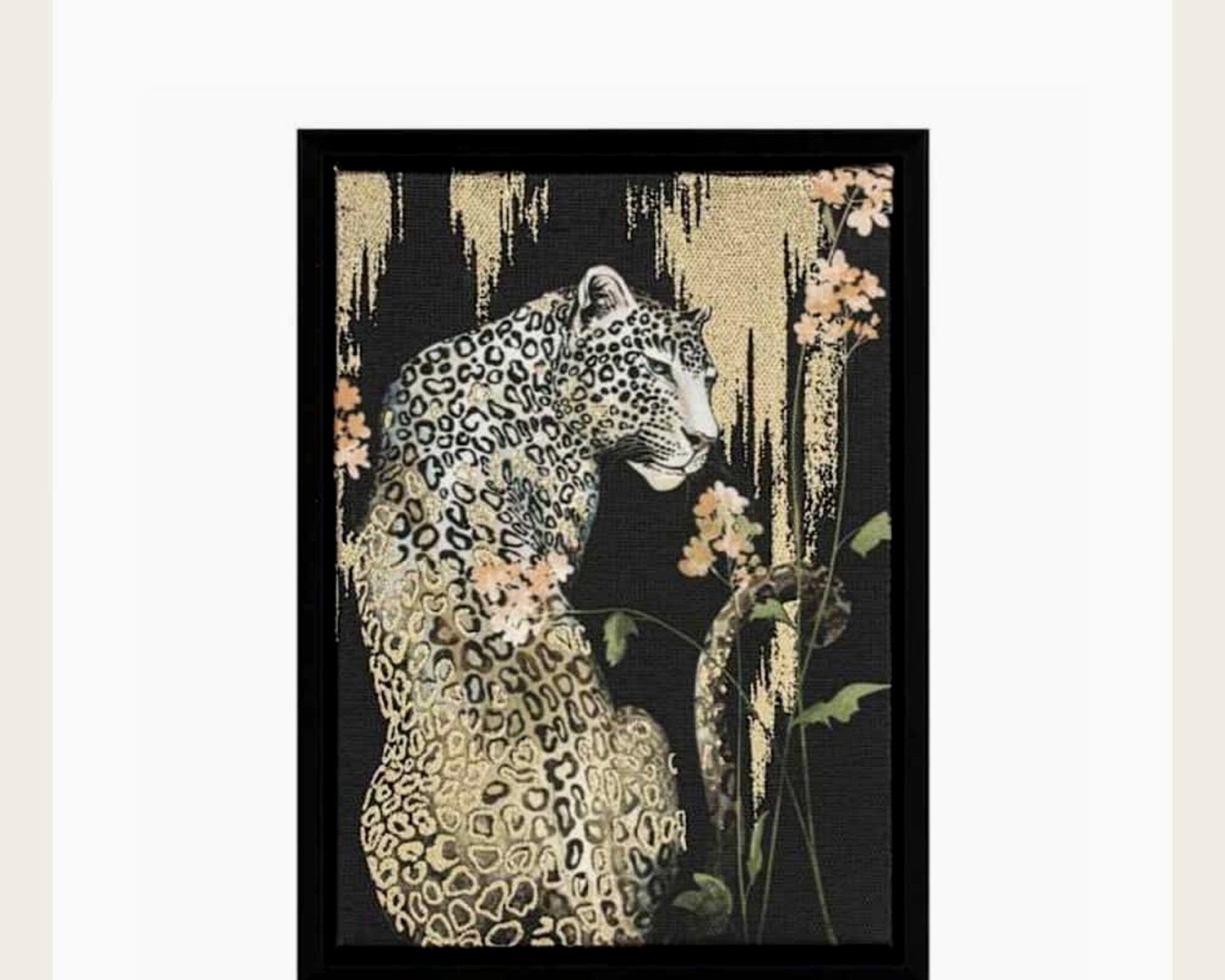
- Charcoal gray with brass or gold accents – very sophisticated, almost Art Deco
- Terracotta and cream with black frames – warm but not overpowering
- Navy blue as an accent color – sounds random but it actually grounds everything
The mistake I see constantly is people doing all warm tones. Like every single thing is tan, beige, brown, ochre… it needs some contrast or it just becomes a blob of sameness. Even just black frames instead of natural wood can make a huge difference.
Framing Options Because This Changes Everything
Okay so I tested like eight different framing situations last month when I was supposed to be doing actual work but whatever. Here’s what I learned:
Black frames are the most versatile. They work with literally any style of leopard art and any room aesthetic. Can’t go wrong. I default to these probably 70% of the time.
Natural wood frames in darker finishes (walnut, espresso) add warmth but still feel current. The light oak or pine frames can work if your whole space is very Scandinavian minimal, but they can also make leopard art look dated. It’s a fine line.
Gold or brass frames are amazing if you’re going for a vintage safari explorer vibe or if you wanna add some glam. But they’re expensive and you gotta commit to the look throughout the room or it’ll feel random.
Floating frames where the art sits between two pieces of glass – these look incredible with photography prints especially. Really gallery-like. But they’re heavy and harder to hang and more expensive. Worth it for a statement piece though.
Oh and another thing – matting. I used to think you always needed a mat but actually for leopard photography I prefer no mat, just frame edge to image edge. It feels more immersive. But for watercolors or illustrations, a cream or off-white mat helps.
Where to Actually Buy Good Stuff
Etsy is honestly where I find most of my best pieces. Search for “wildlife photography print leopard” or “safari animal photography” and filter by shops that have lots of reviews. You can usually get just the digital file and print it yourself at a local print shop which saves money.
Society6 and Redbubble have tons of options from independent artists. Quality varies but their return policy is decent. I got a really cool geometric-ish leopard print from Society6 that’s more artistic than realistic and it’s perfect for a modern space.
For actual original art or super high-end prints, Saatchi Art and Artfinder have beautiful stuff but you’re gonna pay for it. I’m talking like $500+ for a good-sized piece. Worth it if it’s a focal point in your main living area.
Anthropologie randomly has really good leopard art sometimes. It’s hit or miss but when they have it, it tends to be that perfect balance of artistic and accessible.
The Cheap Option That Actually Works
Print your own from a high-res image. I know this sounds sketchy but hear me out. There are wildlife photographers who sell digital downloads specifically for printing. You buy the file for like $15-30, take it to a local print shop or even Costco (their large format printing is surprisingly good), and get it printed on photo paper or canvas. Frame it yourself. Total cost maybe $80-100 for a large piece versus $300+ for the same thing pre-framed.
Just make sure you’re buying from the actual photographer and that they’re selling it as a printable – don’t just screenshot random Google images because the resolution will be terrible and also that’s stealing.
Making It Not Look Too Themed
The thing about safari decor is it can very quickly become costume-y. Like you’re LARPing as a colonial explorer or something which is… not the vibe most people want.
Here’s how to keep it sophisticated:
Mix in non-safari art. Don’t make every single piece on your walls animal-related. I usually do one leopard piece as the anchor and then abstract art, landscapes, or even some modern pieces around it. The leopard becomes an interesting element rather than a theme.
Skip the matching safari accessories. You don’t need the little wooden elephants and the zebra print pillows and the palm leaf everything. Let the leopard art be the main safari reference and keep everything else more neutral and contemporary.
Use it in unexpected rooms. Everyone does safari in living rooms or dens. Put leopard art in your bedroom for a more intimate, sophisticated feel. Or in a hallway where it becomes a surprising moment. I even put a small leopard print in my bathroom and it’s actually my favorite room now.
Gallery Wall Configurations That Work
If you’re doing multiple pieces, here are layouts I’ve actually installed that looked good:
The Triangle: Three pieces where you have one large leopard portrait at eye level, then two smaller complementary pieces (could be other animals, could be landscape, could be abstract) flanking it slightly higher. Creates a nice visual flow.
The Linear: Three same-sized frames in a horizontal row. This works great above a sofa or console table. Mix a leopard with two other elements – maybe a lion and a landscape, or a leopard with two abstract prints in coordinating colors.
The Asymmetric: One large leopard piece on the left, then a cluster of three smaller frames to the right in a loose arrangement. This feels very collected and less formulaic.
Wait I forgot to mention – spacing matters. Give pieces at least 2-3 inches between them, sometimes more. Too close together and it looks cluttered. I use painter’s tape on the wall to map everything out before I start hammering nails because I’ve definitely hung things too close together before and had to redo it.
Lighting Makes or Breaks It
This is something people don’t think about enough. Leopard art, especially photography, needs good lighting or all that beautiful detail gets lost.
Picture lights are worth the investment if it’s a major piece. Those little brass or black lights that mount above the frame – they make art look like it belongs in a museum. Battery-operated ones exist now so you don’t need an electrician.
If that’s too much, just make sure you’re not hanging your leopard art in a dark corner. Near a window is good but not where direct sunlight hits it all day because that’ll fade it over time. Across from a window is often the sweet spot.
Track lighting or adjustable ceiling spots pointed at the art work great too. I installed some in my living room and being able to highlight different pieces depending on the time of day is actually really cool.
What I’m Using Right Now
In my own space I’ve got a 48×36 black and white leopard photography print in my living room. It’s a profile shot of a leopard on a tree branch and the composition is just perfect. Black frame, no mat, hung above my media console. Then I have two smaller abstract pieces in rust and cream on either side that pull colors from a throw pillow. It feels cohesive without being matchy.
In my office I have three small leopard prints in a row – these are more illustrative, almost vintage scientific drawing style. They’re in simple gold frames and I love them because they feel smart and collected rather than decorative.
The trick is treating leopard art like any other art – choose it because you actually like looking at it, not just because it fits a theme you think you should have. I’ve noticed the pieces that get the most compliments are the ones where the leopard almost happens to be the subject rather than being the whole point, if that makes sense?
Anyway I’m gonna stop here because I’m just rambling at this point but seriously, leopard wall art can be so good when you approach it thoughtfully. Just avoid the obvious safari store stuff and look for pieces that have some artistic merit on their own and you’ll be fine.