Wall Art Guide, Wall Art Tutoriels
Keith Haring Wall Art: Pop Art Street Artist Figures

Jul
So I’ve been completely obsessed with Keith Haring lately and honestly it started because a client wanted to add some “fun art” to their downtown loft and I went down this rabbit hole. The thing with Haring’s work is that it looks deceptively simple but when you actually try to incorporate those bold figures and radiant babies into a real living space, there’s a whole strategy to it.
Understanding What You’re Actually Working With
Okay so first thing – Keith Haring’s stuff comes in SO many formats now and they’re definitely not all created equal. You’ve got official licensed prints from places like the Keith Haring Foundation, then you’ve got mass-market reproductions, then there’s this whole world of street art-inspired pieces that are “Haring-style” but not actually his work. I learned this the hard way when I bought what I thought was a steal on a canvas print and it showed up looking like someone printed it at Kinko’s in 1997.
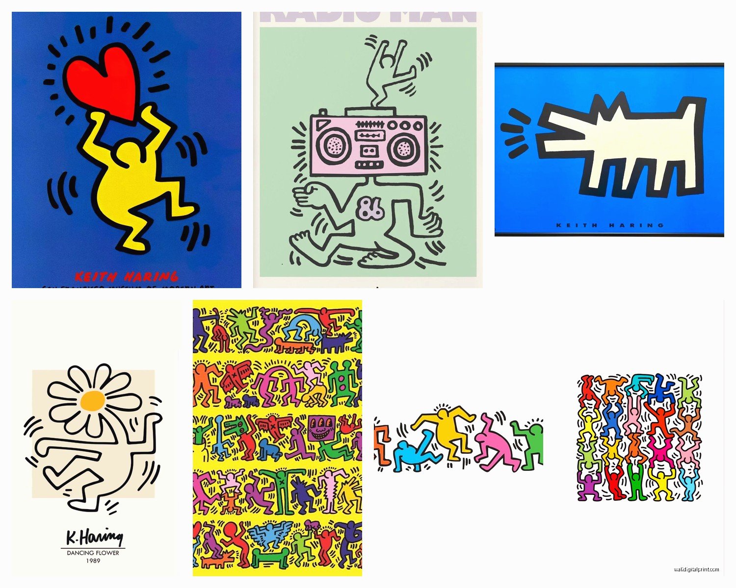
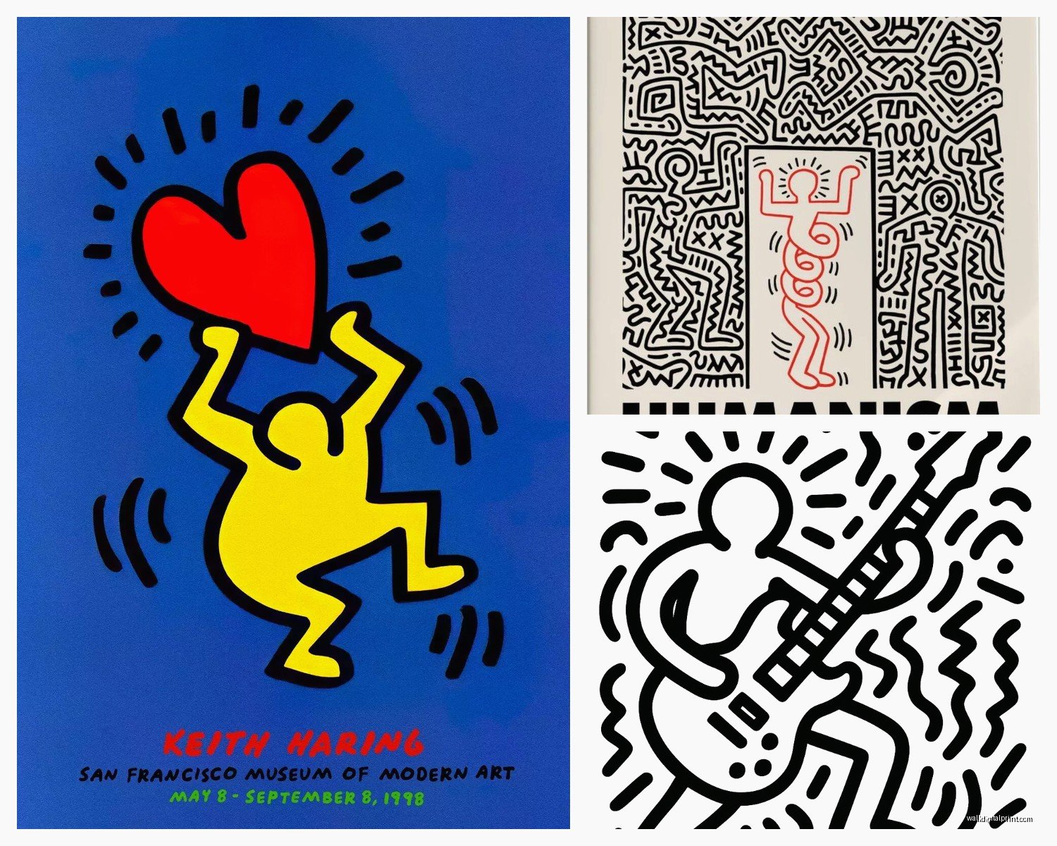
The radiant baby, the barking dog, those dancing figures with the movement lines – these are iconic for a reason. They read instantly from across a room which is why they work so well as wall art. But here’s where it gets tricky… because they’re SO bold and graphic, you can’t just slap them anywhere.
Size Actually Matters More Than You’d Think
I’m gonna say something that sounds backwards but trust me on this – bigger is often easier to work with for Haring pieces. A small 12×16 print of those figures can actually look busier and more chaotic than a massive 40×60 canvas. Something about the scale makes the negative space work better? My friend got this tiny framed print for her bathroom and it just looked cluttered, but when she moved it to her bedroom and went with a larger version in the living room, suddenly everything clicked.
For most living rooms you’re looking at minimum 24×36 if you want it to be a focal point. I did a 48×36 triptych in my own place above the sofa and people always comment on it. The three-panel format actually works beautifully with Haring’s stuff because his art already has this sequential, almost comic-strip energy to it.
Where Different Sizes Work Best
- Small prints (11×14 to 16×20): hallways, bathrooms, gallery walls where they’re mixed with other pieces
- Medium prints (24×36): bedrooms, home offices, smaller living rooms
- Large format (40×60 and up): main living spaces, dining rooms, above furniture
- Oversized (60+ inches): loft spaces, double-height walls, commercial spaces
The Color Situation That No One Talks About
Here’s where I see people mess up constantly – they assume because Haring used primary colors that it’ll work with anything. Not true! His palette is VERY specific and you gotta think about whether you’re going with his classic black and white line work, the primary color versions, or those later pieces with more complex color schemes.
The black and white pieces are honestly the most versatile. I put one in a client’s Scandinavian-style apartment and it was perfect – graphic enough to add energy but neutral enough not to fight with their muted palette. But if you’ve got a space that’s already very colorful, adding a full-color Haring print can make things feel like a preschool classroom real quick.
Oh and another thing – the background color matters SO much. I’ve seen the same Haring figure on white background versus black background and they give completely different vibes. White background feels more gallery, more art-forward. Black background feels edgier, more street art authenticity. Yellow or red backgrounds (which he used a lot) are statement pieces and you gotta be ready for that energy.
Frame or No Frame and What Kind
This is gonna sound weird but I actually prefer most Haring pieces either unframed on canvas or in super minimal frames. The work itself is so bold that ornate framing just competes with it. I tried a thick baroque-style frame once thinking it would be ironic or whatever and it just looked confused.
What works:
- Gallery-style canvas wraps (the image continues around the edges) – very contemporary, very clean
- Simple black floating frames – adds just enough structure without competing
- White box frames for the black and white pieces – classic gallery look
- No frame at all for canvas prints – lets the work breathe
Metal frames can work but they have to be super thin. I used a thin aluminum frame for a client’s industrial loft and it was perfect with the exposed brick and concrete floors.
Mixing Haring With Other Art (Without Looking Like a Dorm Room)
Okay so funny story – my cat knocked over an entire gallery wall I was planning and I had to rethink the whole layout, but it actually made me realize something important about mixing Haring with other pieces. His work is SO graphic that it can easily dominate a gallery wall and make everything else look wimpy.
If you’re gonna mix him with other artists, you need pieces with similar visual weight. I’ve had good luck pairing Haring with:
- Other pop art – Warhol, Lichtenstein, but not all together or it’s too theme-y
- Bold photography – high contrast black and white works especially well
- Abstract expressionism – the gestural quality actually complements Haring’s line work
- Contemporary street art – Banksy, Basquiat (who was literally Haring’s friend), KAWS
What doesn’t work: delicate watercolors, traditional landscapes, anything too precious or detailed. The visual languages just don’t speak to each other.
Room-by-Room Strategy Because Context Is Everything
Living Room
This is where you can go big and bold. The dancing figures work great here because they have this party energy that makes sense in a social space. I did a client’s living room with a massive “Dance” print above their sectional and it literally makes people happy when they walk in. Position it so it’s the first thing you see when you enter the room if you really wanna commit to it.
Bedroom
You’d think Haring’s energetic style would be too much for a bedroom but the simpler pieces actually work. The radiant baby in particular has this joyful but not chaotic vibe. I have a black and white figure piece in my own bedroom and it doesn’t feel too stimulating. Just avoid the really busy multi-figure compositions unless you want your bedroom to feel like a nightclub.
Home Office
YES. The creative energy of Haring’s work is perfect for a workspace. I’m literally looking at my “barking dog” print right now while I’m typing this. It adds visual interest without being distracting and there’s something about that bold, confident line work that makes you feel more creative? Or maybe that’s just me.
Kitchen/Dining
The more playful pieces work great here. Anything with his food imagery or the simple figure compositions. Keep it fun, keep it social. I wouldn’t put his more political pieces in a dining room but that’s just personal preference.
Kids’ Rooms
Obvious choice but done right it’s actually perfect. The radiant baby is literally baby-themed, and kids respond to those bold colors and simple shapes. Just size it appropriately – you don’t want a massive intense piece hovering over a toddler’s bed. Go medium size and cheerful.
The Lighting Thing That Makes or Breaks It
Okay I’m gonna get slightly technical here but it matters – Haring’s bold lines and flat colors need good even lighting. Dramatic spotlight lighting can actually work against these pieces because they don’t have the depth and texture that benefits from shadowing.
I always recommend:
- Track lighting aimed at a 30-degree angle
- LED picture lights for smaller framed pieces
- Good ambient room lighting so the piece doesn’t look like it’s glowing in a dark room
- Natural light is great but watch for fading – use UV-protective glass if it’s in direct sun
Where to Actually Buy Quality Pieces
Not gonna lie, there’s a lot of garbage out there. The Keith Haring Foundation website has officially licensed stuff but it’s pricey. I’ve also had good experiences with:
- Art.com and AllPosters for decent quality reproductions
- Society6 for canvas prints and unique formats
- Local art print shops that do proper giclée printing
- Vintage poster dealers for actual 80s and 90s exhibition posters (these are cool if you can find them)
Avoid Amazon unless you’re really sure about the seller – I’ve seen some truly terrible quality there. Also those weird dropship sites with prices that seem too good to be true… they are too good to be true.
The Authenticity Question
Real talk – unless you’re spending thousands on an actual signed print or original drawing, you’re getting a reproduction. That’s totally fine! The point is to get a GOOD reproduction. Look for:
- Clear, crisp lines (Haring’s line work should be clean, not fuzzy)
- Accurate colors if it’s a color piece
- Quality paper or canvas material
- Proper copyright information (licensed pieces will say so)
I saw someone selling “original Haring” on Craigslist for $200 and like… no. Just no.
Styling Around the Piece
The furniture and decor around your Haring piece matters. I learned this when I put a beautiful print in a room full of overstuffed floral furniture and it looked completely wrong. Haring’s aesthetic is clean, modern, urban. It wants:
- Clean-lined furniture
- Minimal clutter
- Bold solid colors rather than busy patterns
- Modern or industrial elements
- Geometric shapes that echo his graphic style
You can absolutely put Haring in a more traditional space but you gotta commit to it being a deliberate contrast, not an accident.
Wait I forgot to mention – if you’re renting or can’t commit to hanging big pieces, there are removable wall decals of Haring figures that are actually pretty cool. I used them in a teen’s bedroom and they looked way better than I expected. Easy to change out when you get bored too.
The thing about Keith Haring wall art is that it’s inherently optimistic and energetic, so wherever you put it, that space is gonna take on that vibe. Make sure that’s what you want for that room because once you hang a six-foot dancing figure on your wall, that’s the energy you’re living with. But honestly? In a world that can feel pretty heavy, having that bold joyful art staring at you every day isn’t the worst thing.