Wall Art Guide, Wall Art Tutoriels
Easter Wall Art: Spring Holiday Resurrection Religious
Jul
So I’ve been diving deep into Easter wall art lately because honestly my dining room looked so dead after I took down all the winter stuff, and I needed something that felt spring-y but also meaningful since my sister always hosts this big Easter brunch thing.
The Religious vs Seasonal Balance Thing
Okay so here’s what I figured out after buying like three different pieces that totally didn’t work. You gotta decide upfront if you want straight-up religious Easter art or that softer spring-meets-Easter vibe. Because they read completely differently in a space.
The hardcore religious pieces—I’m talking resurrection scenes, crosses with lilies, “He is Risen” typography—those work amazing if you’ve already got a gallery wall with other faith-based art or your home has that established aesthetic. But if you randomly throw a dramatic resurrection scene next to your abstract prints and that photo of your dog, it’s gonna feel jarring.
I learned this the hard way with this gorgeous canvas I found on Etsy. Beautiful craftsmanship, deep jewel tones, depicted the empty tomb with these incredible light rays. Looked stunning in the shop photos. Got it home and it was like…too heavy? My living room is all light grays and natural wood, very Scandinavian-ish, and this piece just demanded all the attention in a way that felt off.
What Actually Works in Real Homes
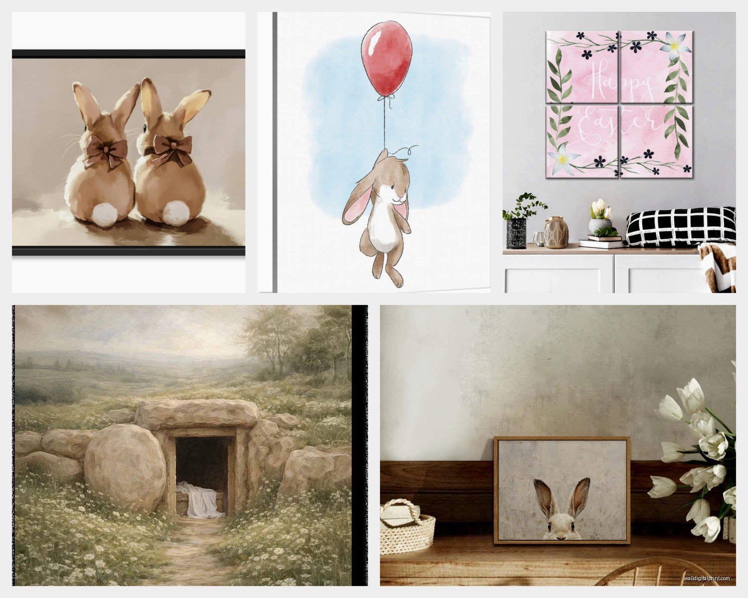
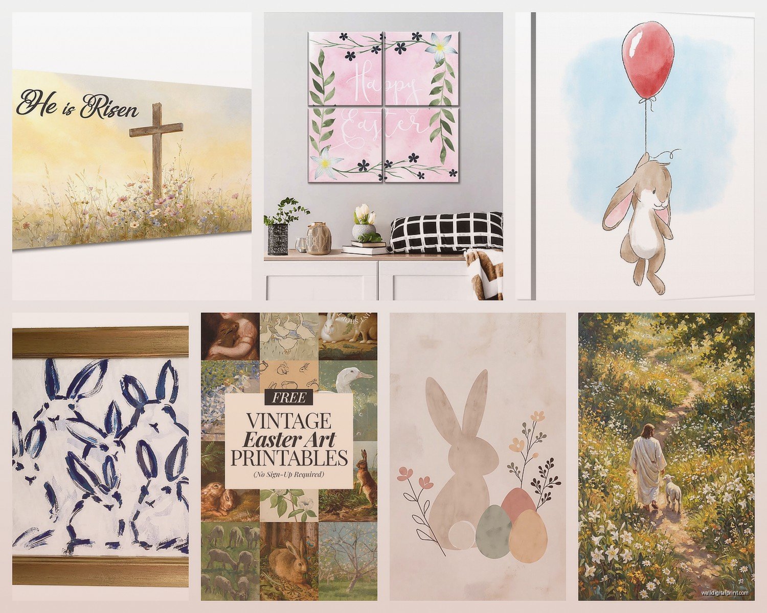
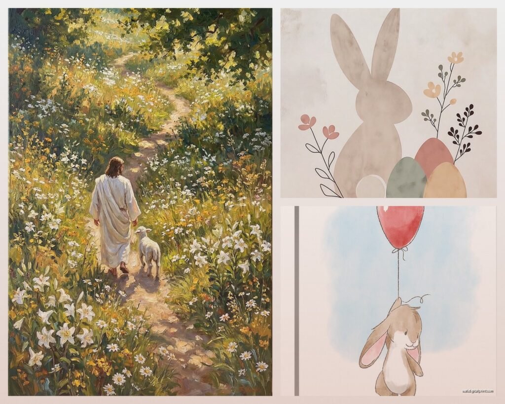
The pieces that I’ve found work best are honestly the ones that hint at the religious aspect without being super literal. Think:
- Watercolor crosses with soft spring florals woven around them
- Simple line art of praying hands holding flowers
- Vintage-style prints with scripture verses in pretty typography surrounded by botanical elements
- Abstract pieces that use Easter symbolism subtly—like three crosses on a hill rendered in minimalist brushstrokes
These blend way easier with existing decor. My client Sarah has this beautiful piece that’s basically just the word “Risen” in this soft sage green script with tiny wildflowers scattered around it. You can style it for Easter specifically but it doesn’t scream EASTER so loud that you feel obligated to take it down April 1st.
Size Matters More Than You Think
Oh and another thing—I keep seeing people buy these tiny 8×10 prints and then wonder why they disappear on the wall. For Easter art specifically, you want something that makes a statement because you’re probably only displaying it for what, 4-6 weeks max?
I’d go minimum 16×20 if it’s a standalone piece. If you’re doing a gallery wall situation, you can mix sizes, but your anchor piece should be at least that big. I’ve got this 24×36 canvas with a cross made of pastel brushstrokes that I lean against my entryway console table, and the scale is what makes it work. Smaller and it would’ve just looked like an afterthought.
Wait I forgot to mention—if you’re renting or don’t wanna put holes in walls, the leaning thing is totally valid. I actually prefer it for seasonal art because you can move it around. Sometimes it’s on the mantel, sometimes the console, sometimes I prop it on my kitchen open shelving if I’m feeling chaotic.
The Typography Route
Okay so funny story, I was watching The Great British Baking Show at like 11pm one night and scrolling Instagram, and I kept seeing these Easter typography prints. At first I thought they were kinda basic? But then I realized they’re actually super versatile.
The good ones use phrases like:
- “He is Risen” in elegant script
- “Resurrection Sunday” with botanical borders
- “Hallelujah” in a mix of fonts
- Scripture verses like John 11:25 styled beautifully
- “Because He Lives” which honestly makes me tear up every time
What makes these work is you can print them yourself if you find digital downloads. I use a local print shop that does same-day on nice cardstock, and it costs maybe $8 for a 16×20. Frame it in something simple from Target or Amazon, and you’ve got custom art for under $30.
The secret is picking fonts that match your home’s vibe. If you’re modern farmhouse, go for that hand-lettered rustic look. More contemporary? Clean sans-serif fonts with lots of white space. Traditional home? Classic serif fonts with ornate details.
Colors That Don’t Look Childish
This is gonna sound weird but the color palette is where most Easter art goes wrong. Those bright primary yellows and purples and pinks? Very cute for kids’ spaces, very difficult to make work in adult rooms.
I stick with:
- Soft pastels—think dusty rose, sage green, pale lavender, cream
- Neutrals with one accent color—like a taupe and white piece with just a touch of gold
- Monochromatic schemes—all whites and creams with texture doing the heavy lifting
- Muted jewel tones if you want drama—deep plum, forest green, antique gold
My bedroom has this print that’s basically all cream and white with the faintest blush pink, and it shows three crosses on a hill done in this really subtle watercolor wash. It reads as spring decor first, Easter second, which means I can leave it up longer without it feeling dated.
Where to Actually Buy This Stuff
Real talk, I’ve ordered from probably fifteen different places at this point. Here’s what I’ve learned:
Etsy is your best bet for unique religious Easter art. Search terms that work: “minimalist Easter art” “modern resurrection print” “botanical cross wall art” “elegant Easter decor.” The digital download section is massive—you buy it, download the file, print it yourself or through a service.
Society6 and Minted have some options but they’re more spring-general than religious-specific. Good if you want that seasonal vibe without overt Christian imagery.
Amazon is hit or miss. Lots of canvas prints that look great in photos but show up and the quality is meh. That said, I’ve found some decent framed prints there, especially if you filter by 4+ stars and actually read reviews.
HomeGoods and TJ Maxx during February and March? Sometimes you strike gold. I found this incredible wooden cross with pressed flowers sealed in resin for $25. But it’s totally random what they’ll have.
The Digital Download Strategy
Okay so this changed everything for me. Instead of buying physical art that you gotta store 11 months of the year, buy digital files and print them seasonally.
Here’s my system: I have a folder on my computer with Easter prints I’ve purchased (usually $3-8 each). When March rolls around, I send three or four to my local FedEx Office or Staples, pick them up same day, swap them into frames I already own. After Easter, I recycle the prints and my frames are ready for whatever’s next.
This means I can switch up my Easter art every year without spending much or dealing with storage. Last year I did soft florals with subtle crosses. This year I’m going more typography-focused with scripture verses.
You gotta make sure you’re buying high-resolution files though—at least 300 DPI. And check the dimensions match standard frame sizes (8×10, 11×14, 16×20) so you’re not paying extra for custom framing.
Styling Easter Art in Different Rooms
Living room—this is where I go bigger and more statement-making. A large canvas or framed print above the sofa or fireplace. If you do a gallery wall, put the Easter piece as the center anchor and surround it with neutral botanical prints or family photos so it doesn’t feel too themed.
Dining room—perfect spot for something you only display seasonally since people mainly see it during gatherings anyway. I hung a triptych of three crosses rendered in gold leaf on cream canvas above my sideboard. Paired it with some white ceramic bunnies and fresh tulips, and it felt complete.
Entryway—this is actually my favorite spot for Easter art because guests see it immediately and it sets the tone. A good-sized print on the console table leaning against the wall, or hung above it. Keep it simple here since entryways can get cluttered fast.
Bedroom—go subtle and personal. I have a small print with “He is Risen” in script on my nightstand. It’s just for me, reminds me of the meaning behind the season when I wake up.
Wait I should mention—don’t forget about your kitchen if you have open shelving or a blank wall. A small framed print tucked between dishes or cookbooks adds charm without being over the top.
DIY Options That Don’t Look DIY
If you’re crafty at all (I’m barely crafty, my cat knocked over my paint water last time I tried) there are some easy options:
Print a high-quality image or verse, stick it in a nice frame with a thick mat. The mat is key—it makes anything look more expensive and intentional.
Buy a plain canvas from the craft store and use vinyl letter stickers to spell out “Hallelujah” or “Risen.” Paint over everything in a pretty color, peel off the letters. Boom, custom typography art.
Press real flowers (I used tulips and small daisies) and arrange them in a shadow box frame with a small cross. This takes patience though because flowers need like two weeks to dry properly between book pages.
Get a wooden board, stain or paint it, use stencils for words or cross shapes. Add picture hanging hardware to the back. Very farmhouse, very forgiving if you mess up because distressed looks intentional.
The Framing Situation
This is where people overspend like crazy. You don’t need custom framing for seasonal art, I promise.
IKEA frames are shockingly good and cheap. Their RIBBA series comes in all standard sizes, looks clean and modern. I have like six of them that I swap art in and out of throughout the year.
Target’s Threshold line has nice frames with a slightly more elevated look. The brass and black ones work with basically everything.
If you want something fancier, wait for Michael’s or Hobby Lobby sales. They do 50% off frames constantly. Sign up for emails, wait for the coupon, go wild.
For canvas prints, you honestly don’t need frames at all. Gallery-wrapped canvases (where the image wraps around the edges) look finished on their own.
Mixing Religious and Secular Easter Elements
So here’s the thing nobody really talks about—how to incorporate religious Easter art when you also have kids who want bunny stuff everywhere, or you just like the spring aesthetic too.
I’ve found they can totally coexist if you’re intentional. In my dining room, I’ve got the religious triptych I mentioned, but on the table itself I have a centerpiece with eggs and flowers. The wall art declares the spiritual meaning, the table decor celebrates the season and tradition. They don’t compete.
Same with gallery walls. Mix a “He is Risen” print with botanical drawings, vintage book pages, and maybe one bunny illustration if you want. The variety actually makes the religious piece stand out more rather than less.
The key is choosing religious art that has some design overlap with your secular pieces. If your bunny prints are watercolor, get watercolor cross art. If you’re doing vintage-style spring prints, find vintage-inspired scripture art.
What To Avoid
Okay real quick, things that haven’t worked for me:
Super graphic or gory crucifixion scenes unless that’s specifically your aesthetic. They’re meaningful but intense for everyday display.
Anything with too many words. Long paragraphs of text on the wall just look cluttered and nobody actually reads them.
Neon colors or super modern digital art with religious Easter themes. It exists and it’s…a choice. Usually not a good one for most homes.
Those wooden word signs that say like “Easter” in chunky letters. They read very 2015 farmhouse and haven’t aged well.
Prints that are clearly just stock photos with text slapped on. You can tell, and they look cheap even in nice frames.
Rotating Your Display
Since Easter moves around date-wise, I usually put up Easter art around mid-March and take it down the week after Easter Sunday. Some people go longer if Easter’s early, shorter if it’s late.
The nice thing about Easter art specifically is it works well with general spring decor, so the transition in and out is pretty seamless. I leave up my botanical prints and just swap the explicitly Easter pieces.
Storage is simple—I keep prints flat in a large portfolio case under my bed. Framed pieces go in a closet wrapped in bubble wrap. Canvases stack in the garage. Label everything so you’re not digging through boxes next year trying to remember what you have.
Anyway that’s basically everything I’ve learned through way too much trial and error. The biggest thing is just picking pieces that actually reflect the meaning Easter holds for you personally, whether that’s super traditional religious imagery or something more subtle and contemporary. And making sure whatever you choose actually works with how your home looks the other 11 months of the year, because nothing’s worse than art that fights with your space.