
Wall Art Guide, Wall Art Tutoriels
Holiday Wall Art: Seasonal Festive Celebration Decor
Jul
So I’ve been rotating holiday wall art in my apartment and various client spaces for years now and honestly it’s one of those things that seems way more complicated than it actually is until you figure out the system.
The Actual Problem With Holiday Wall Art
Most people buy these massive statement pieces thinking they’ll transform their space and then realize they have nowhere to store a 3-foot wooden reindeer for 11 months of the year. I learned this the hard way after my first holiday season styling a boutique hotel lobby – we had seventeen boxes of December decor with absolutely no storage plan and I’m pretty sure the manager still hasn’t forgiven me.
The trick is thinking modular and interchangeable. You want pieces that layer over what you already have or fit into existing frames.
What Actually Works Throughout The Season
Okay so funny story, I was watching The Great British Baking Show while reorganizing my art storage last November and realized I’d been approaching this all wrong. Instead of buying “Christmas art” specifically, I started collecting pieces that work for the entire November through January stretch.
Winter botanicals are your best friend here. Think:
- Evergreen branches and pinecones
- Winter berries in deep reds
- Frosted leaf prints
- Birch tree photography
- Snowy landscape paintings
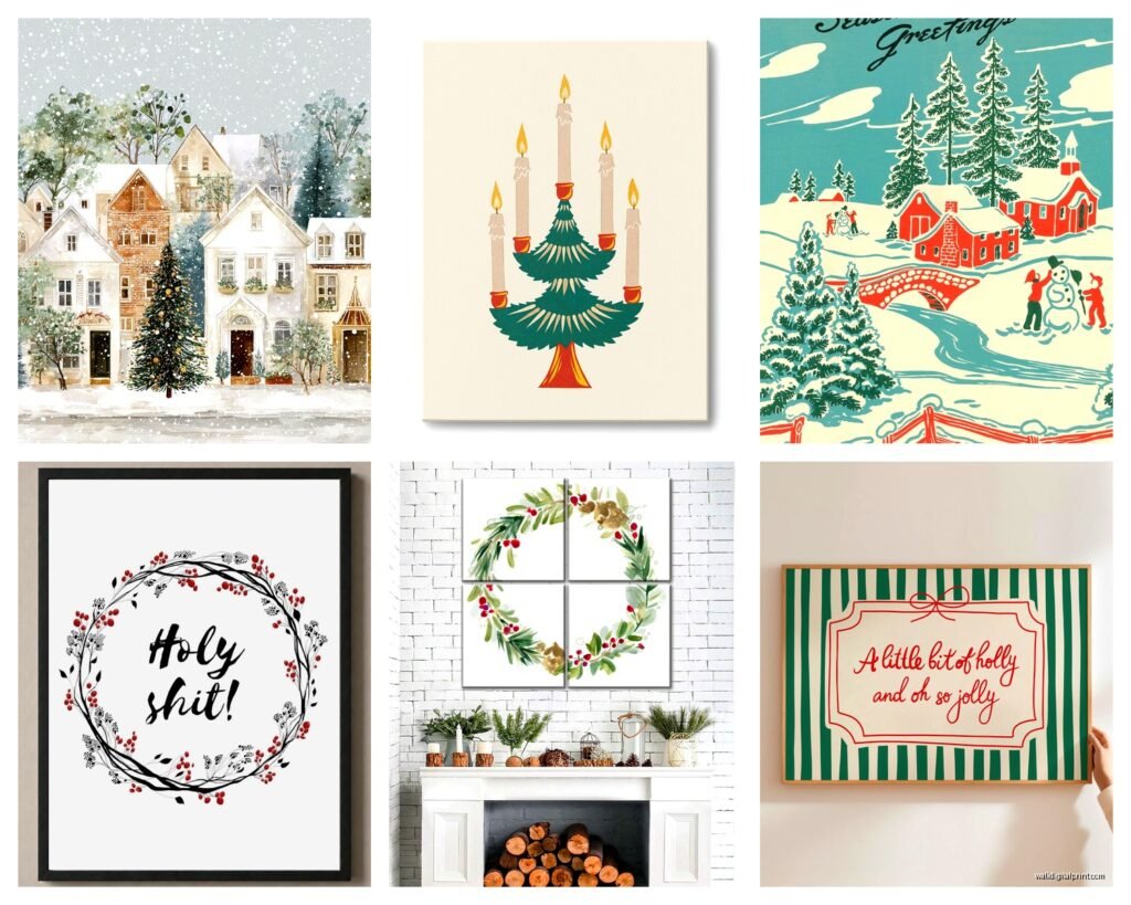
These work from Thanksgiving straight through to late January without feeling specifically tied to one holiday. I have this set of three botanical prints with holly and winter greens that I got from an Etsy seller – they’re in simple black frames and I literally just swap them into the frames I already have in my hallway. Takes maybe five minutes total and suddenly the whole space feels seasonal without screaming SANTA WAS HERE.

The Frame Swap Method
This is gonna sound weird but the absolute game-changer for me was buying a set of matching frames specifically for rotation. I got eight identical 16×20 frames from IKEA (the RIBBA ones because they’re deep enough for canvas prints too) and I just keep swapping the art based on season.
For holidays I have:
- Four winter botanical prints
- Two vintage holiday poster reproductions
- Two abstract pieces in deep reds and golds that read festive without being literal
The art itself I store flat in one of those under-bed storage containers. My cat likes to sleep on top of it which is annoying but whatever, it works.
Size And Placement Strategy
Here’s what I tell clients – you don’t need to redecorate every wall. Pick two or three high-impact spots and focus there. Usually that’s:
The entryway or main hallway because that’s what you and guests see immediately. A large statement piece here or a gallery wall arrangement sets the tone. I did a client’s foyer last year with a massive 30×40 winter forest photograph and it was honestly perfect – moody, seasonal, but not cutesy.
Above the sofa or main seating area. This is where you can do a triptych or diptych situation. Three matching prints in a row creates serious impact without requiring you to nail 47 holes in your wall. I’m really into those narrow vertical prints right now, like 12×36 dimensions? They create height and you can do interesting asymmetrical arrangements.
The dining area if you have one. People gather here during holidays so it makes sense to make it feel special. I usually go smaller here though – like 11×14 prints in a set of two or four.
What About Color Schemes
Oh and another thing – you gotta decide if you’re going traditional colors or doing something different. Traditional red and green is totally fine and honestly having a comeback in a more sophisticated way. Like deep emerald green with burgundy instead of that bright Crayola situation.
But I’ve been really into these alternative palettes:
- Navy, silver, and white for a winter wonderland vibe
- Burgundy, blush, and gold for something softer
- Forest green, cream, and natural wood tones for a Scandinavian feel
- Deep plum, copper, and ivory for something unexpected
The key is picking a palette that already works with your existing decor. If your living room is all grays and whites normally, don’t suddenly introduce bright red – it’ll look disconnected. Instead do silvers, icy blues, maybe some mercury glass tones.
Where To Actually Buy This Stuff
My client canceled yesterday so I spent like an hour comparing print shops and here’s the honest breakdown:
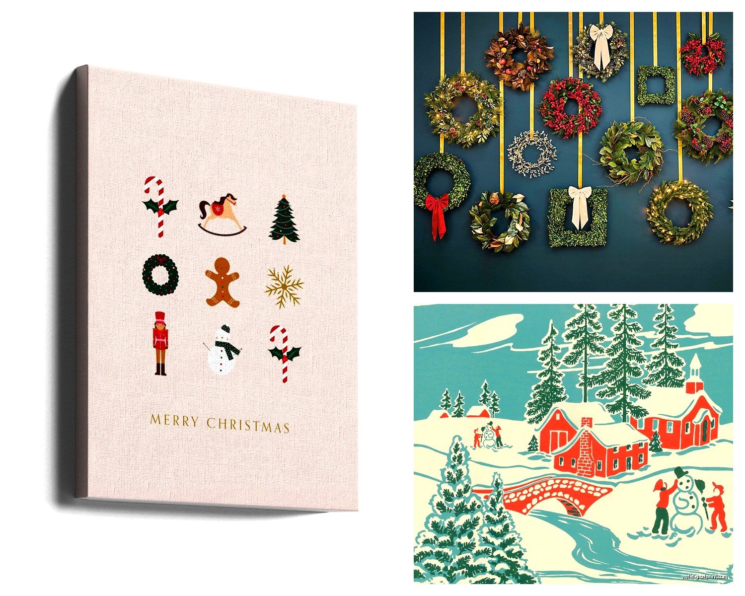
Etsy is still my go-to for unique digital downloads. You can buy the file, print it at your local print shop or online, and frame it yourself. Way cheaper than buying pre-framed art and you get way more options. Search terms that actually work: “winter botanical print,” “vintage holiday poster,” “minimalist Christmas art,” “moody winter landscape.”
Society6 and Redbubble if you want someone else to handle printing and framing. More expensive but convenient. Quality varies by artist so check reviews.
Minted for really high-quality prints and interesting framing options. Their holiday collection is actually curated pretty well. Not cheap though – you’re looking at $150+ for a large framed print.
Target and HomeGoods for affordable pre-framed options. You gotta go in person though because their online inventory doesn’t show everything. I’ve found some surprisingly good stuff at both, especially Target’s Threshold line.
Local art fairs and markets in November and December often have original pieces. I got this beautiful watercolor of winter branches from a local artist for $85 and it’s probably my favorite piece.
The Temporary Installation Problem
Wait I forgot to mention – if you’re renting or don’t want to put more holes in your walls, there are actually good solutions now.
Command strips work for lightweight prints and canvases. I use the large picture hanging strips (the ones rated for 16 pounds) and they genuinely hold. Just make sure your wall is clean before you stick them up and follow the directions exactly about pressing for 30 seconds or whatever.
Picture rails or ledges let you just prop art up and swap it out easily. IKEA’s MOSSLANDA ledges are like $7 each and you can create a whole gallery wall situation where you just lean prints against the wall. Looks intentional and casual at the same time.
Clipboards or pant hangers from IKEA attached to existing hooks or nails. Sounds weird but looks good – you clip your print to the hanger and hang it up. Very easy to swap.
Layering With Your Regular Art
This is something I started doing in my own place that works really well – don’t take down ALL your regular art. Instead, add holiday pieces around it or layer smaller prints in front of larger existing pieces on ledges or mantels.
Like I have a large abstract painting above my console table that stays up year-round. During holidays, I put a small winter botanical print on an easel on the console table itself, and suddenly the whole vignette feels seasonal without me touching the main art piece.
DIY Options That Don’t Look DIY
Okay so if you’re crafty at all or just want to save money, here are things that actually look good:
Printable art – Buy a digital file, print at Staples or FedEx on nice cardstock or photo paper, frame it. I do this constantly. A 16×20 print costs like $8 at Staples if you use a coupon.
Wrapping paper art – I know this sounds Pinterest-y but hear me out. Rifle Paper Co. and some other brands make gorgeous holiday wrapping paper that’s basically wall art. Frame a sheet of it and it looks like an expensive print. I’ve done this in client spaces and people always ask where I got the “print.”
Book page art – Take pages from old holiday books or sheet music, arrange them in a grid, frame them. Creates this vintage collected look.
Paint sample cards – Okay this one’s more conceptual but you can arrange paint chips in ombre holiday colors and frame them as abstract art. Works really well in modern spaces.
Storage Between Seasons
Nobody talks about this enough but storage is half the battle. You can’t just shove everything in a closet and expect it to survive until next year.
I use those clear plastic bins with labels. Each bin has tissue paper between prints to prevent scratching. Framed pieces go in vertically like records, not stacked flat. Store them somewhere climate controlled – not the garage or attic where temperature swings will warp frames and fade prints.
Take a photo of your storage bin contents with your phone. Next year when you’re trying to remember what you have, you can just look at the photo instead of opening everything. I started doing this two years ago and it’s saved me so much time.
What Not To Bother With
Honestly? Those premade gallery wall sets with like 7 pieces that all match. They always look mass-produced and they’re usually overpriced for what you get. Better to curate your own collection gradually.
Really trendy stuff like those “Merry” letter boards or super specific sayings. They date quickly and you’ll be tired of them by next year. If you want text art, go for something classic or vintage-inspired.
Anything fabric-based that you’re supposed to hang with tacks or tape. It always ends up looking wrinkly and sad. If you want fabric, stretch it over a canvas frame properly.
Super expensive “investment” holiday art unless you have a dedicated holiday room or something. It’s gonna be in storage 10 months a year – probably not worth $500.
Making It Feel Cohesive
The thing that makes holiday art look intentional versus random is repetition. Pick a few elements and repeat them across your pieces:
Same frame color and style throughout your space. All black frames or all natural wood or all white – whatever works with your normal decor.
Consistent color palette across all your holiday art. If you’re doing navy and silver in the living room, carry that into the hallway and bedroom too.
Similar artistic style. Don’t mix ultra-modern geometric prints with vintage Victorian illustrations. Pick a vibe – modern and minimalist, rustic and natural, vintage and collected, whatever – and stick with it.
My own space leans toward moody and natural, so all my holiday art is winter landscapes, botanical illustrations, and vintage forest scenes in blacks, deep greens, and natural wood frames. It feels like a collection even though I bought pieces over several years from different sources.
Quick Wins For This Year
If you’re starting from scratch or just want some immediate impact, here’s what I’d do:
Get three matching frames in whatever size works for your main wall space. Buy three coordinating digital prints from Etsy for like $20 total. Print them at Staples. Hang them in a row or triangle formation. Done. You’ve created a holiday gallery wall for under $60.
That’s honestly all you need to make your space feel festive without going overboard or breaking the bank. You can always add more next year, but starting simple means you’ll actually use what you buy instead of it becoming storage clutter.
Also you can totally mix holiday art with your regular winter decor – pinecones, candles, greenery, whatever. The art doesn’t have to do all the heavy lifting. Sometimes one really good piece plus some candles and a garland is all you need.
