Wall Art Guide, Wall Art Tutoriels
Bourbon Wall Art: Whiskey Bar Man Cave Spirits Decor
Jul
So I’ve been setting up bourbon-themed spaces for clients for like three years now and honestly it’s become this whole thing where everyone wants that whiskey bar aesthetic but nobody knows where to start with the wall art part. Let me just dump everything I know because I literally just finished a man cave project last week and it’s still fresh in my head.
The Basic Categories You’re Gonna See
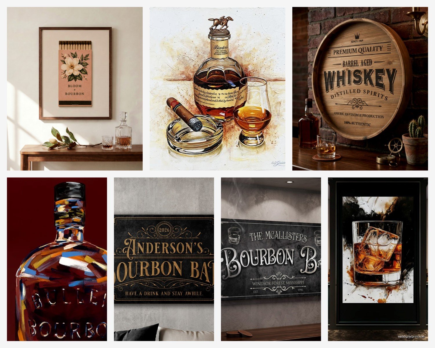
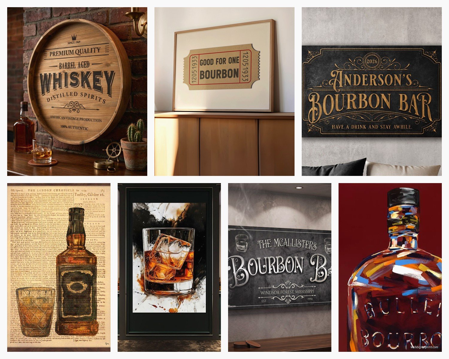
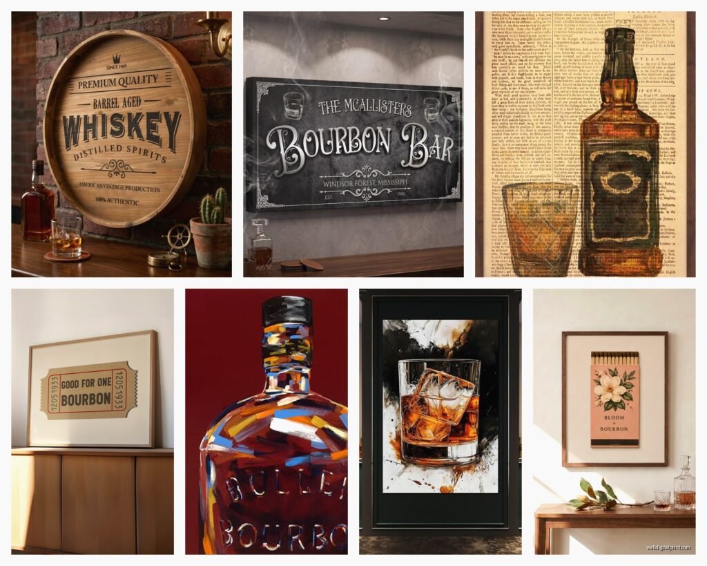
Okay so bourbon wall art basically falls into a few camps and you gotta figure out which vibe you’re going for before you start buying random stuff. There’s the vintage advertisement route—think old Buffalo Trace or Jim Beam ads from the 40s and 50s. Then there’s the modern minimalist stuff with like whiskey glass silhouettes or barrel illustrations. And then there’s what I call the “educational decorative” pieces that show the bourbon making process or maps of the Kentucky bourbon trail.
I personally think mixing categories looks way better than going all-in on one style but that’s just me. My client Steve wanted ONLY vintage ads and honestly it looked like a Cracker Barrel exploded in his basement but hey, he loved it.
Size and Scale Actually Matters Here
This is gonna sound obvious but I see people mess this up constantly. If you’re doing a whole wall behind your bar cart or liquor shelf, you need at least one piece that’s minimum 24×36 inches. I learned this the hard way in my own house when I bought three small 8×10 prints and they just looked like postage stamps floating on this massive wall.
The formula that works for me is usually:
- One large statement piece (24×36 or bigger) as your anchor
- Two to four medium pieces (16×20 or 18×24) to support it
- Maybe some small accent pieces if you’re doing a gallery wall situation
But if you’re just filling space above a small bar cabinet, one good 16×20 might be perfect. I did a lawyer’s office last month where we just put a single framed bourbon barrel illustration above his credenza and it was chef’s kiss.
Canvas vs Framed Prints vs Metal Signs
Okay this is where personal preference really kicks in. Canvas prints are super popular right now because they’re lightweight and you don’t need to worry about framing. I use them a lot for clients who are renting or might move soon. The wrapped edge thing means no frame needed which keeps costs down.
Metal signs give you that authentic distressed look if you’re going for vintage vibes. They work amazing in actual man caves or garage bars where you want that rustic industrial feel. Fair warning though—the cheap ones from Amazon can look really plasticky. I found this out when my dog knocked one off the wall and it literally bent like aluminum foil.
Framed prints are my go-to when the space is a little more upscale. Like if you’re doing a home library with a bar cart situation, a nice wood frame with matting just elevates everything. I usually hit up local frame shops during their sales or honestly just use Framebridge online because I’m lazy and they do good work.
Where to Actually Buy This Stuff
Wait I forgot to mention—Etsy is gonna be your best friend here. There are SO many artists doing custom bourbon prints and the quality is usually way better than the mass-produced stuff. I have like four sellers I go back to constantly.
For vintage reproduction posters, AllPosters and Zazzle have decent selections but you gotta wade through a lot of garbage. I usually search specifically for “bourbon vintage advertisement” or “whiskey barrel patent print” to narrow it down.
If you want actual vintage stuff, eBay and estate sales are where it’s at. I found an original 1960s Wild Turkey ad at an estate sale for thirty bucks and it’s probably my favorite piece I own. Just be prepared to get it professionally cleaned and framed which can double or triple your cost.
Amazon has a ton of options obviously but the quality is hit or miss. I only buy from there if I can see actual customer photos in the reviews because the product images lie constantly.
The Stuff That Actually Looks Good
Okay so based on what I’ve installed in probably twenty different spaces now, here’s what consistently gets compliments:
Barrel and barrel-making illustrations – There’s something about the technical drawings of bourbon barrels that just works. They’re masculine without being too aggressive, they’re interesting to look at, and they tie directly into the theme without being too literal.
Kentucky bourbon trail maps – These are great conversation starters and they’re educational which somehow makes them feel more sophisticated than just slapping up a Maker’s Mark ad.
Patent prints – Like the original patent drawings for whiskey stills or barrel designs. These look expensive even when they’re not and they work in modern or traditional spaces.
Vintage advertisement reproductions – But here’s the key: go for the ones with good graphic design and color palettes that match your space. Not every vintage ad is created equal and some of them are honestly just ugly.
Color Coordination Because It Actually Matters
This is where people get tripped up. You can’t just buy bourbon art without thinking about your existing colors. Most bourbon imagery is gonna be heavy on browns, ambers, blacks, and creams. If your space has a lot of cool grays or blues, you might want to look for pieces that incorporate those tones or you’re gonna have a weird clash happening.
I did a media room last year where the guy had this whole navy and charcoal gray thing going and we found these bourbon prints that had dark blue backgrounds instead of the typical brown. Game changer. They’re harder to find but they exist.
The Gallery Wall Approach
Okay so funny story—I used to hate gallery walls because they seemed fussy but they’re actually perfect for bourbon themes if you do them right. The trick is to keep a consistent color scheme in the frames even if the art styles vary.
Here’s my lazy but effective method:
- Buy all black frames or all wood frames, don’t mix
- Lay everything out on the floor first (I cannot stress this enough)
- Take a photo of your floor layout
- Use that as your guide when hanging
- Keep spacing consistent—I do 2-3 inches between frames
I usually mix vintage ads with barrel illustrations and maybe one or two whiskey glass photos. The variety keeps it interesting but the unified frames make it look intentional instead of chaotic.
DIY Options That Don’t Look DIY
If you’re on a budget or just feeling crafty, there’s some stuff you can do yourself that actually turns out decent. I printed some high-res bourbon label images from the Library of Congress website (they have tons of old alcohol labels in public domain) and had them printed at FedEx on nice paper. With a good frame they look legit.
You can also make your own using:
- Old bourbon bottles as 3D wall art (mount them on wood plaques)
- Framed cocktail recipe cards—I write these out in nice calligraphy or print them in vintage fonts
- Cork displays from your favorite bottles arranged in shadow boxes
- Barrel stave art which you can buy the staves online and arrange them yourself
The cork thing is kinda cool actually because it’s personal to the bottles you’ve actually enjoyed. I did this for my brother’s birthday and he still has it up two years later.
Lighting Your Art Because Dark Spaces Are Common Here
Most man caves and bar areas don’t have great natural light which means your art can just disappear into the wall if you’re not careful. I almost always add some kind of lighting element.
Picture lights are the obvious choice but they can look too formal sometimes. I’ve had good luck with LED strip lights behind larger canvas pieces for a subtle glow effect. Or if you’re doing shelving near your art, add some puck lights that illuminate both the bottles and the wall art.
There’s this one client who installed amber-tinted Edison bulbs in wall sconces near his bourbon art and it gave everything this warm glow that made the whole space feel like an actual speakeasy. Might be overkill for most people but it looked amazing.
What Doesn’t Work (Lessons from My Mistakes)
Gonna save you some trouble here. Neon signs can work but they often compete with your art instead of complementing it. Unless you’re going full dive bar aesthetic, pick one or the other.
Those massive wood signs with bourbon quotes carved into them—everyone wants these but they’re usually too big and too rustic for most spaces. They need like a cabin or a dedicated bar room to work properly.
Anything too cutesy or jokey usually ages poorly. The “I like my whiskey neat and my women dirty” type stuff might seem funny when you’re shopping but it gets old fast and makes your space feel less sophisticated.
Mixing Bourbon Art with Other Decor
Your bourbon wall art shouldn’t exist in a vacuum. I usually pair it with:
- Dark wood shelving or furniture
- Leather elements (chairs, coasters, whatever)
- Brass or copper accents
- Good glassware displayed nearby
- Maybe some books about whiskey or Kentucky
The whole vibe should feel cohesive. Oh and another thing—plants actually work really well with bourbon themes. I know that sounds random but some dark green plants in copper planters near your bar area make everything feel more intentional and designed rather than just “guy who likes whiskey bought some whiskey posters.”
My cat keeps trying to knock over the succulent I have near my bar cart but that’s a separate issue.
Installation Tips Nobody Tells You
Use proper anchors especially for heavier framed pieces or metal signs. I’ve seen too many pieces fall and break because someone just used a nail in drywall. Get yourself some proper picture hanging hooks rated for the weight.
The standard height rule is center of the artwork at 57-60 inches from the floor but honestly in a bar area I go a bit lower, especially if people are gonna be sitting a lot. You want it at eye level when you’re actually using the space.
For gallery walls I use command strips for the smaller lighter pieces because it makes rearranging easy if I hate my first attempt. Which happens more than I’d like to admit.
Anyway that’s basically everything I know about bourbon wall art from actually doing this stuff. The main thing is just make sure whatever you pick actually reflects your taste and not just what you think a whiskey bar is supposed to look like. The best spaces I’ve done are when clients pick pieces that mean something to them personally even if they’re not the most obvious choices.