Wall Art Guide, Wall Art Tutoriels
Beach Wall Art: Coastal Ocean Sand & Sun Photography
Jul
So I’ve been obsessing over beach photography for walls lately and honestly it’s way more complicated than just slapping up a sunset print, which is what I thought like two years ago when I first started curating coastal pieces for my clients.
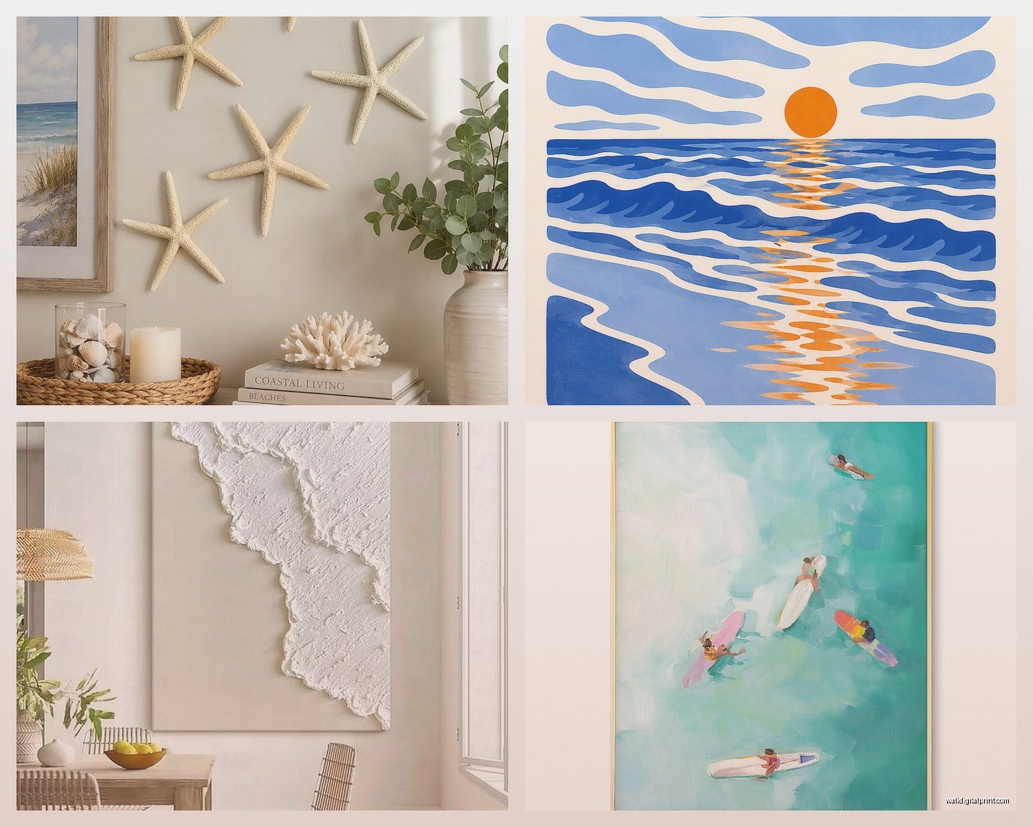
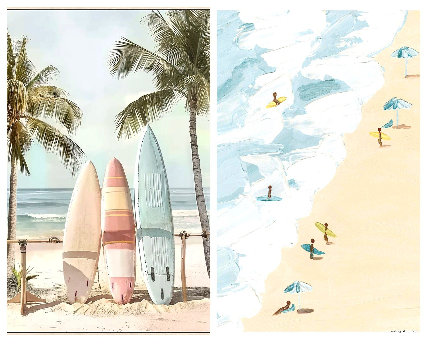
First thing you gotta know is that beach wall art falls into these weird categories that nobody really explains properly. You’ve got your classic sunset shots (which yeah, everyone has but there’s a reason), then there’s the aerial stuff that’s been HUGE the last couple years, abstract water close-ups, and then what I call the “nostalgic beach” vibe with like vintage surfboards and faded beach huts. The trick is figuring out which one actually matches your space because I’ve seen so many people buy a massive crashing wave print and then realize their room feels chaotic.
The Lighting Thing Nobody Tells You About
Okay so this is gonna sound weird but the direction your room faces matters SO much with beach photography. I learned this the hard way when I hung this gorgeous aqua ocean print in a north-facing bedroom and it just looked… gray? Like all that beautiful turquoise just died. North-facing rooms get cool light so you actually want warmer beach tones – think golden hour sand, peachy sunsets, that honey-colored light on dunes.
South-facing rooms can handle literally anything. Those bright white sand prints with the crazy blue water? Perfect. The moody stormy ocean shots? Also great. It’s annoying how much easier south-facing rooms are.
East and west facing you gotta think about when you’re actually IN the room. East gets morning light so if that’s your bedroom, maybe go with softer sunrise vibes rather than intense sunset oranges that’ll look weird in morning light.
Size is Where Everyone Screws Up
I’m gonna be blunt – most people buy beach art that’s way too small. Like you’ve got this massive blank wall and you buy a 16×20 print and wonder why it looks like a postage stamp. My cat literally knocked over a frame that size last week and I barely noticed it was gone for two days.
Here’s my actual formula that I use: measure your wall width, multiply by 0.6, that’s roughly how wide your art should be. So if you have a 10-foot wall (120 inches), you want art that’s around 72 inches wide. That could be one big piece or a gallery wall situation.
For above a couch or bed, the art should be about two-thirds to three-quarters the width of the furniture. I see SO many tiny prints floating above king beds and it just looks lost.
Oh and another thing – if you’re doing a gallery wall with multiple beach shots, the WHOLE arrangement should follow that size rule, not each individual piece. I spent like three hours last month rearranging a client’s gallery wall because she’d followed some Pinterest guide that made no sense for her actual wall dimensions.
Single Statement Piece vs Gallery Wall
Single large pieces work better in modern or minimalist spaces. If your room is already busy with patterns and textures, one big calm ocean photograph can be that breathing room you need. I’m obsessed with those large-scale aerial beach photos right now – like the ones shot from directly above showing people as tiny dots on the sand. They read almost abstract from a distance.
Gallery walls with multiple beach shots work when you want to create a collected, layered look. Mix different perspectives – maybe one aerial shot, one close-up of shells, one horizon line, one detail of beach grass. But keep the color palette consistent or it gets messy fast. All cool tones or all warm tones, not both unless you really know what you’re doing.
The Print Quality Conversation We Need to Have
So here’s where I’m gonna save you money and also tell you where to spend it. Canvas prints are everywhere and they’re fine for certain looks, but they’re honestly overused in beach photography. The texture of canvas can fight with the smooth quality of water and sand. I prefer them for more painterly or vintage beach scenes but not for crisp photography.
Metal prints are incredible for beach shots. The way light reflects off aluminum makes water look luminous and the colors are insane. They’re pricier but worth it for that one statement piece. I have a metal print of tide pools in my hallway and people literally stop to touch it.
Acrylic prints (where the photo is face-mounted to plexiglass) are my secret weapon for modern coastal spaces. Super glossy, incredible depth, very gallery-like. They’re expensive though – like $300+ for a decent size.
Regular framed prints under glass are classic and you can’t go wrong, especially if you’re going for that collected, gallery wall aesthetic. Just make sure you’re getting actual photo paper prints, not just inkjet on regular paper which will fade fast in bright rooms.
Framing Makes or Breaks the Whole Thing
White frames are the obvious choice for beach art and yeah they work great but they can also wash out lighter photographs. If your print is mostly white sand and pale blue water, a white frame might make it disappear into your wall.
Natural wood frames in light oak or whitewashed finishes are *chef’s kiss* for beach photography. They add warmth without competing with the image. I use these probably 60% of the time.
Black frames can be stunning with the right beach photo – especially black and white photography or those dramatic stormy ocean shots. Creates nice contrast.
Wait I forgot to mention – the mat matters more than you think. A wider mat (like 3-4 inches) makes even a smaller print feel more substantial and gallery-quality. White mats are safe, but I’ve been using sand-colored and even soft gray mats lately with really nice results.
This Might Sound Random But Consider Floating Frames
Floating frames where you can see the edges of the print are really good for beach photography because they add dimension. The photo literally floats in the frame with space around it. Works especially well with thicker art prints or canvas where seeing that edge becomes part of the design.
Color Palette Strategy
Okay so this is where my interior stylist side comes out. You gotta think about what blues and greens you’re bringing in. Caribbean turquoise is completely different from Pacific navy which is different from Mediterranean azure. They don’t all work in every space.
If your room has warm undertones (think beige, cream, tan, gold), go for warmer ocean colors – turquoise, aqua, teal, those tropical blues with green in them. Sunset beaches with pink and orange obviously work here too.
Cool-toned rooms (gray, white, blue-gray, silver) can handle the deeper blues, navy, those crisp Nordic beach vibes with gray sand and steel-blue water.
Neutral rooms are your playground but here’s the thing – you need to decide if the beach art is gonna BE your color or if it needs to match existing colors. I usually recommend letting one really vibrant piece be the color moment in an otherwise neutral space.
Subject Matter Breakdown
Aerial beach photography: This is having such a moment right now. Shot from directly overhead, usually showing the contrast between sand and water, sometimes with people or umbrellas for scale. Very modern, works in contemporary spaces. Can feel cold if it’s your only art though.
Horizon line shots: Where the ocean meets sky, usually minimal, often just two or three bands of color. Super calming, great for bedrooms. Can be boring if you don’t choose one with interesting light or subtle detail.
Wave close-ups: Either the dramatic crashing wave or the peaceful rolling wave. The dramatic ones add energy (maybe too much for a bedroom?), the gentle ones are soothing. I have a close-up of a wave curl in my office and I find myself just staring at it when I’m stressed.
Beach details: Shells, sea glass, footprints, beach grass, driftwood. These are great for smaller spaces or for mixing into gallery walls. They add texture and interest without overwhelming.
Vintage beach scenes: Old beach huts, weathered surfboards, retro beach umbrellas, faded beach town architecture. Perfect if you’re going for that collected, nostalgic vibe. Can look dated if not styled carefully though.
Golden hour beach: That warm glowy light on sand and water. Probably the most universally flattering option? Adds warmth to any space, feels expensive, very hard to mess up.
Styling Around Your Beach Photography
This is important because the art doesn’t exist in a vacuum. If you go heavy on beach photography, you gotta be careful with the rest of your coastal decor or it becomes theme-park level. Like you don’t need the art AND the driftwood coffee table AND the rope accents AND the anchor throw pillows. Pick your lane.
I usually do prominent beach photography with more subtle coastal nods elsewhere – maybe linen textures, natural fiber rugs, white or sand-colored furniture. Let the art be the obvious beach moment.
Oh and plants actually look amazing with beach photography. Not palm trees (too literal), but modern sculptural plants or simple greenery creates a nice balance with all that blue and beige.
Where to Actually Buy This Stuff
Etsy has tons of photographers selling digital downloads which is the most affordable option – you download the file and print it yourself at a local print shop or online. Quality varies wildly though so check reviews.
Society6 and Redbubble let you buy prints directly from artists in various sizes and formats. Mid-range pricing, decent quality, huge selection.
Minted and Artfully Walls have more curated selections, better print quality, pricier but worth it for important pieces.
Local art fairs and coastal galleries if you want original photography – obviously most expensive but you get a unique piece and support artists directly.
Gray Malin is like the famous name in beach aerial photography but his stuff is $$$$. Beautiful though if you’ve got the budget.
The Mistakes I See All the Time
Hanging beach art too high – the center of the art should be at eye level which is around 57-60 inches from the floor. Not the top of the frame, the CENTER.
Mixing too many different beach locations/vibes. Like you’ve got California surf culture next to Mediterranean beaches next to tropical Caribbean – pick a cohesive feeling.
Going too literal with everything. The art is ocean, the pillows are anchors, the rug is a ship wheel… it’s too much. Trust me.
Forgetting about scale in relation to ceiling height. If you have high ceilings, you can go bigger with art. Standard 8-foot ceilings need more careful sizing or the room feels bottom-heavy.
Only putting beach art in obvious rooms. I have beach photography in my kitchen and it’s actually perfect? Don’t limit yourself to bedrooms and bathrooms.
Mixing Beach Photography with Other Art
This actually works better than you’d think. Beach photography plays well with:
– Abstract art in similar colors
– Botanical prints (especially coastal plants)
– Black and white photography of any subject
– Minimalist line drawings
– Vintage maps of coastal areas
What doesn’t work: trying to mix it with bold graphic art, busy patterns, or completely different color stories. Keep some visual thread connecting everything.
Look I’m realizing this is getting long but one more thing – think about the mood you actually want. Not all beach photography is calming. Some of it’s energetic and dramatic. Some is nostalgic and romantic. Some is clean and modern. Figure out your actual vibe before you start buying because I’ve seen people buy “beach art” that doesn’t match their goal at all.
The best beach wall art is stuff that makes you feel something specific when you look at it, not just “oh that’s pretty.” Whether it reminds you of a vacation, makes you feel peaceful, or just makes your room feel pulled together – that’s your answer for which one to actually buy.