Wall Art Guide, Wall Art Tutoriels
Whale Wall Art: Ocean Mammal Marine Life Giant Creature
Aug
So I’ve been totally obsessed with whale wall art lately and honestly it started because a client wanted to redo their beach house and I went down this rabbit hole of marine life decor that I can’t seem to climb out of. Let me tell you what I’ve learned because there’s actually way more to this than just slapping a whale picture on your wall.
Size Actually Matters Way More Than You’d Think
Okay so first thing – whale art comes in every size imaginable and picking the wrong one is gonna throw off your entire room. I made this mistake in my own living room last year and had to return a piece because it looked like a postage stamp on my wall. Here’s what actually works:
For over a sofa or bed, you want something that’s at least two-thirds the width of your furniture. So if your couch is 90 inches, you’re looking at 60 inches minimum. I know that sounds huge but trust me. Whales are massive creatures and the art should reflect that scale – otherwise it just looks timid and weird.
Small walls like hallways or bathrooms can handle 16×20 or 24×36 prints. These are perfect for humpback whale portraits or those really detailed tail fluke shots. My powder room has this gorgeous blue whale print that’s only 20×24 and it works because the space is intimate.
Style Options That Don’t All Look The Same
The market is absolutely flooded with whale art and most of it falls into a few categories. Let me break down what I’ve actually seen work in real spaces:
Watercolor and Abstract Styles
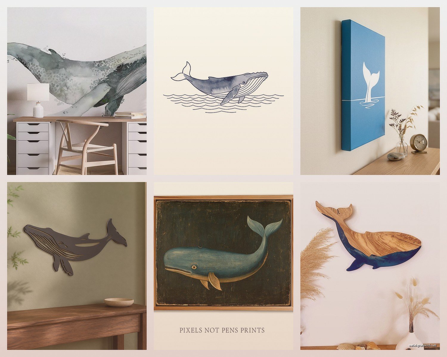
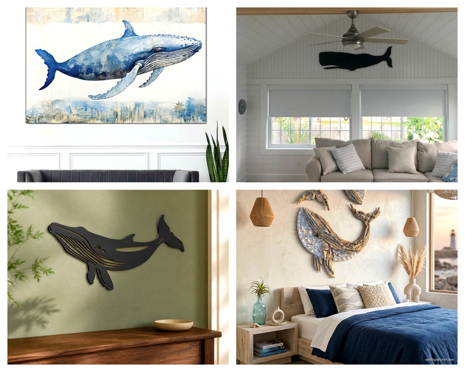
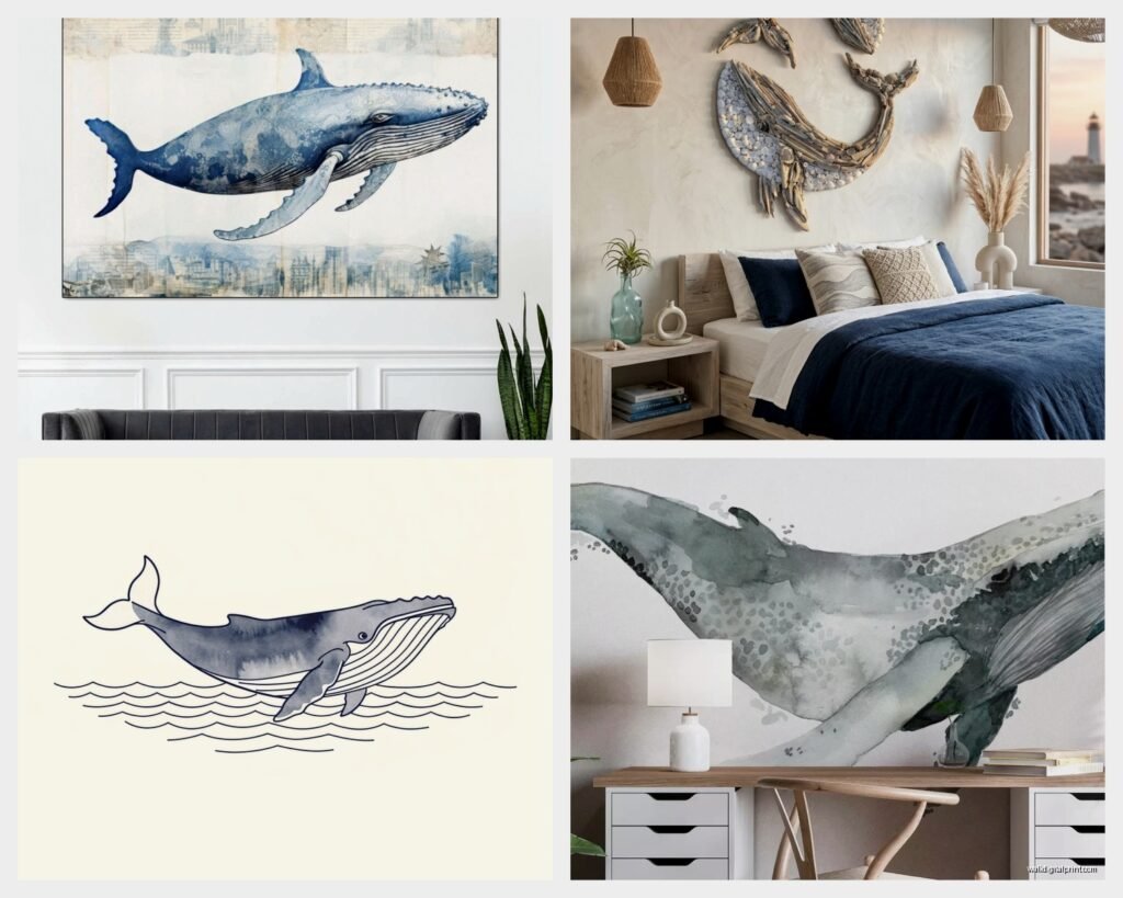
These are everywhere right now. You get those flowing blues and greens with the whale silhouette kind of bleeding into the background. They’re pretty but here’s the thing – they can look really juvenile if you’re not careful. What I’ve found is that the more muted the color palette, the more sophisticated it reads. Look for pieces with navy, slate gray, and cream rather than those bright turquoise and sunshine yellow combos.
I used a watercolor orca piece in a teen’s bedroom last month and it worked because the artist used mostly blacks and grays with just hints of blue. Felt modern instead of kiddie.
Vintage Scientific Illustrations
Oh and another thing – vintage whale charts are having a major moment. You know those old botanical print vibes but with whale anatomy? They’re perfect for that collected, curated look. I have three framed in my office and people always ask where I got them. The trick is to get them professionally framed with wide mats, otherwise they look like you printed something from Wikipedia.
These work great in sets of two or three. Mix different whale species – a blue whale, a narwhal, maybe a beluga. The scientific labels add this intellectual element that balances out the fact that you’re decorating with sea creatures.
Photography Prints
Real whale photography is stunning but it’s hit or miss. The good stuff – actual underwater shots or breaching moments – costs more but looks incredible. Cheap photography prints can look flat and lifeless. I learned this the hard way buying from a random Etsy shop that turned out to be heavily filtered stock photos.
If you’re going the photography route, look for shots with interesting compositions. A whale tail disappearing into dark water. A mom and calf from below with sunlight filtering through. Those aerial shots of whales swimming near the surface are gorgeous too.
Modern Line Art and Minimalist
For contemporary spaces, single-line whale drawings or geometric interpretations work really well. These read as sophisticated and don’t scream “I love the ocean!” quite as loudly. I used a simple black line drawing of a whale in a lawyer’s office and it was perfect – interesting without being distracting.
Material and Medium Choices
Canvas prints are probably the most common and they’re fine but honestly kind of boring at this point? Everyone has canvas prints. What I’ve been doing lately is mixing it up with different materials.
Metal prints have this luminous quality that works beautifully with underwater whale scenes. The colors pop differently and there’s depth to them. They’re more expensive but they look expensive, if that makes sense. Plus they’re durable – I have one in my bathroom and the humidity hasn’t affected it at all.
Wood prints give you this rustic coastal vibe. The wood grain shows through lighter areas of the image which can be really cool with the right design. Works great for those weathered, vintage-looking pieces.
Framed paper prints under glass still look the most refined to me. There’s something about a proper frame with a mat that elevates even a simple print. This is what I’d do for a formal living room or dining room.
Wait I forgot to mention – acrylic prints are also having a moment. They’re basically photos printed and mounted behind thick acrylic glass. Super modern looking, almost like the image is floating. Pricey though.
Color Coordination Without Making It Themed
This is gonna sound weird but the biggest mistake people make with whale art is letting it turn their space into a theme park. You don’t want your living room to feel like an aquarium gift shop.
The key is treating the whale art like any other art – it needs to work with your existing color scheme. If your room is neutrals and whites, look for black and white whale prints or very subtle blues. My living room is mostly grays and creams and I have this incredible gray whale print that’s almost monochromatic. You barely notice it’s a whale at first glance.
For coastal themed rooms (yeah I know I just said avoid themes but there’s a difference between coastal style and aquarium vibes), you can go bolder with blues and teals. Just make sure you’re pulling those colors through in other elements – pillows, throws, maybe a vase.
One trick I use is the 60-30-10 rule. Your wall color is 60%, your furniture and major pieces are 30%, and accent colors including art are 10%. The whale art should pull from that 10% or complement your 30% without introducing entirely new colors.
What Colors Actually Work Together
Navy blue whales work with: cream, white, coral, gold accents, natural wood
Gray whales work with: literally everything, they’re your safe bet
Teal/turquoise whales work with: white, sandy beige, coral, yellow (carefully)
Black and white whales work with: any color scheme, they’re neutral
Placement Ideas Beyond The Obvious
Everyone thinks living room or bedroom but there are so many other spots where whale art actually makes more sense.
Bathrooms are perfect because of the water connection. A single framed whale print above the toilet or a small canvas on a shelf adds personality without overwhelming a small space. My guest bathroom has a tiny narwhal print and it’s a conversation starter every time.
Home offices need art that’s interesting but not distracting. Whale art hits that sweet spot – it’s calming (ocean vibes) but engaging (massive creature). I have that vintage whale chart situation going on in mine and it works great for Zoom backgrounds too.
Nurseries and kids rooms are obvious choices but again, avoid the super cartoony stuff unless you want to redecorate in three years. Stick with more artistic interpretations that can grow with the kid.
Hallways and staircases are great for gallery walls of smaller whale prints. Mix sizes and frame styles but keep the subject matter consistent. Three to five pieces in varying sizes creates visual interest in those awkward narrow spaces.
Mixing Whale Art With Other Ocean Stuff
Okay so funny story – I had a client who wanted whale art, sea turtle art, dolphin art, coral prints, and shell collections all in one room. It was… a lot. Here’s how to mix marine life without going overboard (pun intended I guess):
Stick to one or two main subjects. Whales plus one other element like coral or waves. Not whales AND turtles AND dolphins AND octopi.
Vary the style. If you have a realistic whale photo, pair it with abstract wave art. Don’t do all realistic or all abstract.
Use odd numbers. Three pieces or five pieces, not four. This is basic design stuff but people forget.
I actually think whale art pairs beautifully with landscape photography of coastlines or abstract ocean paintings. The whale becomes a focal point but it’s supported by complementary pieces that don’t compete.
Where To Actually Buy Quality Pieces
I’ve bought from everywhere at this point and here’s my honest take:
Etsy has tons of options but quality varies wildly. Read reviews carefully and check if they’re selling original work or just reselling stock images. I’ve found some incredible independent artists there but also received some disappointing prints. Look for shops that show the actual print quality and framing options.
Society6 and Redbubble are print-on-demand sites with tons of whale designs. The quality is consistent but it’s not amazing – fine for casual spaces but not for your formal living room. Good for trying out a design before committing to something expensive.
Local art fairs and coastal galleries obviously have great options if you live near the ocean. I’ve found some of my favorite pieces at small galleries in beach towns. They’re more expensive but they’re often original or limited editions.
Frame stores like Michael’s or Hobby Lobby have decent selection of pre-framed whale prints if you’re on a budget. Wait for their sales though – they mark stuff up like crazy and then do 50% off constantly.
For high-end pieces, check out specialized ocean conservation organizations. They often sell art where proceeds benefit whale research or protection. The quality is usually excellent and you’re supporting a good cause.
DIY and Budget Options That Don’t Look Cheap
If you’re broke or just don’t wanna spend $300 on wall art (valid), there are ways to make it work.
Print your own from high-resolution images. You can find free vintage whale illustrations online – places like the Biodiversity Heritage Library have tons. Download, print at a local print shop on quality paper, frame it nicely. Boom, expensive-looking art for like $40.
Fabric wall hangings are cheaper than framed art and actually pretty cool looking. You can find whale tapestries or fabric prints and hang them with a simple rod. Very boho-coastal.
This is gonna sound weird but I’ve used wallpaper samples as art. Some companies make these gorgeous whale-patterned wallpapers and you can order samples that are basically the perfect size for framing. Frame it in a deep shadow box and it looks intentional and textured.
My cat knocked over a expensive whale print last year and the glass shattered, so I remounted it in a cheap IKEA frame with a custom mat I cut myself. Looked just as good and cost me like $15 to fix.
The Frame Makes a Huge Difference
Seriously cannot stress this enough – a $20 print in a $100 frame looks better than a $100 print in a $20 frame. Invest in the framing even if you skimp on the print itself.
For whale art specifically, I like:
– Natural wood frames for casual coastal vibes
– Black frames for modern sophisticated looks
– White or cream frames for light airy spaces
– Metal frames for contemporary industrial spaces
Mat size matters too. A wider mat (3-4 inches) makes even a small print look substantial and gallery-worthy.
Mixing Whale Species For Visual Interest
If you’re doing multiple whale pieces, think about mixing species. They all have different shapes and personalities visually.
Blue whales are sleek and streamlined – good for modern spaces
Humpback whales are more dynamic, especially breaching shots
Orcas have that bold black and white contrast
Sperm whales have interesting blocky heads that photograph well
Narwhals add a whimsical element with those tusks
Beluga whales are pale and ghostly – very striking
I did a hallway gallery with five different whale species, all in black and white photography, all in identical frames. It looked like a natural history museum in the best way.
Seasonal and Lighting Considerations
Something nobody tells you – whale art can look completely different depending on your lighting. That gorgeous blue watercolor whale might look muddy in a north-facing room with limited natural light.
For darker rooms, go with lighter colored pieces or ones with high contrast. Black and white works great. Avoid pieces that are all dark blues and greens.
Well-lit rooms can handle darker, moodier whale art. Those deep ocean scenes with dramatic lighting look incredible with good natural light or proper picture lighting.
I actually have different whale prints I rotate seasonally which sounds extra but whatever. Lighter, brighter pieces in summer. Moodier, darker pieces in winter. My husband thinks I’m nuts but it keeps things interesting.
What Doesn’t Work
Okay real talk – some whale art is just bad and you should avoid it.
Those 3D metallic wall sculptures of whales. They always look cheap and dated. Just don’t.
Overly cartoonish whales in adult spaces unless you’re going for full quirky maximalist vibes. And even then, probably not.
Whale art with inspirational quotes on it. “Make waves” or “Go with the flow” or whatever. Just no. Keep the text separate from the art.
String art whales. I know they’re trendy but they read as craft project, not art.
Giant wall decals unless it’s a kid’s room. They’re hard to apply perfectly and usually look amateur.
Look, whale wall art can be absolutely stunning when done right. It brings this sense of calm and wonder to a space without being too literal about the ocean theme. Just treat it like you would any other art purchase – consider your space, your style, and your budget. And maybe don’t buy six whale pieces for one room like my client tried to do unless you’re opening an aquarium.