Wall Art Guide, Wall Art Tutoriels
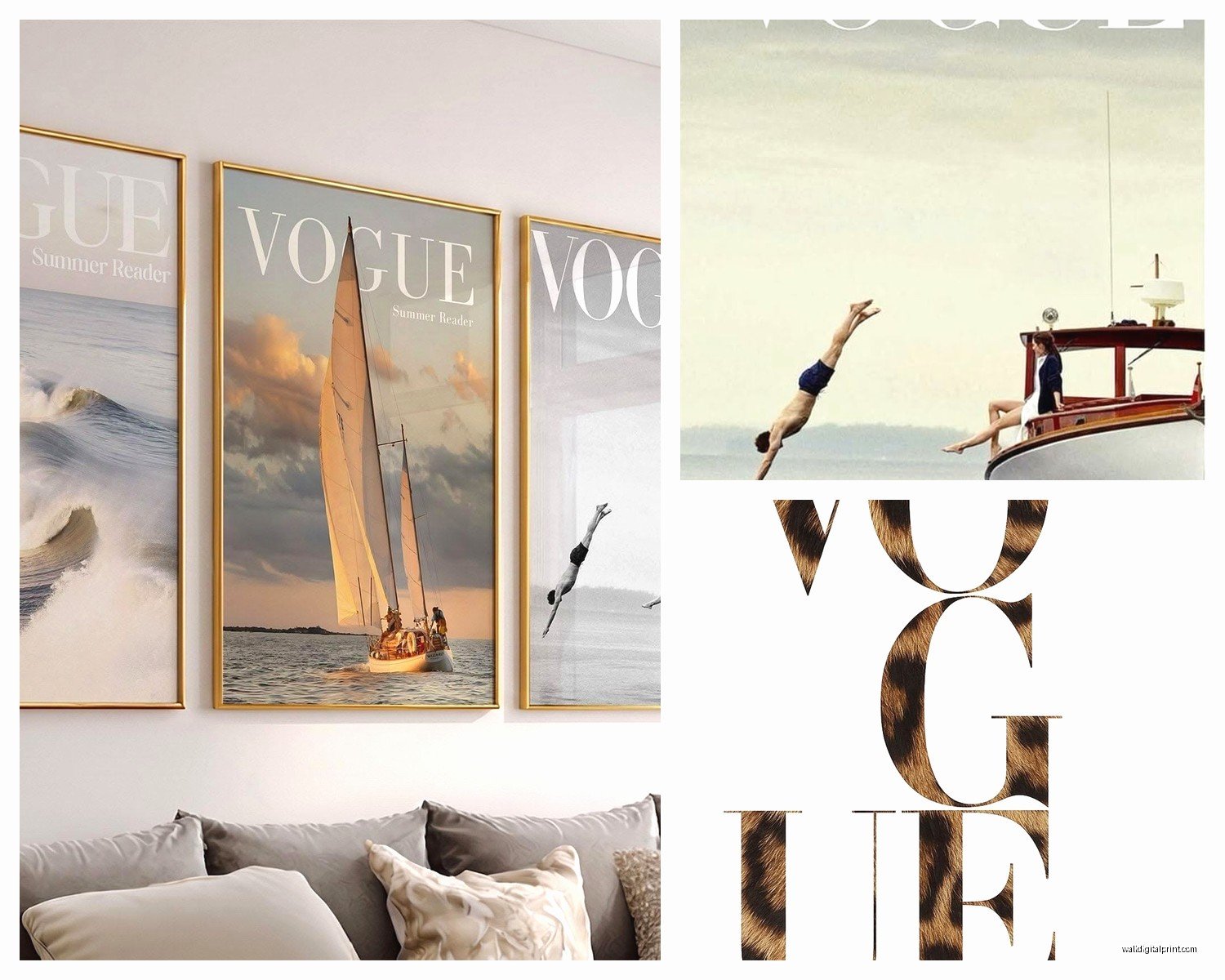
Vogue Wall Art: Fashion Magazine Cover Model Glamour
Aug
So I’ve been obsessing over Vogue wall art lately and honestly it started because a client wanted this whole fashion-forward gallery wall in her dressing room and I fell down this rabbit hole of what actually works versus what just looks good on Pinterest but terrible in real life.
The Different Types You’ll Actually Find
Okay so first thing, there’s like a million options out there. You’ve got actual vintage Vogue covers which are gonna cost you anywhere from $50 to literally thousands depending on the year and condition. Then there’s reproduction prints which is what most people end up buying because let’s be real, not everyone has $800 to drop on a single piece of wall art.
The reproduction prints come in a few categories and this is where it gets confusing. You’ve got officially licensed prints which Condé Nast actually approves and those usually run $100-300 depending on size. Then there’s the Etsy/independent seller prints which are…a gray area legally but they’re everywhere and usually $20-60. I’m not gonna tell you what to do but I will say the quality varies wildly with those.
Framed vs Unframed
This is huge and nobody talks about it enough. Unframed prints are cheaper obviously but then you gotta find the right frame and mat it properly and suddenly you’ve spent just as much or more. I learned this the hard way when I bought five unframed prints thinking I’d save money and then spent three weekends driving to different frame shops because the standard sizes didn’t match.
Here’s what I do now – if the print is a standard size like 16×20 or 18×24, buy it unframed and get frames from IKEA or even Target. Their Threshold line has surprisingly decent frames. But if it’s a weird size like 13×19 or something custom, just buy it framed or you’re gonna hate your life.
Placement Ideas That Don’t Look Ridiculous
My cat knocked over my coffee while I was working on a mood board for this exact thing last week so I have THOUGHTS that are now coffee-stained but whatever.
Closet or Dressing Area – This is the obvious one but it works so well. A single oversized Vogue cover above a dresser or vanity creates this instant glam moment. I usually go with covers from the 50s or 60s for this because the styling was so dramatic. Think Dovima with the elephants or early Twiggy covers.
Home Office – Okay this is gonna sound weird but Vogue covers in a home office actually make it feel less corporate and more creative agency vibes. I did a grid of six black and white covers in my own office and people always comment on it. The trick is keeping them monochrome so it doesn’t feel too chaotic.
Bedroom – Works great but you gotta be careful it doesn’t feel too teenage-bedroom-poster-y. The way around this is either going really large with one statement piece above the bed, or doing a super curated small gallery wall on a side wall. Don’t do the thing where you tape up like 15 magazine covers in a collage unless you’re actually still in college.
Bathroom – This sounds insane but a Vogue cover in a bathroom is actually chic if you do it right. Get it properly framed with glass and make sure your bathroom has decent ventilation. I’ve had one in my powder room for two years and it’s fine. The humidity thing is overblown if you’re not hanging it directly above the shower.
The Gallery Wall Formula
If you’re doing multiple pieces, here’s what actually works after I’ve done probably 30+ fashion gallery walls:
Start with one anchor piece that’s larger than the rest. For Vogue covers this is usually 24×36 or bigger. Then surround it with smaller pieces in varying sizes but keep the frames consistent. Either all black, all white, or all natural wood. Mixing frame colors with fashion prints looks messy not eclectic.
Space them 2-3 inches apart. Closer than that feels cramped, farther apart feels disconnected. And please use a level and measure things properly. I know it’s tedious but eyeballing it never works no matter how many times you think “eh that looks straight.”
Color Coordination Stuff
This is where people mess up the most. You can’t just buy random Vogue covers because you like them and expect them to work together. Well you can, but it’ll look chaotic.
Pick a color story first. Either go full black and white which is the easiest and most classic, or choose covers that share a dominant color. Like all covers with red elements, or all covers with blue backgrounds. I recently did a client’s entryway with all Vogue covers that had pink and red tones and it was *chef’s kiss*.
Or go by era which gives you automatic cohesion. All 1950s covers have a similar illustration style and color palette. All 1990s covers have that supermodel energy and similar photography aesthetics.
Where to Actually Buy This Stuff
For Vintage Originals:
eBay is still the best place honestly. Search “vintage Vogue magazine” with specific years if you want something particular. Check the condition carefully in photos – you want minimal yellowing and no tears. I bought a 1965 Veruschka cover for $85 last month that’s in perfect condition.
Estate sales and flea markets can be goldmines but it’s hit or miss. I’ve found amazing ones for $5 and I’ve also spent entire Saturdays finding nothing.
For Reproduction Prints:
Condé Nast has an official store but it’s pricey. Art.com and AllPosters have licensed versions that are decent quality. For Etsy, read the reviews carefully and look at buyer photos not just the listing photos. Some sellers are printing on cheap paper that’ll fade in six months.
There’s also this site called King & McGaw that I discovered recently and their quality is really good, like proper art print quality on heavy paper stock.
Sizing Guidelines Because This Matters More Than You Think
For above a dresser or console: 24×36 or 20×30 works well. The art should be roughly 2/3 the width of the furniture below it.
For a gallery wall: Mix sizes but I usually do one large (24×36), two medium (16×20 or 18×24), and three to four small (11×14 or 8×10). Odd numbers look better than even.
For above a bed: Go big or go home. Either one massive piece that’s at least 40 inches wide, or a diptych/triptych situation. Those tiny pieces above beds always look like an afterthought.
The Matting Debate
White mats make everything look more polished and gallery-like. But they also add cost and make the image smaller within the frame. For Vogue covers I usually skip the mat if the print is already bordered or if I’m doing a tight gallery wall where the frames touch. With mats if I want more breathing room and a formal look.
Black mats can look incredible with black and white photography but they make colors pop differently – test this before you commit to matting 10 prints in black.
Lighting Makes or Breaks This
You need proper lighting or your expensive art just looks like dark rectangles on the wall. Picture lights are the gold standard but they’re expensive and require wiring. I use these battery-operated LED picture lights from Amazon that are like $25 each and they work surprisingly well.
Or if you have track lighting or can add some, aim spotlights at the wall. The art should be brighter than the surrounding wall. This sounds obvious but so many people hang art and then wonder why it doesn’t look as good as it did in the store.
Natural light is tricky because it’ll fade prints over time. UV-protective glass helps but it’s pricey. If your art is in direct sunlight more than a few hours a day, either accept it’ll fade eventually or move it.
My Favorite Specific Covers to Look For
Okay so if you’re just starting and don’t know which covers to even search for, these are the ones I come back to over and over:
The 1950s illustration covers – any of them really. They have this graphic quality that reads as art not just magazine covers.
Twiggy’s first Vogue cover from 1967. Iconic and the colors still look modern.
Kate Moss by Corinne Day from the 90s grunge era. Black and white, super editorial.
Any cover photographed by Irving Penn or Richard Avedon if you can find them. The photography is just *different*.
The September issues usually have the best covers because they put more budget into them, so if you’re looking at recent years, start there.
The Installation Part Nobody Wants to Deal With
Use proper picture hanging hardware please. Those adhesive strips are fine for lightweight unframed prints but anything in a real frame needs a nail or screw. Command strips have failed me enough times that I don’t trust them for anything I actually care about.
For gallery walls, cut out paper templates of your frames first and tape them to the wall. Rearrange until it looks right, then mark where the nails go. This saves you from 47 unnecessary holes in your wall, ask me how I know.
The center of the art should be at eye level which is usually 57-60 inches from the floor. But if you’re tall or short, adjust accordingly. It’s your house.
Grouping Strategies
Grid layout is the easiest – same size frames in a perfect grid. Works best with 4, 6, or 9 pieces. This is what I recommend if you’re nervous about design stuff because it’s almost impossible to mess up.
Salon style is more organic with different sizes arranged tightly together. This takes more planning but looks really collected and intentional when done right.
Linear arrangement is just pieces in a row, either horizontal above a sofa or vertical along a staircase. Simple but effective.
wait I forgot to mention – if you’re renting, there are these picture rails you can install that don’t require tons of holes. You mount the rail near the ceiling and hang art from wires. Very European gallery vibe and you can rearrange easily.
Common Mistakes I See All the Time
Hanging everything too high. Seriously this is the #1 mistake. People put art way above eye level and then wonder why the room feels off.
Mixing too many eras without a plan. A 1950s illustration cover next to a 2010s photographic cover can work but you need something to tie them together like matching frames or a consistent color palette.
Buying prints that are too small for the space. Bigger is almost always better. Multiple small pieces grouped together works, but one tiny piece alone on a big wall looks sad.
Not considering the room’s existing colors. If your room is all neutrals, any Vogue cover will probably work. But if you’ve got a lot of color already happening, you gotta be more selective.
Budget Breakdown Reality Check
Low budget (under $100 total): Hit up Etsy for prints, frame them yourself with IKEA frames. You can do a nice 3-piece gallery wall for around $75 if you’re strategic.
Medium budget ($200-500): Buy better quality reproduction prints, maybe one or two vintage originals for smaller pieces. Get custom framing for your anchor piece and cheaper frames for the supporting pieces.
High budget ($500+): Vintage originals, professional framing with conservation materials, fancy picture lighting. This is where you can really curate something special with rare covers.
I usually tell people to invest in one really good piece rather than five mediocre ones. One amazing framed vintage Vogue cover from the 60s is gonna look better than five cheap prints in flimsy frames.
Anyway that’s basically everything I’ve learned from doing this way too many times. The main thing is just start with what you genuinely love, not what you think you’re supposed to like. If you’re drawn to the 90s supermodel covers, do that. If you want the vintage illustration era, do that. Your wall, your rules.