Wall Art Guide, Wall Art Tutoriels
Angel Wall Art: Cherub Guardian Religious Spiritual Wings
Aug
So I’ve been kinda obsessed with angel wall art lately because three different clients asked about it in the same week and I went down this whole rabbit hole trying to figure out what actually works versus what just looks good on Pinterest but terrible in real life.
The Different Types You’ll Actually Encounter
Okay so first thing – angel art isn’t just one thing. There’s like four main categories and they do NOT work interchangeably even though stores try to tell you they do.
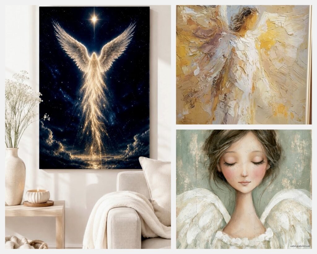
You’ve got your classical cherubs which are those chubby Renaissance baby angels. Then there’s the guardian angel vibe which is more ethereal and protective looking. Religious icons which are super formal and traditional. And then modern interpretations which can go literally anywhere from abstract wings to geometric halos.
The cherub stuff works best in nurseries obviously but also – and this surprised me – in powder rooms. I have no idea why but every time I’ve put a small cherub print in a half bath clients love it. Maybe because it’s whimsical without being childish? My cat knocked over a framed cherub print last month and I had to replace the glass but it made me realize how important the frame choice is with these because the art itself can read really sweet so you need something with substance.
Size and Placement That Actually Makes Sense
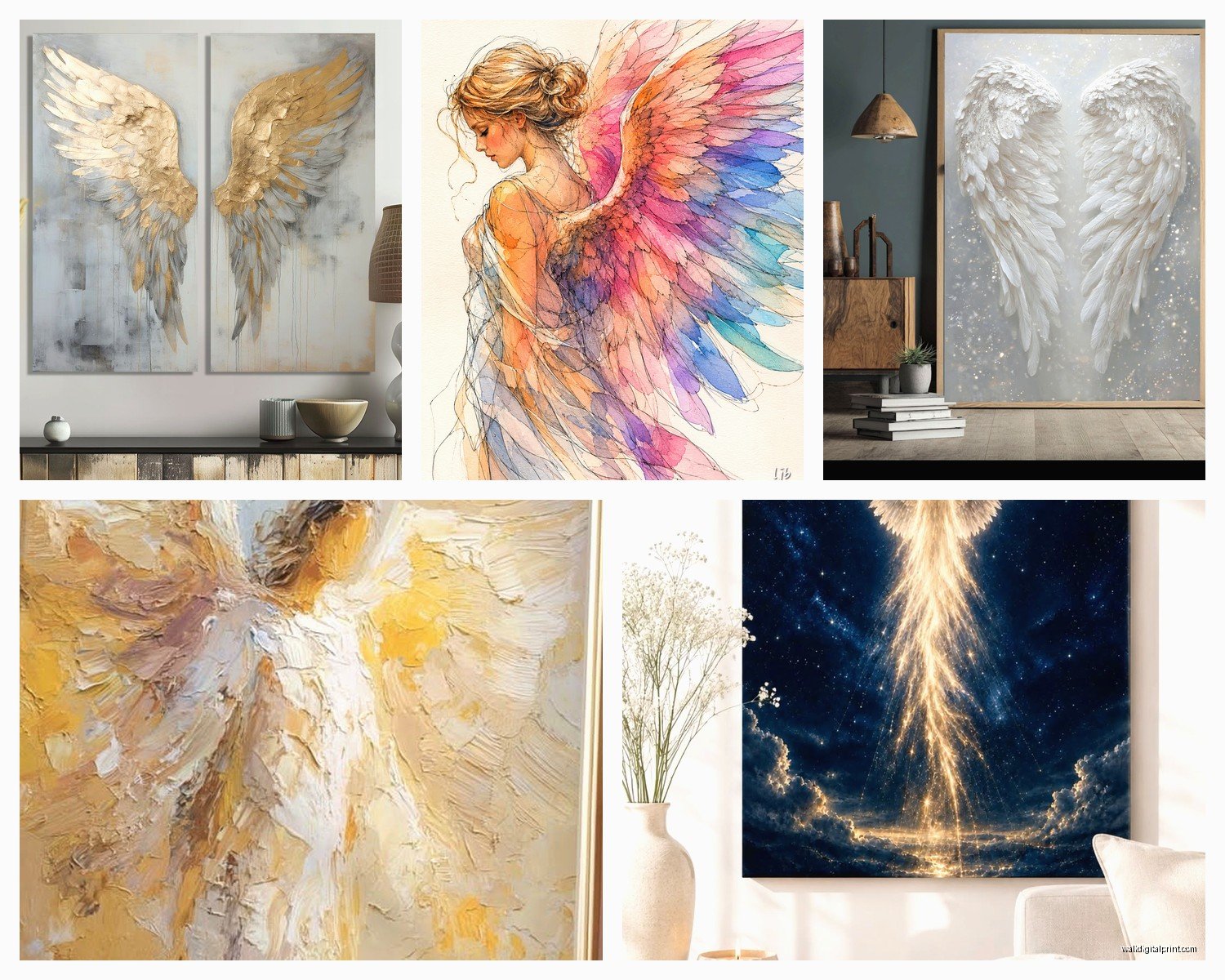
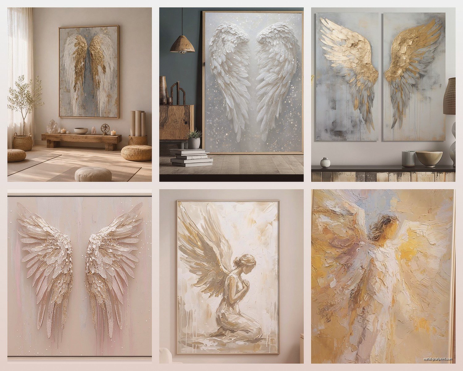
Here’s where everyone messes up. They buy angel art they love and then just…stick it wherever. But wings especially need SPACE. Like if you’re getting one of those dramatic wing pieces you need at least 36 inches of wall width or it looks cramped and loses the whole effect.
For above a bed I usually go 2/3 the width of the headboard. So if you’ve got a queen bed with a 60 inch headboard you want your angel piece to be around 40 inches wide. Could be one piece or a diptych situation.
Guardian angels work really well in hallways which sounds random but think about it – you’re passing through a transitional space and there’s something comforting about that protective imagery. I did a client’s hallway last year with three smaller guardian angel prints in a vertical arrangement and it completely changed how the space felt.
Oh and another thing – don’t put cherubs in dining rooms. I know some people do it but every time I’ve tried it the vibe gets weirdly formal or the angels end up looking like they’re watching you eat which is just uncomfortable.
The Height Thing Everyone Gets Wrong
Standard gallery height is 57 inches to center but with angel art especially wings you gotta adjust. If the piece has upward movement like ascending angels or spread wings you can go up to 60-62 inches center point because your eye naturally follows the upward motion.
I learned this the hard way in my own bedroom actually – hung this gorgeous angel wing piece at standard height and it felt heavy and grounded when the whole point was supposed to be ethereal and lifting.
Materials That Hold Up Versus Looking Cheap
Canvas prints are everywhere for angel art but honestly most of them look terrible after like six months. The whites get dingy and if there’s any gold leaf effect printed on it starts looking orange-ish.
What actually works:
- Framed art prints under glass – keeps the whites crisp and you can control the frame to match your space
- Metal prints for modern angel interpretations – the metallic surface actually enhances wing details
- Wood prints for rustic or farmhouse settings but ONLY if the angel art has enough contrast
- Original paintings if you can swing it because there’s depth you just can’t replicate
I tested a bunch of canvas prints versus framed prints in my studio and the framed ones still looked good after being in direct sunlight for months while the canvas ones faded noticeably.
Resin art is having a moment with angel themes but it’s hit or miss. Saw one at a client’s house that was absolutely stunning with embedded gold leaf and dimensional wings. Saw another one that looked like a craft fair reject. The price doesn’t always indicate quality with resin either which is annoying.
Color Schemes That Don’t Fight Your Room
This is gonna sound weird but white angel art on white walls almost never works unless you have really dramatic lighting. You need contrast or the whole thing disappears.
What I’ve found actually works:
Gold and cream angels on navy or deep green walls – classic and sophisticated without being too religious feeling
Black and white angel photography or sketches on light gray – modern and gallery-like
Soft pastel cherubs on white but you need texture in the frame or mat to create separation
Sepia or aged-looking religious angels on warm beige or taupe – feels collected and intentional
The worst combination I ever saw was full color traditional religious angel art on a bright turquoise wall in someone’s bedroom and it was just…a lot. Like my eyes didn’t know where to go.
Metallics Are Tricky
Gold seems like an obvious choice for angel art right? But it can go tacky SO fast. If you’re doing gold accents in the art you need to repeat that gold somewhere else in the room – picture frame, lamp base, cabinet hardware. Otherwise it floats there looking like you grabbed whatever was on sale.
Silver and white angels work better in modern spaces. I did a client’s office with a silver-leafed angel wing sculpture and it was perfect because the space had chrome fixtures and a glass desk.
Mixing Angel Art With Other Stuff
You don’t have to commit to like a full angel theme unless you really want to. Actually a single angel piece mixed into a gallery wall can be really interesting.
I usually mix angel art with:
- Botanical prints – the organic shapes complement wings nicely
- Abstract art in similar colors – keeps it from feeling too literal
- Vintage mirrors – reflects light and adds dimension
- Black and white photography – grounds the ethereal quality
What doesn’t mix well is angels plus other obvious symbolism. Like angels and crosses and doves all together gets very Sunday school classroom unless that’s specifically the vibe you want for a prayer room or something.
Wait I forgot to mention – if you’re doing a nursery with angel art keep it away from the crib wall. You want babies looking at high contrast stuff not detailed angel faces when they’re trying to develop their vision. Put the angel art on the wall opposite the crib or by the door.
The Religious Versus Decorative Balance
This is super personal but something to think about. Some angel art reads as clearly religious iconography and some is more decorative spiritual vibes. Neither is wrong but you gotta match it to your intent and your household.
Traditional icon-style angels with halos and specific biblical imagery – that’s making a statement about faith
Guardian angels in soft focus protecting children – spiritual but less denominational specific
Wings by themselves – can be totally secular and just about freedom or protection symbolically
Cherubs especially Renaissance style – mostly decorative unless in a religious context
I had a client who wasn’t religious at all but loved the aesthetic of Orthodox icon angels and we made it work by treating them like art history pieces and mixing them with other Renaissance era art. Context is everything.
Practical Shopping Tips From Someone Who’s Bought Too Much
Okay so if you’re actually gonna buy something here’s what I’ve learned:
Check the return policy obsessively especially for online purchases because angel art photographs WEIRD. The colors are always off and you can’t tell scale. I’ve returned probably 40% of angel art I’ve ordered online.
Look for items that show the art in an actual room setting not just the product shot on white background. Even if it’s staged you can get a better sense of scale and color.
Read reviews but ignore the ones that just say “beautiful” or “love it” – look for reviews that mention specific details like quality of print, accuracy of colors, sturdiness of frame.
For vintage or antique angel art check the back of the frame for any damage or repairs. I got burned once on what looked like a perfect vintage cherub print but the backing was completely deteriorated and the print had water damage you couldn’t see from the front.
My dog chewed the corner of a canvas angel print I was gonna use for a client and honestly it made me realize how flimsy most canvas stretcher bars are. If you’re doing canvas make sure it’s got thick stretcher bars – at least 1.5 inches deep or it’ll warp over time.
Lighting Makes or Breaks It
You can have the most gorgeous angel art and completely kill it with bad lighting. Overhead lighting creates shadows in all the wrong places especially with dimensional pieces or anything framed under glass.
What works better:
- Picture lights mounted above the frame – classic and highlights details
- Adjustable track lighting aimed at an angle – prevents glare on glass
- Wall sconces on either side – creates drama and even illumination
- Natural light from the side – but not direct sun which will fade it
I see people put angel art across from windows all the time and then wonder why there’s a glare. You want light coming from the side or from above not bouncing off the glass straight into your eyes.
Specific Recommendations for Different Rooms
Bedroom – guardian angel imagery or soft wing pieces, nothing too detailed or busy because you want calming energy
Nursery – sweet cherubs but keep colors soft, avoid too much gold or metallic that might be overstimulating
Living room – larger statement pieces, can be more dramatic or artistic interpretations
Home office – single wing or abstract angel concepts, keeps it professional but meaningful
Entryway – welcoming guardian angel vibes work great, first thing people see sets the tone
Bathroom – small cherubs or simple wing outlines, anything too detailed gets weird with humidity
The one place I think angel art rarely works is kitchens. Something about the practical cooking space mixed with ethereal angel imagery just doesn’t click for me but maybe someone’s done it successfully.
Small Space Considerations
If you’re working with limited wall space go vertical with your angel art. A tall narrow piece with ascending angels or upward wings draws the eye up and makes ceilings feel higher.
Corners are actually perfect for angel pieces especially wings. You can get creative with diptych or triptych arrangements that wrap around the corner which looks intentional and uses dead space.
okay so that’s basically everything I’ve figured out through way too much trial and error with angel wall art…hopefully something in there helps you figure out what’ll actually work in your space