Wall Art Guide, Wall Art Tutoriels
Alice in Wonderland Wall Art: Lewis Carroll Fantasy Story
Aug
So I’ve been down this Alice in Wonderland rabbit hole lately (pun absolutely intended) and honestly there’s SO much wall art out there for this theme that it can get overwhelming fast. Like I was helping a client last month who wanted a whimsical reading nook and we spent three hours just looking at different Cheshire Cat prints before her kid distracted us with snacks.
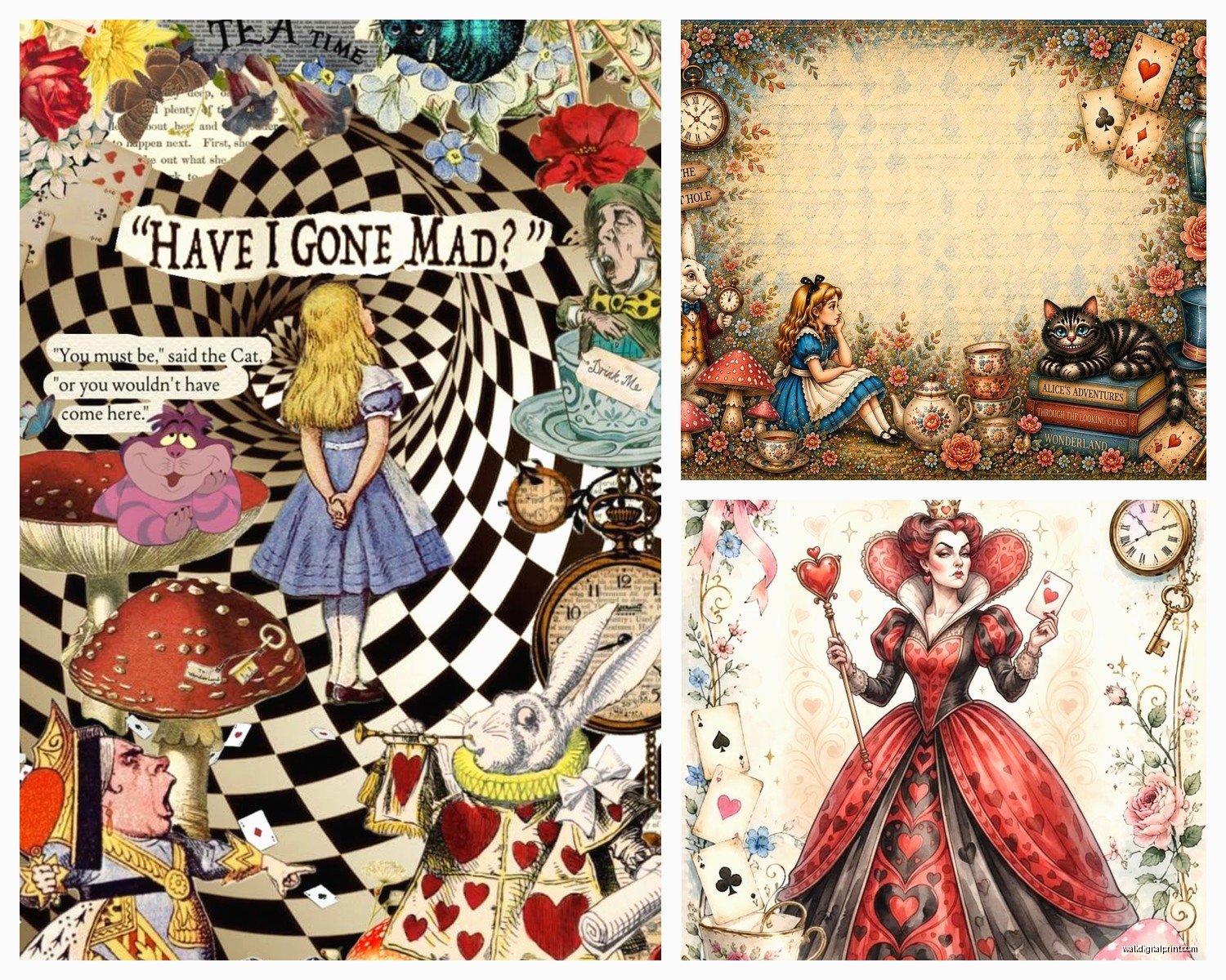
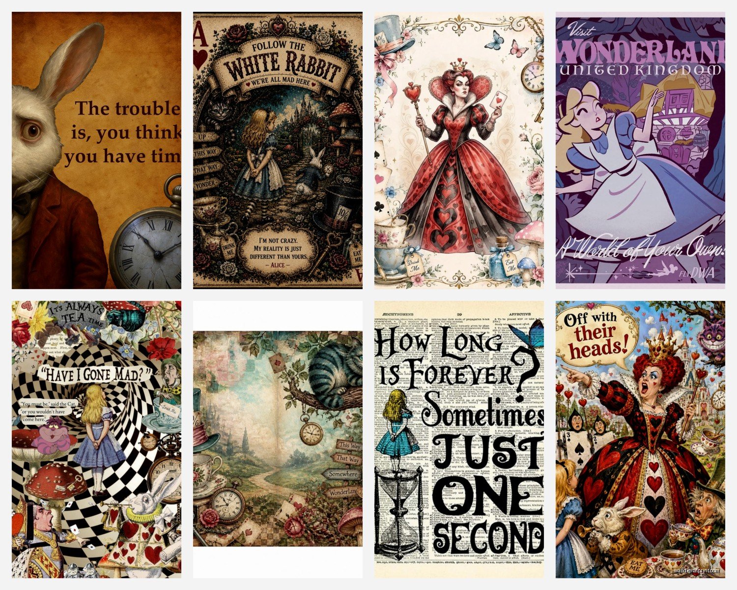
The thing about Alice artwork is you’ve gotta decide what vibe you’re actually going for because there’s basically three camps. You’ve got your vintage Victorian illustration style – the original John Tenniel drawings that are all sepia and delicate and kinda creepy if we’re being honest. Then there’s the Disney-fied colorful stuff which is super cheerful but can read really young if you’re not careful. And then there’s modern interpretations which range from minimalist line drawings to full-on psychedelic trippy art that makes you question if Lewis Carroll was… well, you know.
I usually tell people to start with WHERE you’re hanging this before you even look at art styles. A kid’s room? Go nuts with color. Your home office? Maybe stick with the more sophisticated vintage prints or modern minimalist stuff. I made the mistake once of putting a really vibrant Mad Hatter piece in my own bedroom and it was just too stimulating, couldn’t sleep properly for like a week before I moved it to the hallway.
Vintage Tenniel Illustrations Are Surprisingly Versatile
Okay so the original John Tenniel illustrations from the 1865 book are public domain which means you can find them EVERYWHERE and at every price point. The quality varies wildly though. I’ve ordered prints from Etsy where the seller clearly just downloaded a low-res image and printed it on their home printer – looked terrible, all pixelated and the blacks were more like dark grey.
What you want is either a high-quality digital reproduction or better yet, find actual vintage book plates if you can. There’s this shop… wait let me find the name… anyway there are sellers who frame actual pages from old books and those have this authenticity that you just can’t fake. They’re usually more expensive but the paper quality and the way the ink sits on vintage paper is just different.
For Tenniel prints I love doing gallery walls with multiple smaller illustrations. Like get Alice falling down the rabbit hole, the Cheshire Cat in the tree, the Mad Tea Party, the Queen of Hearts – frame them all identically in simple black frames and arrange them in a grid. Super classic look, works in basically any room that isn’t ultra-modern.
The thing with these vintage illustrations is they’re actually pretty dark and moody which people don’t expect? The original Alice isn’t this bright cheerful story, it’s kinda surreal and unsettling and the art reflects that. So they work really well in spaces with darker wall colors or in rooms where you want that literary, slightly mysterious vibe.
Disney Style For Kids Rooms But Make It Classy
My niece has the Disney version all over her room and look, it’s cute. The bright blues and the blonde Alice and the singing flowers – kids love it. But if you’re gonna go this route as an adult or for a more sophisticated space, you gotta be selective.
What I’ve found works is choosing Disney-inspired art that’s been reinterpreted by artists. Not like, a poster you buy at Target with the movie still on it, but something where an artist has taken the Disney aesthetic and elevated it. There are illustrators on Society6 and Redbubble who do gorgeous watercolor versions of Disney Alice characters that feel way more grown-up.
Or go the opposite direction and get really specific with it – like just a silhouette of Alice falling, or just the Cheshire Cat’s smile on a plain background. Minimalist takes on Disney imagery can be really striking and they don’t scream “child’s room” the way a full character poster does.
Size Matters More Than You Think
This is gonna sound obvious but I see people mess this up constantly – they buy art that’s way too small for their wall. A tiny 8×10 print on a massive empty wall looks sad and lost. You want your Alice art to have presence.
For a standard bedroom wall I usually recommend nothing smaller than 16×20 if it’s a single piece, or if you’re doing a gallery wall, make sure the overall arrangement is at least 3 feet wide. I learned this the hard way when I put up what I thought was a decent-sized Caterpillar print above my desk and it just looked like a postage stamp until I added two more pieces next to it.
On the flip side, in a small powder room or a narrow hallway, smaller prints totally work. I did a client’s guest bathroom with three 5×7 vintage Alice prints in gold frames and it was perfect – anything bigger would’ve overwhelmed the space.
Modern Interpretations Are Hit Or Miss
There’s this whole category of modern Alice art that ranges from stunning to absolutely bizarre. I’ve seen everything from geometric abstract interpretations to street art style graffiti versions to… okay there was this one that was Alice characters as zombies which was a choice.
The modern stuff I actually love tends to be the minimalist line art. Single continuous line drawings of Alice’s silhouette or the White Rabbit or the tea cups. These work SO well in contemporary spaces, Scandinavian-style rooms, anywhere with clean lines and neutral colors. They’re recognizable enough that you get the reference but subtle enough that they don’t dominate the room.
There’s also some really beautiful watercolor modern interpretations. Not Disney watercolor but like, artistic impressionistic takes on the characters and scenes. These can add a lot of color and whimsy to a space without being too literal or childish. I used a abstract watercolor Cheshire Cat piece in a teen girl’s room last year and she absolutely loved it – it felt young and fun but also sophisticated enough that she won’t outgrow it in two years.
Oh and another thing – quote art. So many Alice quotes work as wall art. “We’re all mad here” is probably overused at this point but there are so many other good ones. “Curiouser and curiouser,” “Begin at the beginning,” “I can’t go back to yesterday because I was a different person then.” Get these in nice typography, frame them well, and they work in home offices, reading nooks, bedrooms, wherever.
Framing Makes Or Breaks The Whole Thing
I cannot stress this enough – you can have the most beautiful Alice print in the world and if you frame it poorly it’ll look cheap. And conversely, a mediocre print in a really nice frame can look way more expensive than it is.
For vintage Tenniel illustrations, I almost always use simple black frames with white or cream matting. It’s classic, it lets the artwork be the focus, and it’s easy to find frames at any price point. If you wanna get fancy you can do thin gold frames which give it a more antique Victorian feel.
Disney-style colorful art I usually put in white or light wood frames to keep things feeling fresh and bright. Dark frames can make colorful art feel enclosed and muddy.
Modern minimalist stuff looks great in thin black metal frames or even floating frames where there’s no mat and the art sits between two pieces of glass. Very contemporary, very clean.
My dog just knocked over my coffee and I’m realizing I’ve been typing for way longer than I meant to but whatever, you asked…
Where To Actually Buy This Stuff
Okay so Etsy is like 90% of where I source Alice wall art for clients. The selection is insane and you can find everything from digital downloads you print yourself (cheapest option) to original watercolors ($$$ but unique). Just read the reviews carefully because quality varies wildly between sellers.
Society6 and Redbubble are good for modern interpretations and they handle the printing and framing which is convenient but more expensive. The quality is generally pretty consistent though which I appreciate.
For vintage Tenniel prints, honestly check eBay and Etsy for actual antique book pages. You can also download high-res scans from places like the British Library’s digital collection and print them yourself at a local print shop. Way cheaper and you have control over the size and paper quality.
If you want something really special, commission an artist. I’ve worked with illustrators who create custom Alice-themed pieces and yeah it’s more expensive but you get something literally no one else has. Had a client who commissioned a portrait of her daughter as Alice and it’s still one of my favorite pieces I’ve ever helped source.
Color Coordination Is Key
This is where people get tripped up – they find Alice art they love but it doesn’t work with their room colors. If you’ve got a whole color scheme going, your wall art needs to either complement it or be neutral enough to work with anything.
I generally recommend pulling at least one color from your room into the artwork. If you’ve got blue accents in your space, look for Alice art that incorporates blue (which is easy since Alice’s dress is usually blue). If your room is mostly neutrals, black and white or sepia-toned vintage prints will always work.
You can also go the opposite route and use the Alice art to introduce a new accent color. Like if your room is all greys and whites, a colorful Mad Tea Party print can become your pop of color that you then echo in throw pillows or other accessories.
Unexpected Spaces For Alice Art
Everyone thinks bedrooms and kids rooms but I’ve put Alice art in some really unexpected places that worked great. A reading nook obviously, but also home libraries, powder rooms, even kitchens – there’s all those tea party scenes that are perfect for kitchen or dining area.
I did a client’s laundry room with a “Drink Me” bottle print and it was adorable and unexpected. Guest bedrooms are perfect for Alice art because it’s whimsical and interesting without being too personal.
Home bars are another spot – the “Drink Me” and “Eat Me” references, all the tea party imagery, it actually works really well in a bar area if you do it with the right aesthetic. More vintage apothecary style than cutesy Disney.
Wait I forgot to mention – canvas vs paper prints. Canvas is more casual, works well in relaxed spaces, and you don’t have to frame it which saves money. But it can look cheap if the quality isn’t good. Paper prints feel more refined and traditional but they require framing which adds cost. There’s no right answer, just depends on your space and budget.
Anyway that’s basically everything I’ve learned from probably too many Alice in Wonderland projects. Start with your vibe, consider your space and colors, don’t cheap out on framing, and remember that less is often more – you don’t need to fill every wall with every character. Pick what resonates with you and build from there.