Wall Art Guide, Wall Art Tutoriels
Spa Wall Art: Relaxation Zen Wellness Retreat Decor
Aug
So I’ve been doing spa wall art installations for like three years now and honestly it’s one of those things where you think it’s gonna be easy but there’s actually a whole method to making it not look like a doctor’s waiting room, you know?
The Color Thing Everyone Gets Wrong
Okay so first thing – everyone immediately goes for those blue ocean prints or the generic bamboo shots and like, I get it. But here’s what I learned after redoing my friend Maria’s meditation studio twice… the color temperature matters SO much more than the actual subject. I spent a whole afternoon (my cat was NOT happy I ignored him) testing different prints in the same space and warm-toned spa art actually made the room feel cold? Which sounds backwards but cool grays and soft blues with the right lighting create that actual spa feeling.
You want to look for:
- Soft sage greens – not the bright spring green, the dusty one
- Warm grays that lean slightly taupe
- Muted terracotta if you’re doing a more earthy spa vibe
- Cream and off-white (actual white reads as clinical)
- That specific shade of blue-gray that high-end spas use – it’s like if slate and sky had a baby
The lighting in your space will completely change how these read though. Natural light versus warm bulbs versus those daylight LEDs… test prints if you can because I’ve had pieces that looked perfect in my studio look completely different in a client’s basement spa room.
Size Proportions That Actually Work
This is where people mess up constantly and I did too at first. You walk into HomeGoods and see a cute 16×20 print and think that’ll work above the massage table and then it just… floats there looking sad and small.
For a standard spa room (like 10×12 feet), you’re looking at:
- Above massage tables or main seating: 40-60 inches wide minimum
- Waiting areas: clusters of 3-5 pieces or one large statement piece 36+ inches
- Narrow hallways: vertical pieces 18-24 inches wide, 36-48 inches tall
- Behind reception desk: go bigger than you think, like 48-72 inches wide
I learned this the hard way when I hung three 11×14 prints in my own bathroom trying to create a spa vibe and my husband walked in and was like “are those greeting cards?” So yeah. Go bigger or go home basically.
The Gallery Wall Approach
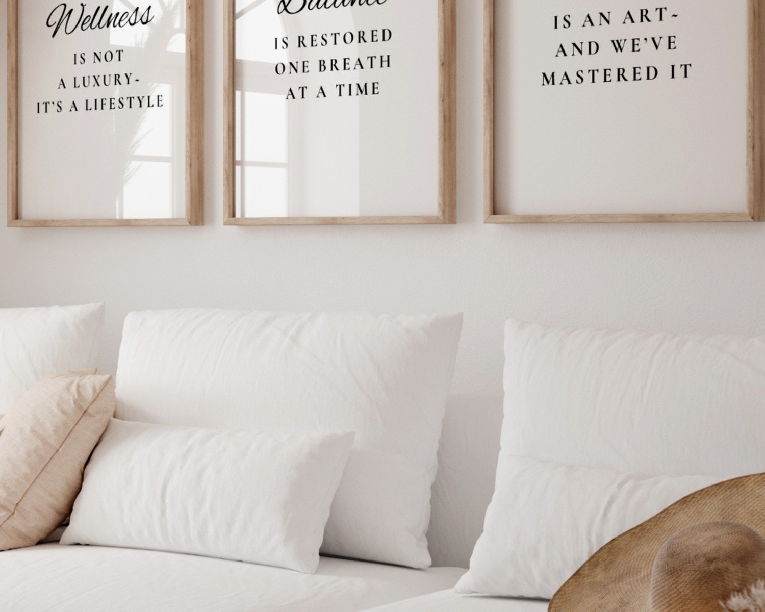
Oh and another thing – if you’re gonna do a gallery wall situation, odd numbers work better. Three or five pieces. I know that sounds like design BS but I’ve literally tested even versus odd arrangements and the odd numbers just feel more organic and less corporate.
Space them 2-3 inches apart, not more. I see people do like 6 inches between frames and it loses all cohesion. You want them to read as a unit, not separate floating pieces.
Subject Matter That Doesn’t Feel Cheesy
Okay so this is super personal but also I’ve done enough client work to know what actually holds up. Those inspirational quote prints? They date SO fast. “Breathe” in fancy script felt fresh in like 2016 but now it’s just… everywhere.
What actually works long-term:
Abstract organic shapes – Think watercolor washes, ink blooms, those minimal line drawings. They suggest nature without being literal about it. I’ve got this one print in my office that’s basically just gray and cream paint strokes and everyone asks where it’s from because it works with everything.
Macro photography of natural elements – Like extreme close-ups of leaves, water droplets, stone texture. But it has to be really well done. The cheap versions look like screensavers.
Minimalist landscapes – Horizons, foggy mountains, calm water. The key is muted tones and lots of negative space. You don’t want drama, you want calm.
Botanical prints but make them sophisticated – Not the cutesy watercolor flowers. More like vintage botanical drawings or modern minimalist plant photography. Single stems, lots of white space.
Wait I forgot to mention – texture matters as much as the image itself. A mediocre photo printed on really nice textured paper or canvas can look way better than an amazing photo on cheap glossy paper.
Frame Choices (This Gets Specific)
So frames are where you can either elevate everything or make it look like a corporate hotel. I’m pretty obsessed with this aspect honestly.
Natural wood frames in light finishes – Maple, oak, bamboo. The grain should be visible but subtle. Nothing too orangey or yellow-toned unless your whole space is warm-toned.
Thin black metal frames – Super modern, works for contemporary spas. But the metal needs to be matte, not shiny. Shiny reads as cheap.
Float frames – Where the art appears to float inside the frame with a gap. These are pricier but they make even simple prints look gallery-quality.
No frame at all – Canvas prints or mounted prints can work if they’re thick enough (like 1.5-2 inches deep). The edges need to be finished though, not just stapled canvas on the sides.
One thing I learned from my friend who runs a day spa – she replaces her frames every 5-7 years even if the art stays the same because frame styles date themselves. Like those distressed white frames from the farmhouse trend? Already looking dated.
Placement Heights and Sightlines
This is gonna sound weirdly specific but hang art at seated eye level in spa spaces, not standing eye level like you would in a regular room. People are lying down on massage tables, sitting in pedicure chairs, reclining in waiting areas.
So instead of the standard 57-60 inches to center, you’re looking at:
- Above massage tables: 40-48 inches to center from the floor
- In pedicure areas: 36-42 inches where people’s natural gaze falls
- Waiting room seating: 42-48 inches
- Standing areas like hallways: standard 57-60 inches works
I totally messed this up in my first spa project and hung everything at normal height. The owner called me and was like “nobody can see the art when they’re lying down” and I had to go back and rehang everything lower. Live and learn.
The Ceiling Consideration
If you have lower ceilings (under 8 feet), vertical art makes the space feel taller. Higher ceilings (10+ feet), horizontal pieces or stacked vertical arrangements work better. I watched some design show while testing this theory in my guest bathroom and it’s actually true.
Lighting Your Art (Often Forgotten)
You can have the perfect print and it’ll look like nothing if the lighting sucks. Spa spaces tend to have dim ambient lighting which is great for mood but terrible for art visibility.
Options that actually work:
- Picture lights mounted above frames – the LED battery-operated ones are surprisingly good now
- Track lighting aimed at art pieces – adjustable heads are key
- Backlit frames – these are trendy right now and create a nice glow
- Strategic placement near natural light sources without direct sun
Direct sunlight will fade your prints SO fast. I had a client who insisted on hanging this beautiful print opposite a west-facing window and within six months it was noticeably lighter. UV-protective glass helps but it’s not foolproof.
Budget Breakdown From Someone Who’s Tried Everything
Okay so let’s talk money because this can get expensive fast or you can do it surprisingly affordable.
Budget tier ($50-150 per piece):
Printable art from Etsy that you get printed locally at a good print shop (not CVS), IKEA frames upgraded with mat boards, or Society6 for framed prints. I’ve used all of these for client projects and they can look really good if you’re selective.
Mid-range ($150-400 per piece):
Art from Minted or Artifact Uprising, custom framing at a local shop, or original pieces from emerging artists on Instagram. This is my sweet spot honestly.
Investment tier ($400+ per piece):
Gallery artists, custom photography commissions, high-end printmakers. Worth it for statement pieces in main areas but you don’t need everything at this level.
I usually tell clients to invest in 1-2 really good pieces for high-visibility areas and fill in with budget-friendly options for secondary spaces.
The Feng Shui Angle (If You Care About That)
Some spa owners are really into the energy flow stuff and honestly whether you believe it or not, there are some practical takeaways. No sharp angles pointing at where people rest – so avoid art with harsh geometric shapes or pointing triangular compositions above massage tables. Water imagery in the north area of the room. Earth tones in the southwest.
I had a client redone her whole spa based on feng shui principles and whether it was the actual energy or just more intentional design, the space did feel noticeably calmer afterward.
Maintenance Nobody Talks About
Spa spaces get humid and sometimes oily from diffusers and products. Your art needs to handle that or it’ll warp and deteriorate.
Use:
- Glass-covered frames, not acrylic (acrylic gets cloudy in humidity)
- Sealed canvas prints or wood-mounted prints
- Metal prints for high-humidity areas like near steam rooms
Clean frames monthly with a barely damp microfiber cloth. Don’t use glass cleaner directly on frames because it can seep behind the glass.
My Actual Favorite Sources Right Now
Since you’re probably gonna ask anyway – here’s where I’m actually buying art for spa projects lately:
Minted has this whole wellness collection that doesn’t feel generic. Artifact Uprising for custom photo prints (their quality is consistently good). Etsy for abstract digital prints but you gotta filter through a lot of crap. Local artists on Instagram – I just search hashtags like #abstractartist + my city name.
Oh and funny story – I found one of my favorite spa pieces at a thrift store for $8. It was this perfect minimal landscape that someone had donated. Sometimes you get lucky just browsing secondhand.
The key is curating a collection that feels cohesive without being matchy-matchy. Everything should feel like it belongs together but not like you bought a pre-made set from one place. Mix sources, mix mediums, but stick to your color palette and overall vibe.
Also gotta mention – don’t hang everything at once. Live with a few pieces, see what’s missing, add slowly. I see people buy everything in one shopping spree and then realize it’s too much or not enough in certain areas.