Wall Art Guide, Wall Art Tutoriels
Serenity Prayer Wall Art: Recovery AA Spiritual Text
Aug
So I’ve been working with Serenity Prayer wall art for like three years now, ever since a client specifically asked me to help design their recovery space and honestly it’s become this whole thing I didn’t expect. The tricky part isn’t finding the art—it’s everywhere—but finding pieces that actually feel right and don’t look like they came from a church basement in 1987.
Size Actually Matters Way More Than You Think
Okay so first thing, you gotta measure your wall before you do anything else. I know that sounds obvious but I’ve literally had to return four pieces because what looked “medium” online turned out to be the size of a postcard. For Serenity Prayer art specifically, I’ve found the sweet spot is usually 16×20 or 20×24 for a main wall. Anything smaller and people can’t actually read the text from a comfortable distance, which kinda defeats the purpose if it’s meant to be a daily reminder.
If you’re putting it in a recovery space or meditation corner, go bigger than you think. Like 24×36 can work beautifully if you have the wall space. I did a client’s home office last year where we went with a 30×40 canvas and it became the focal point of the entire room—she does her morning meditation there and the scale really helps with that intentional feeling.
For smaller spaces like bathrooms or entryways, those 8×10 or 11×14 sizes work, but honestly they read more decorative than functional. Which is fine! Just know what you’re getting.
Material Choices Because They’re All Different
Canvas prints are gonna be your most common option and they’re… fine. The texture hides some of the printing quality issues which is good for budget pieces. I usually recommend gallery-wrapped canvas where the image continues around the edges so you don’t need a frame. Makes it feel more modern and less like wall art your aunt would have.
Metal prints though—okay so I discovered these maybe two years ago and they’re actually incredible for this specific type of text art. The Serenity Prayer on brushed aluminum or HD metal has this clean, contemporary look that doesn’t scream “recovery art” if that makes sense. Some people want it to be obvious, some don’t. Metal also works great in bathrooms because humidity won’t mess with it.
Wood prints give you that rustic farmhouse vibe which can be really beautiful but also very trendy right now, so just be aware it might feel dated in five years. I’ve used reclaimed wood pieces with the prayer carved or printed and they work amazing in spaces that already have wood elements.
Framed prints are classic but you’re gonna spend more. A good frame adds like $40-150 depending on size and quality. The advantage is you can change the frame later if your style evolves.
The Typography Thing Nobody Talks About
This is gonna sound weird but the font choice in Serenity Prayer art is absolutely critical and most people don’t think about it until it’s hanging on their wall and something feels… off.
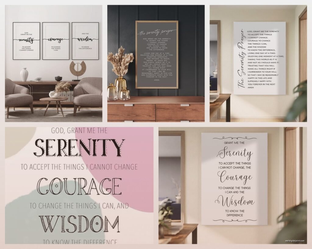
Script fonts—you know, the curly flowing ones—can be really hard to read if you actually need to reference the text. They’re pretty but not functional. I had a client return a gorgeous piece because she literally couldn’t read “serenity” in the fancy calligraphy from more than three feet away.
Sans serif fonts (the plain ones without the little feet on letters) read the cleanest but can feel cold or too modern for something spiritual.
Serif fonts with good spacing are usually your best bet. Think clean, classic, readable. The prayer has enough words that if the typography is cluttered, it becomes visual noise instead of a calming presence.
Color Schemes That Actually Work
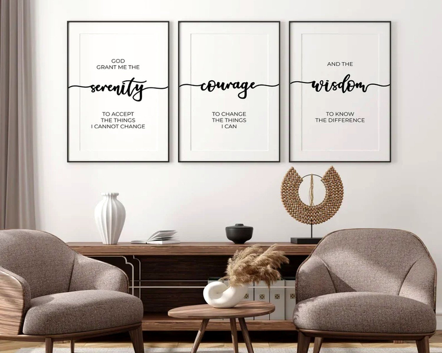
Neutrals are safe but can be boring. Black text on white background is readable but feels very… graphic design class project? Unless that’s your aesthetic.
I’ve had really good luck with:
- Navy or dark gray text on cream or light gray backgrounds
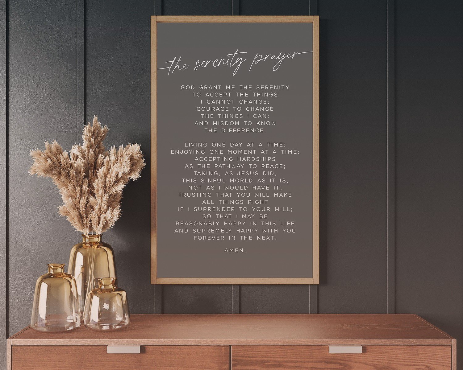
- White text on deep blue, forest green, or charcoal (works great in masculine spaces)
- Earth tones—burnt orange, terracotta, sage green with cream text
- Watercolor backgrounds with dark text overlay (but make sure the background isn’t too busy)
The worst I’ve seen are the ones with like sunset beach photos behind the text. Too much visual competition. The text gets lost and it just looks messy.
Oh and another thing—if you’re in recovery yourself or buying for someone who is, sometimes the really pretty decorative versions with flowers and butterflies and stuff can feel dismissive? Like it’s trivializing something serious. I’ve heard that feedback multiple times. Not always, some people love that softer approach, but it’s worth considering.
Where to Actually Buy These
Etsy is gonna be your most diverse selection. You can find independent artists doing custom work, which means you can often request size changes or color modifications. I’ve worked with probably a dozen different Etsy sellers for client projects. The quality varies wildly though, so read reviews carefully and look at actual customer photos not just the mock-ups.
Amazon has tons of options and obviously fast shipping, but the quality is usually just okay. Fine for temporary situations or if you’re on a tight budget. I wouldn’t expect these to last more than a few years before fading or the canvas sagging.
Society6 and Redbubble have artist-designed versions that tend to be more creative and contemporary. The printing quality is pretty consistent. A bit pricier than Amazon but cheaper than custom Etsy work usually.
Local print shops—don’t sleep on this option. You can bring in a design you found (make sure you have rights to print it) or work with their designers. The quality is usually excellent and you’re supporting local business which feels good.
Custom vs. Pre-Made
I’ve done both extensively and here’s the thing… custom sounds fancy but it’s not always necessary. If you find a pre-made piece that’s the right size, colors, and style for your space, just buy it. Don’t overthink it.
Custom makes sense when:
- You need specific dimensions for an awkward wall space
- You want to match existing decor colors exactly
- You want to add personalization like a sobriety date or name
- You hate everything you’re finding and have specific vision
Custom usually adds 2-3 weeks to delivery and costs 30-50% more. Worth it sometimes, not always.
Styling It On Your Wall
Okay so you’ve got your Serenity Prayer art, now what. Location matters more than people think.
For recovery spaces, I usually recommend somewhere you’ll see it during your morning routine. Over a meditation cushion, across from where you sit for coffee, in your bathroom where you’re getting ready. The whole point is daily reminder right, so put it where you’ll actually see it daily.
Don’t hang it too high. The center of the art should be at eye level, which is usually around 57-60 inches from the floor. I see people hang stuff way too high all the time and then wonder why it feels disconnected from the space.
If you’re doing a gallery wall situation, the Serenity Prayer piece should probably be the largest or most central element. It can anchor a collection of recovery-related art, nature photos, or inspirational pieces. Just don’t crowd it—give it breathing room.
What to Pair It With
This depends on whether you want it to be subtle or obvious. For subtle:
- Abstract art in coordinating colors
- Nature photography
- Neutral decorative pieces
- Personal photos in simple frames
For more obvious recovery-focused spaces:
- AA medallion displays
- Other recovery quotes or prayers
- Sobriety milestone markers
- Inspirational text art
I worked on a client’s home office last month where we did the Serenity Prayer as the main piece and surrounded it with framed photos from her travels—places she’d visited in sobriety. It was really personal and beautiful without being heavy-handed.
The Lighting Component
Nobody thinks about this but lighting changes everything. If you have a dark wall or the art is in a dim corner, it won’t have the impact you want. Consider:
Picture lights are those little lights that mount above frames. They’re kinda traditional looking but they work. Battery-operated ones exist now so you don’t need an outlet nearby.
Track lighting or adjustable ceiling fixtures can highlight wall art. This is what I use in most client spaces because it’s flexible.
Natural light is free but can cause fading over time, especially with canvas prints. If your art is in direct sunlight, maybe go with a metal or framed print with UV-protective glass.
Budget Real Talk
You can find Serenity Prayer art from like $15 to $500+ depending on size, material, and whether it’s custom. Here’s what I typically see:
Small prints (8×10): $15-40
Medium canvas (16×20): $40-80
Large canvas (24×36): $80-150
Metal prints: $60-200
Custom work: $100-400
Framed prints: Add $40-150 for frame
The cheapest options aren’t always bad and the expensive ones aren’t always worth it. I’ve seen $25 prints that looked great and $200 pieces that were disappointing.
Common Mistakes I See
Buying before measuring the wall—just don’t do this
Getting text that’s too small or font that’s too decorative to actually read
Hanging it in a spot where you never look (like behind a door or above a tall bookshelf)
Choosing colors that clash with the room instead of complementing it
Going too matchy-matchy with other recovery stuff so the space feels like a treatment center instead of a home
Not considering the room’s lighting before choosing dark text on dark background or vice versa
Maintenance Stuff
Canvas prints collect dust, especially if they have texture. Gentle dusting every few months with a microfiber cloth.
Metal and glass can be wiped down with glass cleaner but don’t spray directly on it—spray the cloth.
Wood pieces might need occasional treatment depending on the finish, but usually they’re sealed and just need dusting.
Keep everything out of direct sunlight if possible to prevent fading. I learned this the hard way with a beautiful piece in my own bathroom that faded weirdly on one side where the morning sun hit it.
Oh wait I forgot to mention—if you’re buying for someone else as a gift, maybe ask subtly about their style preferences first. I’ve seen well-intentioned gifts that were totally wrong for someone’s aesthetic and they felt obligated to hang it anyway. Recovery is personal, and so is home decor, so the intersection of both should really reflect the individual’s taste.
The whole point of having this prayer visible is that it’s supposed to bring peace and focus, not stress about whether it matches your throw pillows. Find something that feels right to you, put it somewhere meaningful, and let it do its job. That’s really all there is to it.