Wall Art Guide, Wall Art Tutoriels
Rose Wall Art: Romantic Flower Love Garden Decor
Aug
So I’ve been completely obsessed with rose wall art lately and honestly it started because a client wanted to turn her boring hallway into this romantic garden vibe without actually, you know, having a garden. And now I can’t stop noticing roses everywhere.
The Thing Nobody Tells You About Rose Art Placement
Okay so here’s what I learned the hard way – rose wall art looks completely different depending on where natural light hits it. I put this gorgeous burgundy rose print in my own bedroom and it looked amazing during the day but at night with just lamplight? Totally flat and kinda depressing. Had to move it to the opposite wall where my reading lamp could hit it at an angle and suddenly it had depth again.
The best spots are actually near windows but not directly across from them. Like perpendicular walls work better because you get that soft side lighting that makes the petals look dimensional. My cat keeps sitting in front of the one in my living room during golden hour and I swear she knows it looks good there.
Picking The Right Rose Style For Your Actual Space
There’s basically four categories and they all do different things:
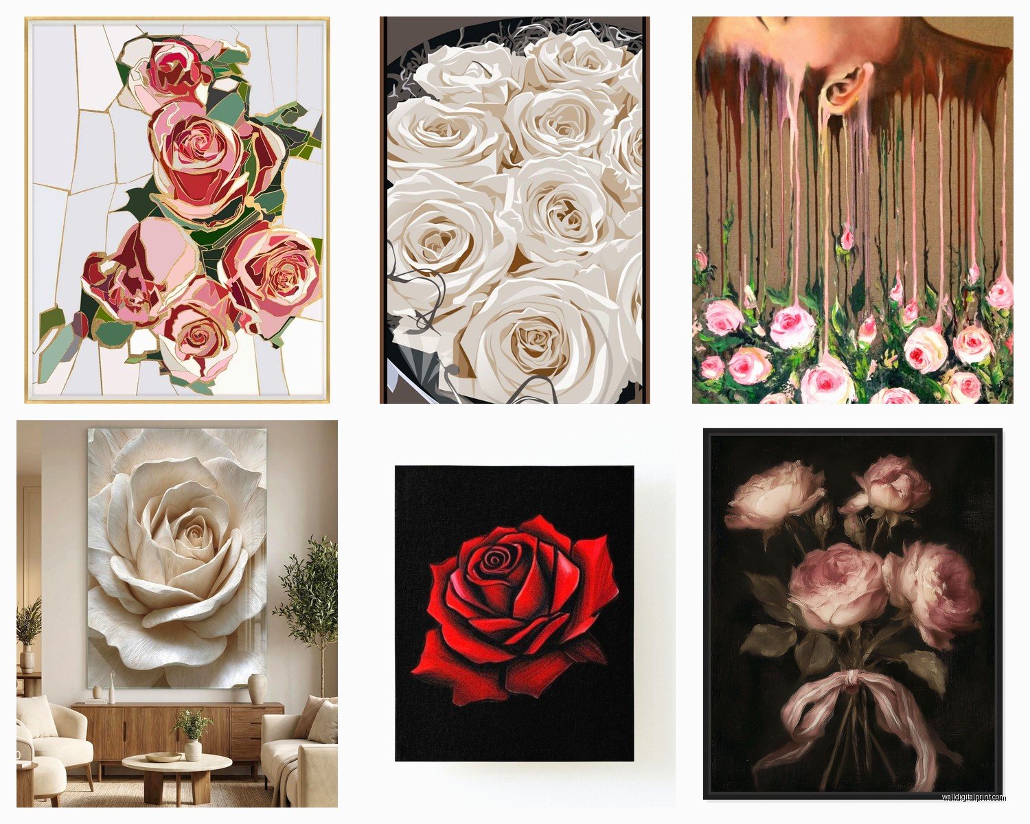
Photographic Roses
These are the super realistic close-up shots. I’ve got one that’s literally just a pink rose with morning dew and it’s stunning but here’s the catch – they need space to breathe. Don’t crowd them with other art or they lose impact. I usually recommend at least 12 inches of empty wall on each side.
Best for: bedrooms, bathrooms, anywhere you want that spa-like romantic feel. They’re also great for small spaces because one large photographic rose can anchor a whole wall without feeling cluttered.
Watercolor or Painted Roses
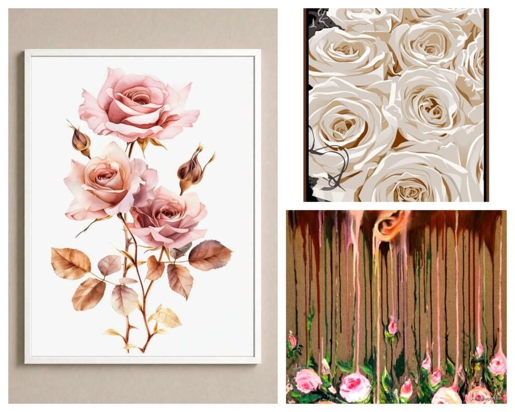
These are my go-to for living rooms and dining areas. The softer edges let them blend with other decor without competing. I just finished a project where we did three watercolor rose prints in blush and sage tones above a console table and it tied together her pink velvet chair with her green plants perfectly.
The thing with painted roses is you gotta pay attention to the background. Solid backgrounds are easier to work with. Those ones with splashy watercolor backgrounds everywhere can clash with patterned furniture.
Vintage Botanical Rose Prints
Wait I forgot to mention – these are having a MOMENT right now. The old-school scientific illustration style with Latin names and everything. They look expensive even when they’re not, which is honestly the dream.
I source a lot of these from… okay this is gonna sound weird but estate sales and then I get them professionally scanned and printed on better paper. The originals are usually too fragile or the wrong size. You can find similar styles on Etsy but make sure you’re getting actual high-resolution files, not someone’s blurry scan.
These work in literally any room. I’ve used them in modern spaces, traditional spaces, even a industrial loft where they added necessary softness.
Abstract or Geometric Roses
For when you want the romance but not the literal flower-power vibe. Think line drawings, minimalist outlines, roses made from geometric shapes. These are perfect if your space is contemporary and regular floral art feels too cottage-core.
Color Combinations That Actually Work
Alright so everyone defaults to red roses for “romantic” but honestly that can read more Valentine’s Day than sophisticated garden vibes. Here’s what I use:
Blush pink roses with sage green leaves – this is my most-requested combination. It’s romantic without being aggressive about it. Works with grey walls, white walls, even navy.
Burgundy and cream – more dramatic, definitely leans vintage. I used this in a dining room with dark wood furniture and it felt like an English garden room.
White roses on dark backgrounds – super elegant, almost bridal but in a good way. The contrast makes them pop and they don’t compete with colorful furniture.
Coral and peach tones – warmer than pink, works amazing in spaces with a lot of natural wood or brass fixtures.
Black and white rose photography – okay so technically no color but the romance still comes through in the form and texture. These are my secret weapon for masculine spaces or offices where color feels wrong but you still want that organic softness.
Size and Scale Stuff You Gotta Know
I made this mistake in my first apartment – bought these tiny 8×10 rose prints for above my bed and they just looked lost. You need way more scale than you think.
For above a bed: minimum 24×36 inches if it’s one piece, or a set of three 16x20s. The art should take up about two-thirds of your headboard width.
For living room walls: go big or go in groups. A single 40×60 rose print can be a showstopper, OR do a gallery wall with varying sizes but keep the spacing consistent – I use 2-3 inches between frames always.
Hallways are tricky because they’re narrow… I usually do a vertical arrangement of three roses going up the wall rather than trying to go wide.
Oh and another thing – canvas prints vs framed prints makes a huge difference. Canvas (those gallery-wrapped ones) feels more casual and garden-like. Framed under glass feels more formal and collected. I mix both in the same space sometimes but you gotta have a good eye for it or it looks confused.
Framing Options Without Going Broke
Real talk – custom framing is insanely expensive. Like $200+ per piece expensive. Here’s my workaround:
Buy standard-sized prints (8×10, 11×14, 16×20, 18×24) so you can use ready-made frames from Target, IKEA, or Amazon. The IKEA RIBBA frames in white or black are honestly great quality for the price.
For that expensive look on a budget, I do the floating frame thing – you know where there’s space between the art and the frame? You can DIY this with regular frames by mounting the print on foam board that’s slightly smaller than the frame opening.
Mat boards add so much sophistication. A $15 print in a $25 frame with a proper mat looks like a $200 piece. I usually do white or cream mats for rose art because colored mats can clash with the flower tones.
My client canceled yesterday so I spent an hour comparing gold vs black frames for rose prints and here’s my conclusion – gold works better with warm-toned roses (peach, coral, burgundy), black works better with cool-toned roses (pink, white, lavender). Silver/chrome is the safe middle ground but can feel cold.
The Gallery Wall Formula That Never Fails
I’ve done probably fifty rose-themed gallery walls at this point and this layout always works:
One large piece (24×36 or bigger) as your anchor – this goes slightly off-center
Four to six smaller pieces around it in varying sizes
Keep them all within the same color family but vary the rose styles
Use all the same frame color/style
Total wall coverage should be about 6-8 feet wide and 4 feet tall
Lay everything out on the floor first. Take a photo. Live with that photo on your phone for a day and see if you still like the arrangement. Then hang it.
The center of your main piece should be at eye level which is like 57-60 inches from the floor. Everything else radiates from there.
Mixing Rose Art With Other Decor
This is where people get nervous but it’s actually pretty forgiving. Roses are classic enough that they play well with most styles.
With modern furniture: Use minimalist rose prints – think line drawings or high-contrast photography. Keep the frames simple and the mats clean.
With traditional furniture: Go for the painted or vintage botanical styles. Ornate frames are actually okay here.
With bohemian vibes: Mix rose prints with macrame, plants, and other nature art. Canvas prints work better than framed here.
With farmhouse style: Watercolor roses in white-washed or distressed frames. Add some greenery prints to the mix.
I usually avoid mixing rose art with other flower art unless they’re in the same style and color palette. Like a rose print next to a peony print can work if they’re both watercolors in blush tones. But a realistic rose photo next to a abstract tulip painting? Nah, that’s chaos.
Lighting Your Rose Art Properly
This makes SUCH a difference and nobody thinks about it. I’ve been watching this design show on Netflix and they always light their art properly and it’s like half the magic.
Picture lights – those little brass or black fixtures that mount above frames – are worth it for special pieces. They’re like $40-80 and you can install them yourself if you’re handy.
For gallery walls, I use track lighting or adjustable can lights positioned about 3 feet in front of the wall at a 30-degree angle. This creates dimension without glare.
If you can’t do dedicated art lighting, just make sure your regular room lighting hits the art somehow. Sometimes I’ll position a floor lamp specifically to uplight a rose print and it creates this gorgeous dramatic effect.
Avoid direct sunlight on prints though – they’ll fade. UV-protective glass exists but it’s expensive. Easier to just position art away from south-facing windows.
Where To Actually Buy Good Rose Wall Art
Okay so I’ve tried everything and here’s my honest recommendations:
Etsy: Best for digital downloads you can print yourself and vintage botanical prints. Check the seller’s reviews and make sure you’re getting high resolution (at least 300 DPI).
Society6 and Redbubble: Good for indie artists, lots of unique styles. Quality is hit or miss – I stick with their framed prints or canvas options rather than posters.
Desenio and Printique: Solid quality, modern selections, reasonable prices. Shipping takes forever though.
Local art fairs and markets: Sometimes you find amazing rose photography for good prices. Plus you can see it in person which matters.
HomeGoods/TJ Maxx: Honestly their framed art selection is sometimes amazing. I’ve found gorgeous rose prints for under $30. You gotta go regularly though because inventory changes constantly.
Make your own: If you’ve got decent photos of roses (or can take some), print them through a service like Nations Photo Lab or Mpix. Way cheaper than buying art and it’s unique to you.
The Stuff That Doesn’t Work
Gonna save you some mistakes I made:
Those peel-and-stick wall decals of roses? They look cheap in person. Just don’t.
Really busy rose patterns as wall art – like if the whole canvas is covered in tiny roses – it reads more wallpaper than art and can feel overwhelming.
Mixing too many rose colors in one space. Stick to 2-3 colors max or it gets chaotic.
Hanging rose art in kitchens near cooking areas – the grease and moisture will damage it over time. Bathrooms are okay if there’s good ventilation.
Dollar store frames for anything bigger than 8×10. They warp and the plastic fronts scratch too easily.
Creating Actual Garden Vibes Beyond Just Roses
If you want the full romantic garden thing, rose art is your anchor but you need supporting elements:
Add real plants – even just a fiddle leaf fig or some pothos. The combination of real and artistic florals creates this layered garden feeling.
Bring in natural textures through furniture and accessories. Rattan, linen, unfinished wood all support the garden theme.
Use soft lighting – swap harsh overhead lights for table lamps with warm bulbs. Garden vibes need that diffused glow.
Layer in subtle rose motifs through other decor – maybe rose-printed pillows or a floral area rug, but keep it subtle or it becomes a theme park.
Consider wallpaper on one accent wall with a subtle trellis or vine pattern, then hang your rose art on the other walls. This creates depth.
Okay I think that’s everything I’ve learned from my rose art obsession phase. The main thing is just to start with one piece you genuinely love and build from there. Don’t try to create the whole romantic garden look in one shopping trip or you’ll end up with a bunch of stuff that doesn’t quite work together.