Wall Art Guide, Wall Art Tutoriels
Best IKEA Wall Art: Top Rated Swedish Budget Pieces
Nov
So I was literally just reorganizing my gallery wall last weekend and got asked about IKEA art pieces like three times this week, so here’s what actually works if you’re trying to fill wall space without dropping serious cash.
The Stuff That Actually Looks Expensive
Okay first things first – the PJÄTTERYD series is where you wanna start looking. I’ve used these in probably five different client projects and nobody ever guesses they’re from IKEA. The canvas quality is surprisingly decent, and they’ve got this abstract art collection that reads way more expensive than the $30-50 price tag. The larger ones (like the 78x78cm pieces) have enough visual weight to anchor a whole wall, which is key because small cheap art just screams “I bought small cheap art.”
The trick with PJÄTTERYD though – and I learned this the hard way in my own living room – is you gotta check the frame edges in store. Some of them have slightly uneven stretching on the canvas corners. Not a huge deal but if you’re hanging it somewhere with direct light, you’ll notice. Just tilt it a bit and look at the side profile before you buy.
The Botanical Print Situation
Their BILD poster series has these botanical prints that everyone and their mother has seen, BUT here’s the thing – if you get them custom framed instead of using the standard IKEA frames, they transform completely. I took the fern prints to a local frame shop, got them matted with like a 3-inch cream border and suddenly they looked like something from an upscale garden gallery.
Also the TVILLING posters are criminally underrated. They’re only like $5-7 each and the paper quality is actually pretty good for the price. My cat knocked over a glass of water near one once (she’s chaos incarnate) and it didn’t immediately disintegrate, so there’s that quality test I guess.
What Works in Different Spaces
Living rooms need something with presence. The BJÖRKSTA series – specifically the larger landscape or abstract pieces – these work because they’re big enough to matter. I put the New York photograph one (yeah I know, very original) in a client’s loft space and it genuinely tied the whole industrial vibe together. It’s 78x118cm so it actually fills the wall over a sofa without looking dinky.
For bedrooms I’m always pushing people toward the softer abstracts or the nature photography pieces. The GRÖNBY series has these minimalist landscape photos that are perfect for creating that calm vibe without being boring. Just skip anything too vibrant or busy because you’re gonna be staring at it before sleep and trust me, your brain doesn’t need stimulation at 11pm when you’re trying to wind down.
Kitchen and Dining Areas
This is gonna sound weird but the EKORRE squirrel print works so well in breakfast nooks. It’s playful without being childish, and something about food spaces benefits from a bit of whimsy. I also really like their vintage-style advertisement posters for dining rooms – the GÄDDEDE series has some retro Swedish designs that add character.
Oh and another thing – bathrooms are where you can actually go bold with cheap art because humidity is gonna mess with anything expensive anyway. Those small YLLEVAD prints are like $4 each and if they get weird from shower steam after a year, who cares? Replace them. I rotate mine seasonally which sounds extra but it’s literally just swapping out $12 worth of prints.
The Framing Situation You Gotta Know
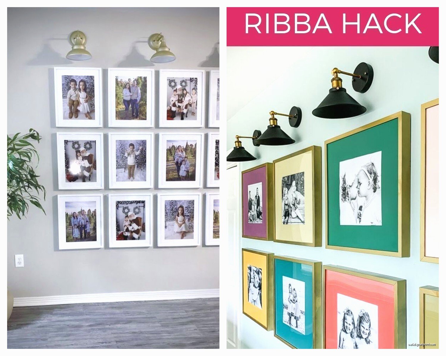
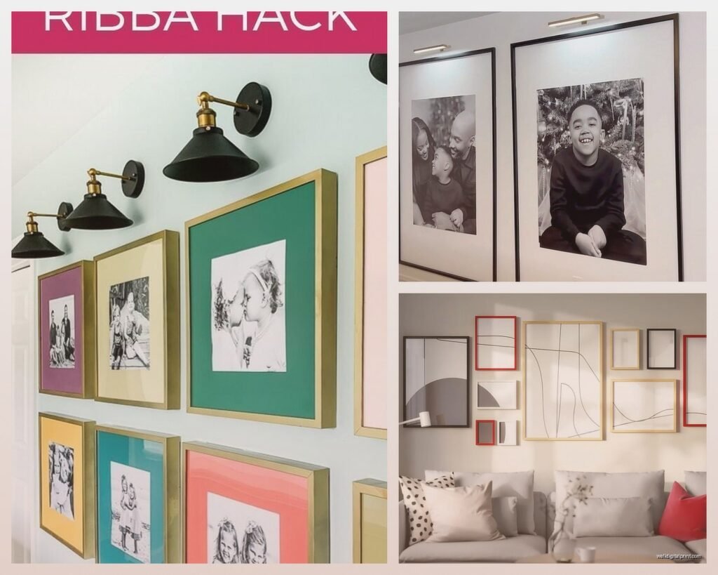
So IKEA frames are hit or miss. The RIBBA frames are the most popular and they’re fine – totally serviceable for standard poster sizes. But here’s what nobody tells you: the plastic front on the cheaper frames gets scratched SO easily. Like if you’re wiping dust off with anything slightly rough, you’re gonna see it.
The SILVERHÖJDEN frames are worth the extra money if you’re doing a gallery wall where people will actually look closely. They’ve got real glass and the backing is more stable. I did a whole hallway gallery with mixed SILVERHÖJDEN frames in black and gold and it looks intentional and curated instead of “I bought 12 of the same cheap frame.”
Wait I forgot to mention – measure your wall space before you go. This seems obvious but I cannot tell you how many times I’ve seen people buy art that’s way too small for their wall. You want the art or gallery wall grouping to take up roughly 2/3 to 3/4 of the wall width. So if you’ve got a 6-foot wide wall section, you’re looking at filling about 4-5 feet of it with art.
Gallery Wall Combinations That Work
Mixing IKEA pieces with other stuff is honestly the move. I’ll combine PJÄTTERYD canvases with vintage finds from thrift stores and maybe one or two higher-end prints, and suddenly the IKEA pieces elevate because they’re in good company.
The FISKBO frames are dirt cheap (like $2-5 depending on size) and perfect for creating those Pinterest-worthy grid galleries. Get like 9 of them in the same size, do a 3×3 grid, and fill them with a mix of IKEA prints, personal photos, and maybe some pages from old books or magazines. The uniformity of the frames makes everything look cohesive even when the content is varied.
What to Actually Skip
Okay so the really cheap canvas prints that are like $10 – usually not worth it. The image quality is often blurry up close and the colors can be weirdly saturated. I bought this abstract canvas once that looked fine online but in person it was giving “printed at a drugstore” vibes.
Also skip the overly trendy stuff unless you’re committed to changing it out frequently. IKEA had this phase with geometric prints that were everywhere for like two years and now they just look dated. Go for either timeless (classic botanicals, landscapes, abstracts) or so specific to your taste that trend cycles don’t matter.
The 3D paper art pieces they’ve done occasionally – BEAUTIFUL in the store, absolute dust magnets at home. Unless you’re really committed to regular cleaning, they’re gonna look grimy within months.
The Color Coordination Thing
I’m probably gonna get judged for this but I literally take paint swatches or fabric samples with me when I’m shopping for art at IKEA. My client canceled last Tuesday so I spent like an hour in the art section comparing the blue tones in the PJÄTTERYD ocean piece to this velvet pillow sample and yeah, I’m that person now.
But it matters! Art should either complement your existing color scheme or provide intentional contrast. Those warm terracotta abstract pieces work amazingly in cool-toned grey and blue rooms because the contrast creates visual interest. Same art in an already warm beige room can feel muddy.
Installation Tips Nobody Mentions
The hanging hardware that comes with IKEA art is… okay. It works. But for anything over like 20 pounds, I’m adding extra support. Get proper wall anchors if you’re not hitting studs, especially with the larger canvas pieces.
For gallery walls, lay everything out on the floor first. Take a photo from above. This saves you from making seventeen nail holes while you “figure out the spacing.” I use painter’s tape to mark the frame positions on the wall before committing to nails. Yes it takes longer, but so does spackling and repainting.
The general rule is 57 inches to the center of the artwork from the floor – that’s museum standard and it’s standard for a reason. It’s roughly eye level for most people. But honestly in bedrooms I go slightly lower because you’re often viewing art while sitting or lying down.
Mixing Sizes and Orientations
This is where people get stuck – they buy all same-sized pieces and wonder why their gallery wall looks boring. The YLLEVAD, TVILLING, and BILD series all come in different sizes, so grab a variety. Mix vertical and horizontal orientations. Include at least one piece that’s significantly larger than the others to create a focal point.
I did this hallway where I mixed three large BJÖRKSTA pieces with probably eight smaller FISKBO frames and the variation in scale made it actually interesting to walk past instead of just being wallpaper.
Seasonal Rotation Strategy
Okay so funny story – I started rotating art seasonally kind of by accident when I got bored during winter lockdowns and now I’m fully committed to it. IKEA art being cheap makes this actually feasible. I keep a bin in my storage closet with “off-season” pieces.
Spring gets botanicals and bright abstracts. Summer I go for those coastal photography pieces and anything with blues. Fall brings in the warmer tones and maybe some of those vintage-style prints. Winter is black and white photography or moody abstracts.
It sounds like a lot but we’re talking about swapping out maybe $50-100 worth of art a few times a year, and it completely refreshes your space without any major investment.
The Lighting Factor
Cannot stress this enough – even the best IKEA art looks mediocre with bad lighting. If you’re putting art on a wall that doesn’t get natural light, add a picture light or position a floor lamp nearby. The PJÄTTERYD canvases especially benefit from good lighting because the texture of the canvas adds dimension when it’s properly lit.
I’ve got this one hallway that’s basically a dark tunnel and I added two small LED picture lights from IKEA (the URSHULT series) and it completely changed how the art read in that space.
Best Pieces for Resale Value
If you’re renting or planning to move, stick with the neutral abstracts and classic photography pieces. The New York skyline, the botanical prints, the minimalist landscapes – these have broad appeal. I’ve sold IKEA art on Facebook Marketplace for like 60-70% of what I paid because people recognize the pieces and know they’re getting decent quality for less than retail.
The really specific stuff – like that squirrel print I mentioned or anything super colorful and abstract – harder to resell unless you find exactly the right buyer.
What Actually Holds Up Over Time
I’ve had some PJÄTTERYD pieces for almost four years now and they still look good. The canvas hasn’t sagged, colors haven’t faded (though they’re not in direct sunlight, that matters). The BJÖRKSTA prints have also held up well – the paper quality is thick enough that it doesn’t yellow quickly.
The cheaper poster series, honestly they’re gonna show age within a year or two if they’re in high-traffic areas. But again, at $5-7 each, just replace them. I think of those like decorative accessories rather than investment pieces.
My absolute top picks if you’re walking into IKEA today: grab a large PJÄTTERYD abstract for your main living space, a couple of BILD botanical prints for literally anywhere, and whatever speaks to you from the BJÖRKSTA photography collection. Mix in some FISKBO frames with personal photos or prints you find elsewhere, and you’ve got a collected-over-time look for under $200.
Just measure your walls first and bring those paint samples if you’re neurotic like me. And yeah, check those canvas edges in person because quality control can be inconsistent. That’s pretty much everything I’ve learned from using way too much IKEA art in the past few years.