Wall Art Guide, Wall Art Tutoriels
Heron Wall Art: Wading Bird Wetland Marsh Photography
Aug
So I’ve been completely obsessed with heron photography for wall art lately and honestly it started because a client asked for “something elegant but not boring” for their dining room and I just… went down this whole rabbit hole. Let me tell you what I’ve learned because I’ve made some mistakes you can totally avoid.
Why Heron Art Actually Works (When Other Bird Art Doesn’t)
Okay so here’s the thing about herons that makes them different from like, generic bird prints. They’ve got this insane architectural quality? The way they stand is basically a living sculpture. I was watching some nature documentary while organizing fabric samples last week and the cinematographer kept focusing on the negative space around herons and it clicked—that’s why they photograph so well for interiors.
The S-curve of their neck creates natural movement without being chaotic. You know how some wildlife photography feels too busy for a calm space? Herons don’t do that. Even when they’re hunting or taking flight, there’s this controlled grace that reads as intentional in a room.
Wetland vs Marsh vs General Water Settings
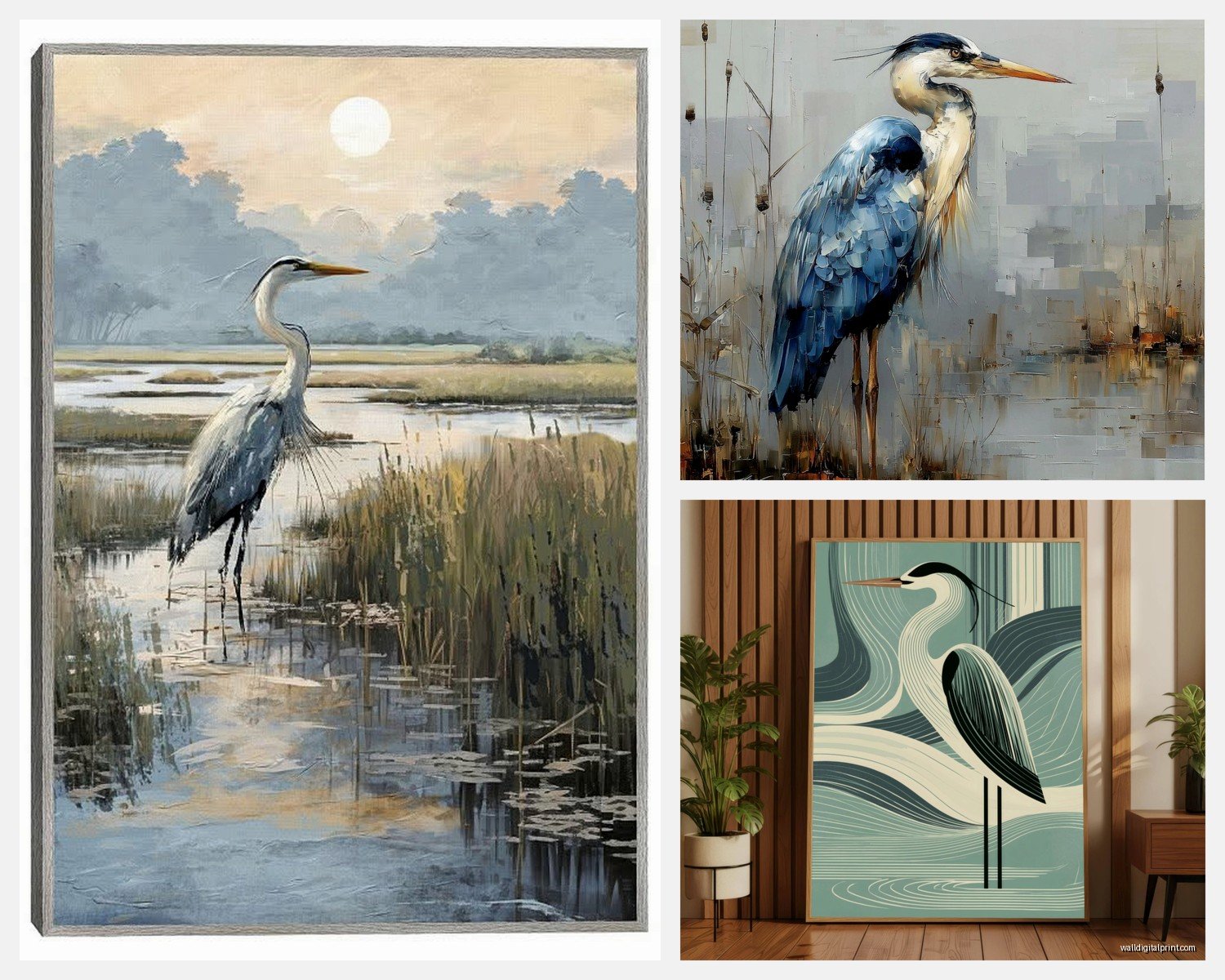
This is gonna sound super specific but it matters for the vibe. Wetland photography tends to have more varied vegetation—you’ll see cattails, lily pads, maybe some flowering plants. The backgrounds are busier but in a lush way. I used a great blue heron in wetland setting for a bathroom redesign and the density of the background actually made the small space feel less claustrophobic somehow.
Marsh photography is usually more minimalist. Tall grasses, reeds, lots of vertical lines. These work better in modern spaces or anywhere you want that Scandinavian-influenced calm. The color palette skews more golden and wheat-toned, especially if it’s shot during golden hour.
Open water shots with herons give you the most flexibility because the background is essentially neutral. But—and I learned this the hard way—they can read as too cold if you’re not careful with the rest of your room’s warmth.
Color Palette Considerations You Actually Need to Think About
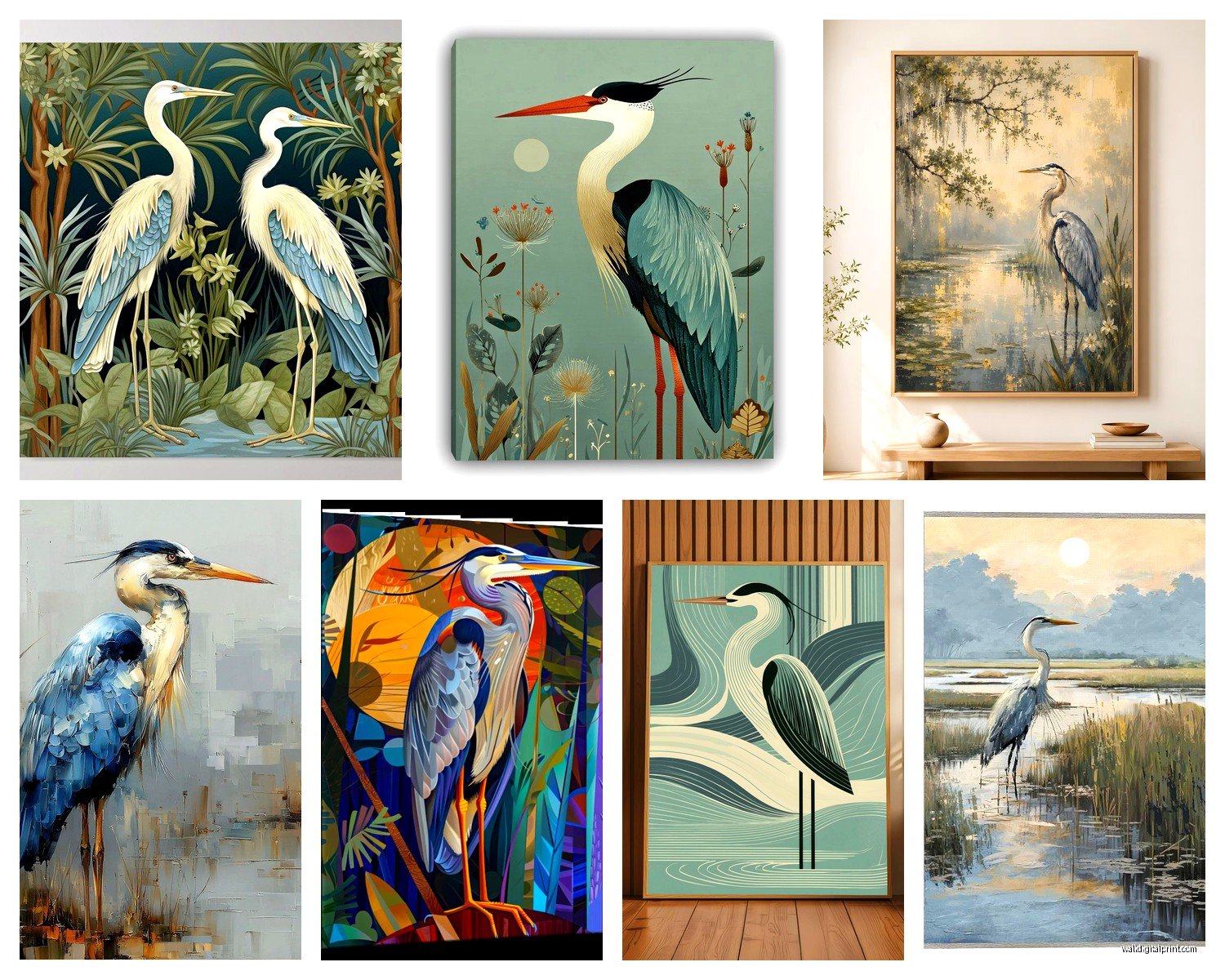
Most heron species photograph in these blue-grey tones, whites, or that rusty reddish-brown if you’re looking at tricolored herons or green herons in certain light. My living room has warm oak floors and I initially picked this gorgeous print of a great blue heron at sunrise… the blue-grey of the bird clashed so badly with the orange undertones in my flooring.
What worked instead: I found a shot of the same species but photographed during warmer light, so the white plumage picked up peachy tones and the grey looked more taupe. The marsh grasses in the background had this golden thing happening that tied into my floors.
Wait I forgot to mention—if you’ve got a lot of cool greys and whites in your space already, lean INTO the blue-grey heron coloring. Don’t fight it. I did a client’s bedroom entirely in cool tones and we went with a massive canvas of a heron in foggy conditions and it’s probably my favorite project from last year.
Size and Placement (This Is Where People Mess Up)
Okay so funny story, I bought a 16×20 heron print for above my entryway console and when it arrived it looked like a postage stamp. Herons are tall, vertical subjects, right? So you gotta think about proportion differently than you would with landscape photography.
For a single heron portrait (bird facing you or in profile, full body visible), you want to go TALL. Like 24×36 minimum for a standard wall. I actually prefer 30×40 or even larger because the drama of a life-size or near-life-size heron is what makes the impact.
If you’re working with a horizontal composition—maybe a heron in flight or a wider wetland scene with the bird as part of the landscape—then standard landscape dimensions work fine. But honestly? The vertical shots are what made me fall in love with this whole theme.
Grouping Multiple Prints
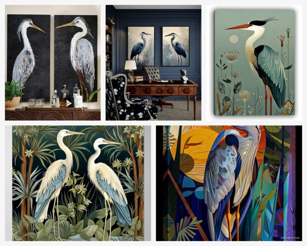
I’m currently testing this in my hallway… three different heron species in similar marsh settings, all in matching frames, hung vertically in a row. The repetition of the vertical format creates this rhythm that makes a narrow hallway feel intentional instead of cramped.
Another option that works is mixing orientations but keeping the subject consistent—one large vertical heron portrait as your anchor, then two smaller horizontal marsh landscape shots flanking it. Just make sure the color grading matches across all three or it’ll look random.
Print Quality Stuff Nobody Tells You
So I’ve ordered from probably a dozen different print-on-demand services and a few actual wildlife photographers who sell direct, and here’s what I’ve learned about quality for wetland/marsh photography specifically.
The detail in the feathers is where cheap printing shows up immediately. Heron feathers have these delicate wispy bits, especially the breeding plumage plumes, and if your printer can’t handle fine detail, they’ll blob together into muddy grey areas. Ask for samples if you’re ordering anything over $100.
For marsh backgrounds, you want a printer that handles subtle color gradations well. The difference between good golden-hour marsh grass and flat yellow-brown nothing is all in those subtle tonal shifts. Metallic or luster finishes actually work beautifully for this—they catch light kinda like water does and enhance that wetland feeling.
Canvas vs paper is a whole debate… my cat knocked over a plant onto my canvas heron print last month and it survived with just a damp cloth wipe-down, so there’s that practical advantage. But for really crisp detail, especially if you’re going BIG, a quality paper print under glass gives you more sharpness.
Frame Choices That Don’t Compete
This is gonna sound weird but I’ve found that simple black frames work about 80% of the time with heron photography. The birds often have dark legs and beaks that echo black framing, and it contains the image without adding warmth that might clash with cool-toned wetland colors.
Natural wood frames—especially light oak or maple—work great with marsh settings that have warm golden grasses. I did a client’s home office with a light wood frame around a sandhill crane (I know, technically not a heron but similar vibe) in prairie wetland and the frame literally disappeared into the composition in the best way.
White or cream mats… honestly I go back and forth. They definitely make the art feel more formal and gallery-like. If your space is casual or bohemian, skip the mat and go edge-to-edge in the frame. If you’re aiming for traditional or transitional style, a mat adds that polish.
Oh and another thing—if you’re doing a really large print, consider a floater frame. It’s that style where the canvas appears to float inside the frame with a gap around it. For a dramatic heron-in-flight shot, the floating effect enhances the sense of movement.
Where to Actually Source Good Heron Photography
I’ve had the best luck with wildlife photographers who specialize in bird photography, obviously. Etsy has some gems but you gotta dig through a lot of AI-generated garbage now unfortunately. Look for sellers who show photos of their actual prints in real spaces—that’s usually a good sign they’re legit photographers.
Fine art photography sites like 500px or SmugMug galleries let you buy directly from photographers, and the quality is typically higher because these are people who invested in good gear and actually spent time in wetlands. The prices reflect that though… expect $150-400 for a large quality print.
Stock photography sites have heron images you can license and print yourself, which gives you more control over size and print method. Just make sure you’re getting high enough resolution—you want at least 300 DPI at your intended print size or it’ll look pixelated.
Styling Around Heron Art
So this is where it gets fun because wetland/marsh photography has these built-in color stories you can pull from. I’m currently working on a living room where the heron print has this soft sage green from the marsh grasses, and we’re echoing it in velvet throw pillows and a vintage rug I found.
Natural materials are your friend here—rattan, jute, linen, raw wood. The organic textures complement the natural subject matter without being too matchy-matchy. I’ve got a client who was worried their heron art would make their space feel “outdoorsy” in a cabin way, but we balanced it with sleek modern furniture and suddenly it reads as sophisticated instead.
Plants obviously work but be strategic. I’d avoid anything too tropical or jungle-like because wetlands aren’t jungles. Grasses in simple vessels, dried botanicals, even some architectural succulents keep the nature connection without confusing the biome, if that makes sense.
Lighting Considerations
Picture lights or gallery lights above heron photography can be gorgeous, especially if you’ve got a darker marsh scene that needs some illumination. But honestly? I usually rely on ambient lighting and just make sure there’s no glare on the glass.
If your heron print is opposite a window, be aware of how natural light hits it throughout the day. I had one positioned where late afternoon sun created this perfect glow on the water elements in the photo… totally accidental but it became my favorite moment in that room.
Mixing Heron Art with Other Themes
You’d think heron photography would only work in like, nature-themed spaces, but I’ve successfully mixed it into some unexpected settings. In a mid-century modern living room, a stark black and white heron portrait became a graphic element that played off the clean lines of the furniture.
For a more traditional space, heron art brings in that classical natural history illustration vibe without being literal botanical prints that everyone’s already doing. It feels collected and intentional.
The one place I’d be careful is super colorful eclectic spaces—unless you find heron photography with unusual color grading or you’re deliberately going for maximum visual interest, the subtle tones of most wetland photography might get lost.
Seasonal Flexibility
This might sound random but one thing I love about heron wall art is it doesn’t scream a specific season. Unlike autumn leaves or spring blossoms, wetland marsh scenes have this timeless quality. The prints I hung two years ago still feel current, which matters if you’re not someone who wants to rotate art seasonally.
That said, you CAN play up seasonal vibes if you want—a foggy marsh scene with a heron feels very autumn/winter, while bright golden-hour shots with lush vegetation lean summer. Just something to consider based on your space’s natural light and how you use the room.
Anyway I gotta wrap this up but honestly just start by finding one really strong heron image that speaks to you, get it printed larger than feels comfortable, and see how it transforms your space. I’ve never regretted going bigger with these prints.