
Wall Art Guide, Wall Art Tutoriels
Peace Sign Wall Art: Hippie Symbol 1960s Counterculture
Aug
So I’ve been obsessed with peace sign wall art lately and honestly it started because a client wanted to do this whole 60s throwback room but make it not look like a college dorm, which is harder than you’d think. Let me tell you what actually works versus what looks kinda sad.
Finding the Right Style Without Looking Like a Costume Shop
The thing about peace signs is they can go really wrong really fast. You don’t want your living room looking like a Spirit Halloween store in October, you know? I spent way too much time (my dog was literally staring at me like “are we gonna walk or what”) scrolling through Etsy and vintage shops trying to figure out the sweet spot.
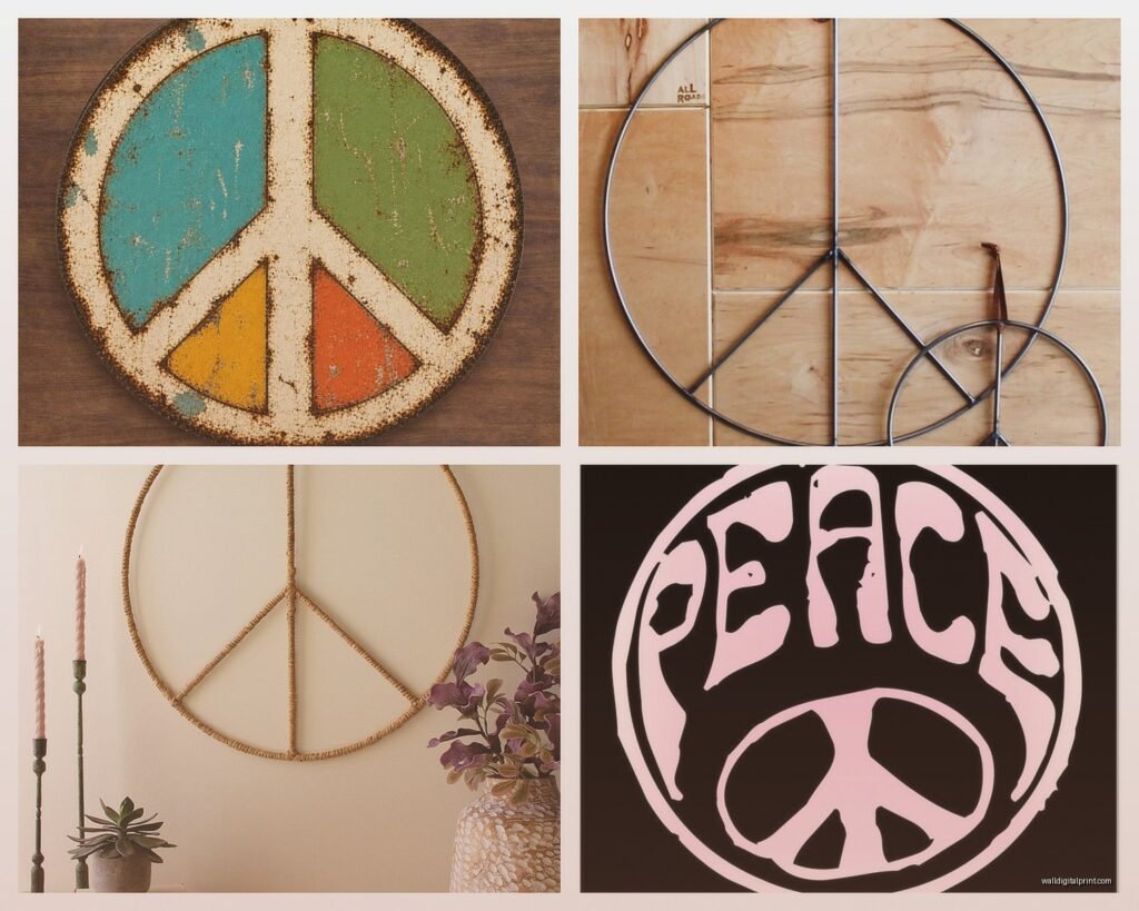
Metal peace signs are probably your safest bet if you’re going for that authentic 60s vibe but want it to feel curated. I found this amazing rustic metal one at a flea market in upstate New York last summer and it’s got this perfect patina that looks like it actually lived through Woodstock. The trick is finding ones that aren’t too shiny or perfectly uniform because the hippie movement was all about handmade, imperfect stuff.
Wood peace signs work too but here’s the thing nobody tells you – they need to be substantial. Like, thick wood with visible grain. Those thin plywood cutouts you see at craft stores? They’re gonna read as cheap no matter how you style them. I learned this the hard way when I bought three of them thinking I could do a cool gallery wall situation and they just looked… flat. Returned them the next day.
Size Matters More Than You Think
Okay so funny story, I had this whole vision of a massive peace sign above my desk, like 36 inches across. Ordered it, waited two weeks, hung it up and it completely overwhelmed the space. My office looked like a teenager’s bedroom circa 1967. Not the vibe.
Here’s what actually works: for a statement piece, go 24-30 inches max unless you have like cathedral ceilings or something. Anything bigger and it starts dominating the room in a way that feels costume-y rather than curated. I ended up using that giant one in a client’s basement rec room where the proportions made sense.
For gallery walls or groupings, mix sizes between 8-16 inches. Three peace signs of slightly different sizes looks intentional, three identical ones looks like you panic-bought at HomeGoods. Which I’ve also done, no judgment.
The Color Situation
Natural materials are your friend here. Weathered metal, natural wood, maybe painted wood in muted tones. I’ve seen some people do bright orange or hot pink peace signs and look, if that’s your thing go for it, but if you’re trying to channel authentic 60s counterculture, they actually used a lot of earth tones. Burnt orange, mustard yellow, avocado green, that weird brown that was everywhere.
One trick I use is matching the peace sign finish to other metals in the room. Got brass light fixtures? Find a brass or gold-toned peace sign. Mostly black metal accents? Matte black peace sign. It makes it feel less like a theme and more like a cohesive design choice.
Where to Actually Find Good Ones
Etsy is gonna be your main source but you gotta dig. Don’t just search “peace sign wall art” because you’ll get buried in printables and cheap imports. Try “vintage peace sign metal” or “handmade wood peace symbol” or even “boho wall hanging peace.”
I found some of my favorite pieces at estate sales, especially in areas that were hippie hubs back in the day. Think Northern California, parts of Colorado, upstate New York, Vermont. Old folks who were actually part of the movement sometimes have the real deal in their attics. Just be respectful when you’re asking about pricing – these have genuine sentimental value for some people.
Anthropologie does a decent job with this aesthetic if you want something new but curated-looking. They had this woven rattan peace sign last year that I bought for three different clients. It’s not trying too hard, which is key.
DIY Options That Don’t Suck
Wait I forgot to mention – if you’re crafty at all, making your own is actually pretty satisfying. I’m not talking about those paint-by-number kits or whatever. Get some reclaimed wood (construction sites often have scraps they’re throwing away, just ask), cut or arrange it into a peace sign shape, and either leave it natural or stain it.
Macrame peace signs are also having a moment and they’re weirdly easy to make. YouTube has a million tutorials. I made one while binge-watching The Crown and it turned out… fine. Not gallery-worthy but fine for a casual space. The nice thing about macrame is it automatically reads as handmade and 60s-inspired without being too literal.
Styling It So It Doesn’t Look Like a Theme Restaurant
This is where people mess up the most. You can’t just slap a peace sign on the wall and call it a day. It needs context or it looks random and trying too hard at the same time, which is a weird combo.
Layer it with other textures and eras. I did a gallery wall for my living room that has a metal peace sign, some vintage concert posters (framed properly, not thumbtacked like a dorm), a woven wall hanging, and some black and white family photos. The peace sign becomes part of the story instead of THE story.
Plants help so much. Put some trailing pothos or a spider plant nearby and suddenly your peace sign looks like it belongs in a groovy 70s California bungalow instead of a costume. Macrame plant hangers obviously work great here too but don’t go overboard – one is cool, seventeen is a fire hazard and also insane-looking.
What to Put Around It
Vintage books with colorful spines, especially poetry or music-related stuff. A vintage record player if you actually use it (don’t be that person with a decorative turntable, please). Ceramic pieces in those 60s shapes – you know, the chunky geometric vases and bowls. Thrifted artwork with warm tones.
Lighting is huge. A warm Edison bulb situation or a vintage lamp with a fabric shade makes everything feel more authentic. Harsh overhead lighting will make your carefully curated peace sign look like it’s from Party City.
The Rooms Where This Actually Works
Bedrooms are probably the easiest. Above the bed as a headboard alternative, or on a side wall with some other boho elements. Just don’t go full hippie explosion – keep your bedding relatively simple so the peace sign can be a focal point.
Living rooms work if you commit to the aesthetic at least somewhat. Like, if the rest of your house is modern farmhouse, a random peace sign is gonna look confused. But if you’ve got some vintage pieces, warm wood tones, maybe a leather couch or some velvet pillows, it fits right in.
Home offices are surprisingly great for this. There’s something about the peace sign that sets a creative, relaxed tone. I have one above my desk and it reminds me to chill out when I’m stressed about deadlines, which sounds cheesy but it’s true.
Bathrooms and Kitchens
Gonna be honest, these are trickier. A small peace sign in a bathroom can work if you’re doing like a boho spa vibe with plants and natural materials. Kitchens… I haven’t really seen this work unless you’re doing a full vintage kitchen situation. It just feels forced otherwise.
The Authentic Counterculture Connection
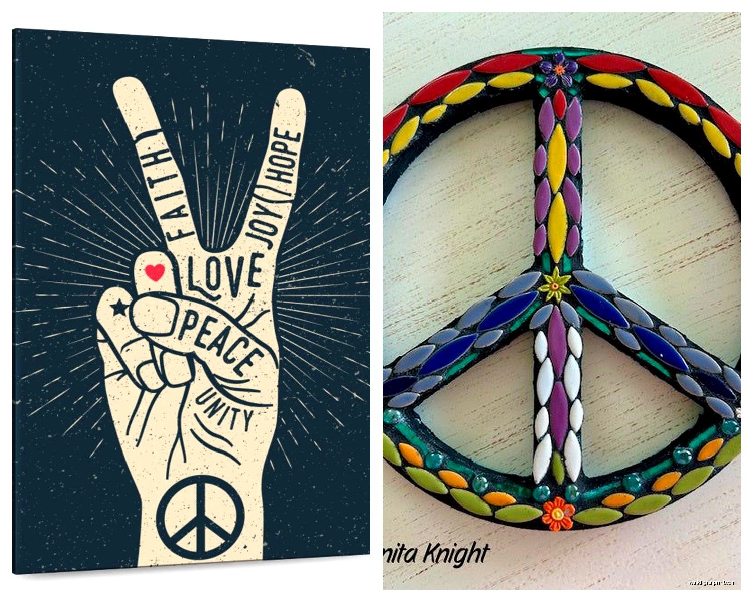
Okay so if you actually care about the history and meaning behind this stuff and not just the aesthetic, it’s worth understanding what the peace sign represented. Designed in 1958 by Gerald Holtom for nuclear disarmament, it became THE symbol of the anti-war movement in the 60s.
The hippie counterculture adopted it because they were protesting Vietnam and advocating for peace, love, and social change. It wasn’t just decoration – it was a political statement. People wore it, painted it, hung it up as a declaration of their values.
I think there’s something nice about honoring that when you’re using it as wall art now. Not saying you need to be a activist or anything, but maybe don’t pair it with like… aggressively consumerist or militaristic decor? Just feels off.
Mixing Eras Without Looking Confused
This is gonna sound weird but I actually think peace signs work well with mid-century modern furniture. Both aesthetics were happening around the same time and they share this optimistic, forward-thinking vibe. A teak credenza with a metal peace sign above it? *Chef’s kiss.*
You can also mix it with more contemporary stuff if you’re careful. Scandinavian minimalism can handle a peace sign if you keep it simple – one piece, natural material, lots of white space around it. Don’t try to force it into industrial or ultra-modern spaces though. The vibes are too different.
What to Avoid
Neon peace signs unless you’re specifically going for a retro diner vibe. Glittery ones. Ones with phrases like “peace out” or “groovy baby” written on them. Anything that feels like it’s winking at the 60s instead of genuinely appreciating the aesthetic.
Also avoid those vinyl wall decals. They always peel weird and look cheap from day one. If you can’t commit to actual wall art, maybe this isn’t your thing and that’s okay.
Multiple peace signs in the same room is risky. I’ve made it work with a gallery wall approach, but if you just scatter them around it looks like you’re really, really insistent that people know you like peace signs. One good one beats five mediocre ones every time.
Price Points That Make Sense
You can find decent peace sign wall art for like $30-60 if you’re patient and shop around. Etsy handmade pieces might run $75-150 depending on size and materials. Vintage authentic pieces from the actual 60s/70s can get pricey – I’ve seen them go for $200+ if they’re in good condition and have provenance.
Don’t overpay for mass-produced stuff from big box stores. If you’re seeing the exact same peace sign at Target, Amazon, and Wayfair, it’s not worth more than $40 tops. Wait for a sale.
Oh and another thing – shipping costs on large metal pieces can be brutal. Factor that in before you fall in love with something. I almost bought this gorgeous 30-inch metal peace sign from a seller in Oregon and shipping to the East Coast was gonna be $65. Ended up finding something similar locally.
Installation Tips Nobody Tells You
Metal peace signs are heavier than they look. Use proper anchors, especially on drywall. I had one fall off a wall at 3am once and it scared me so badly I couldn’t sleep the rest of the night. My cat didn’t come out from under the bed for hours.
For wood pieces, consider the wall color behind it. Dark wood on dark walls disappears. You want some contrast so the shape actually reads as a peace sign and not just a weird circle blob.
Measure and mark before you hammer anything. Sounds obvious but I can’t tell you how many times I’ve eyeballed it and ended up with a crooked peace sign that makes the whole room feel off-balance. Use a level. Be that person.
The whole peace sign wall art thing works best when it feels like a natural extension of your style rather than a costume you’re putting on. Mix it with things you actually love, in spaces where you actually spend time, and it becomes this cool nod to an interesting cultural moment instead of trying too hard to be retro.
