Wall Art Guide, Wall Art Tutoriels
Wall Art Aesthetic: TikTok Instagram Trendy Styles
Aug
So I’ve been completely obsessed with wall art trends lately and honestly TikTok has been both a blessing and a curse for my credit card. Like, I’ll be scrolling at night and suddenly I’m convinced I need an entire gallery wall of abstract prints when my walls were totally fine before.
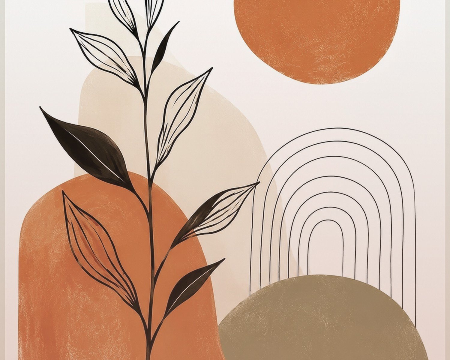
The Abstract Wavy Lines Thing Everyone’s Doing
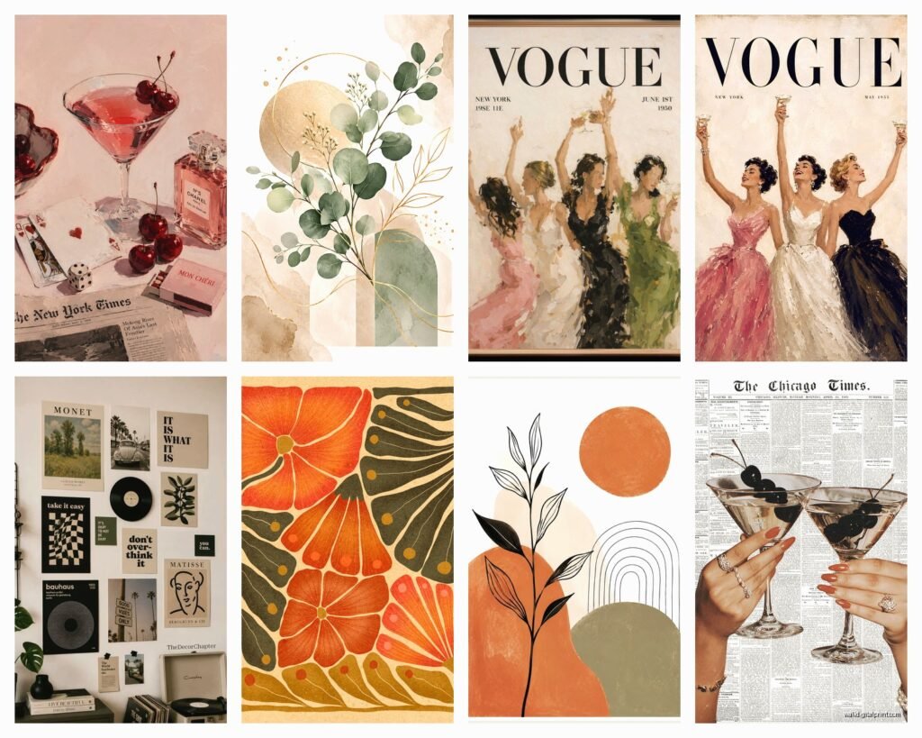
Okay so this trend isn’t going anywhere. You know those prints with the organic shapes and neutral tones? Beige, terracotta, maybe some sage green thrown in? They’re everywhere for a reason. The trick though is you gotta mix them right or it looks like you just printed everything from the same Etsy shop in one panicked shopping spree.
What actually works: get different sizes. I’m talking one large piece maybe 24×36 and then cluster smaller ones around it. Don’t do all the same frame color either, that’s where people mess up. Mix black and light wood frames or go all natural wood but different tones. My living room has three of these abstract prints and I spent like two weeks rearranging them because the symmetry felt too stiff at first.
The prints themselves, you can find them on Etsy obviously but also Society6 has good ones, and honestly sometimes Target has dupes that look nearly identical for like a third of the price. I tested this with my sister’s apartment and no one could tell which ones were the expensive versions.
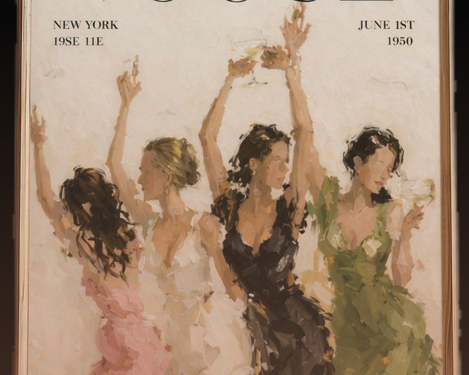
Vintage Poster Aesthetic
This one’s tricky because it can go really cool or really dorm room fast. The vintage travel posters, old movie prints, retro ads, all that stuff. What I’ve learned is you need to commit to a color story or it looks chaotic.
I did a whole wall in my office with vintage botanical prints and one random Pulp Fiction poster and yeah, it didn’t work. Had to remove the movie poster because the vibes were competing. Now it’s all botanical and some vintage seed packet designs and it actually feels intentional.
Where to find these without spending a fortune: check out Desenio, they have tons of vintage-style prints. Also there’s this seller on Etsy called something like ThePoloDesignStudio who does custom vintage prints where you can pick the colors. Changed my life honestly because I needed something that matched my weird mustard yellow couch situation.
Oh and another thing, if you’re doing vintage posters, the frames matter SO much. Black frames make them feel more modern and curated. Brown or gold frames lean into the vintage vibe harder. Just depends what you want.
The Museum Print Trend
So everyone’s suddenly into those classic art prints like you raided a museum gift shop. Monet, Van Gogh, Matisse cutouts, all that. It’s actually a vibe when done right but I’ve seen it go wrong in obvious ways.
The mistake is printing them too small or too large for the space. A tiny Starry Night print on a massive wall looks sad and lost. You want substantial sizes, like at least 16×20 for medium walls, bigger for large spaces.
I mixed some Matisse cutouts with a Monet water lilies print in my entryway and honestly it’s my favorite spot in the house now. The key was keeping the frames identical, all simple black, so the art itself could be the variety. When you mix frame styles with already bold classic art it gets too busy.
Printable art sites like Printique or even just downloading high-res images from museum websites (some let you do this legally for personal use) and printing at a local print shop works great. Way cheaper than buying pre-framed versions.
The Monochrome Line Art Situation
Those single-line drawings of faces, bodies, abstract shapes, usually in black on white or vice versa. They’re still super popular and honestly they’re the easiest to style because they’re so minimalist.
I have a one-line face drawing above my bed and it took me literally five minutes to decide on placement because it’s that simple. These work in literally any room. The bathroom, bedroom, kitchen, wherever. They don’t demand attention but they fill space nicely.
The thing is though, you can’t really mix line art with busy patterns elsewhere. Like if you have a lot going on with your furniture or textiles, line art is perfect because it adds visual interest without competing. But if your walls are already doing a lot, maybe skip it.
Desenio again has tons of these, or just search “line art prints” on Etsy. There’s also gonna be a million options. I bought three from different sellers and honestly couldn’t tell you which one was “better quality” because they’re all just black lines on paper.
Typography and Quote Prints
This is gonna sound weird but I was really against quote prints for the longest time because they felt very 2015 “Live Laugh Love” energy. But the new wave of typography art is actually cool. It’s more abstract words, single impactful phrases, or even just aesthetically pleasing text layouts without cheesy meanings.
What works now: architectural terms, single powerful words in interesting fonts, coordinates of meaningful places, song lyrics if they’re formatted in a cool minimalist way. What doesn’t work: anything that sounds like it came from a motivational calendar.
I put a print in my hallway that just says “FORM” in a beautiful serif font and people always ask about it. It’s technically meaningless but it looks intentional and sophisticated. That’s the vibe you want.
For these, font choice is everything. Avoid anything too cutesy or script-heavy unless you’re specifically going for a feminine romantic vibe. Clean sans-serifs or elegant serifs work for most aesthetics.
The Photo Print Gallery Wall
Okay so this is having a moment on Instagram especially. Personal photos but styled like art. Black and white shots, film photography aesthetics, that grainy nostalgic look.
I finally did this in my dining room with travel photos and some random shots from my phone that I edited to look more artistic. The trick is editing them all with the same filter or preset so they feel cohesive. I use VSCO presets mostly, the HB2 filter makes everything look like expensive film photography.
Print them in varying sizes but keep the mat and frame style consistent. All black frames with white mats is foolproof. Or all natural wood frames for a warmer vibe.
Framebridge is great for this but pricey. I’ve also used Artifact Uprising and the quality was solid. For cheaper options, print at Costco or Walgreens photo center and buy frames separately from IKEA. The RIBBA frames are actually perfect for this.
Sizing and Layout Actually Matters
Wait I forgot to mention this earlier but it’s crucial. The biggest mistake I see is people hanging stuff too high. The center of your artwork should be at eye level, which is roughly 57-60 inches from the floor. I measured this obsessively in my apartment because I kept hanging things too high and it made the ceilings feel lower somehow.
For gallery walls, lay everything out on the floor first. Take a photo of the arrangement. Live with that photo for a day or two and see if you still like it. Then trace the frames on kraft paper, tape the paper to the wall to visualize, adjust until it’s right, then actually hang. Sounds like overkill but I’ve saved myself so many extra nail holes this way.
3D and Textured Wall Art
This is trending hard right now. Macrame wall hangings, woven pieces, sculptural ceramics, floating shelves with objects styled as art. It adds dimension that flat prints can’t give you.
I have a woven wall hanging above my couch that I got from Urban Outfitters during a sale and it completely changed the room. The texture catches light differently throughout the day and makes the space feel more dynamic. Way more interesting than another print would’ve been in that spot.
You can also do floating shelves with small sculptures, plants, art books styled together. This is very TikTok right now. The key is not overcrowding the shelves. Like three to five objects max per shelf, with breathing room between them.
My cat keeps trying to knock things off my floating shelf setup though so maybe consider that if you have pets. I had to remove a small ceramic piece after finding it on the floor twice.
The Dark Academia Vibe
Moody, vintage, lots of dark greens and browns, classical art, old maps, architectural drawings. This aesthetic is super specific but when people do it right it’s stunning.
For this you want ornate frames, gold or dark wood. The art itself should feel historical, aged, important. Think botanical illustrations, vintage maps, classical portraits, old book pages framed as art.
I helped style a friend’s home office in this vibe and we used a lot of stuff from flea markets and antique shops mixed with prints from Etsy. The real vintage pieces add authenticity that new prints can’t quite replicate, even when they’re trying to look old.
One cool thing we did was frame pages from damaged antique books. You can buy these on eBay pretty cheap since the books are already falling apart. The aged paper and old typography look incredible framed.
Colorful Maximalist Approach
Okay complete opposite direction but this is also huge right now. Bold colors, mixed patterns, eclectic combinations, more is more energy. Very Gen Z coded honestly.
The rule here is there are no rules but also there totally are rules or it looks like chaos. You need a unifying element. Maybe it’s a consistent color that appears in every piece, or a similar frame style, or a theme that ties everything together even if the styles vary wildly.
I did a maximalist gallery wall in my guest room with bright abstract prints, colorful vintage ads, some pop art style pieces, all in different frames. The unifying thing was that every piece had at least a touch of coral pink in it. That one color thread made it feel intentional instead of random.
For sources, Society6 and Redbubble have tons of colorful independent artist prints. Supporting actual artists is cool and you get way more unique pieces than the mass-produced stuff.
Mix and Match Strategy That Actually Works
So here’s what I’ve learned from trying literally all these styles: mixing them works better than you’d think but you gotta be strategic.
In my apartment I have abstract neutral prints in the living room, vintage botanical in the office, line art in the bedroom, and colorful maximalist in the guest room. Each room has its own vibe but there’s some crossover that makes it flow.
The living room has mostly neutrals but one piece has a pop of terracotta that matches the vintage tones in my office. The line art in my bedroom is all black and white which echoes the black frames I used everywhere else. Small connections between rooms make the whole place feel cohesive even when individual rooms are different.
If you’re gonna mix styles in one room though, pick two max. Like abstract modern with vintage botanicals can work. Line art with typography can work. But abstract plus vintage plus line art plus typography all together is probably too much unless you really know what you’re doing.
Actually Hanging This Stuff
Command strips are your friend for renters or if you’re commitment-phobic about placement. They hold more weight than you’d think. I’ve had a 16×20 framed print up with command strips for like eight months with zero issues.
For real hanging, get a stud finder or you’ll be sad when your expensive art crashes down at 3am. Picture hanging strips, proper wall anchors if you’re not hitting studs, a level that you actually use because eyeballing it never works as well as you think.
Gallery walls are easiest if you use a template. Some frame sets come with paper templates showing exact placement. Or make your own with kraft paper like I mentioned before.
Honestly the hanging part stressed me out way more than choosing the art itself until I just accepted that I’d probably need to adjust things and make extra holes. Spackle is cheap and fixes mistakes easily.
The whole TikTok aesthetic thing changes constantly but these core trends have been consistent for at least a year now so they’re probably safe bets. Just pick what actually matches your vibe and don’t force a style because it’s trending if it doesn’t fit your space or personality. I tried to do the all-white minimal Scandinavian thing once because Instagram told me to and I hated living with it because that’s just not me.