Wall Art Guide, Wall Art Tutoriels
Popular Wall Art: Trending Best-Selling Viral Designs 2026
Aug
So I just spent the last three hours reorganizing my mood boards because one of my clients wants to know what wall art is actually selling right now, and honestly? The trends for 2026 are kinda wild but also… really workable if you know what to look for.
The Textured Abstract Thing Everyone’s Obsessing Over
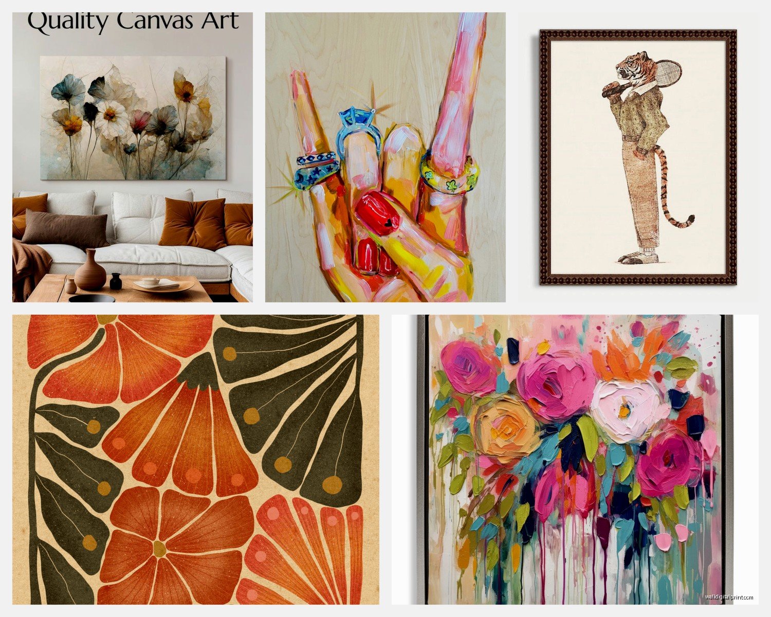
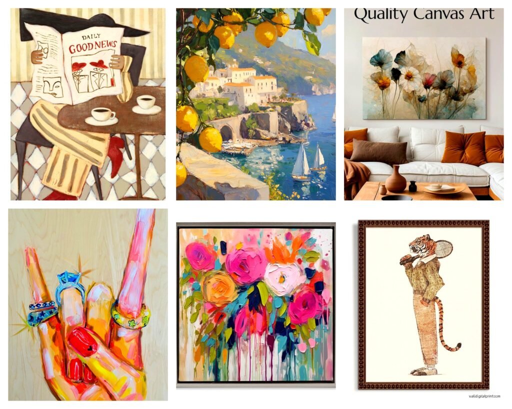
Okay so first off, textured abstracts are absolutely dominating. But not the smooth, boring stuff from like 2019. I’m talking about pieces with actual physical dimension – think heavy impasto, mixed media where you can see layers of plaster or resin. My gallery just sold four pieces in one week that had this crusty, almost sculptural quality to them.
The color palette shifted hard though. Everyone’s doing these muddy tertials – burnt sienna mixed with sage, terracotta with dusty blue. It sounds ugly when I describe it but I promise it works. One artist I follow basically just smooshes different shades of clay-colored paint on canvas and charges $800 for a 24×36 and they sell out every drop.
If you’re buying this stuff online (which, yeah, most people are), make sure the listing shows close-up shots. I cannot stress this enough. I bought what looked like a gorgeous textured piece for my own living room and it arrived completely flat – just printed texture. Had to return it, whole nightmare.
Where to Actually Find Good Ones
- Etsy still dominates but you gotta dig past page 3 of search results
- Saatchi Art has a “textured” filter now which is actually useful
- Instagram – search #texturedabstract2026 and DM artists directly
- Local art markets but you’ll pay 40% more, just being honest
Maximalist Florals Are Back But Make It Weird
Wait I forgot to mention – the whole “girlboss minimalism” thing is completely dead. Like, fully over. What’s selling now are these insane, over-the-top floral pieces but they’re… off somehow? The proportions are wrong on purpose, or the colors are slightly radioactive-looking.
I have a client who bought this massive peony print where the flowers are like, uncomfortably large and the pink is almost neon. She put it in her dining room and everyone who visits asks about it. That’s the vibe – conversation pieces that make people slightly uncomfortable but in an interesting way.
The botanical illustrations are still around but they’ve gotten darker. Lots of nightshade plants, poisonous flowers, decay mixed with bloom. My friend Anna (she does food photography mostly) just hung a series of dying roses in her studio and I was like okay that’s actually genius.
Size Matters Way More Than You Think
Something I learned the hard way – everyone’s going bigger. A 16×20 looks sad on most walls now unless you’re doing a gallery wall situation. The sweet spot is 30×40 minimum for a statement piece, or go full chaos with something 48×60 if you have the wall space.
But here’s the thing nobody tells you… you gotta measure your wall with painter’s tape first. Outline where the piece would go. I cannot tell you how many times people buy art that’s technically the right size but then it arrives and the proportions just feel wrong in the space. The tape trick saved me probably $2000 in returns last year.
Digital Glitch Art and Why It’s Not Just for Tech Bros Anymore
Okay this is gonna sound weird but glitch art finally escaped the crypto bro aesthetic and went mainstream. I’m seeing it in like, pediatric dentist offices now. But the stuff that’s actually selling isn’t the harsh, Matrix-y vibes. It’s softer glitches – think watercolor paintings that have digital distortion effects, or landscape photos with subtle pixel sorting.
There’s this one artist on Foundation (the NFT platform, yeah, but stay with me) who does glitch florals and they’re genuinely beautiful. She takes vintage botanical prints and runs them through custom algorithms. Each piece is unique and they’re like $300-500 for a digital file you can print yourself.
Oh and another thing – a lot of these artists sell both NFT and physical print versions now, so you can actually hang them without figuring out the whole digital frame situation which honestly still feels too complicated for most spaces.
Printing Digital Art Without It Looking Cheap
If you’re gonna buy digital files and print them yourself:
- Use a local print shop, not your home printer (learned this when my cat knocked over my coffee onto a $60 print attempt)
- Ask for giclée printing on fine art paper – costs more but actually worth it
- Get it mounted or framed immediately because the corners WILL curl
- Make sure you’re buying at least 300 DPI files, preferably higher
The Unexpected Return of Typography Art
So typography art came back but it’s not the “Live Laugh Love” stuff, thank god. What’s trending is like… poetry excerpts, song lyrics you’ve actually heard of, or even just single words in interesting typefaces. But they’re paired with abstract elements or photography.
I just curated a show where someone had printed Kurt Vonnegut quotes over satellite imagery of cities and it was *chef’s kiss*. Sold half the pieces opening night.
The key is it can’t be cheesy. No motivational quotes about hustle or whatever. People want literary references, obscure song lyrics, or even just aesthetically pleasing words. There’s a shop on Society6 doing single words in different languages with their translations and etymology info in tiny text at the bottom – super clean, actually educational, doesn’t feel like dorm room art.
3D Wall Sculptures Disguised as Art
This trend is exploding and I gotta say, I was skeptical at first. But wall-mounted sculptures that serve as art are everywhere now. Not talking about those metal tree things from HomeGoods. I mean actual sculptural pieces – ceramic wall installations, macramé that’s more art than craft, wooden geometric pieces that cast cool shadows.
The bestsellers right now are:
- Modular ceramic tiles you can arrange yourself (very popular with indecisive people)
- Brass or copper wire sculptures – minimalist but with dimension
- Preserved moss installations in shadow boxes
- Rattan or woven fiber pieces that add texture without color
Fair warning though – shipping costs on dimensional pieces are brutal. I ordered a ceramic wall piece for a client’s entryway and shipping was $85. The piece itself was $200. Just… be prepared for that.
Vintage Photography Prints But Curated Weird
Okay so funny story, I was watching this documentary about archive photography while reorganizing my storage unit, and I realized why vintage photo prints are selling like crazy right now. People are tired of obvious stock photo art but they still want photography that feels accessible.
What’s working: obscure vintage photos that feel personal but aren’t actually your family. Think 1970s street photography, weird architectural details from the 60s, candid shots from old magazines. There’s something about the grain and color palette of old film that just works with modern interiors.
Etsy sellers are scanning old photo albums they find at estate sales and selling the individual prints. It’s genius honestly. You can get a set of three vintage photos for like $45 and they look way more expensive than they are.
How to Make Vintage Photos Not Look Like a TJ Maxx
The framing is everything here. Don’t use ornate vintage frames – that’s too matchy. Use simple black, white, or natural wood frames. Let the photo be vintage, keep the frame modern. Or do the opposite – ultra-modern chrome frame with a 1940s photo. The contrast is what makes it interesting.
Also mix your eras if you’re doing a gallery wall. A 1920s portrait next to a 1980s landscape next to a 2000s abstract keeps it from feeling theme-y.
Hyperrealistic Animal Portraits (But Not Your Pets)
Pet portraits are still around but the trend shifted to wild animals in hyperrealistic styles. Like, National Geographic-level detail. I’m seeing tons of close-up bird portraits, big cat eyes, even insects rendered in insane detail.
The ones that sell best have unusual cropping – just the eye and part of the face, or a profile that cuts off unexpectedly. Makes them feel more like art and less like biology textbook illustrations.
There’s a UK artist doing moth portraits on black backgrounds that are absolutely stunning. Each piece is like 18×24 and she captures every single scale on the wings. They’re $400-600 and she has a six-month waitlist.
The Unexpected Popularity of Monochrome Everything
All-black art, all-white art, all-navy art – basically monochromatic pieces in a single color family are huge right now. I think people’s brains are tired? Like we’re all overstimulated so art that’s intentionally limited in palette feels calming.
But it can’t be boring monochrome. It needs texture, dimension, variation in tone. An all-white piece might have 15 different shades of white and cream with different finishes – matte, glossy, textured. That’s what makes it interesting enough to actually look at every day.
I just hung an all-black abstract in my office and I was worried it would be too dark but it’s actually my favorite piece now. The way light hits it throughout the day completely changes how it looks.
Custom Coordinate and Map Art That Doesn’t Suck
Okay coordinate art has been around forever but the 2026 version is way more sophisticated. Instead of just printing coordinates on a white background, artists are integrating them into actual map details, topography, or abstract representations of the location.
The bestselling version I keep seeing: watercolor maps with coordinates embedded in the design, metallic foil details, sometimes even raised elements. They’re personalized but don’t scream “I bought this on Etsy” the way the old ones did.
Price range is all over the place – $50 for a basic print to $500+ for custom painted versions. The sweet spot seems to be around $150-200 for a quality piece that’s personalized but not totally custom.
What’s Actually Worth the Money
Look, I’ve wasted money on trendy art that looked dated six months later, so here’s what I think has staying power:
Original pieces from emerging artists – yeah they cost more but they hold value and you’re supporting actual humans. Prints are fine but if you can swing $300-800 for an original, do it.
Large-scale photography prints on metal or acrylic – the materials make them feel substantial and modern without being trendy. They work with multiple design styles.
Handmade textile art – weavings, tapestries, fiber art. Takes forever to make so it feels special and the texture adds so much to a space.
What’s probably not worth it: anything that’s super specific to 2026 trends unless you’re gonna swap it out yearly. Like if it only works because it’s “on trend right now,” maybe skip it.
Framing Mistakes Everyone Makes
Real quick because I gotta wrap this up – please don’t cheap out on framing. A $50 print in a $200 custom frame looks like a $500 piece. A $500 print in a $30 Amazon frame looks like dorm art.
Also white mats are not mandatory anymore. Try colored mats, double mats, or no mat at all with a floater frame. And please, PLEASE hang things at the right height – center of the artwork should be at 57-60 inches from the floor. I see so many gorgeous pieces hung way too high and it ruins the whole vibe.
Anyway yeah, those are the trends I’m seeing actually sell and work in real spaces. The textured abstracts and dimensional pieces are probably your safest bet if you want something that’ll still look current in a couple years. But honestly just buy what makes you happy to look at – that never goes out of style.