Wall Art Guide, Wall Art Tutoriels
Grey Wall Art: Charcoal to Silver Neutral Spectrum
Aug
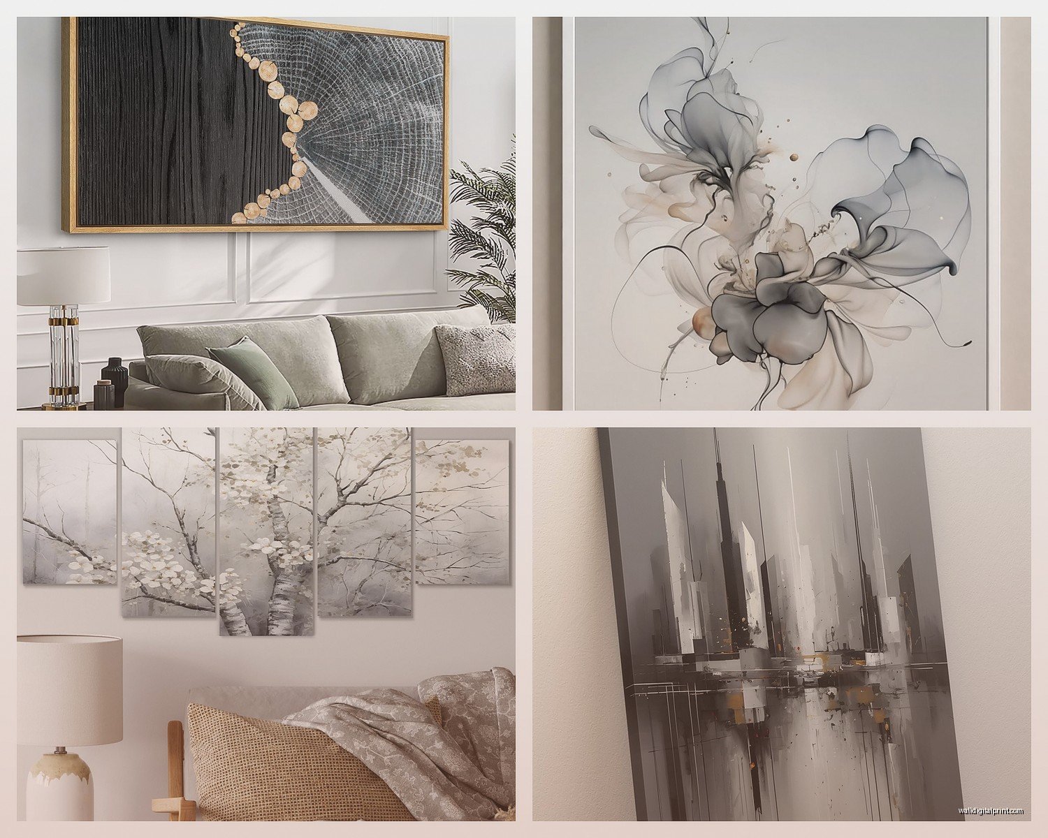
So I’ve been working with grey wall art for like six years now and honestly it’s probably the most versatile thing you can hang on a wall but also the easiest to mess up because people think “oh it’s just grey, it’ll go with everything” and then they end up with this weird muddy situation that makes their whole room feel… off.
The Thing About Grey Nobody Tells You
Okay so first thing – grey isn’t actually neutral the way beige is neutral. Grey has undertones and they WILL fight with your other greys if you’re not careful. I learned this the hard way when I hung this gorgeous charcoal abstract piece in a client’s living room and it looked straight up purple next to their grey couch. Turns out the couch was warm grey (brown undertones) and the art was cool grey (blue undertones). They were literally two feet apart and looked like they were from different planets.
What you gotta do is figure out if your existing greys lean warm or cool. Take whatever grey thing you already have – couch, rug, whatever – and hold it next to something pure white in natural light. If it looks slightly brownish or taupe-ish, it’s warm. If it looks blue-ish or even slightly purple, it’s cool. This sounds tedious but I promise it saves you from returning art three times.
The Charcoal End of the Spectrum
Charcoal pieces are basically your dark greys, almost black but not quite. These are fantastic for creating anchor points in a room. I use them when a space feels too floaty or when everything’s the same value and nothing has weight.
Here’s what works with charcoal art:
- Rooms with lots of natural light – the darkness won’t overwhelm
- Spaces that already have black accents (window frames, light fixtures, furniture legs)
- Above light-colored furniture where you need contrast
- In galleries walls where you need something to ground all the lighter pieces
The mistake I see constantly is people putting charcoal art in already-dark rooms thinking it’ll look sophisticated but it just disappears into the wall. You need contrast for charcoal to actually read as intentional and not just like a dark blob.
Oh and another thing – charcoal art shows dust like crazy if it’s got texture. I have this textured charcoal piece in my hallway and I’m constantly wiping it down because my cat likes to rub against the wall corner right below it and somehow the dust just… accumulates.
Mid-Tone Greys Are Your Workhorses
These are your true neutral greys – not too dark, not too light. Think concrete, slate, that color of an overcast sky. This is actually where most people should start because mid-tone grey is the most forgiving.
I’m gonna be honest, I probably recommend mid-tone grey art to like 60% of my clients because it works in so many situations. It doesn’t compete with colorful furniture, it doesn’t make small rooms feel smaller, and it doesn’t show every fingerprint if you have kids.
Best uses for mid-tone grey art:
- Bedrooms where you want calm but not boring
- Offices and workspaces (it’s professional without being cold)
- Transitional spaces like hallways
- As a bridge between rooms with different color schemes
Wait I forgot to mention – if you’re doing a gallery wall, mid-tone grey pieces are what tie everything together. You can have one colorful piece, one black and white photo, one cream abstract thing, and if you throw in a mid-tone grey piece or two, suddenly the whole thing looks intentional instead of random.
Light Grey to Silver Territory
This is where it gets tricky because light grey art can either look incredibly sophisticated or like you hung a dirty piece of paper on your wall. The difference is usually in the finish and texture.
Light grey works best when:
- It has some kind of sheen or metallic element – this is why silver-toned pieces photograph so well
- There’s texture involved (brushstrokes, mixed media, actual dimension)
- The frame is substantial enough that the art doesn’t just blend into the wall
- You’re layering it with other art in a similar tonal range
I did a whole bedroom last year where we used only light grey and silver art and it could’ve been boring but we mixed glossy pieces with matte pieces, added some with gold leaf accents (which reads as warm grey from a distance), and varied the sizes dramatically. The client was watching that Netflix show about interior design while I was installing and kept asking if it was “too much grey” and I’m like… wait for me to finish before you panic.
The thing about light grey art is it needs something to play off of. Either darker walls, or darker furniture, or colorful textiles. If everything in your room is already light and neutral, adding light grey art is just gonna make the room feel washed out.
Mixing Different Grey Tones
Okay so funny story – I used to tell people to stick to one temperature of grey (all warm or all cool) but then I accidentally mixed them in my own apartment and it actually looked… really good?
The trick is you need a clear dominant tone and then you can accent with the opposite. Like if your room is primarily cool greys (walls, sofa, rug), you can absolutely throw in one piece of warm charcoal art with brown undertones. It creates this subtle tension that makes the space more interesting.
What doesn’t work is trying to do a perfect 50/50 split. That just looks confused.
Also – and this is gonna sound weird but – metallic elements in grey art can bridge warm and cool. Silver leaf in a piece reads cool, but if that same piece has warm charcoal undertones, it somehow works with both temperature families. I don’t fully understand the science of it but I’ve used this trick probably a hundred times.
Framing Matters More Than You Think
White frames make grey art look cooler and more modern. Black frames make it look more dramatic and gallery-like. Natural wood frames warm everything up.
I default to black frames for grey art probably 80% of the time because they create this clean boundary that makes the art feel more intentional. But if your room already has a lot of black (windows, doors, whatever), white frames can actually make grey art pop more.
Floating frames – the ones with a gap between the art and frame – are really good for lighter grey pieces because they create a shadow that gives the art more presence on the wall.
Size and Placement Strategy
Here’s something nobody talks about – grey art needs to be slightly larger than you think to have impact. Because it’s not pulling attention with bright colors, it needs to command space through size.
My general rule: go at least 6 inches bigger than what your gut tells you. If you’re looking at a 24×36 piece thinking “that’ll work,” get the 30×40 instead. Grey art that’s too small just disappears, especially from across the room.
For placement:
- Charcoal pieces work above eye level because the darkness draws your gaze up
- Light grey pieces often work better at or slightly below eye level where you can see texture and detail
- Mid-tone grey is flexible – honestly anywhere
I hung a massive charcoal piece (like 48×60) in a client’s entryway right when you walk in and people literally stop and stare at it. Same piece in a smaller size would’ve been forgettable. Scale matters SO much with neutral art.
Texture Is Your Secret Weapon
Flat grey art can be beautiful but it’s hard to pull off. Texture makes grey art interesting even from across the room. I’m talking:
- Heavy brushstrokes you can see from 10 feet away
- Mixed media with actual dimension
- Canvas texture that’s visible
- Metallic elements that catch light
- Layered paint that creates shadows
This is why photographs printed on canvas sometimes fall flat as grey art – there’s no texture to create visual interest. Unless the photography itself has really strong composition, it can read as just… grey.
I’ve got this one piece in my office that’s mostly charcoal with raised silver details and depending on the time of day it looks completely different because of how light hits the texture. That’s the kind of thing that makes grey art worth having.
What Actually Goes With Grey Art
Pretty much everything, but some combinations are chef’s kiss:
- Grey art + navy blue furniture = sophisticated without trying too hard
- Grey art + warm wood tones = modern organic (very 2024)
- Grey art + blush pink or terracotta accents = soft but grounded
- Grey art + all white everything = gallery minimal
- Grey art + jewel tones = the grey calms down the color so it’s not overwhelming
The only thing I really struggle with pairing grey art with is beige. They’re both neutral but they often compete in this weird way where neither looks intentional. If you’re gonna do grey art in a beige room, make sure the grey has warm undertones and lean into charcoal rather than cool light greys.
Where to Actually Buy Decent Grey Art
I get asked this constantly. For original pieces or high-quality prints:
- Minted has good abstract grey stuff, tends to run cool-toned
- Etsy for original work from actual artists – search “charcoal abstract” or “grey minimal art”
- Society6 for affordable prints but quality varies wildly
- Local art fairs if you want something unique (I found my favorite grey piece at a random street fair)
- West Elm and CB2 for safe mid-tone options that ship fast
Avoid those print-on-demand sites that show up in Instagram ads unless you’re okay with something that might look washed out in person. The grey tones often don’t translate accurately from screen to print.
The Lighting Situation
Grey art is moody and atmospheric but it needs proper lighting or it just looks muddy. If you’re putting grey art somewhere, make sure there’s either:
- Good natural light during the day
- A picture light or spot light on the piece
- Ambient lighting that’s warm enough to keep the grey from looking dingy
Cool LED bulbs make grey art look even cooler and sometimes flat-out depressing. Warm LEDs (2700-3000K) make grey art feel more inviting while still keeping its sophisticated edge.
This is tedious but I always look at art under the actual lighting conditions where it’ll hang. A charcoal piece that looks amazing in a bright gallery can look like a black hole in a poorly lit hallway.
Common Mistakes to Skip
Don’t match your grey art exactly to your grey walls – you need contrast or the art disappears. Either go significantly darker or lighter than the wall color.
Don’t assume all grey art is modern – there’s traditional grey landscape art, grey botanical prints, grey abstract expressionism. Match the style to your room, not just the color.
Don’t forget about the space around the art. Grey art often needs breathing room. Cramming it next to a busy bookshelf or patterned wallpaper defeats the whole calming neutral thing.
And honestly don’t overthink it. I’ve spent hours agonizing over whether a piece was the right shade of grey only to hang it and realize the overall vibe mattered way more than the exact undertone. Sometimes you just gotta commit and see how it feels after living with it for a week.