Wall Art Guide, Wall Art Tutoriels
Gold Abstract Wall Art: Metallic Modern Non-Representational
Aug
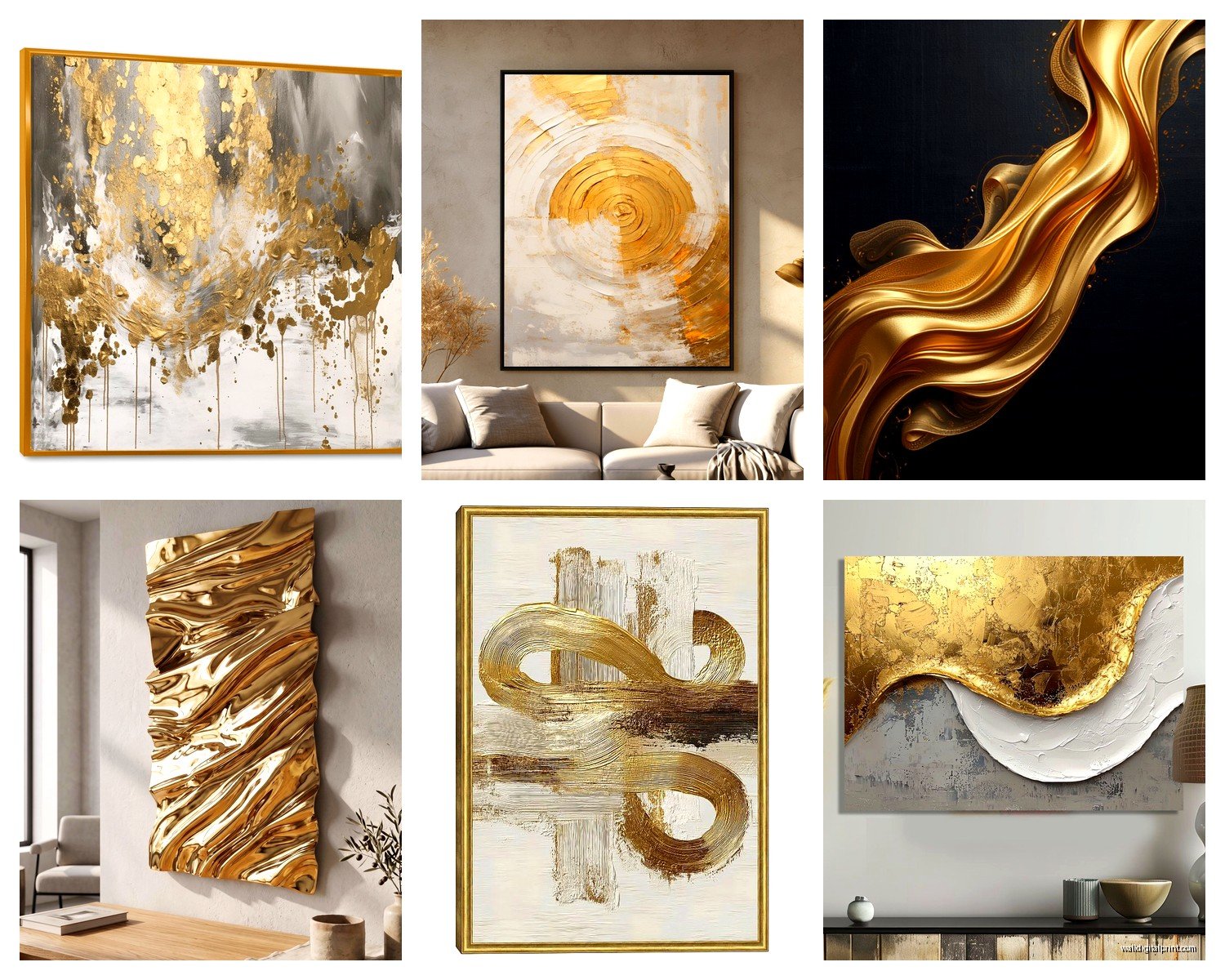
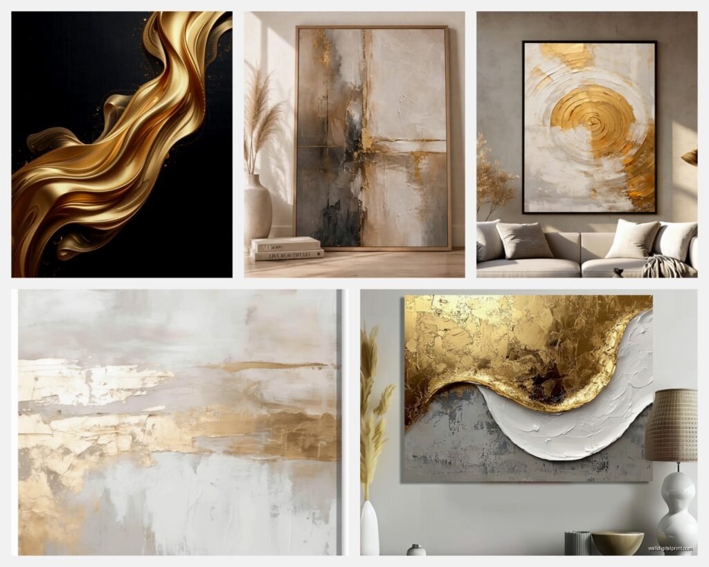
So I’ve been obsessing over gold abstract pieces lately because this client wanted to completely redo their living room and I fell down this whole rabbit hole of metallic wall art…and honestly I’ve learned way more than I expected about what actually works versus what just looks good in those perfectly staged Instagram photos.
The Thing Nobody Tells You About Gold Finishes
Okay so first thing – not all gold is created equal and this is gonna sound super specific but it matters SO much. You’ve got your bright gold (think shiny new jewelry), your champagne gold (more subtle, almost peachy), antique gold (darker, aged looking), and then rose gold which is technically pink but everyone calls it gold anyway.
I made the mistake of ordering what I thought was a “modern gold abstract” for my own apartment last year and it showed up looking like something from a 1970s hotel lobby. The finish was too brassy. What you actually want for modern spaces is either champagne gold or a brushed gold that doesn’t reflect light like a mirror. The super shiny stuff can look cheap really fast unless you’re going for that maximalist vibe.
Size Actually Matters More Than You Think
This is where everyone screws up including me the first dozen times. You see a piece online that’s like 24×36 inches and think “oh that’ll look great above my couch” but then it arrives and it’s completely dwarfed by your furniture.
Here’s what I tell people – measure your wall space, then go BIGGER than you think you need. If you’ve got a standard couch that’s about 84 inches wide, you want art that’s at least 50-60 inches wide. Could be one large piece or a set of two or three panels. I just finished a project where we did three 24×36 panels in a row and it looked way more intentional than one medium piece would have.
Oh and another thing – hang it at eye level which is roughly 57-60 inches from the floor to the center of the artwork. Not the top, the CENTER. I see this mistake constantly and it makes even expensive art look weird.
What to Actually Look For When Shopping
Okay so you’re scrolling through whatever site and there’s like ten thousand options. Here’s how I narrow it down without spending six hours on it.
Texture is Everything
Flat printed gold on canvas? Usually disappointing in person. What you want is actual texture – either hand-painted with thick acrylics, resin layers, or mixed media with gold leaf. The light needs to hit different surfaces at different angles or it just looks…flat and boring.
I found this one piece on Etsy (wait I forgot to mention – Etsy is actually really good for this stuff if you filter by “handmade”) that had layers of white and gray paint with gold leaf applied on top in random patches. The texture made it look completely different depending on the time of day. THAT’S what you’re going for.
The Background Color Situation
Gold needs something to contrast against or it just becomes visual noise. The combinations I’ve seen work best:
– Gold with navy or deep blue (very classic, works in traditional or modern spaces)
– Gold with white and gray (super modern, clean)
– Gold with black (dramatic, looks expensive)
– Gold with blush pink or cream (softer, good for bedrooms)
– Gold with teal or emerald (unexpected but really pretty)
What doesn’t work as well – gold with brown, gold with too many other metallics (unless you really know what you’re doing), gold with bright red (can look very Christmas-y).
Canvas vs. Metal vs. Acrylic Prints
So there’s different substrates and they all give different vibes. Canvas is most common and usually cheapest. It’s fine, looks traditional, easy to hang. But it can sag over time if it’s not stretched properly.
Metal prints with gold elements are having a moment right now and honestly they’re pretty cool. The gold gets printed directly onto aluminum and it has this luminous quality. They’re lighter than canvas, won’t sag, and they feel very contemporary. Downside is they show fingerprints easily and they’re more expensive.
Acrylic prints are basically the art printed and then mounted behind a sheet of plexiglass. Super glossy, very modern, makes colors pop like crazy. The gold in these can look almost three-dimensional. But they’re heavy, breakable if you drop them, and the most expensive option usually.
I’ve been watching this show about art forgers (totally unrelated but fascinating) and it made me think about how much the substrate affects our perception of value.
Framed or Unframed
Gallery wrapped canvas (where the image wraps around the sides) doesn’t need a frame and looks very modern. If you go this route make sure the edges are painted or have the image continuing around them – white edges look unfinished.
Frames can make cheaper art look more expensive. A simple floating frame in gold, black, or natural wood adds like $50-150 depending on size but elevates the whole thing. My cat knocked over a framed piece last month and I’m still finding glass shards so…just be aware that’s a thing.
For metallic art specifically I usually skip the frame unless we’re doing a gallery wall situation. The frame can compete with the gold in the artwork.
Where to Actually Buy This Stuff
Alright so you’ve got a bunch of options at different price points.
Budget tier ($50-200): HomeGoods, TJ Maxx, Wayfair, Amazon. The quality is hit or miss but if you’re just testing out the look this is fine. Read reviews with photos – the professional product shots are usually misleading.
Mid-range ($200-600): West Elm, CB2, Anthropologie, independent artists on Etsy or Saatchi Art. This is where you start getting actual hand-painted pieces or limited edition prints. Quality jump is noticeable.
Investment ($600+): Original art from galleries, commissioned pieces, established artists. If you’re gonna spend this much make sure you actually love it and it’s not just trendy.
I got a piece from an artist in Portland through Instagram DMs for like $400 and it’s probably my favorite thing I own. Sometimes going directly to artists gets you better prices than galleries.
The Lighting Thing That Changes Everything
This is gonna sound weird but the lighting in your room will make or break gold art. Natural light during the day makes it glow. Warm artificial light (2700-3000K bulbs) makes gold look rich and luxurious. Cool white light (4000K+) makes gold look washed out and cheap.
If you’ve got recessed lighting, angle one or two fixtures to graze across the art. This highlights the texture and makes the metallic elements pop. Track lighting works even better if you can swing it.
I had a client who hated their gold piece until we changed the bulbs in the room from cool white to warm white. Completely transformed it.
Styling Around It Without Going Overboard
Okay so you’ve got your gold abstract art up. Now what? The temptation is to add gold everything else and that’s usually too much.
Pick like two other places in the room for gold accents – maybe lamp bases and picture frames, or throw pillow details and a coffee table tray. That’s it. The art should be the star.
Colors that make gold art look better in the room: navy, charcoal gray, white, cream, dusty pink, sage green, deep teal. You want the wall color behind the art to be fairly neutral so the gold doesn’t have to compete.
The Multi-Panel Approach
Instead of one large piece, sets of 2-3 panels are really popular right now. You can arrange them horizontally, vertically, or in an asymmetrical layout. Leave about 2-4 inches between panels.
I just did a bedroom with three vertical panels – gold abstract with gray and white. Hung them above the bed with 3 inches between each panel and it looked so much more interesting than one big square piece would have.
DIY Option If You’re Feeling Adventurous
Look, you can totally make your own gold abstract art and it’s not as hard as you’d think. Get a canvas from Michael’s, some acrylic paint in white/gray/black, and gold leaf sheets (the imitation stuff is like $15 for a pack).
Paint your background colors in random organic shapes. Let it dry completely. Use gold leaf adhesive on areas where you want the gold, wait till it’s tacky, then press on the gold leaf. Seal it with a spray sealer. Done.
I’m not saying it’ll look like a $2000 gallery piece but for like $60 in materials you can get something custom that fits your exact color scheme. I’ve done this for clients who had super specific needs and it always turns out better than expected.
Common Mistakes I See Literally All the Time
Hanging it too high. Seriously, bring it down.
Choosing a piece that’s too small for the space. Go bigger.
Picking gold art but having brass or bronze hardware elsewhere in the room – the metals clash and it looks unintentional.
Not considering the room’s natural light – a north-facing room with cool light is gonna make gold look different than a south-facing room with warm light.
Buying something just because it’s trendy without thinking about whether you’ll still like it in two years. Gold abstract is having a moment but make sure it actually fits your style.
oh and another thing – those ultra-cheap prints where the gold is just yellow ink? They never look metallic in person. You need actual metallic pigment or leaf for it to catch light properly. This is where spending a bit more actually matters.
Mixing Metals and Making It Work
The old rule was never mix metals but that’s kinda outdated. You CAN mix gold with silver, brass, copper, whatever – you just need to do it intentionally. If you’ve got gold abstract art, you can have silver lamp bases or copper planters. Just make sure one metal is dominant (in this case gold from your art) and the others are accents.
I have a client with gold art, brass curtain rods, and chrome cabinet pulls in the same open concept space and it works because the finishes are all brushed not shiny, and the gold is clearly the main player.
Seasonal Consideration Nobody Thinks About
This sounds extra but gold art tends to feel warmer and cozier which makes it perfect for fall and winter. In summer it can sometimes feel heavy depending on your climate and how much natural light you get. If you’re in a hot sunny place, consider gold with lots of white or cool grays to keep it feeling fresh.
Or just ignore this entirely because rules are made to be broken and if you love it, you love it.
The main thing is just…don’t overthink it too much? Like yes, consider all this stuff, but also trust your gut. If you stare at a piece online for three days and keep coming back to it, that probably means something. I’ve bought art based purely on vibe and had it work out great, and I’ve also done all the “right” things and ended up with something boring.
Anyway that’s basically everything I’ve figured out about gold abstract wall art after way too many hours researching and installing these things. Let me know what you end up getting – I’m always curious to see what people actually choose versus what they think they should choose.