Wall Art Guide, Wall Art Tutoriels
Brown Wall Art: Chocolate Tan Earth Tone Warm Designs
Aug
So I’ve been dealing with brown wall art for like three years now and honestly it’s one of those things where people think it’s boring until they see it done right. Just last week I had a client who was like “brown feels so dated” and then I showed her this chocolate-toned abstract piece and she literally changed her entire living room plan.
Why Brown Actually Works When You Think It Won’t
Okay so here’s the thing about brown wall art that nobody tells you. It’s not about the brown itself, it’s about what brown DOES in a space. Like, warm browns—your chocolates, tans, caramels—they create this grounding effect that cooler colors just can’t match. I tested this in my own studio (which gets terrible north-facing light btw) and a terracotta-brown landscape piece literally made the whole room feel warmer without changing the actual temperature.
The trick is understanding undertones. Chocolate browns with red undertones? Totally different vibe from chocolate with gray undertones. I’m gonna sound like a paint chip person here but it matters SO much.
Chocolate Browns (The Dark Stuff)
These are your statement pieces. Think 60-80% brown coverage on the canvas. What I’ve learned is that chocolate brown works best when:
- You’ve got white or cream walls—the contrast is chef’s kiss
- The room gets decent natural light (otherwise it can feel cave-like, learned that the hard way)
- You pair it with brass or gold frames, not silver
- There’s texture involved—flat chocolate brown can read as just… a brown rectangle
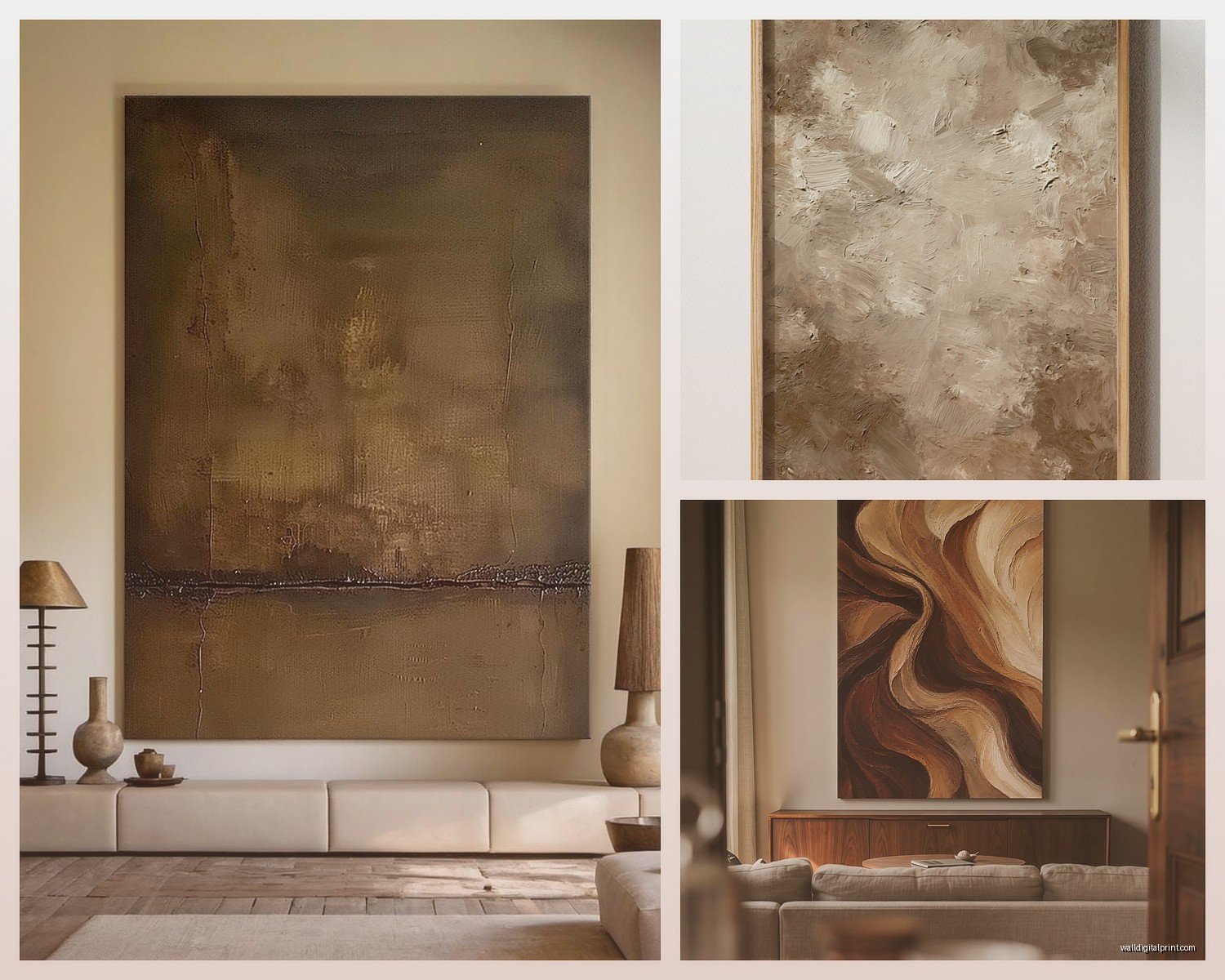
I hung this massive chocolate-brown abstract with gold leaf accents above my client’s sectional last month and her husband who “doesn’t care about art” stopped and stared at it for like five minutes. The gold leaf catches light differently throughout the day which keeps it interesting.
Tan and Beige Territory
Okay so tans are where most people start because they feel safer. And yeah, they ARE more versatile, but they can also disappear if you’re not careful. My cat knocked over a tan watercolor piece once and it sat on my beige rug for two days before I noticed it, which tells you something.
For tans to work they need:
- Variation in shade—like three different tans in one piece minimum
- A defined subject or pattern, not just abstract blocks
- Contrast elements, even if it’s just crisp white matting
- Good framing because tan art in a cheap frame looks like a thrift store find (and not in a good way)
Where to Actually Hang This Stuff
Living rooms are obvious but let me tell you where brown wall art is absolutely killer: dining rooms. Something about earth tones while eating just works on like a primal level? I did a whole gallery wall of sepia-toned photographs in my dining nook and people always comment on how the space feels “expensive” even though half those frames are from Target.
Bedrooms too—warm browns are weirdly calming. I’ve got this tan and cream botanical print above my bed and I swear I sleep better. That might be placebo effect but whatever, it’s working.
The Bathroom Thing
This is gonna sound weird but brown art in bathrooms is underrated. Not like, chocolate brown in a tiny powder room, but sandy tans and warm earth tones in a larger bathroom? Creates a spa feeling without the cliché beach themes. Just make sure it’s properly sealed or framed with glass because humidity is real.
Mixing Brown Art with Other Colors
Oh and another thing—brown plays well with almost everything but some combinations are just *better*. Here’s what I’ve actually tested:
Brown + White: Classic, can’t go wrong, but it can feel a bit sterile if that’s ALL you do. Add in some natural wood elements or greenery.
Brown + Navy: Unexpectedly sophisticated. I did this in a home office and it felt like a fancy library. The navy keeps it from feeling too earthy-crunchy.
Brown + Sage Green: Very 2024 but honestly it works. The warm-cool contrast is interesting without being jarring. My friend just did this in her nursery and it’s gender-neutral without being yellow.
Brown + Blush Pink: Sounds weird on paper but warm browns with dusty pink tones is giving romantic without being girly. Good for bedrooms or reading nooks.
Brown + Terracotta: Tone on tone earth vibes. Can feel very Southwestern if you’re not careful, but if you keep lines modern and avoid any cacti imagery it reads as globally inspired instead.
Texture Matters More Than You Think
Flat brown art is where people go wrong. You need texture or visual interest because brown can read as flat otherwise. Wait I forgot to mention—I spent like three hours last Tuesday comparing different textured pieces because my client canceled and here’s what actually makes a difference:
- Canvas texture showing through paint (that visible weave)
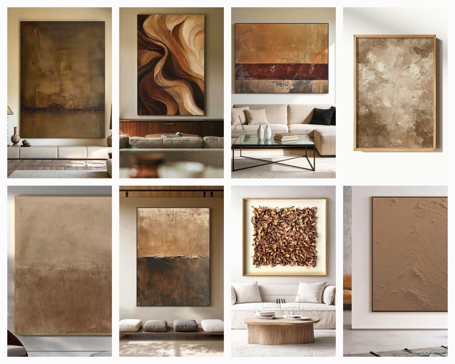
- Impasto technique where paint is thick and dimensional
- Mixed media with fabric, paper, or natural elements
- Metallic accents catching light
- Matte and gloss contrasts in the same piece
I bought this textured chocolate piece from an Etsy artist where she’d mixed coffee grounds into the paint and you can see all these subtle variations. Sounds hippie-ish but it’s actually really cool and smells faintly of coffee which is either a pro or con depending on your feelings about scented art.
Size Considerations Because This Trips People Up
Brown art follows different size rules than bright art. Bright colors can be small and still pop. Brown needs to be bigger to make an impact OR you need to group multiple pieces.
For a standard sofa that’s 84 inches wide, you want brown wall art that’s:
- Single piece: at least 40-50 inches wide
- Diptych or triptych: combined width of 50-60 inches
- Gallery wall: covering roughly 2/3 the sofa width
I went too small once and the brown art just looked like a weird afterthought hovering above the couch. Had to return it and size up, which was annoying because return shipping on framed art is expensive.
The Gallery Wall Approach
If you’re doing a gallery wall with brown tones, odd numbers work better. Like 3, 5, or 7 pieces. I usually do a mix of:
- One large anchor piece (biggest and darkest brown)
- Two medium pieces (different brown shades)
- Two small pieces (maybe incorporating cream or tan)
Keep spacing consistent—I use 2-3 inches between frames. Closer than that feels cluttered, farther apart feels disconnected.
Lighting Is Everything
Okay so this is critical with brown art. The lighting can make or break it. I’ve seen the same piece look completely different in three different homes based purely on lighting.
Natural light: Brown art LOVES natural light, especially warm afternoon sun. If your room gets harsh direct sun though, make sure the art is UV protected because browns can fade weirdly.
Warm artificial light: Use warm white bulbs (2700-3000K) not cool white. Cool white makes browns look muddy and gray. I switched all my client’s bulbs once and it was like a different artwork appeared.
Picture lights: For chocolate brown pieces especially, a small picture light mounted above can create really nice depth and drama. Makes it feel gallery-like.
Frame Choices That Actually Work
Frames for brown art are specific. Here’s what I’ve learned through trial and error (and one expensive mistake):
Natural wood frames: Go 2-3 shades lighter or darker than the dominant brown in the art. Same-shade frames make everything blend together.
Black frames: Work with chocolate browns but can be too harsh with lighter tans. Use sparingly.
Gold/brass frames: Perfect for warm browns. This is my go-to combo. Even inexpensive gold frames elevate brown art significantly.
White frames: Great for tan and beige art, creates clean contrast. Not my favorite with dark chocolate browns unless you’re going for high contrast.
I made the mistake of putting a cool-toned silver frame on a warm brown landscape once and it looked like two things fighting each other. Had to reframe the whole thing.
Where to Buy Without Breaking the Bank
Real talk—good brown wall art exists at every price point but you gotta know where to look.
Etsy: Tons of printable brown art you can download and frame yourself. I do this often for clients with tight budgets. Print at a local print shop on nice paper and it looks way more expensive than it is. Search terms like “abstract brown earth tones printable” or “chocolate brown botanical print.”
Society6 and Minted: More curated, slightly pricier, but they do framing which saves hassle. Their brown abstract selections are solid.
Thrift stores: Okay gonna sound like everyone’s grandma but I’ve found amazing brown-toned vintage landscapes and botanical prints at thrift stores. Usually in terrible frames but that’s an easy fix.
Local artists: Check Instagram for artists in your area working in earth tones. Original pieces aren’t as expensive as people think, especially from emerging artists. Plus you get a conversation piece.
Styling Around Brown Art
The art is only part of it—you gotta style around it properly. This is where I see people give up because the art alone isn’t doing enough.
Add these elements:
- Natural fiber textures (jute, linen, wool) that echo the earthiness
- Wood furniture in complementary tones
- Plants—always plants with brown art, the green-brown combo is unbeatable
- Warm metallics in decor accessories
- Layered lighting so the browns don’t flatten out
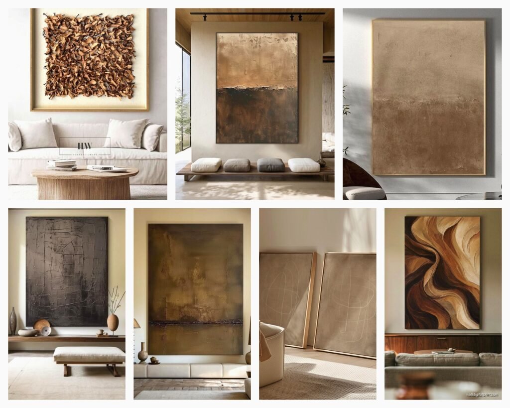
I styled a console table under brown abstract art with a brass lamp, some dried pampas grass in a ceramic vase, and a stack of coffee table books with brown spines. The whole vignette came together and suddenly the art made sense in the space.
What NOT to Do
Learned these the hard way:
Don’t match your brown art exactly to your brown couch. Too matchy-matchy and everything disappears into itself.
Don’t hang brown art on a brown accent wall unless there’s significant contrast. I did this once and the art literally disappeared.
Don’t go all cool-toned in the rest of the room if your brown art is warm-toned. The temperature clash will feel off even if people can’t articulate why.
Seasonal Switching
Wait I forgot to mention—brown art is great because it works year-round but you can style around it seasonally. In fall I add rust and orange accents, in spring I bring in more sage and cream tones, summer gets lighter tans emphasized, winter I go heavier on the chocolate with rich textures.
It’s like having different art without actually changing the art, which is nice when you’ve invested in good pieces.
The key thing I’ve learned after doing this for years is that brown wall art requires commitment to the warm tone story you’re telling in a space. You can’t just slap it up and hope it works—you gotta build the environment around it with intentional color temperatures, textures, and lighting. But when you do it right? It creates this cozy sophisticated thing that’s really hard to achieve with brighter colors.
Anyway that’s basically everything I know about brown wall art from actually working with it constantly. My dog is staring at me because it’s past his dinner time so I gotta go, but hopefully this helps you figure out what’ll actually work in your space.