Wall Art Guide, Wall Art Tutoriels
Ballerina Wall Art: Ballet Dancer Pointe Dance Studio
Aug
So I’ve been totally obsessed with ballerina wall art lately and honestly it started because this client wanted to turn her spare bedroom into a dance-inspired space and I went down this massive rabbit hole. Like, I thought it would be simple but there’s SO much to consider when you’re picking ballet dancer pieces for an actual space.
Figure Out Your Vibe First Because It Actually Matters
Okay so the biggest mistake I see people make is just buying the first pretty ballerina print they find on Etsy or whatever. But like… what’s the actual mood you’re going for? Because ballet art ranges from super classical oil painting vibes to these modern minimalist line drawings that are basically one continuous stroke. I spent probably three hours one night (my dog was giving me judgy looks the entire time) just scrolling through different styles and they’re wildly different.
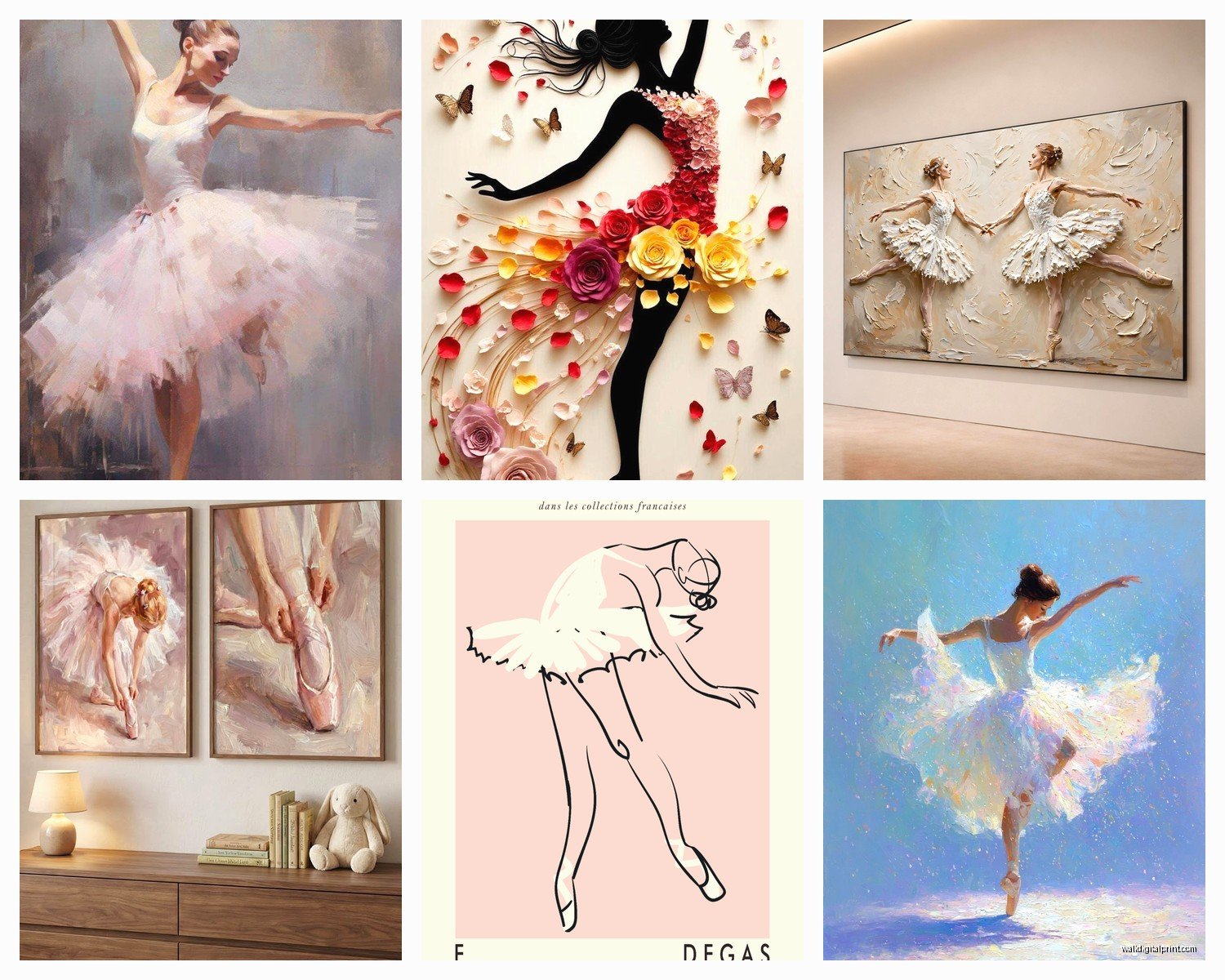
Classical ballet paintings give you that romantic, traditional feel. Think soft pastels, tutus with actual texture painted in, very Degas-inspired stuff. These work amazing in studios that have that old-world charm or if you’re decorating a young dancer’s room and want that dreamy quality.
Then there’s photography prints which… honestly can be hit or miss. The good ones are REALLY good though. Black and white pointe shoe photos, especially close-ups of the ribbons and worn satin, those have this raw authenticity that painted versions don’t capture. I used one in a studio redesign last year and the instructor literally teared up because it reminded her of her performing days.
Modern line art is having a moment right now and I get why. Single line drawings of dancers mid-leap or in arabesque positions work in literally any space because they’re so minimal. They don’t compete with your existing decor which is gonna be important if you’re not redoing the whole room.
Size and Scale Will Make or Break This
This is where people mess up constantly. You cannot just eyeball this, you really can’t. I learned this the hard way when I ordered what I thought would be a statement piece for above a barre and it arrived and was like… the size of a notebook. Super embarrassing.
For above a barre or piano in a dance studio, you want something substantial. I’m talking at least 36 inches wide, preferably bigger. The wall space above dance equipment is usually pretty expansive and a tiny print just looks lost and sad up there.
If you’re creating a gallery wall situation, which honestly looks incredible with ballet art, you can mix sizes but you need an anchor piece. I usually go with one large piece (like 24×36) and then surround it with smaller 8×10 or 11×14 prints. The key is mapping it out on the floor first or using painter’s tape on the wall to mark where frames will go. Sounds tedious but I promise it saves you from a million nail holes.
Oh and another thing, consider the ceiling height. In studios with those gorgeous high ceilings, you can go TALL with your art. Vertical pieces of dancers in elongated poses emphasize that height beautifully. Low ceilings? Stick with horizontal orientations or square formats.
Frame Choices That Won’t Make You Cringe Later
Okay so funny story, I once used these ornate gold baroque frames for ballet prints thinking they’d look elegant and sophisticated and they just looked… like a grandma’s house? Not in a cool vintage way, just dated.
For classical ballet paintings or vintage-style prints, simple black frames work best. Matte black, thin profile, nothing fancy. They let the art be the star and they’re timeless so you won’t want to change them in two years.
Modern line drawings look sick in natural wood frames. Light oak or walnut, keeps things warm and contemporary. I’ve also done floating frames for some pieces which creates this cool dimensional effect.
White frames can work but they’re tricky because they need to match your wall color pretty closely or they create this weird contrast that’s distracting. Unless your walls are bright white, I’d skip these.
If you’re hanging in an actual dance studio where there’s activity and movement, consider plexiglass instead of regular glass. It’s lighter, won’t shatter if someone’s doing grand jetés nearby, and honestly looks just as good for most pieces.
Where to Actually Source Good Pieces
Etsy is obvious but you gotta dig. Don’t just buy from the first page of results because those are usually the same mass-produced prints everyone has. I search really specific terms like “vintage ballet poster reproduction” or “custom ballerina silhouette” to find the smaller artists doing unique work.
Society6 and Redbubble have some talented artists doing ballet work. The advantage here is they print on demand in whatever size you need, which is super convenient. Quality can be inconsistent though, so check reviews on that specific artist’s work.
For actual photography, there are dance photographers who sell prints of their performance and studio work. These are pricier but the quality is insane. I’m talking museum-grade printing, proper color calibration, the whole thing. If you’re designing a professional studio space, this is worth the investment.
Vintage shops and estate sales sometimes have actual ballet posters from performances or dance schools. These are my favorite finds because they’re one-of-a-kind and have this authentic history. I found a 1960s Bolshoi Ballet poster at an estate sale for like thirty bucks and it’s one of my favorite pieces ever.
Color Coordination Without Being Matchy-Matchy
This is gonna sound weird but I don’t actually match ballet art to wall colors exactly. What works better is pulling accent colors from the art into your space through other elements.
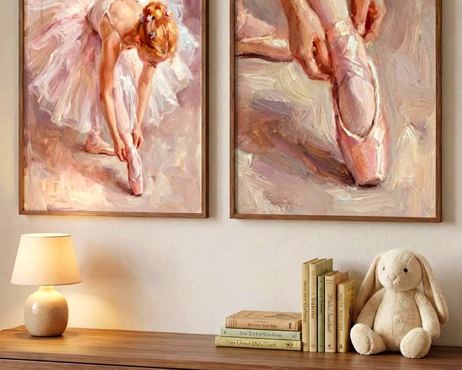
If you’ve got a print with soft pink tutus, bring that pink into throw pillows or a small chair rather than painting walls pink. The art then ties everything together instead of disappearing into matching walls.
Black and white ballet photography is basically foolproof. It works with any wall color, any decor style, and you can change your room colors later without needing new art. I use B&W pieces when I’m not sure about a client’s long-term plans.
For kids’ rooms or young dancer spaces, you can go bolder with color. I did this amazing installation with watercolor-style ballerina prints in jewel tones—emerald, sapphire, ruby reds. Looked incredible against light gray walls and the young dancer absolutely loved it.
Wait I forgot to mention, metallics are having a moment in ballet art. Gold leaf details, silver foil accents on pointe shoes, copper line drawings. These add visual interest without being colorful, so they work in more neutral spaces but still have personality.
Practical Stuff for Dance Studios Specifically
If you’re decorating an actual working dance studio, there are some functional considerations beyond just aesthetics. The art needs to be secured properly because of vibrations from jumping, floor work, etc. I use heavy-duty wall anchors and make sure frames are level-mounted, not just hanging on a single nail.
Placement matters too. Don’t hang anything directly above where dancers warm up at the barre because it’s a distraction. The best spots are on the wall opposite the mirrors or on side walls where dancers can see them between combinations but they’re not in the direct sightline during practice.
Motivational pieces work well in studio waiting areas or changing rooms. Those inspirational quote prints combined with ballet imagery… some of them are cheesy but some are actually lovely. I used one that said “First position, last impression” with a simple silhouette and the studio owner said parents loved it.
DIY Options If You’re On a Budget
My client canceled last month so I spent an afternoon testing DIY ballet art options and honestly some of them turned out really well. You can buy high-resolution ballet images from stock photo sites (like twenty bucks), get them printed at a local print shop on nice paper, and frame them yourself. Total cost was under fifty dollars for a 24×36 print that looked professional.
Vinyl wall decals of ballerinas are another option. They’re temporary, which is perfect for renters or kids’ rooms that’ll change as they grow. The good ones don’t look cheap or tacky—there are some really elegant silhouette designs out there.
If you’re artistic at all, tracing ballet poses onto canvas and painting them in a single color creates these cool modern pieces. I’m not even that artistic and mine turned out decent. Used a projector to trace a ballerina image onto canvas, painted the silhouette in matte black acrylic, and it looked like something from West Elm.
Mixing Ballet Art with Other Decor Styles
You don’t need to go full ballet theme for this to work. Actually, I think it looks better when you don’t. Ballet art adds elegance and movement to lots of different design styles.
In industrial spaces with exposed brick and metal elements, black and white ballet photography creates this cool contrast between the rough textures and the graceful subject matter. I did this in a loft apartment and it was stunning.
Bohemian or eclectic spaces can handle more colorful, whimsical ballet pieces. Think watercolors, abstract interpretations of dancers, mixed media pieces with fabric and paint combined.
Even super modern minimalist spaces work with ballet art if you choose simple line drawings or high-contrast photography. The human form in motion actually complements clean-lined furniture and sparse decor really well.
Lighting Makes Such a Huge Difference
Okay this is something I didn’t realize mattered so much until I started testing it. The lighting on your ballet art completely changes how it looks and feels.
Picture lights mounted above frames work great for creating a gallery effect, especially in studios or formal spaces. They highlight the artwork and create this professional polish.
Natural light is tricky because you don’t want direct sunlight fading your prints, but indirect natural light makes ballet photography especially look incredible. The shadows and highlights in the images come alive with natural lighting.
Track lighting or recessed lights aimed at the wall create a modern museum vibe. This works especially well if you’ve got a gallery wall of multiple ballet pieces.
For kids’ rooms or casual spaces, regular room lighting is fine, but consider the warmth of your bulbs. Cool white light makes colors look crisp but can feel sterile. Warm white is softer and more inviting for bedroom spaces.
Unconventional Placement Ideas That Actually Work
Everyone thinks walls, but there are other options. I’ve leaned large ballet canvases on mantels or console tables instead of hanging them, which creates this casual collected look.
In dance studios with high shelving, smaller framed ballet prints displayed on the shelves among trophies and dance memorabilia tells a story better than just hanging everything on walls.
Bathroom art is underutilized. A small vintage ballet poster in a powder room is unexpected and charming. Just make sure it’s properly sealed if there’s moisture concerns.
I even did a ceiling installation once in a young dancer’s room where we hung a large sheer fabric print of a ballerina from the ceiling as a canopy element. It was dramatic and she felt like she was sleeping in a performance space.
The thing with ballerina wall art is it’s so versatile that you really can’t mess it up too badly as long as you’re thinking about scale and choosing images that genuinely speak to you rather than just what’s trendy. I’ve seen the same basic pointe shoe photo look completely different in various spaces depending on framing, placement, and surrounding decor, so don’t stress too much about finding the “perfect” piece because the perfect piece is really about how you style it in your specific space.