Wall Art Guide, Wall Art Tutoriels
Custom Quote Wall Art: Personalized Text Typography Design
Aug
So I’ve been down this custom quote wall art rabbit hole for like three years now and honestly it started because a client wanted something super specific that I couldn’t find anywhere, and now I’m that person who has opinions about kerning at dinner parties.
The first thing you gotta know is that there are basically three routes here: DIY digital design, online customization tools, or commissioning someone. Each one has its moment depending on what you’re after.
The DIY Digital Route
Okay so if you’re even slightly comfortable with design programs, Canva is gonna be your best friend. I know everyone says this but genuinely their text tools have gotten so good. You can create something in like 20 minutes that looks professionally done if you follow some basic rules.
Start with their poster templates, then delete everything except the background. Pick your quote first obviously. Here’s where people mess up though – they try to fit too many words. Like, if your quote is more than 15-20 words, you’re gonna have a readability problem unless you’re doing a massive print. I learned this the hard way with a Virginia Woolf quote that ended up looking like an eye exam chart.
Font pairing is where it gets tricky. My rule that actually works: pick one serif and one sans serif, never more than two fonts total. My go-to combinations are Playfair Display with Montserrat, or Cormorant with Raleway. There’s this thing called font hierarchy that sounds complicated but really just means make the important words bigger. The mistake I see constantly is people making every word the same size and weight.
Actually Useful Typography Tips
Letter spacing matters SO much more than you’d think. In Canva you can adjust this and honestly just increasing it by like 5-10 points makes things look more expensive and intentional. Tighten it for bold impact statements, spread it out for elegant vibes.
Line height too – give your text room to breathe. Nothing screams amateur like cramped lines. I usually set line spacing to at least 1.2, sometimes up to 1.5 for that airy gallery look.
Color-wise, just because you can use seventeen colors doesn’t mean you should. Black on white is classic for a reason. If you want color, limit yourself to two max. I’ve been really into this charcoal grey (#3D3D3D) instead of pure black lately because it’s softer but still readable from across a room.
Online Customization Tools
Wait I forgot to mention – if you don’t wanna design from scratch, sites like Etsy have these instant download templates where you edit the text yourself. Mixed bag though because some sellers give you actual editable files and others just… don’t respond when you need help.
For actual customization tools, Minted and Shutterfly have come a long way. Minted especially has these beautiful foil press options that you can’t really DIY. Their customizer is pretty intuitive but here’s the thing – their preview images can be misleading about scale. Always check the actual dimensions they’re showing you.
Artifact Uprising is another one I use for clients who want that premium feel. Their text customization is more limited but the print quality is insane. Like, the paper stock alone makes it worth the extra cost. They have this cotton rag paper option that feels like actual art.
Print-on-Demand Services
Society6 and Redbubble let you upload your own design which is cool for flexibility. The quality is… fine. Not amazing, but fine for a bedroom or home office. I wouldn’t put it in a formal living room if we’re being honest. Their canvas wraps tend to show texture inconsistencies but their framed prints are decent.
Printful is what I use when I’m ordering for clients now. You need to upload a print-ready file which means you gotta know about resolution (300 DPI minimum, don’t even try with anything less). Their mockups are accurate which is huge because what you see is actually what you get.
The Commission Route
This is gonna sound weird but commissioning a custom piece from a lettering artist or calligrapher is sometimes cheaper than you’d expect. I found this artist on Instagram who does custom watercolor typography for like $150-200 and it’s genuinely museum-quality stuff. You’re paying for their expertise in composition and their actual artistic skill.
When you’re reaching out to someone, be specific about dimensions, color preferences, and the vibe you’re going for. Send reference images. The more info you give them upfront, the fewer revision rounds you’ll need. Also ask about file formats – you want a high-res PNG or TIFF at minimum so you can print it anywhere.
Getting the Design Actually Right
Okay so funny story, I once spent three hours perfecting a design only to realize I’d spelled “separate” wrong in the quote. Proofread your text in like three different contexts. Put it in your phone notes, paste it in an email draft, have someone else read it. Typos in permanent wall art are… not great.
Think about where this is going in your space because that affects everything. A narrow hallway needs a vertical orientation. Above a sofa you want horizontal, probably 2/3 the width of the furniture. I use this rule: stand back 10 feet and you should still be able to read it comfortably.
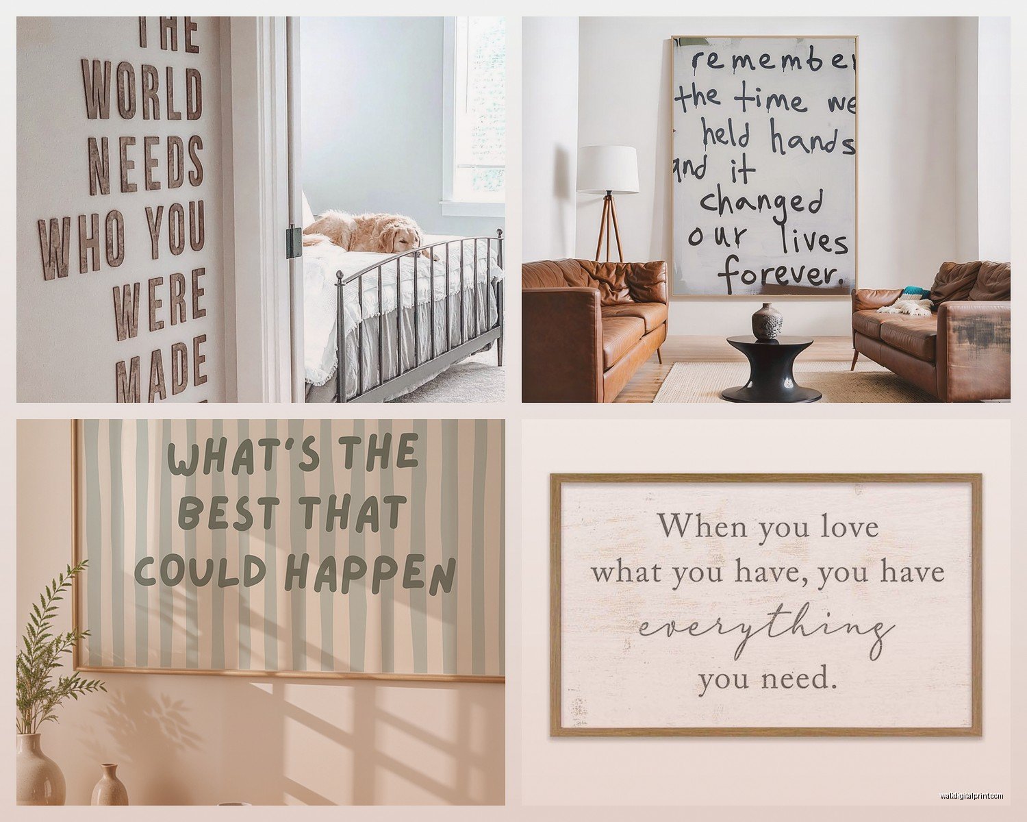
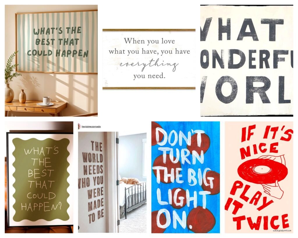
The style needs to match your space too. Modern minimalist rooms can handle bold geometric typography. Traditional spaces look better with script fonts or serif classics. Bohemian vibes work with mixed fonts and playful layouts. I did this eclectic gallery wall once where we mixed three different quote styles and it worked because the frames unified everything.
Color and Background Decisions
White or cream backgrounds are safest and most versatile. But if your walls are already white, sometimes a colored background makes the art pop more. I’m really into this dusty blue-grey right now that works in basically any room.
Textured backgrounds add depth – think linen, concrete, watercolor washes. Just make sure the texture doesn’t compete with the text for attention. The quote should always be the star.
For text color on colored backgrounds, use the squint test. Squint at your design and if the text blurs into the background, you don’t have enough contrast. This matters more than people think because you want this readable in different lighting conditions.
File Formats and Printing
This part is technical but important. For print, you need high resolution – that 300 DPI I mentioned earlier. The file size should be pretty large, like several megabytes at least for anything over 8×10. If your file is tiny, it’s gonna print pixelated and fuzzy.
PDF is great for preserving fonts and formatting. PNG works if you need transparency. TIFF is best for absolute highest quality but the files are huge. JPEG is fine for most uses but it compresses the image so you lose some quality.
Get your color mode right – CMYK for professional printing, RGB for most print-on-demand services. This is where things can shift weirdly if you’re not careful. Colors look different on screen versus printed so if color accuracy matters a lot, order a test print first.
Framing and Display Options
Canvas wraps are popular but honestly I think they’re overused and can look cheap. If you’re doing canvas, make sure it’s at least 1.5 inches deep and gallery-wrapped (meaning the image continues around the sides).
Framed prints are classic and you have more control over the final look. Black frames are safe, wood frames add warmth, white frames feel clean and gallery-like. I’ve been using these thin metal frames lately that have this floating effect – really modern and lets the art speak.
Acrylic prints are having a moment and they’re actually gorgeous for typography. The text looks super crisp and the depth is really cool. More expensive but worth it for a statement piece.
My cat just knocked over my coffee but anyway –
Poster hangers are great for renters or if you like changing things up. Those magnetic wooden ones or the simple clip hangers work well with minimalist designs. Less commitment than permanent framing.
Size and Scale Guidelines
This trips people up constantly. Too small looks insignificant, too large overwhelms the space. For above a sofa or bed, you want something at least 24 inches wide, ideally closer to 36-48 inches. Single focal point pieces should be substantial – think 24×36 or larger.
For gallery walls you can mix sizes but keep at least one larger piece as an anchor. I usually do one 16×20, a couple 11x14s, and fill in with 8x10s. Odd numbers look better than even for some reason.
Measure your wall space before you design anything. I use painter’s tape to map out where the art will go. Sounds excessive but it prevents that thing where you hang something and immediately realize it’s wrong.
Common Mistakes to Actually Avoid
Using too many fonts – seriously just don’t. Two max, one is often enough.
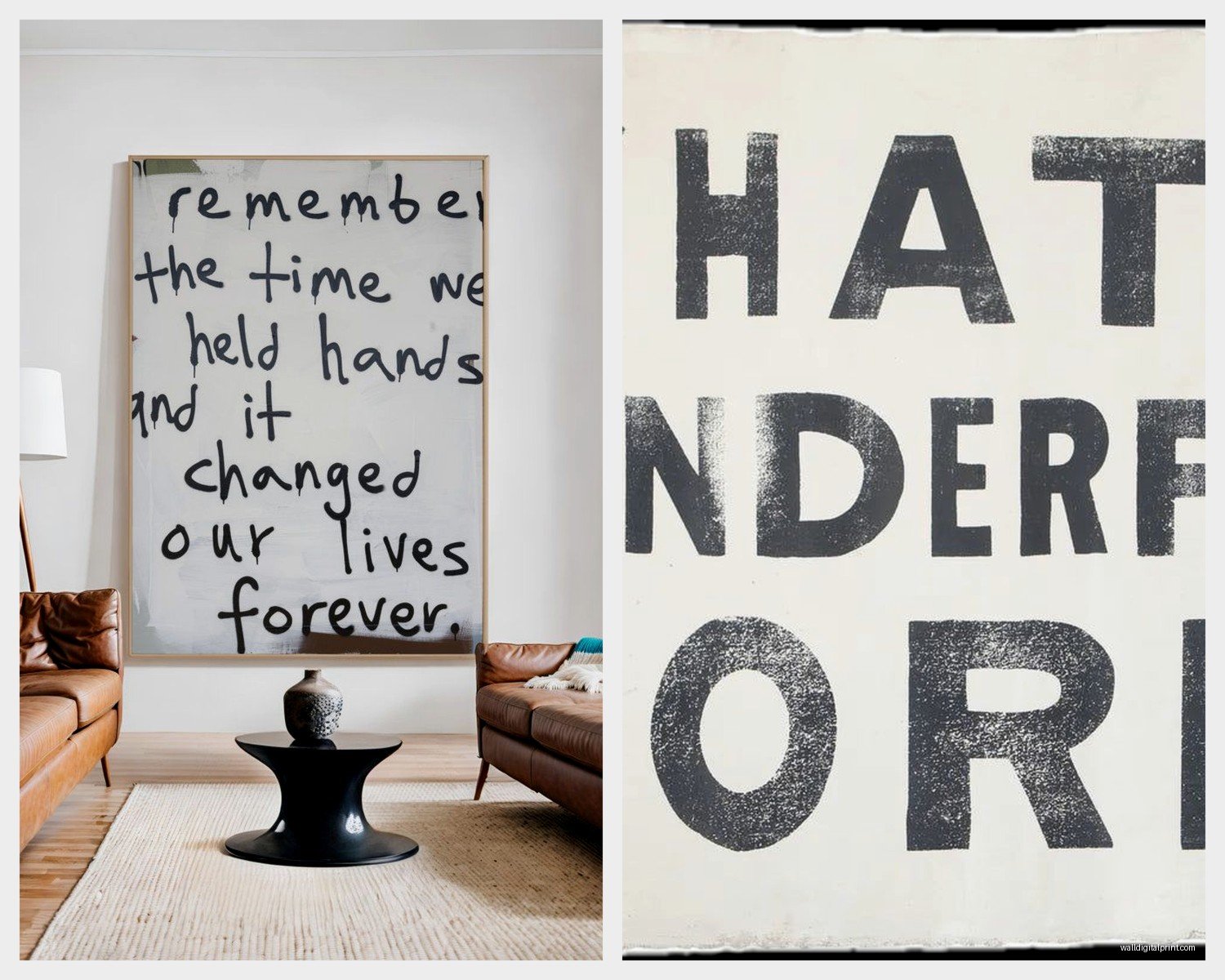
Centering everything – sometimes asymmetrical layouts are way more interesting. Left-aligned text can look really sophisticated.
Ignoring negative space – cramming text edge to edge looks amatuer. Leave breathing room, especially on the margins.
Choosing trendy fonts that’ll look dated in a year. Script fonts especially age poorly if they’re too decorative. Stick with classics or simple modern fonts.
Not considering your wall color. A white print on a white wall needs a frame or mat to define it. Dark text on dark walls disappears.
Forgetting about lighting – where’s your light source? Will there be glare on glass? Matte finishes help with this.
Oh and another thing – think about longevity. Is this quote gonna resonate with you in five years? I’ve removed so many “live laugh love” variations from clients’ homes during redesigns. Choose something meaningful to you specifically or go with classic literature or poetry quotes that have staying power.
The beauty of custom typography art is you can literally put anything you want on your wall. Song lyrics that mean something, coordinates of a special place, a family motto, inside jokes even. I did one for a client that just said “She persisted” in this gorgeous serif font and it’s still my favorite project.
Just start with good bones – readable font, proper contrast, appropriate sizing – and you honestly can’t go too wrong. The technical stuff matters but not as much as choosing words that actually mean something to you.