Wall Art Guide, Wall Art Tutoriels
White Metal Wall Art: Clean Pure Sculptural Designs
Aug
So I’ve been obsessing over white metal wall art lately and honestly it’s one of those things that sounds simple but can go SO wrong if you don’t know what you’re looking for. Like my friend Anna bought this piece from a big box store and it was this weird off-white that looked dingy from day one, not the crisp clean vibe she wanted at all.
The White Finish Actually Matters Way More Than You Think
Okay so here’s the thing nobody tells you – “white” metal wall art comes in like a million different finishes and they all read completely different on your wall. You’ve got powder-coated white which is super durable and has this matte finish that’s gorgeous but can sometimes look a bit flat if your lighting isn’t great. Then there’s glossy white which reflects light beautifully but shows every fingerprint and speck of dust, learned that one the hard way in my dining room.
I spent probably three hours last Tuesday just comparing finishes because a client wanted something for her minimalist loft and the difference between a warm white and a cool white is actually insane. Warm whites have this slight cream or ivory undertone – they work amazing in spaces with wood tones or warmer lighting. Cool whites are more true white with blue undertones, perfect for modern spaces with lots of concrete or glass.
Matte vs Glossy – What Actually Works
Matte white is gonna be your best friend if you want that sculptural museum-quality look. It doesn’t compete with other elements in the room and the shadows that the sculpture creates are more defined. I have this geometric piece in my hallway that’s matte white and depending on the time of day it looks completely different because of how the shadows shift.
Glossy white though… okay so this is gonna sound weird but it almost acts like a mirror in some lights? Not literally but it bounces light around in a way that can make a small room feel bigger. Just don’t put it anywhere near where people will touch it because you’ll be wiping it down constantly.
Size and Scale – Where Everyone Messes Up
The biggest mistake I see is people buying pieces that are way too small for their wall. Like you need to go bigger than you think you need to. I always tell people to measure their wall space and then aim for a piece that takes up at least 60-75% of that width. A tiny white sculpture on a huge wall just looks like you forgot to finish decorating.
My living room has this 8-foot wall and I went with a piece that’s about 5 feet wide – it’s this abstract flowing design that looks like ribbons or wind or something, hard to describe. But the scale makes it feel intentional and bold rather than like an afterthought.
Oh and another thing – consider the viewing distance. If you’re putting something in a hallway where people walk close to it, you can get away with more intricate details. But if it’s going above a sofa where you’ll mainly see it from across the room, you want bolder simpler shapes that read well from a distance.
Actually Measuring Your Space
Get some painter’s tape and map out the size you’re thinking about directly on the wall. Live with it for a day or two. I do this with every piece I’m considering and it’s saved me from so many bad purchases. You can also cut out paper templates if you’re really unsure – sounds silly but it works.
Types of White Metal Sculptural Designs
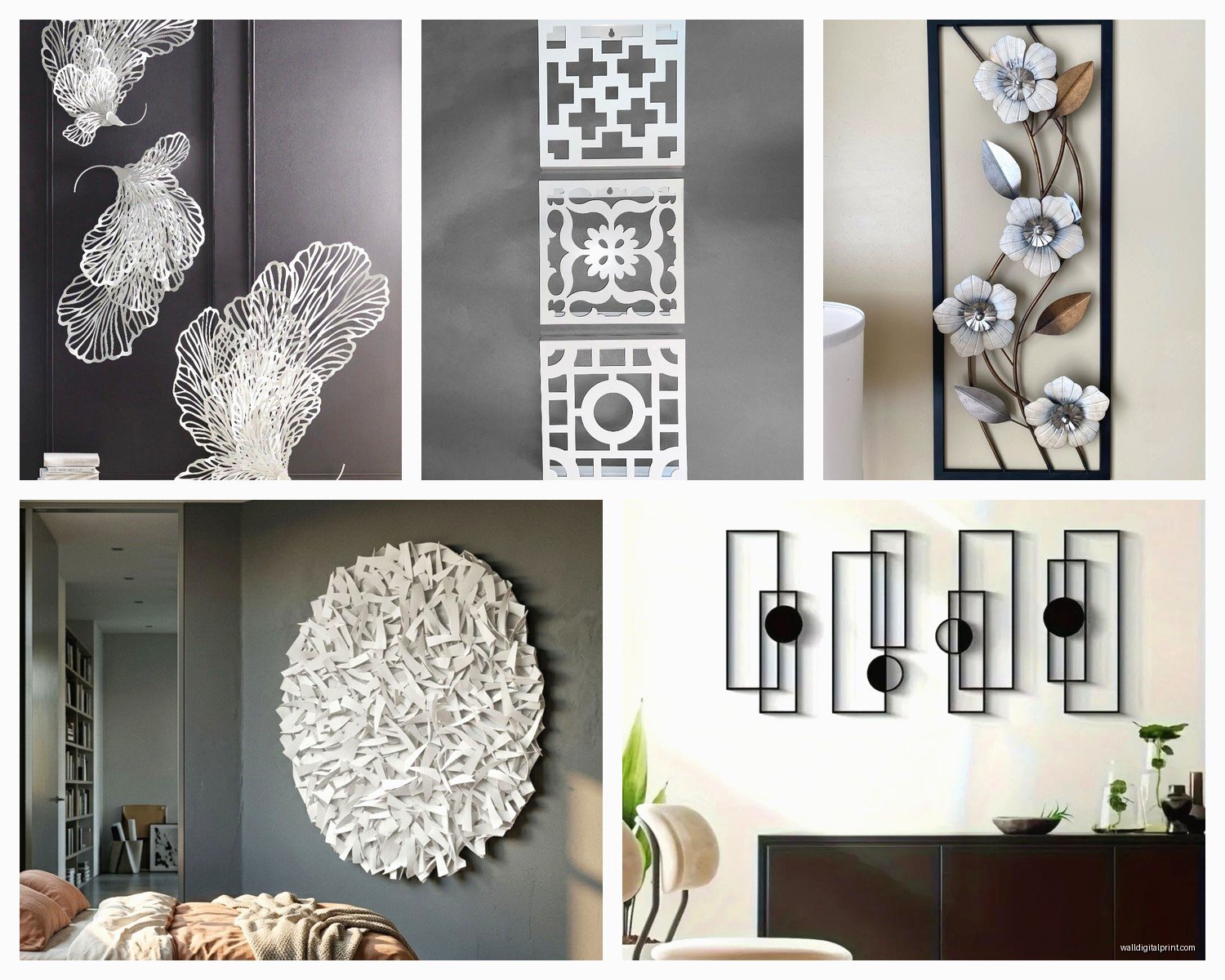
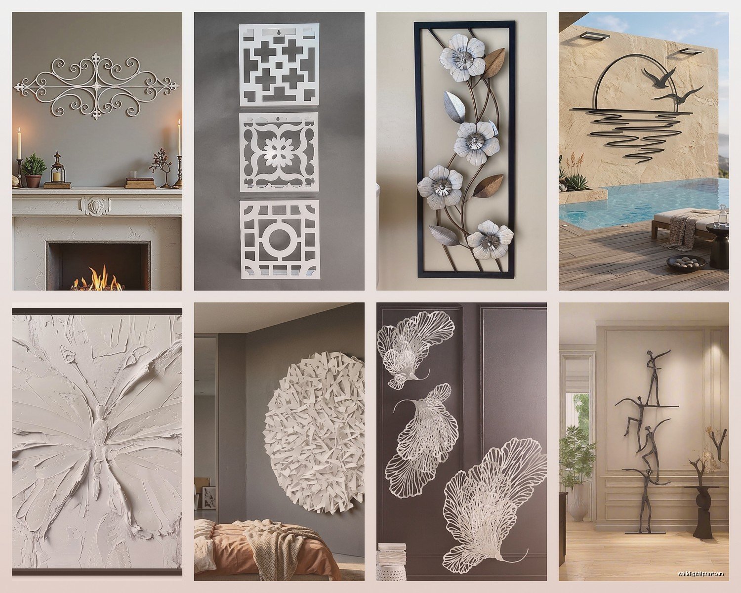
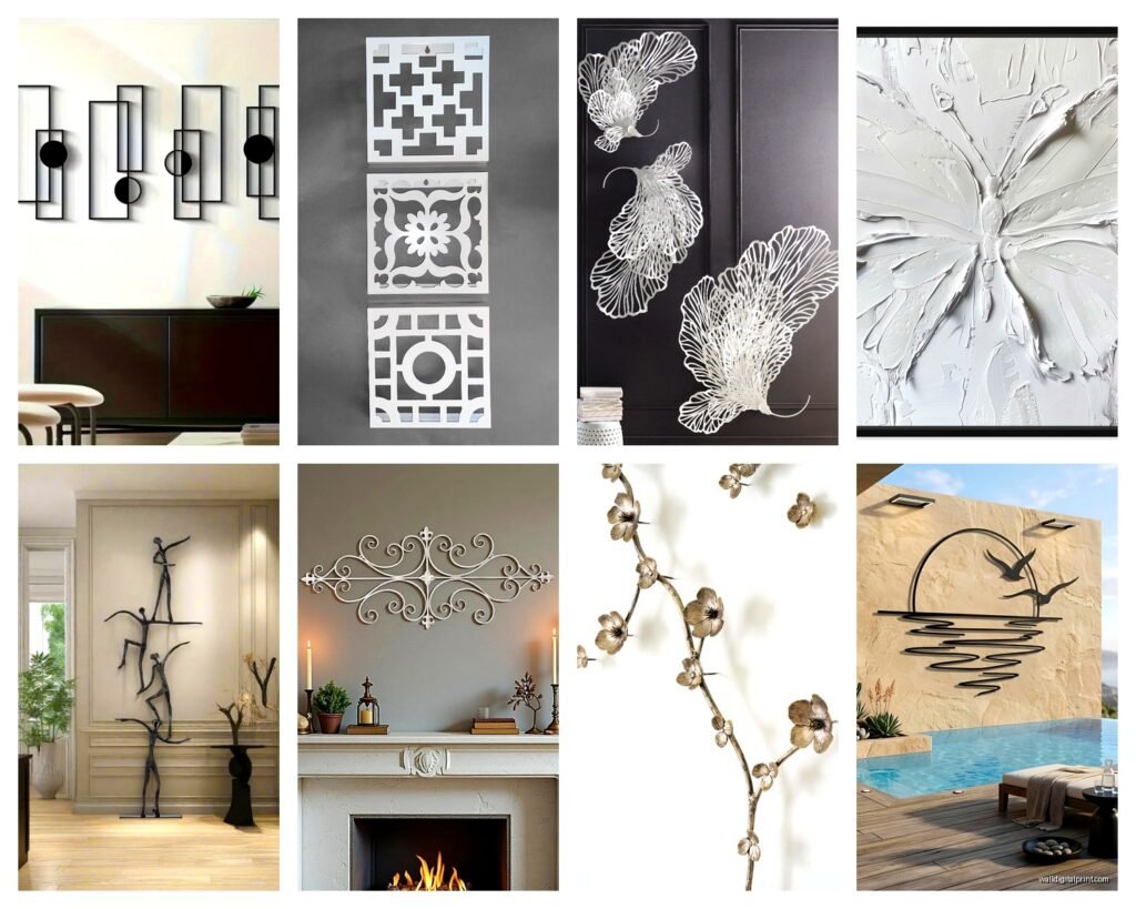
Geometric pieces are probably the most popular right now and for good reason. Clean lines, sharp angles, they work in basically any modern or contemporary space. I’m seeing a lot of hexagon patterns, overlapping circles, and these cool 3D cube designs that create amazing shadows.
Then you’ve got organic flowing designs – these are more abstract, inspired by nature or movement. Think curves, waves, leaves, branches. They soften a space in a way geometric pieces don’t. I just installed one in a client’s bedroom that looks like abstract feathers or maybe clouds? It’s open to interpretation which is kinda the point.
Literal vs Abstract Shapes
You can find white metal art that’s literally shaped like trees, birds, flowers – I’m less into these personally because they can read as a bit dated. Unless you find a really modern take on it. There’s this one company that does minimalist line-drawing style birds in white metal that’s actually stunning, very different from the traditional stuff.
Abstract is where it’s at though if you want something timeless. No one’s gonna look at geometric shapes or flowing curves in five years and think “wow that’s so 2024” you know?
Materials and Construction Quality
Not all metal is created equal and this is where you really get what you pay for. Steel is heavy and durable – if a piece feels substantial when you pick it up that’s usually a good sign. Aluminum is lighter which makes it easier to hang but can feel cheaper if it’s thin.
Check the welding or joining points. Are they smooth and well-finished? Or can you see rough spots and gaps? With white finishes especially, poor construction shows up more because you don’t have color or texture to hide imperfections.
I bought this piece online once without seeing it in person first – my dog was sick so I was stuck at home just scrolling – and when it arrived the powder coating was uneven and you could see the metal underneath in spots. Had to send it back which was a whole thing with the packaging.
Weight and Wall Mounting
This is super important – check what kind of wall you have before you buy something heavy. Drywall needs proper anchors for anything over like 10 pounds. I use toggle bolts for most pieces and they’re honestly so much more secure than regular anchors.
The piece should come with mounting hardware but honestly half the time what they include is garbage. I keep a stash of heavy-duty picture hangers and D-rings because I’ve learned not to trust the included hardware. Better safe than having your art crash down at 3am and scaring you half to death.
Where to Actually Buy Quality Pieces
Online is obviously convenient but the color accuracy is tricky with white. What looks crisp and bright on your screen might arrive looking cream or gray. I try to order from places with good return policies – free returns are non-negotiable for me now.
Local art galleries and home decor boutiques let you see the finish in person which is huge. You can check the quality, see how the light hits it, make sure it’s actually the shade of white you want. Plus supporting local artists is nice when you can.
Wait I forgot to mention – art fairs and craft shows are goldmine for unique pieces. I found this amazing white metal sculpture at a street fair last summer that I would never have found online. One of a kind stuff that isn’t mass produced.
What to Expect Price-Wise
You can find small pieces for under $50 but they’re usually pretty basic. For something substantial with good quality finish and interesting design, expect to spend $150-400. Larger statement pieces or artist-made work can easily run $500-1000+.
I know that sounds like a lot but a good piece of wall art lasts forever if you take care of it. I’ve had the same white metal geometric piece in my entryway for six years and it still looks brand new.
Styling White Metal Art in Different Spaces
In all-white or neutral rooms, white metal art creates this subtle textural interest without adding color. It’s all about the shadows and dimension. I did a client’s bedroom in whites and creams with this flowing white metal piece above the bed and it’s so peaceful and serene.
But here’s what’s cool – white metal also pops against dark walls. Navy, charcoal, black… the contrast is striking. My office has dark gray walls and the white geometric piece I hung there becomes this focal point that draws your eye immediately.
Layering and Grouping
You can group multiple white metal pieces together for a gallery wall effect. I like mixing different sizes and shapes but keeping them all the same white tone so it feels cohesive. Three circular pieces in graduating sizes is a classic look that works.
Or layer white metal art with other textures – a white sculpture over a natural fiber wallpaper, or against exposed brick. The mix of the smooth metal with rough textures creates really interesting visual contrast.
Maintenance and Care
White shows dirt unfortunately, that’s just reality. Dust with a microfiber cloth regularly – like once a week if it’s in a high-traffic area. For matte finishes you can use a slightly damp cloth if needed but make sure it’s barely damp not wet.
Glossy finishes need glass cleaner or a specific metal polish to keep them looking shiny. I use the same stuff I use on my stainless steel appliances and it works great.
Don’t hang white metal art in direct sunlight if you can avoid it – some finishes can yellow over time. Also keep it away from moisture if possible, though most powder-coated pieces are pretty resilient.
Fixing Minor Damage
Chips and scratches happen. You can buy white touch-up paint from hardware stores – get both matte and glossy so you have options. Test it on the back of the piece first to make sure the white matches. Sometimes you gotta mix a tiny bit of cream or gray into pure white to get the right shade.
For bent metal you can sometimes carefully bend it back but honestly if it’s bad you might just need to replace it. Thin aluminum especially doesn’t bounce back well from damage.
Trends I’m Seeing Right Now
Oversized single statement pieces rather than lots of small ones. People want that one dramatic sculptural element that anchors a room.
Mixed materials – white metal combined with wood, marble, or glass. There’s this piece I’m obsessed with that has white metal with small circular mirrors embedded in it, creates the coolest light reflections.
Three-dimensional layered designs that extend off the wall 4-6 inches. They cast better shadows and feel more sculptural than flat pieces. I just saw one that’s basically like white metal waves coming off the wall and it’s so dynamic.
Oh and asymmetrical geometric patterns are everywhere. Perfectly symmetrical is out, organized chaos is in. Shapes that look random but are actually carefully balanced.
Common Problems and Solutions
If your white metal art looks yellow or dingy, check your lightbulbs. Warm-toned bulbs can make white look cream or yellow. Switch to daylight or cool white bulbs and see if that helps.
Pieces that look flat and boring usually need better lighting. Add a picture light above it or position a floor lamp to create shadows and dimension. The whole point of sculptural art is the depth and that only shows with proper lighting.
If it doesn’t feel substantial enough, you might need to go bigger or choose a design with more depth. Flat cutout designs don’t have the same impact as pieces with actual dimensional elements.
The room feels cold with white metal art – add warmth through textiles, wood tones, or plants. White metal in an all-white room can definitely feel sterile if you don’t balance it with warmer elements.
Okay so I think that covers most of what I’ve learned through trial and error with white metal wall art. The main things are getting the right shade of white for your space, going bigger than you think, checking quality before buying, and lighting it properly. Everything else is just details but those four things will make or break whether your piece looks amazing or just… there.