Wall Art Guide, Wall Art Tutoriels
Zelda Wall Art: Legend Video Game Nintendo Fantasy
Aug
So I’ve been doing this whole video game art thing in homes for like three years now and Zelda stuff is honestly where most people mess up because they think slapping any poster on the wall equals decor and it really doesn’t.
Finding Pieces That Don’t Look Like Dorm Room Posters
Okay first thing – skip the basic character renders. You know the ones I mean, just Link standing there holding the Master Sword with like a generic background. They scream “I bought this at a convention” which is fine if that’s your vibe but you asked me for actual styling advice so.
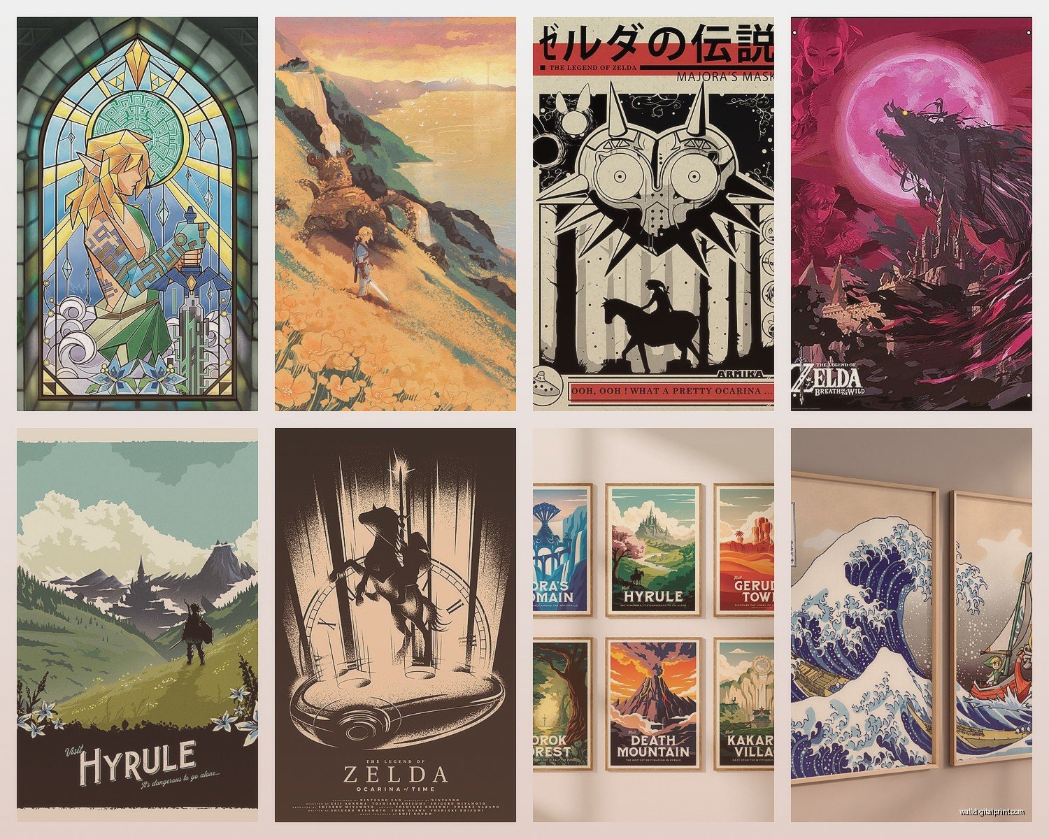
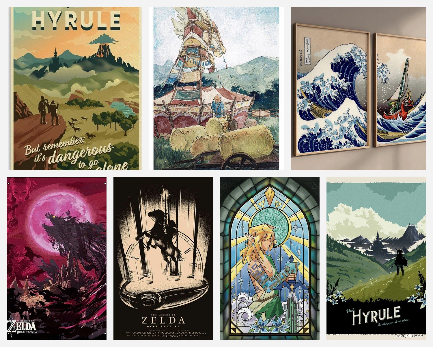
What actually works are the landscape pieces. Hyrule has these incredible environments and when you get artwork that focuses on Death Mountain at sunset or the Temple of Time in ruins or even just the rolling fields with those old structures, it reads as fantasy landscape art first, video game merch second. I did a client’s home office last month and we used this gorgeous print of Kakariko Village that looked almost like a Japanese woodblock print? Her boss came over and complimented her “travel photography from Japan” and she didn’t even correct him.
Canvas prints are gonna be your best bet over posters. The texture hides that “printed” look and they feel more substantial. I usually go for gallery-wrapped edges so you don’t need a frame, which also keeps costs down. Frames get expensive fast and honestly for game art you want the money going into the print quality not the frame.
Size Actually Matters More Than You Think
This is where everyone screws up including me when I first started. Too small and it looks like you’re afraid of committing, too large and it overwhelms everything else in the room. For Zelda art specifically I’ve found these guidelines actually work:
- Small bedroom or office nook: 16×20 inches max
- Standard bedroom or office: 24×36 inches is the sweet spot
- Living room or large space: go 30×40 or larger, but make sure your wall can handle it
- Gallery walls: mix of 8×10, 11×14, and 16×20
I had this client who bought a massive 48×72 inch Breath of the Wild landscape for his apartment and like… it was beautiful but it made his entire living room feel like a shrine. We ended up moving it to his gaming room and getting something more reasonable for the main space.
The Color Palette Problem
Zelda games have really distinct color palettes depending on which game we’re talking about. Breath of the Wild is all those soft blues and greens with sunset oranges. Twilight Princess is darker, more muted. Wind Waker is saturated primary colors. You gotta match this to your existing room or it’s gonna clash badly.
I learned this the hard way when I put a bright Wind Waker piece in a room with all these neutral grays and taupes – it looked like someone’s kid had decorated. Not the vibe. But that same piece in a room with navy blues and warm woods? Perfect.
If your room is mostly neutral, go for the more painterly Zelda art or the minimalist poster designs. There’s this whole category of Zelda art that’s like… simplified geometric versions of the Triforce or minimal line drawings of items and those work in literally any modern space.
Where to Actually Buy This Stuff
Etsy is obvious but you gotta be careful because quality varies wildly. I always check reviews with photos because sellers use the same stock images and what you get can be way different. Look for shops that specifically mention archival inks and premium canvas or paper.
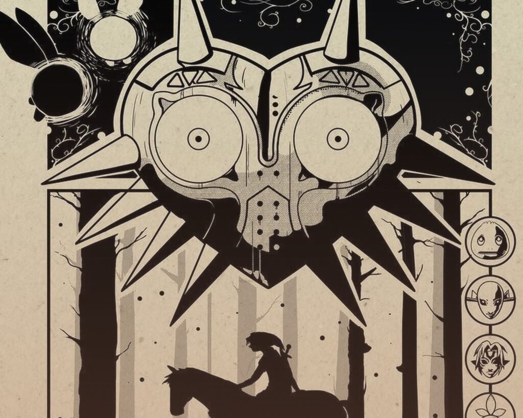
Displate is interesting – they’re metal prints which sounds weird for fantasy art but they actually look really sleek and modern. My brother has a Majora’s Mask one and it’s held up for two years without fading. They’re pricey though, like $45-150 depending on size.
Society6 and Redbubble have tons of options and the quality is consistent since it’s print-on-demand through their facilities. The downside is shipping takes forever sometimes and returns are complicated. But I’ve ordered probably 15 pieces through Society6 and only had issues once.
Oh and another thing – check the official Nintendo store occasionally. They do limited runs of actually nice art prints, not just the standard merch stuff. I snagged a screenprinted Ocarina of Time poster last year that’s embossed and textured and it’s legitimately one of my favorite pieces.
The Framing Question Everyone Asks
If you’re getting paper prints you need frames, obviously. But here’s my thing – don’t buy frames from the same place you buy the art unless they’re bundled. Amazon Basics frames are like $15-25 and they’re perfectly fine for game art. You’re not framing a Rembrandt.
Black frames work with literally everything Zelda. White frames only work if your walls are white or very light colored, otherwise they create this harsh contrast that draws attention to the frame instead of the art.
Wood frames are tricky – light wood works with Breath of the Wild’s aesthetic, dark wood works with Twilight Princess or older game art. My cat knocked over a frame last week and I learned that plastic “wood-look” frames shatter way easier than actual wood, so there’s that data point for you.
Arranging Multiple Pieces Without Looking Chaotic
Okay so funny story, I once arranged a client’s Zelda gallery wall and didn’t step back to look at it from across the room until I was done and it looked like a tornado of random images. Here’s what I should’ve done:
Pick a focal point piece first. This is your largest or most visually striking print. Everything else supports this piece. I usually go with a landscape or a dramatic scene like Link fighting a Guardian.
Keep consistent spacing between frames – 2 to 3 inches works for most gallery walls. Inconsistent spacing reads as messy even if the art itself is curated.
Stick to max three different frame colors in one gallery wall. I usually do all matching but if you’re mixing, make sure there’s a reason like alternating black and gold or whatever.
Theme helps but you don’t have to be rigid about it. All Breath of the Wild works obviously, or all minimalist designs, or all landscapes from different games. What doesn’t work is random merch-y stuff mixed with fine art prints.
The Lighting Thing Nobody Thinks About
Your Zelda art is gonna look completely different depending on your lighting and this is something I see people ignore all the time. If you have warm yellow bulbs, colors shift warmer. Cool white LEDs make everything look more blue-toned.
For game art I actually prefer neutral white LEDs around 3500-4000K because they don’t distort the colors as much. And if you’re serious about a piece, get a picture light or use track lighting to actually illuminate it. The difference is wild – suddenly it looks intentional instead of “stuff on my wall.”
Natural light is tricky because it fades prints over time. Don’t put valuable or sentimental pieces in direct sunlight. I had a client who put a limited edition Skyward Sword print next to a west-facing window and after 8 months the blues had noticeably shifted. UV-protective glass helps but it’s expensive.
Mixing Zelda Art with Other Decor
This is gonna sound weird but Zelda art actually pairs really well with natural elements. Like if you’ve got plants, wood furniture, stone accents – the fantasy aesthetic complements that. I did a living room where we mixed Breath of the Wild landscapes with botanical prints and some abstract art and you couldn’t even tell which theme was “leading.”
What doesn’t work is mixing it with ultra-modern minimalist stuff unless you’re using the minimalist Zelda designs. A photorealistic painting of Ganondorf next to your all-white Scandinavian furniture setup? No. A simple gold Triforce line drawing? Yes.
Books help ground gaming art. If you’ve got bookshelves near your Zelda prints it creates this fantasy library vibe that feels cohesive. I’m watching The Last of Us show right now while writing this and it’s making me think about how video game adaptations are making game art more acceptable in mainstream decor, which is cool.
Budget Breakdown From Someone Who’s Tried Everything
Entry level: $20-40 for a decent quality print from Redbubble or Etsy plus a basic frame. This is your “I want Zelda art but I’m not sure how committed I am” tier.
Mid-range: $50-100 for better quality canvas or a Displate metal print. This is where most people should probably land because the quality jump is noticeable but you’re not breaking the bank.
High-end: $150-300+ for limited edition prints, officially licensed art, or custom commissioned pieces. Only worth it if you’re a serious collector or it’s a focal point in an important room.
I’ve wasted money on cheap $15 prints that looked pixelated and faded within months, so going too budget isn’t worth it. But I’ve also spent $200 on a piece that honestly doesn’t look that different from a $75 option, so there’s definitely a point of diminishing returns.
The Rooms Where Zelda Art Actually Works
Gaming room or office: obviously, anything goes here. Go wild. Full shrine mode if you want.
Bedroom: landscape pieces work great, more subtle designs, avoid anything too action-heavy or bright that’ll be visually stimulating when you’re trying to sleep.
Living room: this is where you gotta be more selective. Stick with the artistic landscape pieces, minimalist designs, or really high-quality prints that could pass as regular fantasy art.
Bathroom: I’ve actually done this and it’s kinda fun? Small prints in frames, nothing that’ll get damaged by moisture. Wind Waker ocean scenes work perfectly.
Kitchen: honestly skip it unless you’re doing a full themed space, otherwise it’s gonna look random.
Maintaining Your Prints
Dust them regularly with a microfiber cloth. Sounds obvious but people forget and then wonder why their art looks dingy after a year.
Canvas prints can be gently vacuumed with a brush attachment if they get really dusty.
Don’t use cleaning products on prints unless they’re behind glass, and even then be careful with the frame.
If something gets damaged, sometimes you can find the same print again but honestly I’ve had clients get really attached to specific pieces so maybe order a backup if it’s limited edition? That feels excessive but I’ve seen people devastated when a print got ruined.
The whole point is making your space feel like yours without it looking like a teenager’s bedroom, and Zelda art can absolutely do that if you’re thoughtful about it. I’ve got a Breath of the Wild landscape in my own living room and people compliment it all the time without even knowing it’s from a video game, so it’s definitely possible to pull off.