Wall Art Guide, Wall Art Tutoriels
Moody Wall Art: Dark Atmospheric Dramatic Emotional
Aug
So I’ve been kinda obsessed with moody wall art lately and honestly it’s one of those things that sounds intimidating but once you get it, you GET it. Like my whole living room was this beige nightmare and I threw up some dark atmospheric pieces and suddenly the space felt like it had a personality instead of looking like a waiting room.
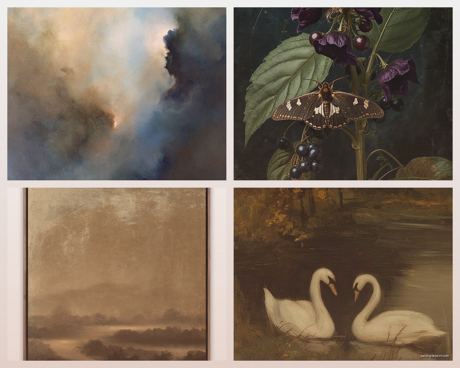
First thing – moody doesn’t automatically mean black walls and depression vibes. I made that mistake initially and my apartment looked like a vampire’s lair for like three weeks. What you’re actually going for is depth and emotion, which yeah can include dark colors but it’s more about the FEELING. Think stormy seascapes, abstract pieces with deep burgundies and navy, foggy landscapes, dramatic portraits with interesting lighting.
The easiest entry point is honestly black and white photography. I found this amazing print of a misty forest at like 2am one night when I couldn’t sleep and it completely changed how I thought about wall art. Black and white gives you that moody atmosphere without committing to color, which is great if you’re nervous about going too dark. Look for high contrast images – deep blacks, bright whites, interesting gray tones. Storm clouds, architecture with dramatic shadows, portraits with film noir lighting.
Oh and another thing, size matters SO much with moody art. I learned this the hard way when I bought these tiny 8×10 prints thinking I’d make a gallery wall and they just looked…sad? Moody art needs to make a statement, so go bigger than you think. Like if you’re looking at a 16×20, get the 24×36 instead. One large dramatic piece will always beat five small ones when you’re going for atmosphere.
For actual subject matter that works:
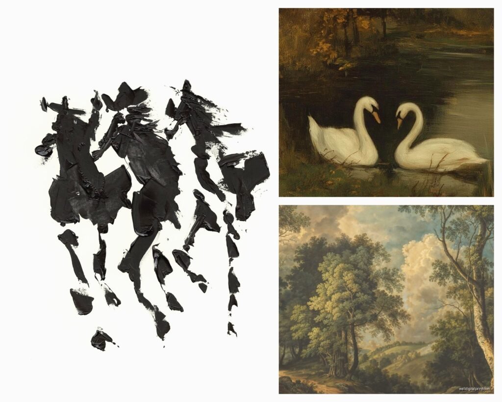
Landscapes but make them dramatic – not sunny beach scenes but like, mountains shrouded in fog, stormy oceans, deserted roads, winter scenes with heavy skies. I have this incredible piece of the Scottish Highlands that’s basically just gray and green and it sets the entire mood for my bedroom.
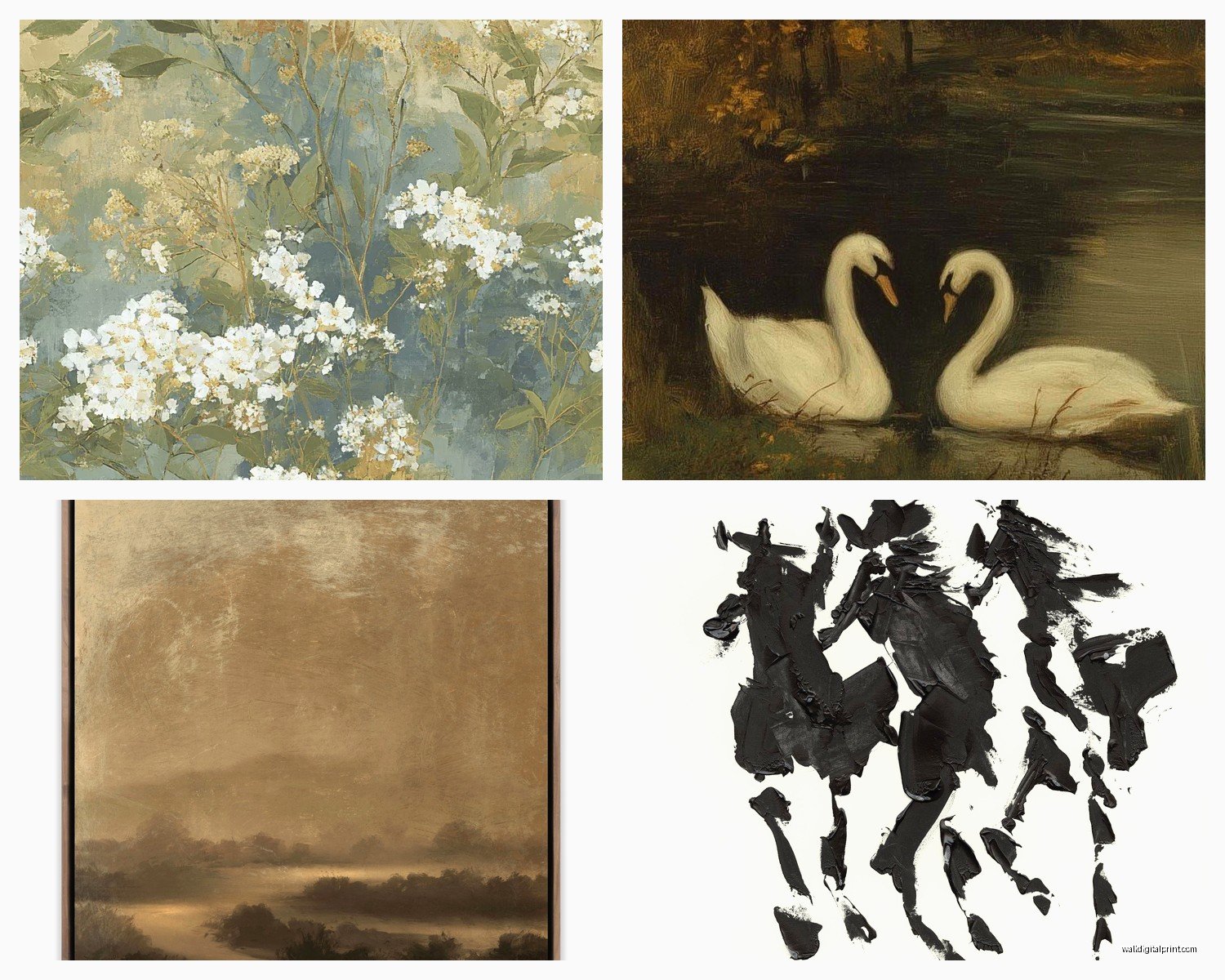
Abstract art in deep colors – this is where you can play with burgundy, deep teal, charcoal, navy, forest green. The key is layers and texture. Flat color doesn’t read as moody, you need depth. Look for pieces where you can see brushstrokes or where colors blend into each other in interesting ways.
Architectural photography – empty staircases, brutalist buildings, industrial spaces, old European streets. Something about architecture in moody lighting just WORKS. My friend has this print of an abandoned theater and people always comment on it.
Figurative work with emotion – not smiley portraits obviously, but pieces where you can feel something. Pensive expressions, dramatic poses, interesting use of shadow on faces. I’m weirdly into classical-style portraits but printed large and modern.
Now let’s talk about where to actually find this stuff because that’s what you really wanna know right?
Etsy is honestly my go-to. Search terms like “moody landscape print” “dark abstract art” “atmospheric photography” and you’ll find tons of downloadable prints. The cool thing about downloadables is you can get them printed at whatever size you need. I use a local print shop that does gallery-quality prints on nice paper and it’s way cheaper than buying pre-made framed stuff. Like $30 for a massive print versus $200 for the same thing already framed.
Society6 and Redbubble have good stuff but it’s hit or miss. You gotta scroll past a lot of mediocre work to find the gems. But when you find an artist you like, follow them because they usually have whole collections in the same vibe.
For higher-end stuff (when I’m working with clients who have actual budgets lol) I look at Saatchi Art and Artfully Walls. More expensive but the quality is noticeably better and you’re supporting actual artists directly.
Wait I forgot to mention – thrift stores and vintage shops can be GOLD for moody art. Old oil paintings, vintage photography, weird inherited portraits that nobody wanted. I found this painting of a ship in a storm at Goodwill for $12 and it’s genuinely one of my favorite pieces. Just gotta be willing to dig.
The Technical Stuff Nobody Tells You
Okay so framing matters more than you’d think. Moody art generally looks better in simple frames – black, dark wood, or even frameless with just a float mount. Ornate gold frames can work if you’re going for like gothic drama, but most of the time you want the frame to disappear and let the art be the focus.
Matting is another thing…white mats can actually work really well with dark art because the contrast is striking. But if that feels too harsh, black mats or no mat at all keeps everything cohesive. I tend to skip mats entirely on my really dark pieces because I want the color to go edge-to-edge.
Lighting is CRUCIAL and this took me forever to figure out. You’d think dark art doesn’t need special lighting but it’s the opposite – it needs MORE light to read properly. But not flat overhead light, you want directional light. Picture lights or track lighting that hits the art at an angle creates shadow and depth. My cat keeps sitting directly in front of my favorite piece right when the evening light hits it perfectly and it drives me insane.
Placement and Composition
So here’s where it gets fun. You can go a few different directions:
The statement wall approach – one large moody piece on an otherwise neutral wall. This is the safest bet and honestly looks expensive even if it wasn’t. Hang it at eye level (like 57-60 inches to the center of the piece) and let it breathe. Don’t crowd it with other stuff.
Gallery wall but make it dark – multiple pieces in the same moody palette. This only works if you’re careful about cohesion though. I use the “lay it out on the floor first” method which sounds obvious but I definitely hung things before planning and had to redo it like three times. Keep spacing consistent – I do 2-3 inches between frames.
The layered look – leaning art on shelves or mantels, layering frames. This feels more casual and you can switch things out easily. Works great if you’re renting and can’t put a million holes in the wall.
Color theory stuff that actually matters: moody art works in basically any space but you gotta think about balance. If your room is already dark, moody art doubles down on that vibe – which can be amazing or can be too much depending on natural light. I have almost no natural light in my hallway so I went FULL dark and it feels intentional like a gallery. But in my living room which gets tons of light, the dark art creates contrast and interest.
If your walls are light (white, cream, light gray), dark art pops like crazy. If your walls are already dark or colorful, you might want to consider how the art reads against that background. Sometimes dark on dark gets muddy. Testing with a printout or painter’s tape outline before you buy is gonna save you so much frustration.
Actually Hanging the Stuff
Use proper hanging hardware please. Those little sawtooth hangers that come on cheap frames are terrible. Get proper D-rings and picture wire, or better yet, use heavy-duty picture hooks rated for the actual weight. I had a frame fall at 3am once and nearly had a heart attack.
For gallery walls, make a template. Trace your frames on kraft paper, tape the paper to the wall where you want everything, nail through the paper, then remove it. Sounds fussy but it works and you won’t have 47 holes to spackle later.
Command strips work fine for lightweight stuff but don’t trust them with anything heavy or valuable. I learned this when my print slowly peeled off the wall over the course of like two weeks and I kept thinking “I should fix that” until it crashed down while I was watching Netflix.
Mixing Moody with Other Styles
This is gonna sound weird but moody art actually plays well with different decor styles. With minimalist spaces it adds necessary drama. With bohemian spaces it grounds all the color and pattern. Even in more traditional rooms, a moody piece creates an unexpected moment.
What doesn’t work is trying to make moody art “cheerful” by surrounding it with bright colors and too much stuff. Let it be moody. That’s the whole point.
I’ve mixed dark landscape photography with mid-century modern furniture and it looks intentional and collected. Same art with farmhouse decor and it created this cool contrast. But when I tried to put it in a room with lots of pastels and floral patterns it just looked confused.
DIY Options If You’re Broke or Crafty
You can make your own moody art pretty easily. I’ve done abstract pieces with just black, gray, and deep blue acrylic paint on canvas. Layer colors, add texture with palette knives, embrace imperfection. It doesn’t have to be precious – moody art is forgiving because darkness hides a lot.
Print your own photography if you take pictures. That moody shot from your last trip could be wall art. Just get it properly printed, not from your home printer unless you have a really good one.
Scan old family photos and print them large in black and white. There’s something inherently moody about vintage photography and it’s personal which makes it interesting.
Oh and another thing – consider unconventional materials. I’ve seen moody art on wood, metal, acrylic. The material adds another layer to the mood. A foggy landscape printed on brushed metal looks completely different than the same image on paper.
The main thing is just START. Get one piece you’re drawn to and see how it feels. Moody art is weirdly addictive once you get into it. Like now I can’t stop collecting dark stormy ocean prints and I don’t even live near the ocean but whatever, it makes my space feel like it has depth and story and that’s worth way more than playing it safe with generic art that doesn’t make you feel anything.