Wall Art Guide, Wall Art Tutoriels
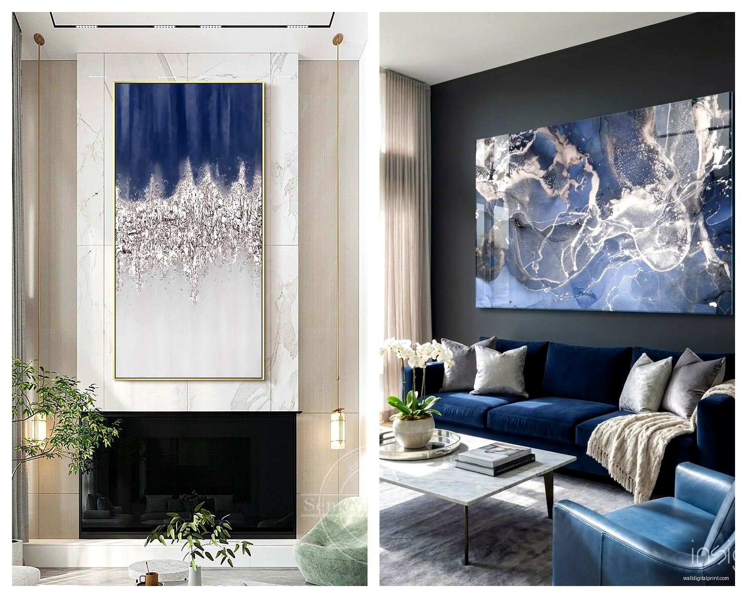
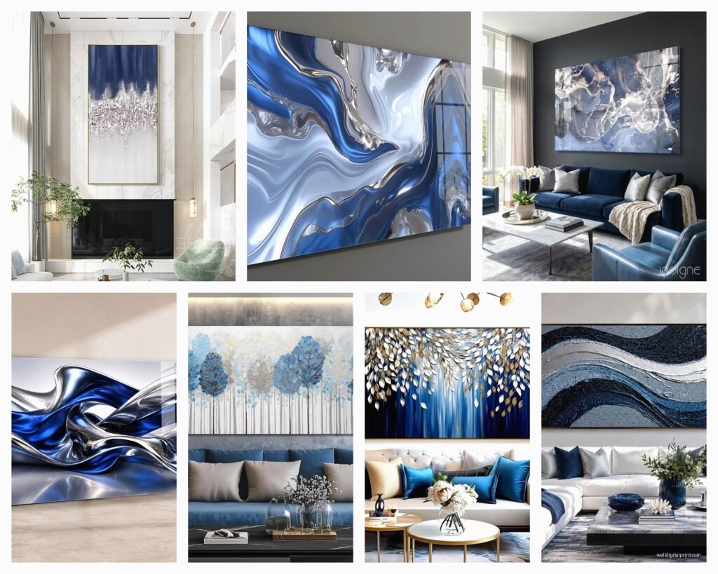
Blue and Silver Wall Art for Living Room: Cool Metallic Combo
Sep
So I’ve been deep in the blue and silver wall art thing for like three clients this month and honestly it’s such a good combo when you get it right but also super easy to make look cheap if you’re not careful.
Why This Actually Works When Other Metallic Combos Don’t
The thing with blue and silver is that silver reads as cool-toned, right? So it doesn’t fight with blue the way gold sometimes does. I had this whole situation last year where a client insisted on gold frames with navy art and it just… looked confused. Silver just slides right in next to any blue from powder to navy and feels intentional.
But here’s what nobody tells you – the finish matters SO much. Like brushed silver versus shiny chrome versus that antiqued silver look? Completely different vibes. I learned this the hard way when I ordered what I thought was gonna be this sleek modern piece and it showed up looking like something from a medieval castle. Not the vibe for a contemporary living room.
Actually Picking Pieces That Won’t Look Cheap
Okay so when you’re shopping for this stuff, you gotta avoid anything that screams “hotel lobby art” which is like 80% of what comes up when you search blue and silver wall art online.
Things I look for:
- Texture – if it’s just flat print, it needs something else going on dimensionally
- Real metal elements not just printed silver color
- Abstract or geometric usually works better than literal images
- Matte finishes mixed with glossy creates depth
The pieces that actually look expensive usually have layers. So like a canvas base with actual metal leaf applied, or resin poured over metallic paint, or metal cutouts mounted on a painted background. My go-to move lately is finding pieces where the silver is either embossed or has actual aluminum or steel incorporated.
Size Matters More Than You Think
I see people buying art that’s way too small all the time. Your wall art should take up like 60-75% of the wall space you’re dedicating to it. So if you’ve got a sofa that’s 84 inches wide, you want art that’s roughly 50-60 inches wide either as one piece or a gallery wall situation.
One big piece usually looks more expensive than multiple small ones btw. Unless you really commit to a gallery wall with like 6+ pieces. Three medium pieces in a row can look weird and indecisive.
The Different Styles You Can Actually Pull Off
Modern Minimalist
This is the easiest honestly. Think geometric shapes, clean lines, maybe some navy rectangles with silver leaf corners. I just finished a condo where we did this massive 48×36 piece that was literally just textured blue paint with silver resin stripes. Sounds simple but it was like $400 and completely made the room.
For this style you want high contrast – so either really dark navy with bright silver, or pale blue with brushed silver. The in-between gets muddy.
Abstract Fluid Art
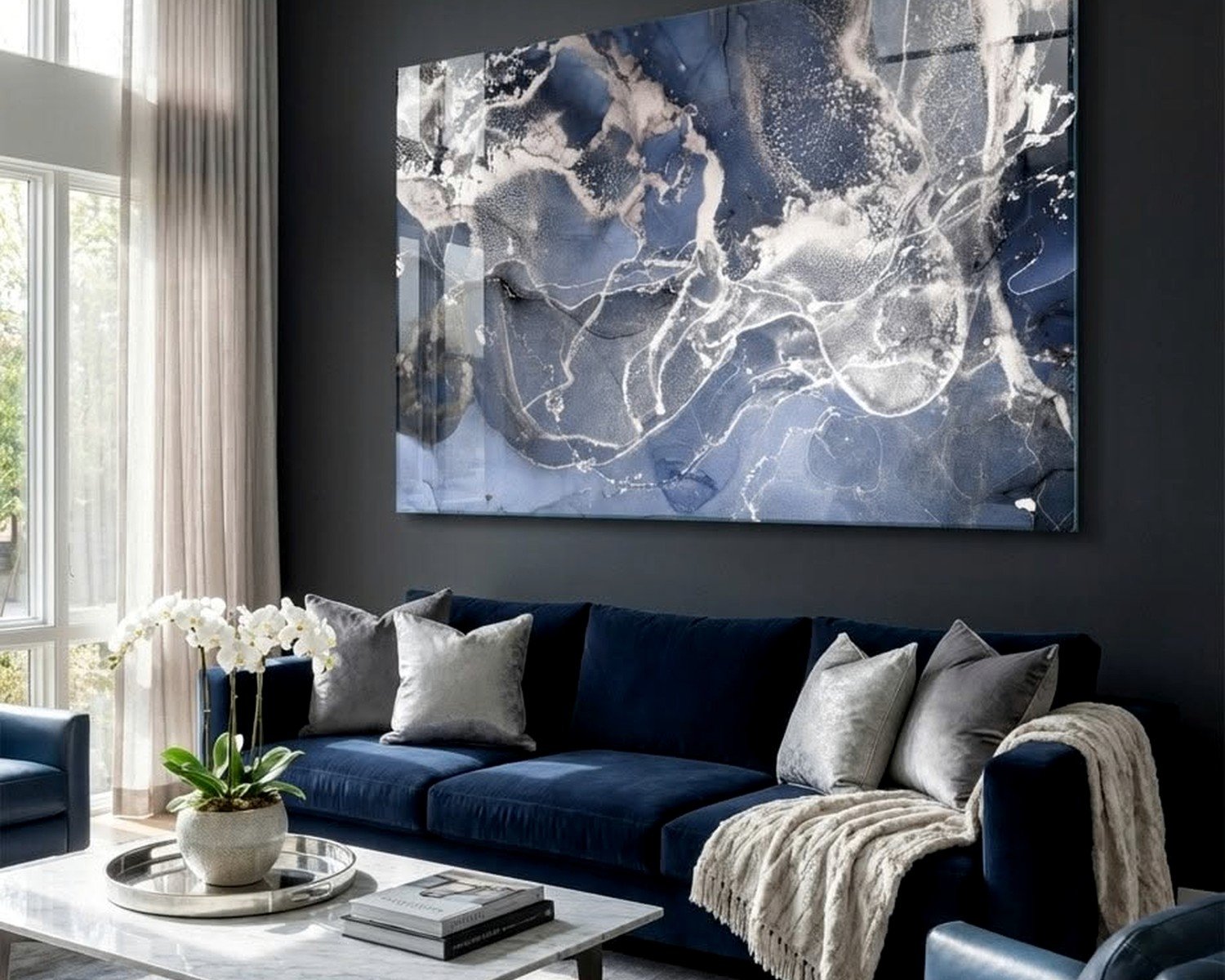
This is having a moment and it can look really good but also can go wrong fast. The alcohol ink style stuff with blues swirling into silver? When it’s done well it’s gorgeous. When it’s not… looks like a craft fair reject.
What works: pieces where the silver has actual metallic sheen, where the blues range from light to dark within the same piece, and where there’s some white or gray to break it up. My cat knocked over my coffee looking at examples of this last week which was fun.
What doesn’t work: muddy colors, too much silver (it overwhelms the blue), anything that looks like it was made with a spin art machine.
Coastal But Make It Sophisticated
Okay so coastal is tricky because it can go beachy-kitschy real fast. But blue and silver actually lets you do a refined coastal thing. Think abstract ocean scenes, not literal anchors and lighthouses.
I’ve used pieces with textured blues that suggest water with silver leaf that catches light like sun on waves. Sounds cheesy when I write it out but it genuinely works. The key is keeping it abstract enough that you have to tell people it’s ocean-inspired – they shouldn’t immediately think “beach house.”
Wait I Forgot to Mention the Lighting Thing
This is gonna sound weird but you HAVE to think about lighting with metallic art. Silver reflects light which is the whole point but also can create glare if you’re not careful.
I always tell people to avoid placing silver art directly opposite a window. The glare at certain times of day will be annoying. Instead put it on a wall perpendicular to windows so it catches indirect light. If you have overhead lighting or picture lights, angle them so they’re hitting the art at like 30 degrees not straight on.
Also silver looks completely different in warm light versus cool light. If you have warm-toned LED bulbs (the yellowy ones), silver can look almost gold. Cool white bulbs make it pop more. I learned this when a client texted me freaking out that her art looked “wrong” and it turned out she had these super warm Edison bulbs everywhere.
Mixing Metals (Yes You Can)
People get weird about mixing metals but with blue art you actually have flexibility. I’ve mixed silver frames with gold accent pieces in the same room when there’s blue tying it together. The blue acts as a buffer somehow.
But if you’re gonna do this, commit to it. One gold piece and one silver piece looks accidental. Three silver pieces and two gold pieces with blue in all of them looks intentional.
Actual Places to Buy This Stuff
So Etsy is hit or miss – you can find amazing independent artists doing custom work but you also have to wade through a lot of printed canvas that’s just… not it. I filter by “handmade” and look for shops that show their process.
West Elm and CB2 usually have a few good options in this color scheme. They’re pricey but the quality is consistent. I grabbed a piece from West Elm last month that’s textured blue with actual metal frame elements for like $350 and it looks way more expensive.
HomeGoods is worth checking but you gotta go in person and dig. Their online stuff is different from what’s in stores. I’ve found incredible blue and silver pieces there for under $100 but it’s totally random.
Oh and another thing – Minted does custom art prints and you can get them with silver frames. Not as impactful as textured originals but works if you’re on a budget. Just size up bigger than you think you need.
For actual investment pieces I work with a few artists directly. There’s this one artist who does blue resin pours with embedded silver leaf that are just stunning. Like $800-1200 range but they’re conversation pieces.
DIY If You’re Feeling Adventurous
I’m not usually a DIY person for art because it often looks DIY, you know? But blue and silver is actually doable if you have patience.
You need:
- Large canvas (go bigger than feels comfortable)
- Blue acrylic paints in multiple shades
- Silver leaf or silver paint (real leaf looks better)
- Texture medium or modeling paste
- Clear coat sealer
Basic process is layer your blues with texture medium, let it dry completely (like overnight), then apply silver leaf to certain areas. The texture catches light differently which is what makes it look professional. Seal everything when you’re done.
I watched my assistant do this for her apartment and it actually turned out decent. Took her like three attempts to get the color balance right though so maybe buy extra supplies.
Making It Work With Your Existing Stuff
Your living room probably already has a color scheme happening. Blue and silver art is pretty flexible but there are some combinations that work better than others.
With gray walls: This is like the easiest pairing. Any shade of gray works. Go for darker blues if your walls are light gray, lighter blues if your walls are dark gray. The silver will pop either way.
With white walls: You can go bold here. Deep navy with bright silver looks incredible on white. This is actually my favorite combo for modern spaces.
With beige/warm neutrals: Trickier but doable. Stick with warmer blues like teal or turquoise rather than cool navy. And maybe mix in some warm metallic accents elsewhere in the room so the silver doesn’t feel isolated.
With existing blue walls: You’d think this would be too much blue but it can work. Just make sure your art blue is significantly different from your wall blue. Like if you have pale blue walls, go with navy art. And increase the silver ratio in the art so there’s contrast.
What About Your Couch Situation
If you have a gray couch this is a no-brainer – blue and silver art is perfect. Navy couch? Also great, just don’t do navy art. Beige or tan couch? Works fine, maybe add some blue throw pillows to tie it together.
I had a client with a brown leather couch who was worried this wouldn’t work but we added a blue and silver piece above it with some silver accent tables and it totally worked. The key was bringing the colors down into the furniture arrangement with accessories.
The Gallery Wall Approach
Okay so if you’re doing multiple pieces instead of one statement piece, you gotta have a plan. I map it out on the floor first which sounds basic but people skip this step and then have like fifty nail holes to fill.
For blue and silver gallery walls I usually do:
- Mix of frame finishes – some silver metal frames, some white, maybe one black for contrast
- Variety of blue shades but keep the undertones consistent (all cool or all warm)
- Different sizes but balanced weight – don’t put all the big pieces on one side
- Odd numbers work better (5 or 7 pieces rather than 6)
- Keep spacing consistent between frames, like 2-3 inches
The center of your gallery wall should be at eye level which is roughly 57-60 inches from the floor. This is where people mess up – they hang everything too high.
Random Things That Elevate the Look
Picture lights. Those little LED picture lights you mount above frames make such a difference with metallic art. The silver catches the light and the whole piece comes alive at night.
Layering. If you have a console table or credenza under your art, layer in silver accessories – a silver bowl, some books with blue covers, maybe a small silver-framed mirror leaning against the wall. This makes the art feel integrated not just stuck on the wall.
Plants. Okay this sounds random but greenery next to blue and silver art is chef’s kiss. The organic shapes and natural green play off the cool metallics really nicely. I always add a plant nearby if possible.
Common Mistakes I See All the Time
Matching too perfectly. If your throw pillows exactly match your art exactly match your rug it looks like a catalog page not a real room. Pull the colors but vary the shades and textures.
Going too small. I said this already but seriously everyone does this. Your art should have presence.
Forgetting about the ceiling height. If you have high ceilings you need larger scale art or vertical pieces. Standard sizes look lost in rooms with 10+ foot ceilings.
All shiny everything. If your art is high-gloss silver and you have shiny chrome furniture and glossy surfaces everywhere it’s too much reflection. Mix in some matte finishes.
Oh and one more thing – not considering the view from other rooms. If your living room is open to your kitchen or dining room, think about how the art looks from those angles too. I’ve had pieces that looked great straight-on but weird from the kitchen doorway.
My client just texted me about her installation so I gotta wrap this up, but honestly blue and silver is one of those combos that’s pretty forgiving once you understand the basics. Just remember – bigger than you think, texture matters, watch your lighting, and don’t match everything perfectly. You’re gonna do great with this.