Wall Art Guide, Wall Art Tutoriels
Neutral Bedroom Wall Art: Earth Tone Sleep Space Designs
Sep
So I’ve been working on this bedroom project for like three weeks now and honestly the whole earth tone wall art thing is WAY more specific than I thought it would be. Like, you can’t just throw up any brown painting and call it a day, you know?
The Actual Color Range That Works
Okay so first thing – when people say “earth tones” they think beige and brown but it’s actually this whole spectrum. I’m talking terracotta, burnt sienna, sage green, dusty olive, warm grays, cream, ochre, clay colors. The trick is they all need to have this kind of… muted warmth? Not bright, not cool-toned. I learned this the hard way when I bought what I THOUGHT was a neutral abstract piece and it had this blue undertone that just clashed with everything.
What actually works: Look at the piece in different lighting before you commit. I take photos on my phone in warm light and cool light because our bedrooms usually have that awful mix of natural light during the day and lamp light at night. If the colors shift too dramatically in different light, it’s gonna annoy you eventually.
Size Matters More Than You Think
This is where everyone messes up including me the first dozen times. The rule I actually use now is – your wall art should take up about two-thirds to three-quarters the width of your bed or furniture piece below it. So if you’ve got a queen bed that’s 60 inches wide, you want art that’s like 40-45 inches across.
But here’s the thing nobody tells you – you can achieve that with:
- One large canvas
- A gallery wall of smaller pieces
- Two medium pieces hung as a diptych
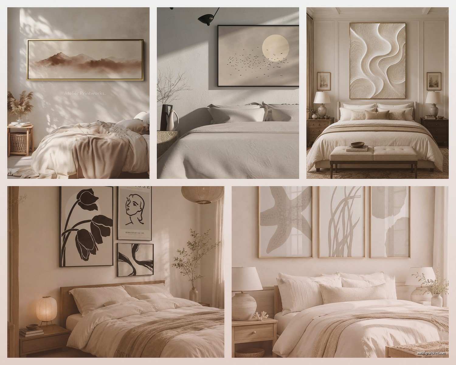
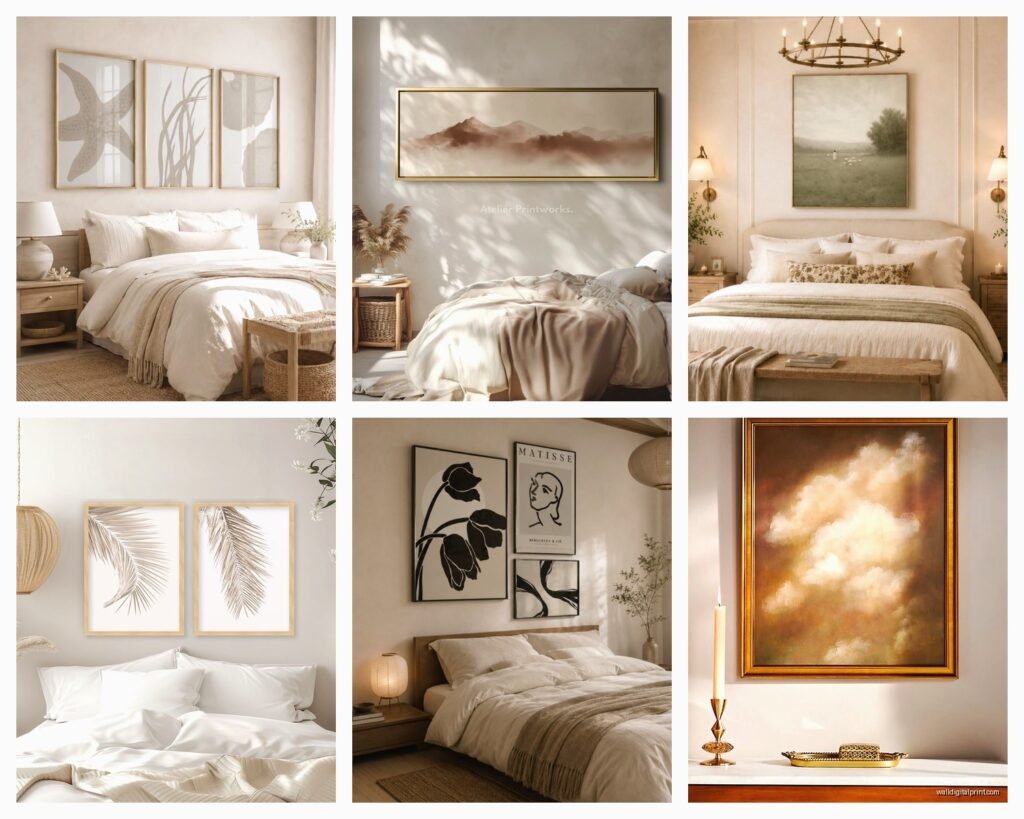
- Three vertical pieces in a row
I did a client’s bedroom last month where we used three 16×20 prints in matching frames and it looked SO much more intentional than one big piece would have. Sometimes that works better because you can play with the spacing and arrangement.
Gallery Wall Without Losing Your Mind
Okay so funny story, my cat knocked over my entire layout plan on the floor at like 2am and honestly? It looked better scattered randomly than my careful arrangement. But that’s not actually helpful advice so here’s what I do:
Lay everything out on the floor first. Use painter’s tape on the wall to mark where frames will go. The center of your gallery wall should be at eye level which is roughly 57-60 inches from the floor. But in a bedroom you’re usually looking at it while lying down so I actually go slightly lower, like 55 inches.
For earth tone galleries I mix:
- Abstract landscapes that are mostly texture
- Botanical prints in muted colors
- Line drawings with warm-toned mats
- Woven pieces or macrame if you’re into that
- Black and white photos in natural wood frames
The frames matter SO much. I’m obsessed with natural wood frames right now – oak, walnut, even bamboo. They add warmth without competing with the art. White and black frames can work but they need to tie into other elements in your room or they’ll look disconnected.
Spacing Between Frames
Keep it consistent at 2-3 inches between pieces. I use my fist as a rough measurement tool which sounds ridiculous but it works. Closer than 2 inches looks cramped, wider than 3 inches and they stop feeling like a cohesive collection.
Where to Actually Find This Stuff
Oh and another thing – sourcing is half the battle. I’ve spent hours scrolling trying to find pieces that don’t look like they came from a hotel lobby.
Etsy is actually amazing for this. Search for “abstract earth tone print” or “terracotta landscape” and you’ll find digital downloads you can print at FedEx for like $15. I do this ALL the time. The quality is good if you stick to 300 DPI files.
Society6 and Minted have curated collections and you can filter by color which saves time. Their framing options are decent but expensive – I usually just buy the print.
Local art fairs and makers markets – this is where I find the really unique stuff. Ceramic wall hangings, woven pieces, actual paintings with texture. They cost more but they add dimension that prints can’t match.
Thrift stores but you gotta reframe everything. I found this gorgeous landscape painting last year for $8 but the frame was that awful ornate gold thing. Put it in a simple oak frame and suddenly it’s a $200 piece.
The Texture Layer Nobody Talks About
Flat prints are fine but if EVERYTHING on your wall is flat and behind glass it’s gonna feel sterile. This is where you add:
- Woven wall hangings
- Macrame pieces
- Wooden shelves with small objects
- 3D ceramic art
- Floating shelves with books and plants
I did this bedroom where we hung two flat botanical prints and then added a woven basket as part of the arrangement. It sounds weird but the mix of textures made the whole thing feel more collected and less “I bought a set at HomeGoods.”
Wait I forgot to mention – canvas prints have more texture than paper prints behind glass. If you’re going for a really warm cozy vibe, canvas is the move. No glare either which is nice.
Lighting Your Wall Art
This is gonna sound extra but proper lighting makes mediocre art look amazing. I use:
- Picture lights mounted above large pieces
- Adjustable wall sconces aimed at the art
- LED strip lighting on floating shelves
The warm white bulbs (2700K) work best with earth tones. Cool white makes everything look washed out and sad. I learned this watching that interior design show on Netflix while testing different bulbs in my own place – took forever but now I’m super picky about it.
DIY Options That Don’t Look DIY
My client canceled last week so I spent an hour making my own abstract earth tone piece and honestly it turned out pretty good. Here’s what worked:
Get a canvas from the craft store, acrylic paints in terracotta, cream, olive green, and burnt umber. Water down the paint so it’s more like a stain. Apply in loose horizontal strokes, let colors blend together, add texture with a palette knife. The key is to NOT overthink it. The more intentional you try to make abstract art look, the worse it gets.
Another easy option – frame fabric samples or wallpaper squares. I’ve done this with textured linen samples in cream and rust colors. Put them in matching frames and suddenly you have a sophisticated diptych for like $30 total.
Common Mistakes I Keep Seeing
Hanging things too high – seriously everyone does this. Your art should feel connected to your furniture not floating near the ceiling.
All the same size frames in a gallery wall – it looks too rigid. Mix it up with different sizes but keep the frame style similar.
Ignoring the undertones – if your walls have pink undertones and you hang art with green undertones it’s gonna feel off even if both are technically “neutral.”
Too much symmetry in a bedroom – this isn’t a hotel. One large piece off-center above a nightstand can look really good. Not everything needs a matching piece on the other side.
Buying art before you have your bedding and furniture figured out – I know it’s backwards but the art should complement what’s already there, not the other way around. Unless you’re starting from scratch then I guess it doesn’t matter.
Specific Pieces I Keep Recommending
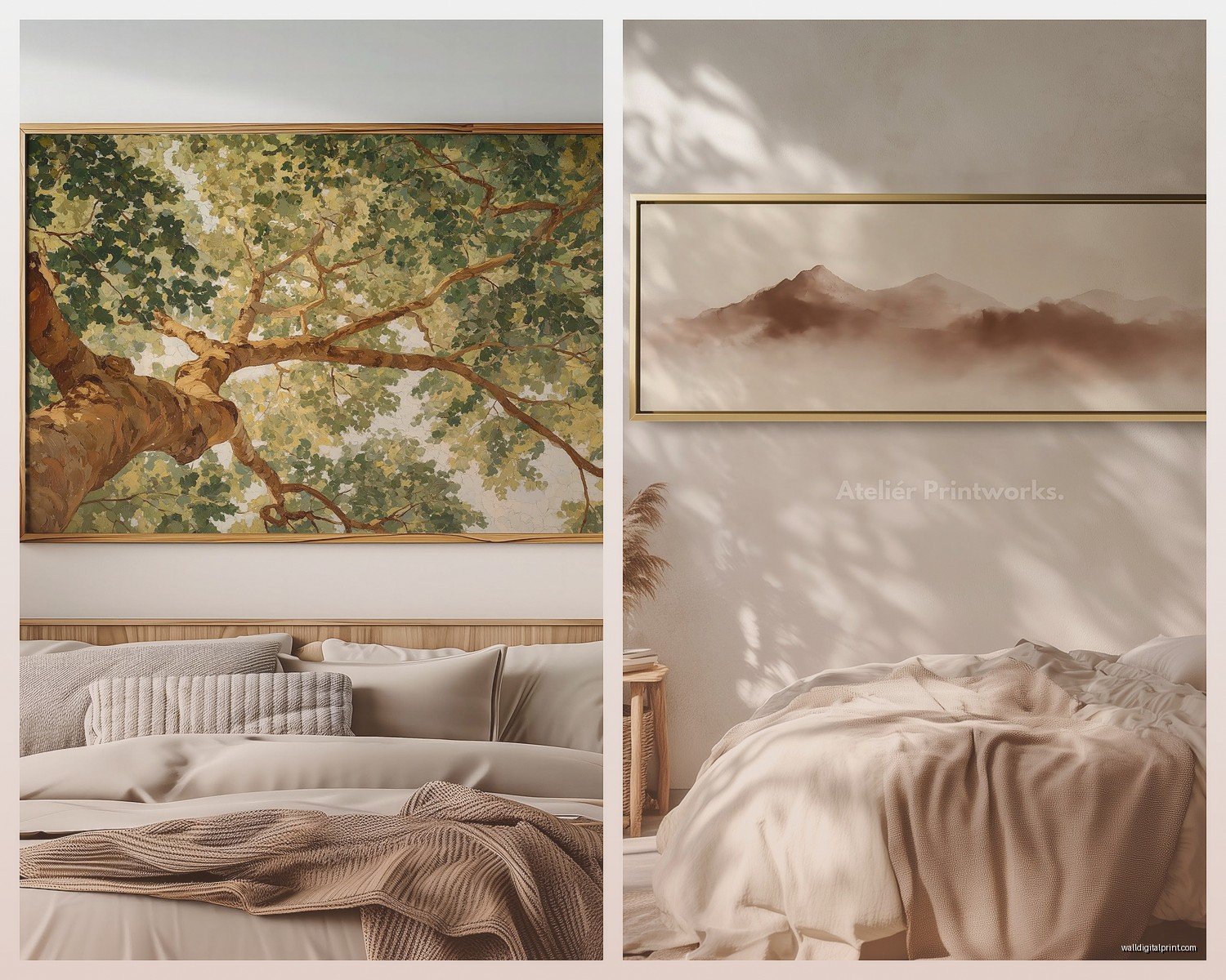
There’s this Etsy shop that does minimalist line art landscapes in earth tones – I’ve probably bought from them six times. The mountains are just simple curved lines in terracotta and olive on cream background.
West Elm has these wood wall art pieces that are basically carved patterns in natural wood. They’re pricey but they last forever and add that texture element I mentioned.
Target actually has decent abstract prints in their Project 62 line. The quality isn’t amazing but for a rental or if you’re not ready to invest much, they work. I have one in my guest room.
The Oversized Single Piece Approach
If gallery walls stress you out, one massive piece can be just as impactful. I’m talking like 48×60 inches or bigger. It needs to be simple though – a busy pattern in that size will overwhelm the room. Think:
- Abstract color blocks in earth tones
- Oversized botanical print
- Minimalist landscape
- Large-scale line drawing
The advantage here is it’s one decision, one nail hole, done. Plus it makes a small bedroom feel bigger if you choose the right piece.
Mixing Warm and Cool Earth Tones
This is advanced stuff but once you get it, it opens up way more options. You CAN mix warm browns with cool grays if you have a transition color. Usually that’s greige (gray-beige) or a warm taupe.
I did a bedroom with terracotta walls (bold choice but it worked) and we added art that had both warm rust tones AND cool sage green. The sage kept it from feeling too hot and heavy. The trick was making sure both colors appeared in multiple pieces so nothing looked out of place.
What Actually Helps You Sleep
Okay this might sound weird but I genuinely think the art in your bedroom affects sleep quality. Not in like a scientific way that I can prove, but in a “your environment affects your mood” way.
Abstract pieces are better than representational art with faces or busy scenes. Your brain doesn’t need to process complex images when you’re trying to wind down. Simple shapes, organic forms, subtle color variations – that’s what works.
I avoid anything with bright white in the bedroom because it catches light and draws your eye even in dim lighting. Cream or warm white is better.
Nature scenes are good but not dramatic ones. Like, a peaceful landscape is great. A stormy ocean or dramatic mountain scene might be too stimulating. I know that sounds woo-woo but I’ve noticed it in my own space.
Budget Breakdown
If you’ve got $100:
Three digital downloads from Etsy printed at FedEx, three simple frames from Target. This works and looks intentional.
If you’ve got $300:
One larger original piece from a local artist or two nice canvas prints with one textured element like a woven hanging.
If you’ve got $500+:
Mix of original art, quality prints in custom frames, textured pieces, proper lighting. This is where you can really create something unique.
I always tell people to start with one piece they absolutely love and build around it. Don’t buy a whole set at once because your taste will evolve as you live with the space. My bedroom wall art has changed like four times in two years and that’s totally normal.
The thing about earth tone art is it’s forgiving – you can add to it over time and as long as you stay in that warm neutral palette, new pieces tend to work with what’s already there. Just avoid anything too matchy-matchy because that looks dated fast. You want collected, not coordinated.
Anyway I gotta run but hopefully this helps you figure out your wall situation. The main thing is don’t overthink it – if you love looking at it and it doesn’t clash with your bedding, you’re probably good.