Wall Art Guide, Wall Art Tutoriels
Beauty Room Wall Art: Makeup Vanity Glam Space Decor
Sep
So I’ve been obsessing over beauty room wall art lately because my own vanity area looked like a sad corner with one mirror and zero personality, and honestly the transformation is wild when you actually put some thought into it.
First thing you gotta figure out is your vibe. Like are you going full Hollywood regency glam with golds and blacks, or is it more that minimalist Scandinavian aesthetic with soft pinks and whites? I spent like three weeks flip-flopping between the two and my husband was like “it’s literally just a wall” but he doesn’t understand that this is WHERE THE MAGIC HAPPENS.
The Layout Strategy Nobody Tells You
Okay so here’s what actually works. You need to think about your wall space in zones. I learned this the hard way after buying like seven prints and then realizing they all fought for attention. The area directly above your vanity is prime real estate, but you don’t want something SO dramatic that you can’t see it when you’re sitting down doing your makeup.
I did a gallery wall once and had to redo it because when I sat at my vanity, I could only see the bottom third. Total waste. Now I do a large statement piece above the vanity at eye level when standing, then smaller accent pieces on the sides or adjacent walls.
Size Matters More Than You Think
Your main piece should be roughly two-thirds the width of your vanity. So if you have a 48-inch vanity, you’re looking at around 30-32 inches wide for your primary art. Anything smaller looks like it’s floating awkwardly, anything bigger overwhelms the space.
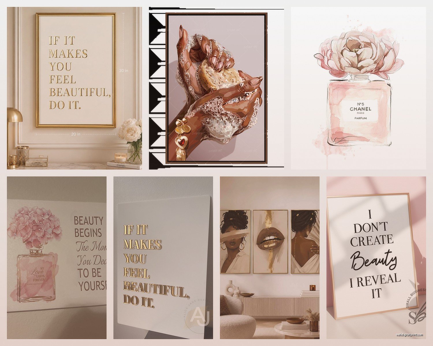
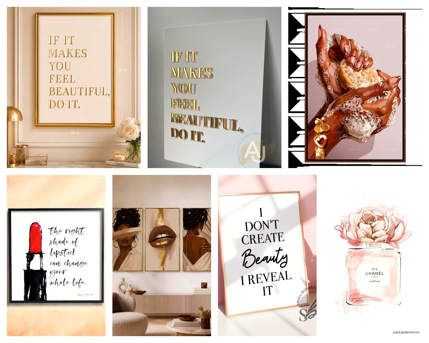
For my setup I have a 42-inch vanity and I used a 28-inch framed print of abstract lips in rose gold, and then flanked it with two 11×14 fashion illustrations. The symmetry is chef’s kiss without being too matchy-matchy.
What Actually Looks Good in a Beauty Room
I’m gonna be real with you, not everything works in this space. I tried doing moody landscape photography because I loved it in theory and it just felt WRONG. The lighting, the mood, everything was off.
What consistently works:
- Fashion illustrations, especially vintage Vogue or Harper’s Bazaar style
- Makeup product art like lipstick prints, perfume bottles, compacts
- Abstract art in your color scheme, especially with metallic accents
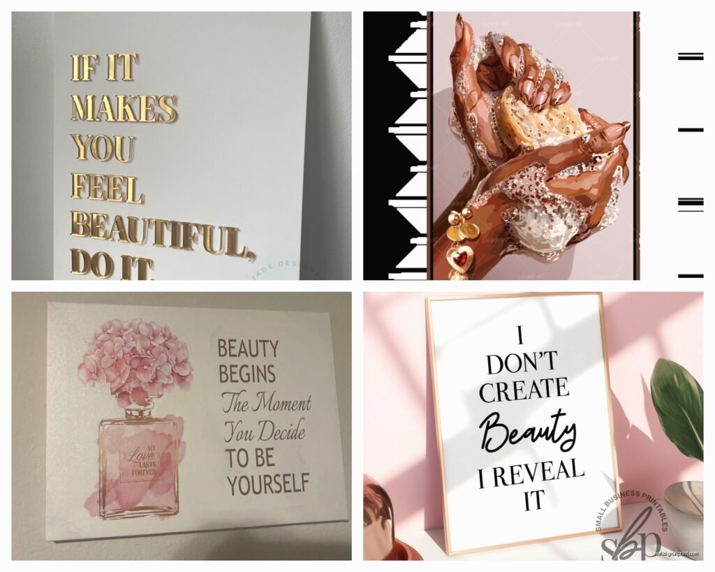
- Typography prints with beauty quotes or cheeky sayings
- Black and white photography of models or beauty close-ups
- Floral art but make it sophisticated, not grandma’s guest room
The trick is keeping it relevant to the space. This is your glam zone, so the art should enhance that energy not distract from it.
My Actual Recommendations By Style
For classic Hollywood glam, I’m obsessed with Oliver Gal prints. They’re pricey but they frequently have sales, and the quality is actually there. Their “Doll Memories” series with the pink Chanel and fashion illustrations is exactly what you picture when you think glam beauty room. I have the “All I Need is Lipstick” print and it’s been up for two years, no fading.
If you’re on a budget though, Desenio has shockingly good stuff. I decorated my sister’s vanity area for like $120 total with their prints and frames. The quality isn’t gonna wow you but from normal viewing distance it looks expensive. Just avoid their super thin frames, spend the extra $10 for the nicer ones.
Oh and another thing, Society6 is hit or miss. The art selection is huge which sounds great but it’s overwhelming, and I’ve had issues with color accuracy. What looks soft blush pink online shows up almost coral. Their return process is decent though so there’s that.
The Color Coordination Thing
This is gonna sound obvious but pull colors from your existing setup. If you have a white vanity with gold hardware and blush pink accents, your art needs to echo that. I see so many people grab art they love in isolation and then it clashes with their whole setup.
I use the three-color rule: pick three main colors from your space and make sure your art incorporates at least two of them. My scheme is white, champagne gold, and dusty rose, so all my art has some combination of those.
Metallics are your friend here. Gold leaf art, rose gold foils, silver accents, they catch the light from your vanity bulbs and add dimension. I have this abstract piece with gold leaf details and depending on the time of day it looks completely different.
Framing Makes or Breaks Everything
Okay so funny story, I bought these gorgeous prints and just thumbtacked them to the wall because I was impatient and didn’t wanna deal with framing. Looked like a college dorm. The exact same prints in proper frames elevated the entire room.
For beauty rooms specifically:
Thin metal frames in gold, rose gold, or black are the move. Chunky wooden frames feel too casual unless you’re specifically going for a boho vibe. I get most of my frames from Framebridge for special pieces and IKEA for everything else. The IKEA Silverhöjden frames in gold are like $15 and look way more expensive.
Floating frames work beautifully for this aesthetic. They have that modern gallery feel and the prints appear to float between two panes of glass. A bit more expensive but worth it for your main statement piece.
Matting is optional but I usually skip it in beauty rooms because it can feel too formal. Unless you’re doing black and white photography, then a white mat adds the right amount of breathing room.
The Gallery Wall Approach
If you’re doing a gallery wall, tape out your layout on the floor first. Seriously. I know it sounds extra but I’ve redone gallery walls three times because I eyeballed it and ended up with weird spacing.
Start with your largest piece and build around it. Keep spacing consistent, I do 2 inches between frames. Mix frame sizes but stick to one or two frame colors max or it gets chaotic.
Wait I forgot to mention, there are these peel and stick gallery wall templates on Amazon that are actually genius. You stick them to your wall, arrange your frames on the templates, hammer in your nails, then peel off the templates. Game changer for getting everything level.
Lighting Your Art Properly
This is where people mess up. You can have incredible art but if the lighting is wrong it disappears or looks washed out. Your vanity lights illuminate your face but they don’t necessarily light your art well.
I added small picture lights above my main pieces. The battery-operated LED ones from Cocoweb are expensive but they’re genuinely good and you don’t need an electrician. They have a warm glow that makes everything look more luxe.
If that’s too much, even strategic placement matters. Don’t hang art where it’ll get glare from your vanity bulbs. I had a framed print directly across from my mirror with bulbs and all you could see was glare. Moved it 18 inches to the left, problem solved.
DIY Options That Don’t Look DIY
My cat knocked over my coffee onto a vintage Vogue cover I was gonna frame and I was SO mad, but anyway.
If you wanna save money, printable art from Etsy is legit. You download the file, print it at FedEx or a local print shop on quality paper, frame it yourself. I’ve done this for like half my beauty room art and nobody can tell which pieces are $200 Oliver Gal prints versus $8 Etsy downloads.
The key is printing quality. Don’t use your home printer unless it’s actually good. I use a local print shop that does photo-quality prints on heavyweight matte paper for like $12 for an 16×20. Totally worth it.
You can also DIY with:
- Pressed flowers in floating frames
- Your own makeup product photography if you’re crafty
- Fabric wall hangings in velvet or silk
- Decorative mirrors as art pieces
- Vinyl wall decals in elegant scripts
Incorporating Mirrors as Art
Okay so this is technically not wall art but decorative mirrors function the same way and they’re super practical in a beauty room. I have three small sunburst mirrors in antique gold clustered on one wall and they reflect light beautifully while adding visual interest.
Anthropologie has gorgeous decorative mirrors but they’re insane expensive. HomeGoods and TJ Maxx randomly get similar styles for like a quarter of the price. You gotta hunt but it’s worth it.
The Functional Art Piece
One thing I did that’s worked really well is a large pegboard painted in my color scheme with gold pegboard hooks. I display my prettiest makeup brushes, perfumes, and jewelry on it. It’s functional storage but it looks like an art installation. Very Instagram-worthy, very practical.
What to Avoid
Learn from my mistakes:
Overly personal photos feel weird in a beauty room. Like family photos or vacation snapshots. This is your glam space, keep it aspirational.
Anything too dark or moody unless that’s specifically your aesthetic. I tried a black and white stormy ocean print and it killed the vibe.
Super trendy stuff that’ll feel dated in six months. Those “but first, coffee” style prints already feel kinda 2016.
Too many different art styles competing. Pick a lane. You can mix abstract with fashion illustration but throw in landscape photography and typography quotes and suddenly it’s visual chaos.
Seasonal Switching
This is gonna sound extra but I swap out smaller accent pieces seasonally. Not everything, just like two pieces. Spring gets softer florals, fall gets richer jewel tones. Keeps the space feeling fresh without redoing the whole thing.
Installation Tips
Use proper hanging hardware, not just whatever nail you found in the junk drawer. For frames under 15 pounds, 3M Command strips work great and don’t damage walls. Anything heavier needs actual picture hangers rated for the weight.
Level everything. Get a small level from the dollar store. Crooked art will haunt you every single time you sit at your vanity.
For renters, there are so many damage-free options now. Command strips, picture hanging strips, even those ceiling track systems if you’re really committed.
The space above your vanity should make you feel something when you walk in. Whether that’s glamorous, creative, confident, whatever. If your art isn’t doing that, it’s just decoration taking up space. Switch it out until it clicks.