Wall Art Guide, Wall Art Tutoriels
Orange Kitchen Wall Art: Citrus Warm Cooking Space Accents
Sep
So I’ve been obsessing over orange kitchen wall art lately and honestly it started because my neighbor painted her cabinets this awful gray and I was like, you need WARMTH, and down the rabbit hole I went.
Orange is tricky though because you can go full citrus grove or end up looking like a 1970s diner, and there’s actually a sweet spot in between that makes your kitchen feel alive without screaming at you while you’re trying to drink coffee at 6am.
Figure Out Your Orange First
Okay so this is gonna sound weird but you need to know WHICH orange you’re working with. I made this mistake in my own kitchen and bought these gorgeous terracotta prints that clashed horribly with my copper pots. Like they were both “orange” but fighting each other constantly.
Your options are basically:
- Burnt orange/terracotta – earthy, southwest vibes, pairs with cream and brown
- True orange – bold, energetic, needs white or gray to calm it down
- Coral/peachy orange – softer, works with mint green or navy surprisingly well
- Blood orange/reddish – dramatic, goes with black or deep wood tones
I literally held paint swatches next to my backsplash for like three days because the lighting changes everything. Morning light makes orange look more yellow, evening light makes it richer. Test your art ideas at different times or you’ll hate yourself later.
Size and Placement That Actually Works
Here’s what I learned after hanging stuff wrong multiple times… the wall space above your sink or stove is prime real estate but you gotta leave breathing room. At least 6-8 inches between the top of your backsplash and the bottom of your art. Any closer and it looks cramped plus you’ll get splatter on it eventually.
For size, measure your wall space and go with art that takes up about 60-75% of that width. So if you’ve got a 40-inch wide wall section, look for pieces around 24-30 inches wide. Too small looks like you ran out of money, too big overwhelms everything.
I did a gallery wall in my breakfast nook with five pieces and the whole thing spans about 48 inches – three small citrus prints (8×10), one medium abstract orange piece (11×14), and one larger vintage orange ad (16×20). The variety keeps it interesting but they’re all in the same color family so it doesn’t look chaotic.
The Height Thing Nobody Gets Right
Eye level is standard for most rooms but kitchens are different because you’re standing and moving around. I hang art so the center point is about 58-60 inches from the floor, maybe slightly higher in the kitchen because you’re rarely sitting. But if it’s above a counter or table, different rules – leave that 6-8 inch gap I mentioned and don’t worry about the eye level thing as much.
What Actually Looks Good in Orange
I’ve tested a bunch of styles and here’s what works:
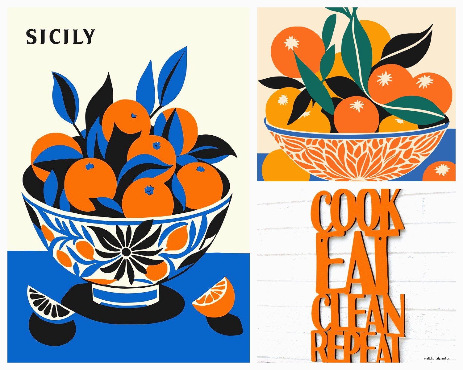
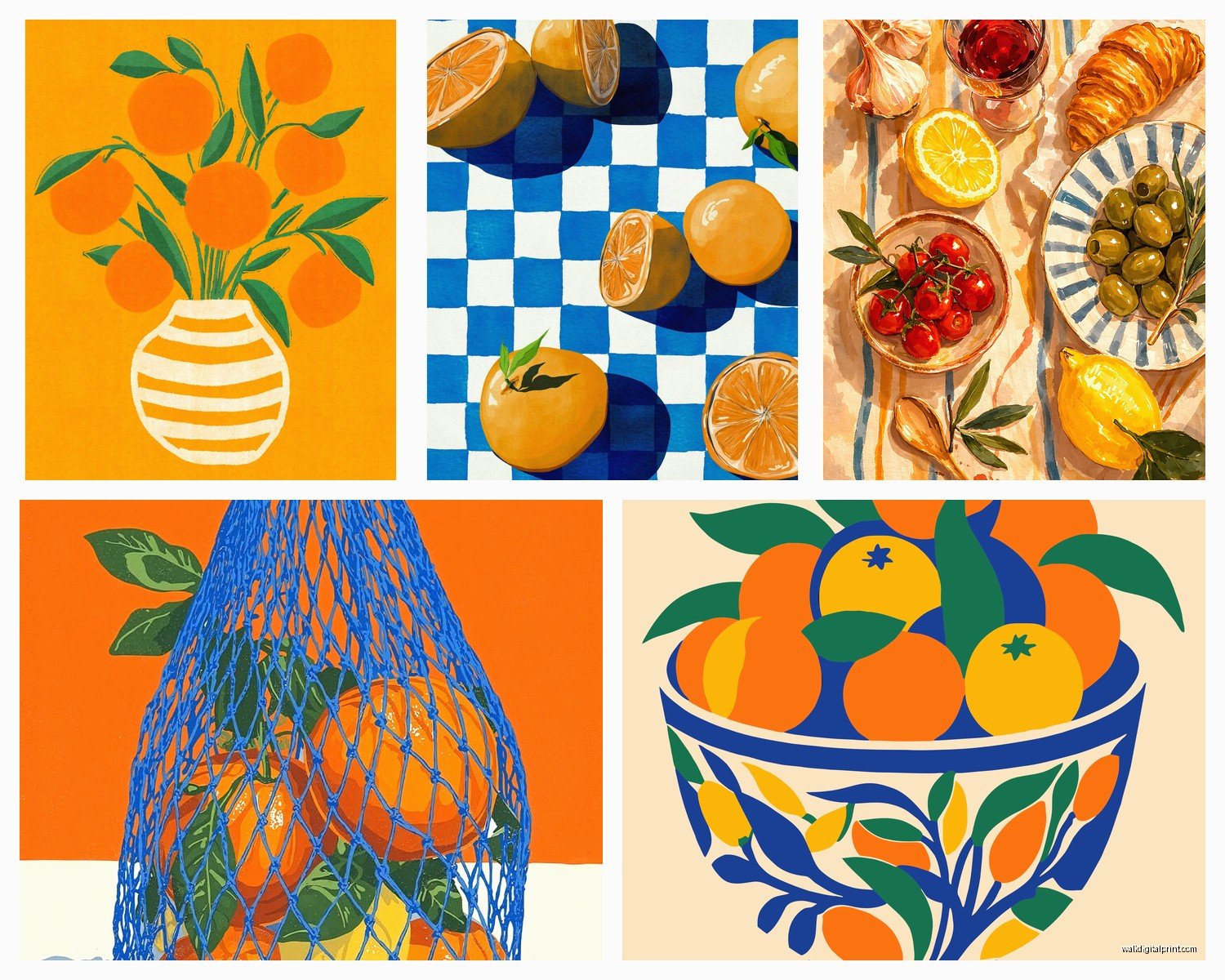
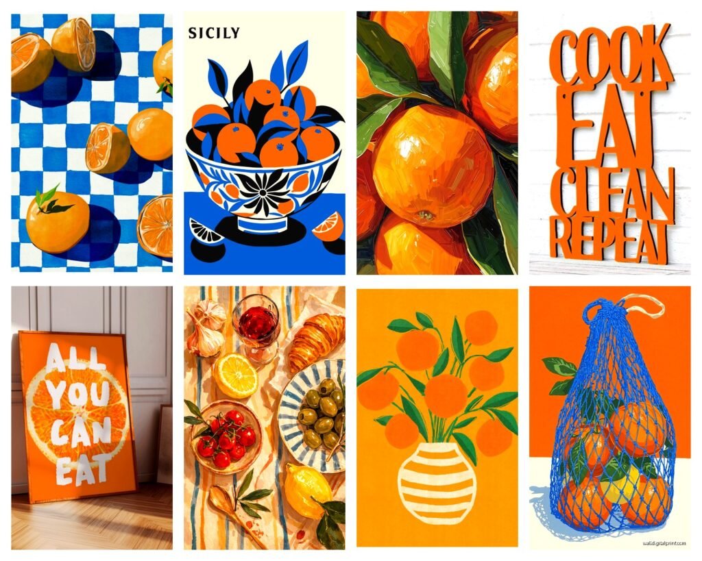
Citrus prints are the obvious choice and yeah they’re a bit on-the-nose but honestly they’re cheerful and they WORK. I found these vintage botanical orange prints on Etsy that look way more sophisticated than the cutesy stuff you see everywhere. Look for ones with some green leaves included because the color combo is *chef’s kiss*.
Abstract art with orange as the dominant color gives you that warmth without being literal. I got this piece from a local artist that’s mostly burnt orange with some cream and rust streaks, and it ties together my orange Le Creuset pot, my wooden cutting boards, and my white subway tile perfectly. Cost me $180 but it was worth it because it’s the right size and custom to my space.
Vintage advertisements especially for food or beverages in orange tones – I’m talking old Fanta ads, Italian aperitif posters, that kind of thing. They add personality and story. Found mine at an antique market for $25 and had it framed for $60, so all-in $85 for something totally unique.
Typography prints with orange backgrounds or orange text can work if your kitchen is modern. Something like a recipe in orange on white, or a food quote. Just avoid the “live laugh love” energy unless that’s your thing, no judgment.
Materials That Can Handle Kitchen Life
This is important because kitchens are humid and greasy and generally hostile to paper. I learned this when a print I loved got warped from steam.
Go with:
- Canvas prints – they can handle moisture better than paper
- Framed prints under glass – the glass protects the art from splatter
- Metal prints – pricier but literally waterproof, great near the sink
- Acrylic prints – modern looking and super durable
Skip unframed paper prints unless they’re nowhere near your cooking zones. I have one in my pantry area that’s fine but the ones near my stove are all either canvas or under glass.
Where to Actually Buy This Stuff
okay so funny story, I spent an entire Sunday comparing prices because my cat knocked over my coffee onto my laptop and I had to wait for it to dry out so I had nothing better to do…
Etsy is great for vintage prints and independent artists. Search “orange kitchen art” or “citrus botanical print” or “mid century orange abstract.” Prices range wildly from $15 digital downloads you print yourself to $300+ originals. I’ve had good luck with digital downloads printed at my local print shop on nice cardstock, then framed – total cost around $40-50 per piece.
Society6 has tons of options and you can get the same design as a framed print, canvas, or metal print. Their framing is decent quality. I got a peachy-orange abstract there for my mom’s kitchen, the 18×24 framed print was $85 with a sale.
Minted is pricier but really good quality. Their framing is excellent and they have lots of sophisticated citrus and food art. Expect to pay $150-250 for a framed piece but it’ll look expensive.
Local art fairs and markets if you want something nobody else has. I’ve found my favorite pieces this way. Bring measurements of your space on your phone and don’t be afraid to negotiate if you’re buying multiple pieces.
Target and HomeGoods for budget-friendly options that still look decent. You gotta dig through a lot of mediocre stuff but occasionally there are gems. I found a set of three small orange abstract prints at Target for $30 total that I used in a client’s rental kitchen.
Mixing Orange Art with Your Existing Kitchen
If your kitchen is mostly white or neutral, orange art is gonna pop and energize the space. This is the easiest scenario – you can go bold or subtle, whatever feels right.
White cabinets + orange art + wood accents = chef’s kiss every time. Add some brass or copper hardware and you’ve got a whole vibe going.
Gray cabinets need warmer oranges to not look dingy. Think terracotta or peachy tones, skip the true bright orange unless your gray is really light and cool-toned.
Wood cabinets depend on the wood tone. Honey oak? Go with burnt orange or rust. Dark walnut? Blood orange or coral works better. Light maple? Pretty much any orange is fine.
If you already have colorful elements like a blue backsplash or green cabinets, orange can still work but be strategic. Orange and blue are complementary colors so they actually play nice together – I did this in my sister’s kitchen with a blue tile backsplash and peachy-orange art and it’s gorgeous. Orange and green need more care – go with softer oranges like apricot or peach rather than bright pumpkin.
The Gallery Wall Approach
I’m gonna be honest, gallery walls are harder than they look but really rewarding when you get them right. Here’s my process:
Cut out paper templates the size of each frame and tape them to the wall. Move them around until it looks balanced. The center of the whole arrangement should be at that 58-60 inch height. Take a photo so you remember the layout.
Start with the middle or largest piece and work outward. Use a level because even slightly crooked art makes everything look off. I use those Command picture hanging strips for anything under 5 pounds because I change my mind a lot and they don’t leave holes.
Mix frame colors if you want – all black is safe, all wood is warm, or do a mix of black and natural wood for more interest. I’d avoid white frames in a kitchen because they show dirt too easily.
Practical Stuff Nobody Tells You
Grease happens. Even with your best exhaust fan, kitchens get grimy. Use glass cleaner on framed pieces monthly. Canvas can be gently dusted but that’s about it – keep those away from the stove.
Sunlight fades art. If you have a window near your art wall, consider UV-protective glass or expect to rotate pieces every couple years. I learned this the hard way with a print that went from vibrant coral to sad peachy-beige.
Command strips are your friend for renters or commitment-phobes like me. They hold surprisingly well and you can change things up seasonally if you want. I actually swap some of my kitchen art in winter for warmer, spicier tones and lighter citrus stuff in summer.
Lighting matters SO MUCH. If your art wall is dim, it doesn’t matter how beautiful the pieces are. I added a simple picture light above my largest piece (battery operated, $30 on Amazon) and it completely transformed the whole wall. Under-cabinet lighting also helps illuminate art on that wall.
My Actual Setup That Works
Since I’ve been rambling I should probably tell you what I actually did that I’m happy with…
Main wall above my sink: Three vintage botanical orange prints in matching black frames, arranged horizontally. Each is 11×14, total spread is about 44 inches with 2 inches between frames. Cost was $45 for the prints and $90 for framing at Michael’s with a sale.
Breakfast nook: One large abstract piece that’s mostly burnt orange and cream, 24×36, leaning on a shelf rather than hung because I’m lazy and it actually looks more casual that way. Got it from a local artist for $180.
Opposite wall near the pantry: A vintage orange Campari poster, framed under glass, 16×20. This area gets less traffic so I’m not worried about splatter. Found it at an estate sale for $15, frame was $55.
The whole thing took me like three months to pull together because I kept finding better options and changing my mind, but now it feels cohesive and makes me happy every time I walk in. The orange adds this warmth that my all-white kitchen desperately needed without being overwhelming.
If You’re Still Not Sure
Start small. Get one piece you really love and live with it for a week. See how it makes you feel, how it looks at different times of day, whether it makes you smile or annoys you. Then build from there.
And honestly? Rules are meant to be broken. If you find a bright orange pop art piece that makes you happy but “shouldn’t” work with your kitchen according to design rules, who cares. Your kitchen, your art, your joy.
I’ve gotta go because I’m watching this show about home renovations and they’re about to reveal the kitchen but yeah, orange art is surprisingly versatile and totally worth trying if you want to warm up your cooking space without a major renovation.