
Wall Art Guide, Wall Art Tutoriels
Printable Coco Chanel Wall Art: Free Fashion Downloads
Sep
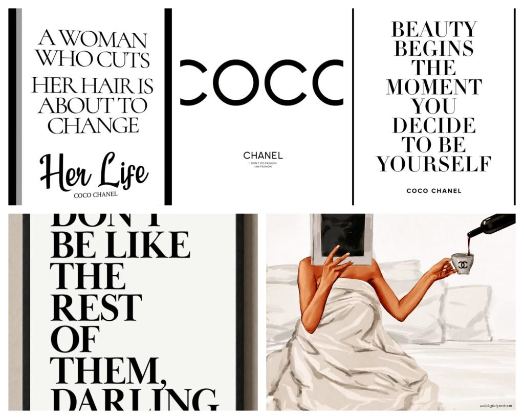
So I’ve been downloading and printing Coco Chanel wall art for like three years now and honestly it’s one of those things that sounds way more complicated than it actually is. My neighbor texted me last week asking where I got those fashion prints in my hallway and I was like… Pinterest, ten minutes, done.
Where to Actually Find the Good Stuff
Okay so first thing, not all free printables are created equal. I learned this the hard way when I printed something that looked amazing on my laptop and came out pixelated as hell. You need to look for files that are at least 300 DPI resolution, and honestly most people don’t list that in the description which is annoying.
The best places I’ve found are Creative Market during their free goods weeks, Etsy shops that offer freebies to get you on their email list (just make a separate email for this stuff trust me), and weirdly enough some museum websites. The Met has this whole open access thing going on and while they don’t have Chanel specifically, they have vintage fashion illustrations that give the same vibe.
For actual Chanel quotes and silhouettes, I usually hit up:
- Pinterest but you gotta reverse image search to find the original source
- Design blogs that do monthly freebie roundups
- Canva’s free templates which you can customize
- Those “link in bio” Instagram accounts for interior printables
Wait I forgot to mention, some Etsy sellers mark things as “free” but then charge you like $1 which technically isn’t free but also it’s a dollar so whatever. I’ve found some really good ones that way.
The Printing Situation
This is where people mess up constantly. Your home printer is gonna be fine for smaller prints like 5×7 or 8×10, but anything bigger and you’re gonna want to go somewhere else. I use Staples for most of mine because they’re everywhere and their cardstock options are decent.
Here’s what I do – download the file, open it in Preview or whatever, check the actual dimensions. Sometimes a “printable” is sized for A4 paper which is not the same as standard US letter size and everything gets weird. If the proportions are off, I’ll pop it into Canva real quick and resize it to exactly what I need.
For printing at home you’re gonna need:
- Decent cardstock, like 80lb minimum (regular paper looks cheap, sorry not sorry)
- Your printer settings on “best quality” or “photo”
- A paper cutter if you want clean edges, or just use scissors but be careful
My cat knocked over my coffee onto a whole stack of prints once and I had to redo everything, so maybe print extras or at least save the files somewhere you can find them again. I have a folder on my desktop that’s just “PRINTS DON’T DELETE” because I’ve accidentally trashed things before.
What About Copyright Though
Okay so funny story, I got really paranoid about this after a client asked me to source some Chanel prints for her boutique. For personal use in your home, you’re generally fine with most free downloads. But technically a lot of these are in a gray area legally because they’re using Chanel’s branding or quotes.
The safest options are:
- Vintage fashion illustrations that are old enough to be public domain
- Prints that say “inspired by” rather than using actual logos
- Quote prints where you’re just using text (quotes themselves usually can’t be copyrighted)
- Stuff from designers who explicitly say it’s for personal use
I’m not a lawyer obviously but that’s what I’ve figured out from reading way too many blog posts about this at 2am.
Making Them Look Expensive
This is the actual secret that nobody tells you. The print itself matters but the framing is like 80% of whether it looks good or like a college dorm room situation.
I buy most of my frames from IKEA because their RIBBA frames are cheap and come in black, white, and wood. For a gallery wall of Chanel prints, I usually do all black frames with white mats. It’s classic and it lets the prints be the focus without getting too matchy-matchy.
But here’s the thing – you can also do this without frames entirely. I’ve mounted prints on foam board with spray adhesive and just leaned them against the wall on a shelf. Or you can do the clipboards thing which is very Pinterest 2019 but honestly still looks cute in the right space.
The Gallery Wall Formula
People always ask me how to arrange multiple prints and there’s this formula I use that works every time. Start with your largest print in the center or slightly off-center, then build out from there with smaller pieces. Keep about 2-3 inches between each frame.
For Chanel specifically, I like mixing:
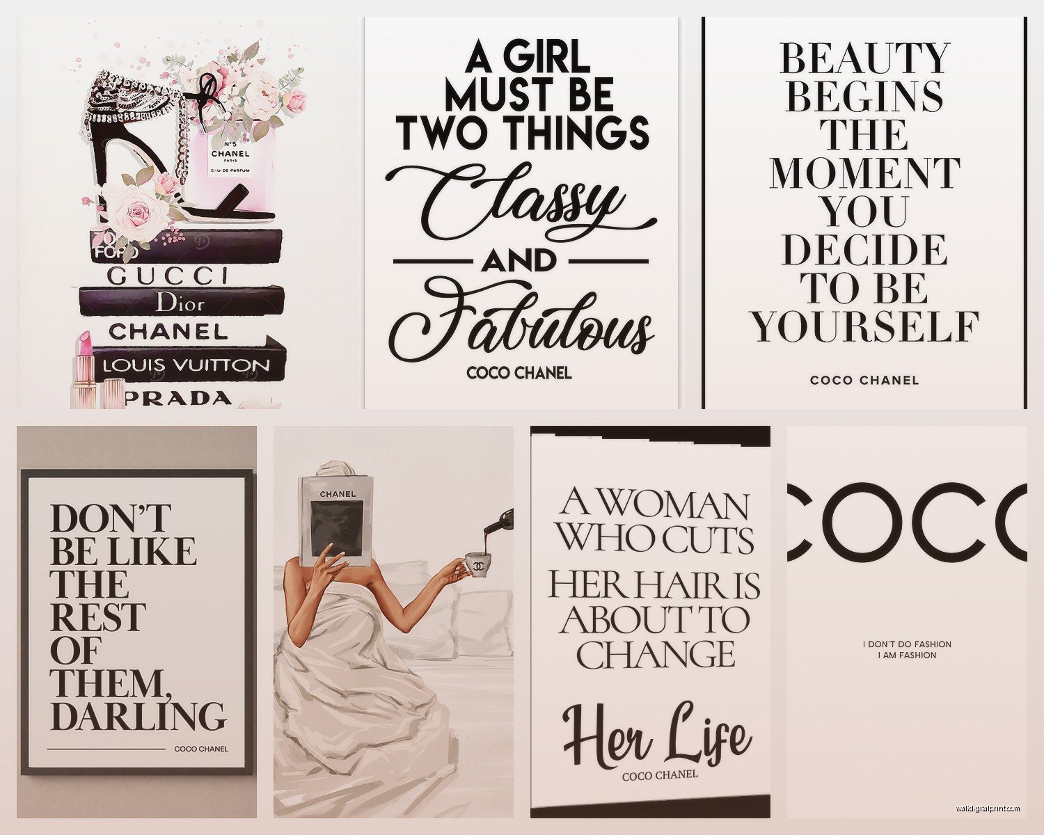
- A perfume bottle illustration
- One or two fashion quotes in elegant typography
- A silhouette or fashion sketch
- Maybe a lipstick or shoe print if you want more variety
I always lay everything out on the floor first and take a photo so I remember the arrangement when I’m actually hanging stuff. Oh and another thing, use painter’s tape to mark where the frames go on the wall before you start putting holes everywhere.
File Formats and Technical Stuff
Most free downloads come as JPG or PNG files. PNG is better if you want to customize anything because it has a transparent background usually. PDF is also common and honestly the easiest to print because the sizing stays consistent.
If you download something and it’s like 150 KB, that’s gonna be too small to print well. You want files that are at least a couple MB for decent quality. I’ve wasted so much cardstock on prints that looked fine on screen but came out blurry.
Sometimes you’ll find SVG files which are vector graphics – these are actually the best because you can resize them infinitely without losing quality, but you need Canva Pro or Illustrator to work with them properly. I have Canva Pro because I use it for work anyway and it’s honestly worth it.
Customizing the Downloads
This is gonna sound weird but I almost never print something exactly as I downloaded it. I’ll change the background color, adjust the text size, switch out fonts to match my space better. Canva makes this super easy even if you’re not design-savvy.
For Chanel prints specifically, I tend to go with:
- Black text on white or cream backgrounds for a classic look
- Blush pink backgrounds for more feminine spaces
- Gold accents if I’m feeling fancy (but use metallic cardstock for this)
Just keep it simple. The whole vibe of Chanel is elegance and restraint so don’t go crazy with like rainbow gradients or whatever.
Where to Actually Hang Them
I’ve put Chanel prints in basically every room at this point. They work in bedrooms obviously, but also in closets if you have a walk-in situation, above a vanity, in an entryway, even in powder rooms. One of my friends has a tiny print in her laundry room that says “A girl should be two things: classy and fabulous” and it makes her laugh every time she’s doing boring chores.
The key is making sure the style fits the room. Like if your bedroom is very minimalist and neutral, go with simple black and white prints. If you’ve got more of a glam situation with velvet and metallics, you can do fancier versions with gold foil effects.
I have this one client who wanted Chanel prints but her whole house is farmhouse style and honestly it was challenging to make it work. We ended up going with very subtle typography prints in rustic wood frames and it turned out okay but it’s not my favorite combo.
Avoiding the Tacky Factor
Real talk, Chanel wall art can look really tacky if you’re not careful. Here’s what to avoid:
- Too many prints in one space (pick 3-5 max for a gallery wall)
- Mixing too many different styles or fonts
- Using actual Chanel logos unless you’re going for an ironic vibe
- Printing on regular printer paper and just taping it up
- Putting them in cheap plastic frames from the dollar store
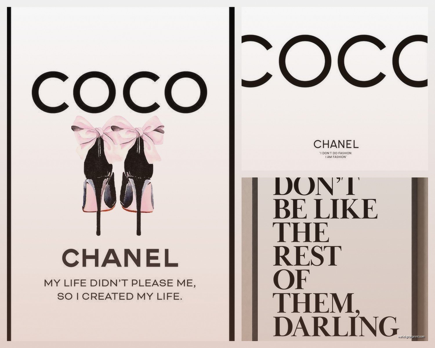
Also maybe skip the ones that say stuff like “I don’t do fashion, I am fashion” unless that’s genuinely your personality. Some of these quotes are kinda cringe when you really think about them.
The Matting Trick
If you wanna make cheap prints look more expensive, get mats cut at a framing shop. It costs like $10-15 per mat but it makes such a difference. I usually do a white mat with a print that has some color, or a cream mat with black and white prints.
You can also DIY mats with a mat cutter but I tried this once while watching The Crown and completely botched it so now I just pay someone else to do it. Not everything needs to be a project, you know?
Organizing Your Downloads
This is boring but important – create a system for saving your printable files. I have folders organized by room and style so I can find stuff again when I inevitably want to reprint something or use it for a different space.
Name your files something actually useful like “Chanel-Perfume-Black-White-8×10” instead of “IMG_9847.jpg” because future you will be annoyed trying to figure out which file is which.
I also keep a spreadsheet (yes I’m that person) with links to where I originally downloaded things, especially if they’re from blogs that might take them down eventually. I’ve lost access to so many good freebies because the website disappeared or they moved to paid-only.
Quick Fixes for Common Problems
Colors look different when printed – this happens because screens show RGB color and printers use CMYK. Not much you can do except print a test page first if it’s really important.
Print came out too dark – adjust your printer settings to “lighter” or decrease the color density. Sometimes I’ll also brighten the image slightly in Canva before printing.
Can’t get the file to download – try a different browser or check if you need to disable your ad blocker. Some freebie sites are annoying about this.
Frame size doesn’t match print size – either trim the print down or get a mat cut to fill the gap. Or just size your print correctly before printing which is the smarter option honestly.
Honestly once you do this a few times it becomes super quick. I can go from finding a print to having it framed and hung in like an hour if I’m motivated. It’s one of the easiest ways to update your space without spending much money and you can change them out seasonally or whenever you get bored. My office has had like four different Chanel gallery walls in the past two years because I can’t make up my mind about anything apparently.
Just start with one or two prints and see how you like them before committing to a whole wall situation. And save your favorite sources because the good free stuff tends to disappear quickly once everyone finds it.
