Wall Art Guide, Wall Art Tutoriels
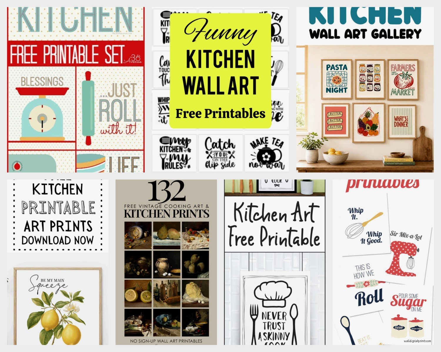
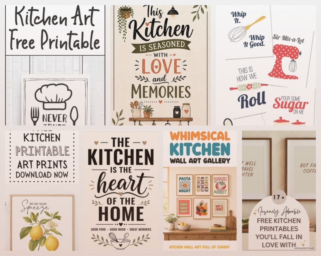
DIY Free Printable Kitchen Wall Art: Handmade Downloads
Sep
So I’ve been diving deep into free printable kitchen art lately because honestly, my own kitchen looked so sad and I didn’t wanna spend like $200 on some basic prints from those fancy home stores. Plus I had a client last month who needed something quick for a rental property and we literally printed stuff the same day, so let me tell you what actually works.
Finding the Good Stuff That Doesn’t Look Free
Okay so first thing – not all free printables are created equal. You’re gonna find a lot of that really clipart-y stuff that screams “I downloaded this in 2015” and we don’t want that. I usually start with a few specific sites that I’ve tested like a million times.
The Graphics Fairy has this whole vintage section that’s perfect for kitchens. Think old botanical prints, vintage utensil illustrations, antique recipe cards. The resolution is usually high enough that you can print at 11×14 without it looking pixelated which is key. I printed this gorgeous vintage rolling pin illustration last week and it looks like I paid for it, I swear.
Unsplash isn’t technically a printable site but hear me out – you can download high-res photos for free and just print them. I’ve done this with minimalist food photography, coffee shots, fresh herb photos. Just make sure you check the license but most are totally free for personal use.
Oh and another thing, Canva has free templates specifically for kitchen prints. You gotta sort through some mediocre ones but there are gems. I made this “fresh baked daily” print in like 10 minutes by tweaking their template and changing the font. My sister wanted one too so that’s how I know it’s actually good.
The Printing Part That Everyone Messes Up
This is gonna sound weird but the paper matters SO much more than you’d think. I wasted so much paper in the beginning printing on regular printer paper and wondering why it looked cheap. Because it is cheap, that’s why.
Get yourself some cardstock. I use the HP Premium Presentation Paper in matte – it’s like $15 for 50 sheets on Amazon and it makes everything look professional. The 32lb weight is perfect. Not too thick that your printer freaks out but substantial enough that it doesn’t feel flimsy.
For my home printer I have an HP OfficeJet Pro and it handles 11×14 prints no problem. Before that I had a Canon Pixma and it was fine too. You don’t need anything fancy. Just make sure it can handle heavier paper and do borderless printing if you want that clean edge look.
Wait I forgot to mention – check your print settings. This is where people mess up constantly. You want to set it to “Best” quality, not draft. And if you’re printing a photo or something with lots of color, select “Photo” paper type even if you’re using cardstock. It tells the printer to use more ink and the colors come out richer.
When to Use a Print Shop Instead
Sometimes your home printer just isn’t gonna cut it. If you want something bigger than 11×14 or if you’re doing like 10 prints for a gallery wall, just go to Staples or FedEx. I do this all the time. Upload your file, select cardstock or photo paper, and pick it up same day. Usually costs like $3-8 per print depending on size.
My cat knocked over my coffee right as I was about to print a big batch last week so I just sent them to Staples instead and honestly they turned out better than I could’ve done at home anyway.
File Formats and Resolution You Actually Need to Know
Okay this gets slightly technical but stay with me. You want files that are at least 300 DPI (dots per inch). Anything less will look blurry when printed. Most good free printables will list the DPI in the download info.
PDF files are usually best for printing because they maintain quality. JPG is fine too if it’s high resolution. PNG works great especially for designs with transparent backgrounds.
If you find something you love but it’s only available in a smaller size, don’t just stretch it in your document. It’ll look terrible. Either find a different version or size down your frame instead.
My Actual Process Start to Finish
So here’s what I do when I’m creating a kitchen gallery wall or even just one statement piece:
First I figure out what vibe I’m going for. Are we doing vintage farmhouse? Modern minimalist? Botanical and fresh? I learned the hard way that you can’t just print random stuff and hope it works together. Pick a theme or at least a color palette.
Then I hunt for 3-5 designs that fit that theme. I usually save way more than I need because some won’t work once I see them together. I’ll download like 15 options and narrow it down.
Next I test print one on regular paper just to see the colors and make sure nothing’s cut off. This saves so much cardstock and ink. My printer always prints slightly different than what I see on screen so this step is crucial.
Once I’m happy with how everything looks, I do the real prints on cardstock. I let them sit for like 10 minutes after printing so the ink can fully dry before I touch them too much.
Framing Without Spending a Fortune
Frames are where this can get expensive if you’re not careful. IKEA frames are your friend – the RIBBA and SILVERHÖJDEN lines are cheap and look way more expensive than they are. I have like 20 of them throughout my house and clients’ homes.
Target’s Threshold frames are good too, especially when they’re on sale. I got a set of three 8×10 black frames for $15 last month.
Oh and another thing – don’t feel like you need to mat everything. For kitchen art especially, I think no mat looks cleaner and more modern. Plus it saves you money and hassle.
If you do want mats, you can buy pre-cut mat boards at craft stores or Amazon. Just make sure your print size matches standard mat openings or you’ll be cutting mats yourself which is honestly not fun.
Design Ideas That Actually Work in Real Kitchens
I’ve tried a lot of different styles and here’s what consistently looks good:
Vintage botanical prints of herbs or vegetables work in literally any kitchen style. I printed basil, rosemary, and thyme illustrations in matching frames and put them above my kitchen window. Everyone asks where I bought them.
Coffee-themed prints are classic for a reason. But skip the super cutesy “but first coffee” stuff unless that’s really your vibe. I like minimal line drawings of coffee cups or vintage coffee advertisement reproductions.
Recipe cards or cookbook pages – you can find free vintage ones or scan your grandma’s handwritten recipes which is actually really cool and personal. I did this for a client using her mom’s lasagna recipe and she literally cried.
Farmers market style fruit and veggie prints. There’s something about a simple lemon illustration or tomato print that just works. Not too country, not too modern, just right.
Typography prints with cooking quotes or measurements. I made one that’s just measurement conversions in a pretty font and it’s both decorative and actually useful when I’m baking.
Color Matching Your Actual Kitchen
This is something I see people skip and then wonder why their prints don’t look right. Take a photo of your kitchen and look at it while you’re choosing prints.
If you have warm wood tones and brass fixtures, go for prints with cream backgrounds and warm colors. Cool gray cabinets and chrome? Stick to black and white or cool-toned prints.
I have white cabinets with black hardware and I went with black and white prints with just small pops of green from herb illustrations. It’s cohesive without being matchy-matchy.
Mixing Free Prints with Other Art
You don’t have to do all printables. I mix them with other stuff all the time. Maybe you have one piece you actually bought or a painting from a local artist – use printables to fill in around it.
I have this vintage cutting board hanging in my kitchen and I surrounded it with three free botanical prints in matching frames. Nobody can tell which pieces were free and which weren’t.
Stuff That Didn’t Work For Me
Let me save you some trouble. I tried printing on regular copy paper and sticking it in a frame – looked terrible, you could see the frame backing through the thin paper.
I attempted to print my own coffee-stained “aged” paper look by actually staining paper with coffee. What a mess. Just download vintage paper textures if you want that look.
Printing super colorful stuff on my printer that’s low on color ink – the colors came out muddy and weird. Either refill your ink or stick to black and white when you’re running low.
Using frames that are too small for the space. I had this massive blank wall and put up three 5×7 prints and they just looked lost. Scale matters. Bigger walls need bigger art or more pieces.
Quick Tips I Wish Someone Told Me
Always download the highest resolution available even if you think you might print smaller. You can always size down but you can’t add resolution later.
Save your files in organized folders by room or theme. I have folders labeled “Kitchen Modern,” “Kitchen Vintage,” “Kitchen Botanical” so I can find stuff again when clients ask.
If you’re doing a series, print them all at once with the same printer settings so the colors match exactly. I printed three herbs on different days and the green was slightly different on each one – annoying.
Let prints sit flat under a heavy book overnight after printing if they’re curling at all. Makes framing so much easier.
Consider printing in black and white even if the original is color. Sometimes it looks more sophisticated and you use way less ink.
oh and test your printer before you commit to printing 10 things. Print a test page to make sure nothing’s running low or printing streaky.
Where This Approach Works Best
Honestly? Rentals, first homes, or if you just like changing things up frequently. I wouldn’t do this for every single art piece in a house but for kitchens where stuff might get splattered or you want to change seasonally, it’s perfect.
I also do this for staging properties. Why spend hundreds on art that’s just gonna be there for showings when you can print professional-looking pieces for under $20 total?
My own kitchen art changes like every few months because I get bored easily and with printables I don’t feel bad about switching things out. Can’t do that when you’ve spent $80 on a framed print.
Some sites let you save favorites or create collections which is super helpful when you’re gathering ideas. I have Pinterest boards too but honestly half those links are dead when you go back to them.
The whole process from finding art to hanging it on the wall takes me maybe 2 hours now that I know what I’m doing. First time definitely took longer because I was figuring everything out but it’s pretty quick once you get your system down.
Just start with one or two prints if this feels overwhelming. You don’t need a whole gallery wall right away. I started with a single herb print above my stove and built from there as I found more pieces I liked.