Wall Art Guide, Wall Art Tutoriels
Spiderman Wall Art: Marvel Spider-Man Superhero Comic
Sep
So I’ve been completely obsessed with Spider-Man wall art lately because three different clients asked about it within the same week, which felt like the universe telling me something. And honestly, picking the right pieces is way trickier than you’d think because there’s SO much out there and a lot of it looks amazing online but shows up looking like a pixelated mess.
What Actually Works Size-Wise
Okay so first thing—size matters way more than people realize. I made this mistake in my own home office last year where I bought this gorgeous Spider-Man canvas print, like the classic comic book cover style, but it was only 16×20 inches and it just looked sad on my wall. You need to go bigger than your instinct tells you. For a focal wall or above a bed, you’re looking at minimum 24×36 inches, but honestly 40×60 inches is where it starts having actual impact.
The rule I tell everyone is measure your wall space and aim for art that takes up about two-thirds to three-quarters of that width. So if you’ve got a 6-foot wide wall section, you want something around 4-5 feet wide. This is gonna sound weird but I actually use painter’s tape to mark out the dimensions on the wall before buying anything because my spatial reasoning is terrible and I always think things will be bigger than they are.
Canvas vs Poster vs Metal Prints
Here’s where it gets interesting. Canvas prints are the most popular and they look really good in person—that gallery-wrapped edge thing where the image continues around the sides makes them feel more expensive than they are. I’ve ordered from like five different companies and the quality varies wildly. The cheap ones from Amazon sometimes arrive with the canvas already sagging, which is annoying.
Metal prints though… okay so I discovered these last year and they’re incredible for comic book art specifically. The colors pop in this way that paper and canvas just can’t match. There’s this company that does dye-sublimation printing on aluminum and the Spider-Man action scenes look insane. The reds are actually RED, you know? My nephew has one in his room and every time I visit I just stare at it. Downside is they’re pricier and heavier, so you need proper wall anchors.
Posters are fine if you’re gonna frame them properly. Don’t do the thumb tack thing unless it’s genuinely a teenager’s room and you’re going for that aesthetic. A poster in a nice frame with a mat actually looks sophisticated—I did this in a client’s home office with vintage Spider-Man comic covers and it looked like legitimate art collection.
The Framing Thing Nobody Talks About
Wait I forgot to mention—if you go the poster route, spend money on the frame. Like actually spend money. Those cheap plastic frames from Target make everything look cheap no matter how cool the art is. I usually go with simple black wood frames, nothing ornate, and a white or black mat board. The mat creates this breathing room around the image that makes it feel more curated.
Michael’s and Hobby Lobby have sales literally every week so never pay full price. I got three custom frames for like 60% off last month just by waiting for their email coupon.
Style Categories That Actually Exist
This is where you gotta figure out what vibe you’re going for because Spider-Man art falls into pretty distinct categories:
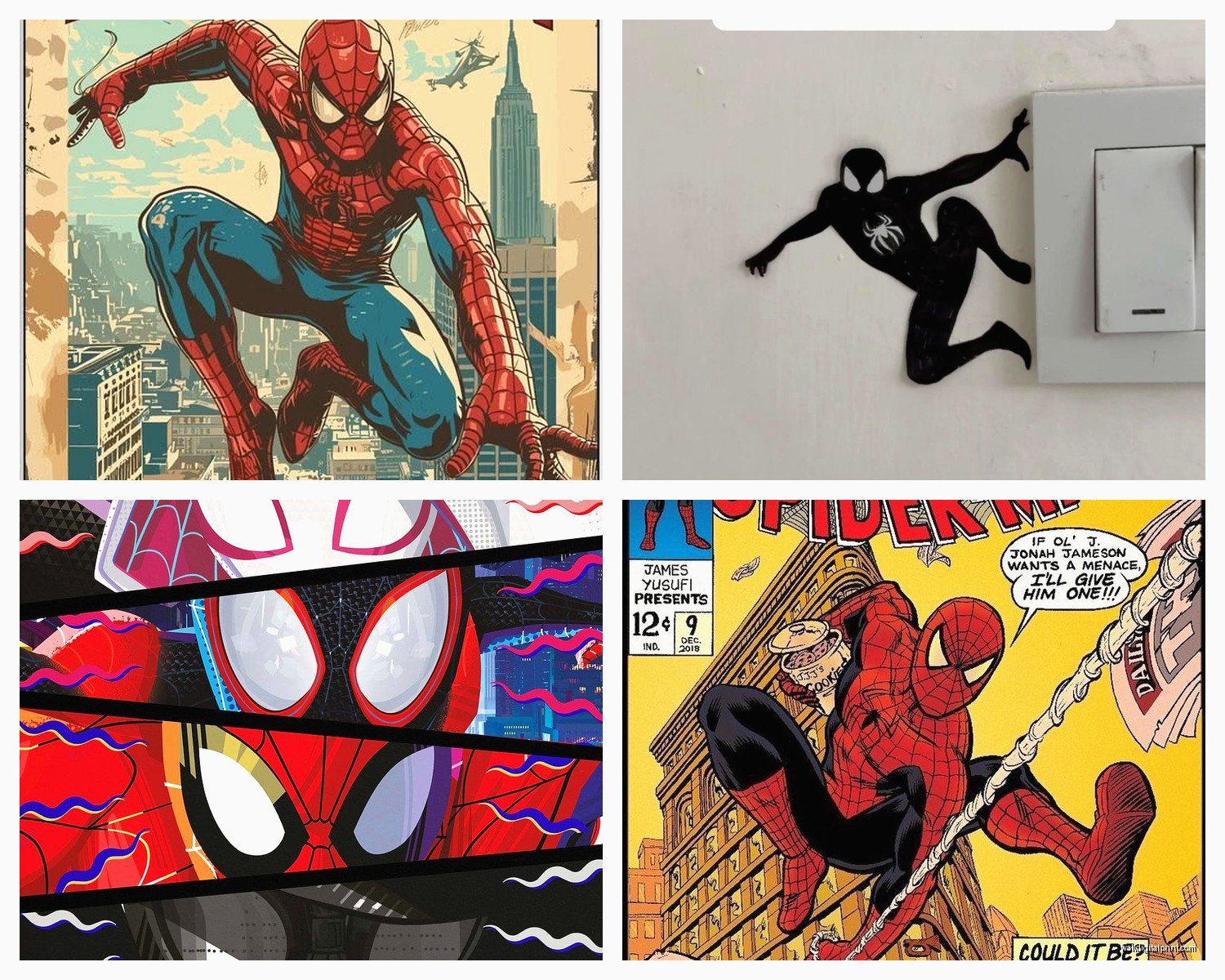
Classic Comic Book Style – These are reproductions of actual vintage comic covers or panels. Amazing Fantasy #15 is the iconic one everyone knows. These work great in offices, game rooms, or if you’re doing a whole vintage pop art thing. They’re colorful but in that retro halftone printing way.
Modern Minimalist – Vector art, silhouettes, geometric designs. Usually limited color palettes. I’ve used these in adult spaces where someone wants to show they like Spider-Man but doesn’t want it to look like a kid’s room. There’s this one that’s just the spider symbol in black on white and it’s genuinely chic.
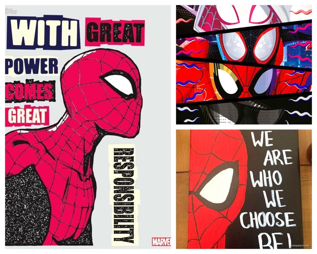
Graffiti/Street Art Style – More urban, edgy, sometimes combined with typography. These fit really well in industrial or contemporary spaces. My client with the exposed brick loft has one and it’s perfect.
Photorealistic Movie Stills – From the various Spider-Man movies. These can look amazing but also can look like a generic movie poster if you’re not careful. The key is finding ones with interesting compositions, not just like… Tom Holland’s face.
Abstract/Artistic Interpretations – Watercolor, paint splatter, artistic renderings. These are hit or miss. When they’re good they’re REALLY good, but I’ve seen some that look like someone just threw red and blue paint at a canvas and called it Spider-Man.
Where to Actually Buy This Stuff
Okay so funny story, I spent an entire Saturday comparing prices across different sites because my cat knocked over my coffee onto my laptop and I had to wait for it to dry out so I had nothing better to do.
Etsy is honestly great for unique prints and you’re supporting actual artists. The quality varies so read reviews carefully. I’ve gotten amazing stuff and also received something that looked like it was printed on notebook paper, so yeah. Look for shops with hundreds of sales and good photos in the reviews.
Society6 and Redbubble are solid for licensed and fan art. They do print-on-demand so there’s no inventory risk for artists which means tons of variety. Quality is pretty consistent. I’ve ordered probably 15 pieces total from them over the years and only had one issue.
Displate if you want metal prints specifically. They have this magnet mounting system which is actually genius—no holes in your wall. The prints are pricey but they last forever and look premium.
Amazon is a gamble. Some sellers are great, some are dropshipping garbage. The advantage is easy returns. I’ve found some surprisingly good canvas sets there but you gotta dig through a lot of crap.
Target and Walmart actually carry officially licensed Marvel stuff now and it’s not terrible? Like it’s not gonna be unique but if you need something quick and cheap it works.
The Multi-Panel Thing
Oh and another thing—those multi-panel sets are super popular right now. Like one image split across 3 or 5 canvases. They look really dramatic and modern when done right. The spacing between panels matters though. I usually do 2-3 inches between each piece. Too close and it looks cramped, too far and it looks disconnected.
I helped my sister set up a 5-panel Spider-Man piece above her son’s bed and we used a level and painter’s tape to mark exactly where each piece would go before hammering a single nail. Took like 40 minutes of planning but it’s perfectly aligned and looks professional.
Color Coordination With Your Actual Room
This is where people mess up constantly. They find art they love but don’t think about whether it works with their space. Spider-Man art is predominantly red and blue obviously, which can clash with certain color schemes.
If your room has warm tones—oranges, yellows, browns—the bright blue can look weird. In those cases I’d go for pieces that emphasize the red more, or choose sunset/dramatic lighting versions where the colors are more muted.
Gray walls are your friend here. Literally any Spider-Man art looks good against gray. White walls too. If you’ve got navy or dark blue walls, pieces with lots of red pop really nicely.
I did a room with sage green walls once and we chose a black and white Spider-Man sketch style print with just tiny red accents and it was *chef’s kiss*.
Lighting Makes or Breaks It
Nobody thinks about this but lighting is crucial. I’ve got these LED picture lights that clip onto frames and they make such a difference, especially with darker comic art pieces. You can get battery operated ones on Amazon for like 15 bucks.
If you’ve got overhead lighting, make sure it’s not creating glare on glass-covered frames. This drove me insane in my living room until I switched to museum glass which has anti-reflective coating. Expensive but worth it for pieces you really love.
Natural light is tricky—it makes colors look amazing but can fade prints over time. UV-protective glass or keeping art out of direct sunlight helps. I learned this the hard way when a vintage print I had faded after a year near a window.
Mixing Spider-Man Art With Other Stuff
Unless you’re doing a dedicated Spider-Man room, you probably want to mix it with other pieces. The trick is finding a common element—color palette, frame style, or theme.
I did a gallery wall once that mixed Spider-Man with other New York City photography and street art because Spider-Man IS New York, right? It felt cohesive and intentional rather than random.
Or you can do all superhero art but different characters. Keep the frame style consistent—all black frames or all white—and it looks like a collection rather than clutter.
The Kids Room Dilemma
If this is for a kid’s room you’ve got more freedom to go bold and playful. But here’s my advice—choose art that could transition as they get older. A sophisticated comic book style piece or a cool minimalist design will still work when they’re 16, whereas a cartoon-y toddler style thing won’t.
Also consider removable options like wall decals if you’re renting or if your kid changes their mind every six months. My nephew went from Spider-Man to Minecraft to Among Us in like two years so his parents learned to go temporary.
Installation Tips That Actually Matter
Use proper wall anchors, especially for canvas or metal prints. Drywall anchors for drywall, toggle bolts for hollow walls. I’ve had canvases fall at 3am and it’s terrifying.
The whole “hang art at eye level” rule is generally 57-60 inches from the floor to the center of the artwork. But honestly I adjust based on furniture—if it’s above a bed or couch, you want the bottom of the frame about 6-8 inches above the furniture.
Get a laser level if you’re doing multiple pieces. Changed my life. Twenty bucks at Harbor Freight and suddenly I can hang things straight without having a breakdown.
What I’d Actually Buy Right Now
If someone asked me TODAY what to get, I’d probably say look for a large-scale metal print of a dynamic action scene—Spider-Man mid-swing through the city with that motion blur effect. The dimensional quality of metal printing makes those look incredible.
Or if budget’s tight, a set of three vintage comic cover prints in matching black frames. Classic, recognizable, works in most spaces.
The worst thing you can do is buy something too small or too cheap-looking. Better to save up for one really good piece than get three mediocre ones. This is coming from someone who has definitely bought mediocre ones and regretted it while they sat in my closet for two years before I donated them.
Anyway, that’s basically everything I’ve learned from probably too much time thinking about Spider-Man wall art. Let me know what you end up getting because I’m genuinely curious now.