Wall Art Guide, Wall Art Tutoriels
Panoramic Wall Art: Wide Vista Landscape Format Designs
Sep
So I’ve been obsessing over panoramic wall art lately and honestly it’s one of those things that sounds straightforward until you actually try to hang one and realize you’ve created a disaster zone in your living room at 9pm on a Tuesday.
Let me just dump everything I’ve learned because I literally just finished installing three different panoramic pieces for clients this month and my arms are still sore from holding that level up for what felt like forever.
The Sizing Thing Everyone Gets Wrong
Okay so here’s what nobody tells you about panoramic art – the ratio matters WAY more than the actual dimensions. Most people see “60 inches wide” and think that’s all they need to know but like… a 60×20 panoramic hits completely different than a 60×30.
The sweet spot I keep coming back to is the 3:1 ratio. That means if it’s 60 inches wide, you want it around 20 inches tall. This creates that true vista feeling without looking like you just slapped a random horizontal rectangle on your wall. I’ve also done 2.5:1 ratios that work beautifully, especially if you’ve got higher ceilings.
Here’s my actual measuring process because I learned this the hard way: Don’t measure your wall space and then buy art to fit it. I know that sounds backwards but trust me. Instead, find the art you actually love, THEN figure out where it can live. I wasted so much money early on buying “the right size” for a space and ending up with mediocre art I didn’t even like.
Wall Space Reality Check
Your panoramic needs breathing room. I usually tell people to leave at least 6-8 inches of empty space on each side of the piece. So if you’ve got a wall that’s 80 inches wide, you’re actually shopping for something around 64-66 inches max.
And vertical placement – this is where people really mess up. The center of your panoramic should be at eye level, which is typically 57-60 inches from the floor. But here’s the thing… if you’re hanging it above furniture, that rule goes out the window. Above a sofa, you want the bottom edge to be 6-8 inches above the back of the couch. Above a console table, maybe 4-6 inches.
Material Choices That Actually Matter
Canvas is still the most popular and honestly for good reason. It’s lightweight which matters SO much when you’re dealing with a piece that’s 5+ feet wide. My favorite canvas panoramics have the gallery wrap where the image continues around the edges – no frame needed and it looks super clean and modern.
But wait I forgot to mention – if you go canvas, make sure it’s stretched on wooden bars that are at least 1.5 inches deep. The thin ones warp over time, especially with wider pieces. I’ve had to replace two client pieces because they cheaped out on the stretcher bars and the canvas started sagging in the middle after like 6 months.
Metal prints are having a moment right now and for panoramic landscapes they can be absolutely stunning. The colors pop in this way that canvas just can’t match. Downside? They’re heavy as hell and you need serious hardware to hang them. I’m talking heavy-duty wall anchors, not just nails in drywall.
Acrylic (also called plexiglass prints) give you that high-end gallery look with serious depth. The image is printed on the back of clear acrylic so you get this floating effect. These are my go-to for modern spaces or when someone wants their ocean vista to really feel immersive. Super expensive though, like easily 3x the cost of canvas.
Oh and another thing – framed prints under glass. Traditional but can work beautifully for panoramic art if you find the right frame. The problem is weight again, and also glare. If you go this route, spring for museum glass or at least non-glare glass. Regular glass on a panoramic piece basically turns it into a mirror from certain angles.
Subject Matter That Works in Panoramic Format
Not everything translates to panoramic, which I learned when I tried to do a panoramic portrait and it looked absolutely ridiculous.
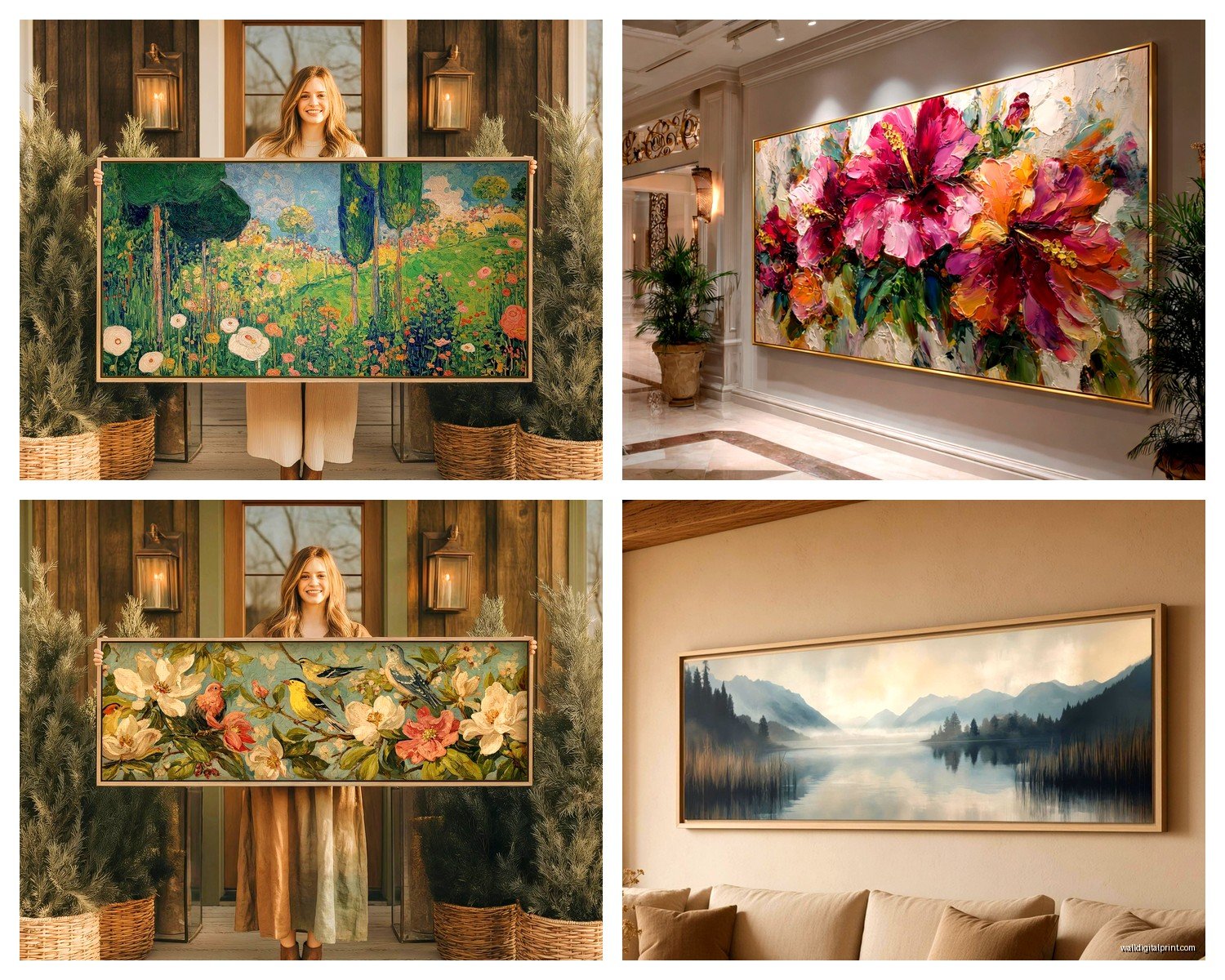
Landscapes are the obvious choice. Ocean horizons, mountain ranges, desert vistas – these were basically made for the panoramic format. I’ve got this one panoramic print of the Icelandic coastline in my own place and the horizontal sweep just makes sense for how your eye naturally wants to travel across that kind of scene.
Cityscapes work incredibly well too. Skylines especially. I did a panoramic Chicago skyline for a client’s office and it completely transformed the space. The horizontal format mimics how you’d actually see a city skyline in real life.
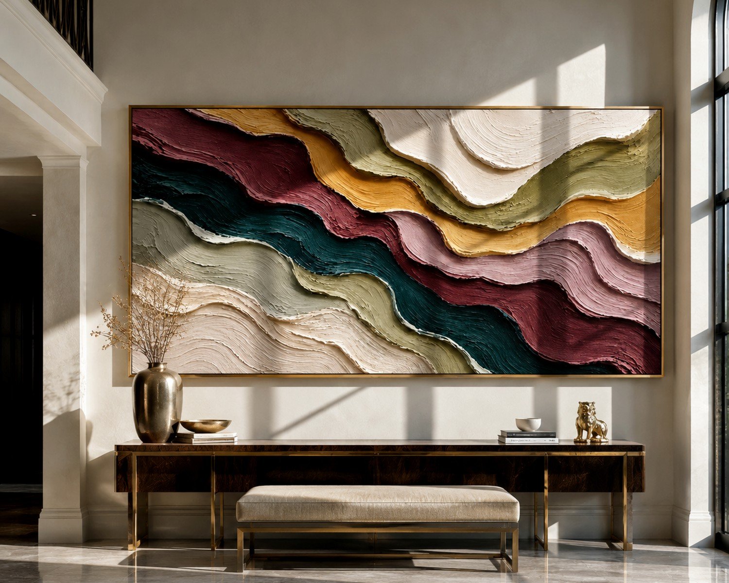
Abstract art in panoramic can be hit or miss. When it works, it REALLY works – think bold horizontal brushstrokes or color field paintings. When it doesn’t work, it just looks stretched and weird. My rule is if the abstract piece has a strong horizontal movement or rhythm, it’ll probably work.
This is gonna sound weird but I’ve also seen some amazing macro photography in panoramic format. Like extreme close-ups of flowers or textures that span the width. It creates this unexpected intimate-yet-expansive feeling.
What Doesn’t Work
Portraits. Just no. Unless you’re doing some avant-garde thing, human faces in panoramic format look distorted.
Busy patterns that need vertical space to breathe. I tried a dense forest scene once and it felt claustrophobic because there wasn’t enough height to show the tree canopy properly.
The Hanging Process Nobody Talks About
Okay so funny story – I once tried to hang a 72-inch panoramic by myself because I’m stubborn and thought I could manage it. I ended up with three extra holes in the wall and a bruised shin from when I dropped the level. Get help. Seriously.
Here’s my actual process now:
First, I use painter’s tape to mark where I think the piece should go. I cut strips that match the dimensions and stick them on the wall. Live with it for a day or two if you can. Walk past it multiple times. Sit on your couch and look at it. You’d be surprised how often I move my tape template around before committing.
For the actual hanging, you need two people minimum for anything over 48 inches wide. One person can’t eyeball level on something that long – your perspective gets all wonky.
Hardware-wise, I’m obsessed with these heavy-duty picture hangers that have two nails at an angle. For panoramic pieces, I use at least two hangers spaced evenly across the back. If it’s particularly heavy (metal or glass), I’ll use wall anchors and screws instead of nails.
The level is your best friend but here’s a pro tip my contractor friend taught me – use a laser level if you’ve got access to one. Project a horizontal line on the wall and align your hanging hardware to that. Game changer for wide pieces where even being off by half a degree becomes super obvious.
Where to Actually Buy This Stuff
I’ve ordered from probably a dozen different places at this point and here’s what I’ve learned:
Society6 has tons of panoramic options and you can get them in different materials. Quality is pretty consistent, prices are reasonable. The artist selection is huge which means you can find some really unique pieces. Shipping takes forever though, like plan for 3-4 weeks.
Etsy is where I find the most interesting panoramic photography. Lots of independent photographers selling their landscape work. You can often request custom sizes which is clutch. Quality varies wildly though so check reviews and ask for material details before ordering.
For high-end stuff, I go through art galleries or directly with photographers. Way more expensive but the print quality is noticeably better. I’m talking $800+ for a large panoramic but it’ll last decades.
Wayfair and Overstock have budget-friendly options that are… fine. They’re not gonna blow anyone away but if you need something large to fill a space and don’t wanna spend a fortune, they work. Just know that the colors might not be super accurate to what you see online.
Oh and Costco actually does canvas prints including panoramic formats, and their quality is surprisingly decent for the price. My cat knocked over my coffee on some paperwork last week and I discovered this while procrastinating on cleaning it up by browsing their website.
Styling Around Your Panoramic
The whole point of panoramic art is that it’s a statement piece, so don’t crowd it. I see people hang panoramic art and then surround it with a gallery wall and it’s just… too much. Let it breathe.
If you’re hanging above furniture, keep the styling on the furniture minimal. Maybe a couple of small objects or a plant, but don’t line up a bunch of stuff that competes with the horizontal line of the art.
Lighting matters more than you think. If possible, add picture lights or track lighting that highlights your panoramic piece. This is especially important for darker images that might get lost on the wall otherwise.
For room placement, I love panoramic art on the wall opposite your main entrance to a room. It draws your eye across the space and makes the room feel wider. Also great above beds as a headboard alternative – that wide horizontal format really anchors the bed.
Multi-Panel Panoramics
Wait I forgot to mention split panoramics, where the image is divided across 2-3 separate panels. These are trendy right now and I have mixed feelings.
The upside is they’re easier to hang because each panel is lighter and more manageable. They also create visual interest with the gaps between panels. And if you ever move, they’re way easier to transport.
The downside is you gotta hang multiple pieces perfectly aligned and spaced, which is honestly harder than hanging one large piece. I’ve spent hours getting three panels to line up just right. Also, the gaps interrupt the image flow which can be annoying depending on the subject matter.
If you do go multi-panel, keep the spacing between panels consistent – usually 2-3 inches looks right. Use a level for EACH panel individually and then step back frequently to check the overall alignment.
The Spacing Formula I Use
For a three-panel panoramic, I calculate the total wall space I have, subtract the combined width of all three panels, then divide by 4. That gives me the spacing for both ends and between panels. So if I have 100 inches of wall space and three 24-inch panels (72 inches total), I’ve got 28 inches left to work with. Divided by 4 = 7 inches on each end and between each panel.
Maintenance and Long-Term Care
Canvas needs to be dusted regularly with a soft brush or microfiber cloth. Don’t use water or cleaning products unless you want to ruin it. If it’s in a sunny spot, it’ll fade over time – UV-protective glass or acrylic helps but nothing’s perfect.
Metal and acrylic prints are way more durable. You can actually clean them with glass cleaner and a soft cloth. They don’t fade as easily either.
For framed pieces under glass, clean the glass but be careful not to let moisture seep behind the frame.
The biggest enemy of any wall art is direct sunlight and humidity. Try to avoid hanging panoramic pieces where they’ll get blasted by afternoon sun through a window, or in bathrooms where humidity is high.
Honestly the maintenance is pretty minimal if you place things thoughtfully from the start. I’ve had the same panoramic ocean print in my hallway for four years and it still looks exactly like the day I hung it because it’s not in direct light and I dust it every few months.
Look, panoramic wall art isn’t rocket science but there are definitely tricks that make the whole process smoother. The key is really just taking your time with placement, using proper hardware, and choosing art you genuinely love because you’re gonna be looking at it every single day. And maybe have a glass of wine ready for hanging day because you’re probably gonna need it.