
Wall Art Guide, Wall Art Tutoriels
Monopoly Wall Art: Board Game Property Capitalism Decor
Sep
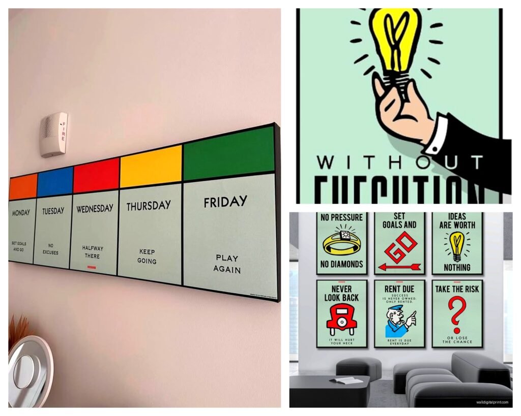
So I just finished installing this massive Monopoly board piece in a client’s game room and honestly, I’m still thinking about how unexpectedly cool it turned out, so let me dump everything I know about Monopoly wall art before I forget half of it.
Finding the Right Style Without Looking Like a Teenager’s Dorm
Okay so the biggest mistake people make is going straight for those super bright, primary-colored vintage board reproductions. They scream “I bought this at Target in 2015” and look dated already. What actually works – and I’ve tested this in three different spaces now – are the more sophisticated takes on the theme.
The property card prints are where it’s at. You can get individual Boardwalk, Park Place, whatever properties printed as standalone pieces. I found this seller on Etsy who does them in muted tones, almost like aged paper, and they look exponentially better than the glossy versions. Mount them in simple black frames, maybe 11×14 or 16×20, and suddenly you’ve got actual art instead of memorabilia.
Patent prints are another direction that doesn’t get enough attention. The original Monopoly board patent drawings from the 1930s have this technical, blueprint vibe that works in modern spaces. I hung a set of three in a minimalist office last month and my client’s husband didn’t even realize they were game-related until I pointed it out.
Size Matters More Than You Think
This is gonna sound weird but I see people constantly go too small with themed art. If you’re doing a Monopoly piece, commit to it. A tiny 8×10 property card on a big wall just looks like you forgot to decorate. I usually recommend:
- Single statement piece: minimum 24×36 inches, honestly bigger if you have the wall space
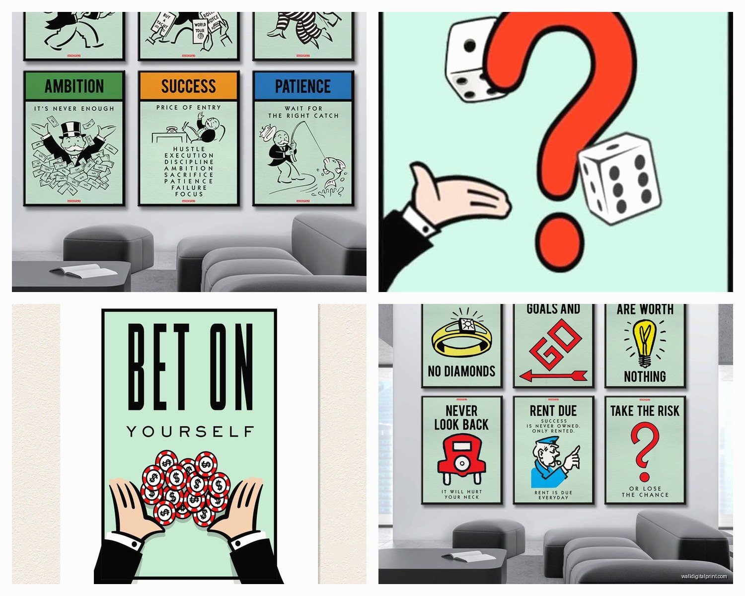
- Gallery wall of property cards: at least 6-9 pieces to make an impact
- Full board reproduction: go huge or go home, like 40×40 minimum
My own office has this 48×48 inch canvas of the classic board and it’s the right scale to actually read the properties from across the room, which is kinda the point? Otherwise it’s just colorful squares.
Where to Actually Buy This Stuff
Etsy is your friend but you gotta dig. Search terms that work better than just “Monopoly wall art”: vintage Monopoly print, property deed art, board game patent, capitalism decor (yes really), real estate game art. The algorithm shows you different stuff depending on your exact wording.
I’ve ordered from probably eight different shops at this point. The ones that do print-on-demand usually have better quality control than people selling pre-made canvases. You can often request custom sizes too, which is clutch when you’re trying to fit a specific space.
Hasbro’s official stuff is… fine? It exists. But it’s overpriced for what you get and tends to look very licensed-product-y. There’s a stiffness to officially branded art that doesn’t photograph well.
Oh and another thing – check Society6 and Redbubble. Independent artists upload Monopoly-inspired designs that aren’t exact replicas, so they’re legally safer and often more creative. I found this incredible interpretation where someone reimagined the properties as actual architectural drawings. Bought it immediately.
DIY Options That Don’t Suck
If you’ve got an actual vintage Monopoly board, you can mount it directly. I’ve done this twice and here’s what actually works:
Get the board professionally mounted on foam core first. It’s like $30 at a framing shop and prevents warping. Then either frame it under glass (expensive, we’re talking $200+ for a custom frame that size) or do a floating mount where you adhere it to a painted canvas backing and hang the whole thing frameless.
The frameless route is surprisingly modern-looking. I used 3M spray adhesive – the repositionable kind in case you mess up – and it’s held for two years now in my friend’s basement bar. Her husband was skeptical but it’s totally fine.
You can also scan property cards and print them yourself if you have access to a decent printer. I did this for a client on a budget, printed on cardstock at FedEx, popped them in IKEA frames, done. Cost maybe $80 total for a nine-piece gallery wall versus the $400 the Etsy version would’ve been.
Styling It So It Doesn’t Look Childish
This is where I see people struggle. The art itself might be cool but the way they integrate it makes the whole room feel theme-park-y.
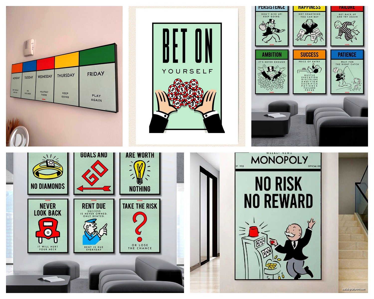
Keep the surrounding decor adult. If you’ve got Monopoly art, the rest of the room should be pretty restrained. Think: leather furniture, metallic accents, dark wood, concrete or stone textures. The game art becomes a playful accent instead of the room’s entire personality.
I did a home office where we had vintage property cards on one wall, but everything else was charcoal gray, brass, and walnut. The Monopoly pieces read as quirky and personal instead of gimmicky.
Color coordination helps too. Pull one or two colors from the board – usually the green from the dark properties or that distinctive red – and echo them in throw pillows, a rug, whatever. Creates cohesion.
Framing Choices That Elevate It
Black frames. Just… black frames. I know everyone wants to get creative but black works with literally every version of Monopoly art. Simple, clean lines, no matting usually looks more modern.
If you’re doing a gallery wall of property cards, keep all the frames identical. Same size, same color, same style. The variation in the cards themselves provides enough visual interest.
For a full board piece, floating frames are really nice – the kind where there’s a small gap between the art and the frame. Gives it this high-end gallery vibe.
I tried gold frames once thinking it would tie into the whole money/capitalism theme and it looked tacky as hell. Returned them same day.
Specific Pieces I’ve Used and Actually Liked
Okay so there’s this one artist – I think the shop is called something like IndustrialPrints or maybe VintageGameArt, my memory is terrible – who does the property cards with the actual vintage textures, like coffee stains and creases printed in. Sounds weird, looks incredible. Very “found in an attic” aesthetic.
The full-size board reproductions on canvas from AllPosters worked fine for a budget option. Not amazing quality but for like $60 you can’t really complain. I used one in a teen’s room and it’s held up.
There’s also this cool approach where you get individual game pieces – the thimble, the dog, the car – printed huge. I saw someone do the Scottie dog at like 30×40 inches in just black silhouette on white background and it was so much cooler than I expected. Very graphic and modern.
Wait I forgot to mention – 3D versions exist. Like, wooden cut-out property cards that mount off the wall slightly. I haven’t personally used them but I saw them at a design show and they’d be perfect for adding dimension if your space is feeling flat.
Where This Actually Works Best
Game rooms obviously, but that’s boring. Here’s where I’ve successfully used Monopoly art in less expected spaces:
- Home offices – especially for real estate agents, financial advisors, anyone where the capitalism theme is kinda on-brand
- Basement bars – pairs well with the whole vintage Americana thing
- Kids’ playrooms that adults also use – keeps it fun but not juvenile
- Guest bedrooms – gives personality without being too personal
- Man caves (I hate that term but you know what I mean)
I would maybe avoid it in dining rooms or living rooms unless your whole aesthetic is very eclectic and maximalist. It’s a strong statement and can overwhelm more formal spaces.
The Property Selection Thing
If you’re doing individual property cards, which ones you choose actually matters. Boardwalk and Park Place are obvious but kinda boring because everyone does them. I like pulling properties that mean something to you – like if you’re from Atlantic City, do the actual street you lived on or whatever.
The railroads have great graphics and are underutilized. Strong typography, simple design, very Art Deco.
Baltic Avenue and Mediterranean – the cheap brown properties – have this underdog appeal that’s kinda charming. I used them in a startup office once and the symbolism was perfect.
Common Mistakes to Avoid
Don’t mix different editions of the game in one display. The vintage 1935 version looks totally different from the 1970s version looks different from current. Pick one era and stick with it or it looks confused.
Don’t go too literal with the whole theme. Like, you don’t need Monopoly money in the frames and little house pieces scattered around. The art should be enough.
Avoid anything with slogans like “Do Not Pass Go” or “Get Out of Jail Free” printed in that novelty font. So overdone and honestly kinda cringey at this point.
Don’t hang it too high. This is a general art rule but especially important for pieces with text you want people to read. Center should be at eye level, roughly 57-60 inches from the floor.
Lighting Considerations
If you’re investing in a nice piece – like a custom framed vintage board – light it properly. A simple picture light or even a nearby floor lamp angled toward it makes a huge difference. The colors pop more and it signals that this is intentional decor, not just random nostalgia.
I installed a track light for a client’s Monopoly gallery wall and the difference was night and day. Suddenly it looked like a curated collection instead of stuff randomly stuck on a wall.
Avoid direct sunlight though. It’ll fade the colors over time, especially on prints that aren’t UV-protected.
Making It Personal
The best Monopoly art installations I’ve done have some personal connection. Had a client who proposed during a Monopoly game – we framed the actual Chance card “Advance to Boardwalk” with their engagement date underneath. Sweet without being cheesy.
Another client’s grandfather invented some variation of a property trading game before Monopoly existed, so we did a whole wall mixing vintage Monopoly with his grandfather’s hand-drawn game boards. Told a story.
Think about why you’re drawn to this theme beyond just “I like Monopoly.” Is it nostalgia? The aesthetic? The competitive aspect? Let that drive your choices and the installation will feel more authentic.
Oh and if you’ve got kids, involving them in choosing which properties or pieces to feature makes it more of a family thing. My daughter picked the cat game piece for her room and we found this cute minimalist print of just that. She’s way more invested in keeping her room clean now because she helped design it, so there’s that unexpected benefit.
Anyway yeah, that’s basically everything I’ve learned from doing this way too many times. Start with one good piece, see how you feel about it, then expand if it’s working. Don’t overthink it but also don’t just grab the first thing you see on Amazon because it’ll probably look cheap and you’ll end up replacing it anyway – learned that one the hard way with my own house before I knew better.
